
High-converting SaaS landing pages have almost nothing to do with visual polish or custom illustrations. Visually complex redesigns frequently fail to lift signups, while surfacing live product UI above the fold can meaningfully increase conversion - sometimes dramatically. The most effective product teams treat their landing page as an interactive product walkthrough, not a digital billboard.
You already understand color contrast, typography scales, and mobile responsiveness. This isn't a design-basics primer or a gallery of pretty screenshots. The core objective here is solving a structural conversion problem: why standard design patterns fail to convert traffic into free trials or demo requests, and how top pages push well past the SaaS industry median of roughly 3.8% to 6.6%.
The Mechanics of High-Converting SaaS Landing Pages
Outcome-Led Headlines vs. Feature Descriptions
Framing a SaaS landing page around a market category - "The Next-Generation AI Analytics Platform" - harms messaging clarity. Visitors evaluate immediate workflow utility, not industry taxonomy. Benefit-led, outcome-first headlines tend to outperform feature or category claims noticeably, and adding a specific numerical target to that headline tends to add a further lift on top. "Deploy Production Infrastructure in Under 30 Seconds" gives a visitor something concrete to evaluate; "The Ultimate Cloud Orchestration Layer" doesn't.
Most guides tell you to keep headlines short for readability. That's true, but incomplete - the real reason a tight headline works is that it forces you to distill the value proposition into an outcome under eight words, using vocabulary your actual customers use in support tickets and reviews, not internal product terminology nobody outside the building recognizes.
Interactive Product Hero Previews
Designing landing pages inside static design software conceals operational edge cases, state changes, responsive breakpoints, and component interactions that only surface once a page is actually implemented against real data. Top-performing SaaS pages - Linear, Framer, ReadMe - tend to achieve stronger conversion because they present functional UI components directly in the hero section instead of relying on static illustrations or abstract 3D graphics.
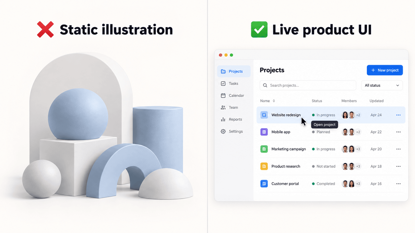
Design teams routinely spend real sprint time polishing high-fidelity Figma mockups that look impressive in a review and then break the moment engineering tries to implement them against real data and actual responsive breakpoints. That gap - looks finished in Figma, breaks in production - is exactly where a landing page project quietly loses its timeline.
Deconstructing 5 High-Converting Landing Page Frameworks
| Framework | Best For | Hero Content | CTA Approach |
|---|---|---|---|
| Hero-First Product Walkthrough | Visual, self-serve products | Live, interactive product preview | Single, low-commitment (“Get Started Free”) |
| Minimal Friction Self-Serve | Developer tools, infrastructure | Code block, terminal, or API preview | Single authentication step (e.g., “Continue with GitHub”) |
| Metric-Backed Enterprise | Long-consideration, high-ticket sales | Verified outcome data, case study summary | Single conversion path (“Book a Demo”), no dual CTA |
| Single-Path Focus | Any campaign landing page | Whatever fits the product, minus navigation | One CTA only — no competing secondary action |
| Verified Social Proof | Any page needing trust signals | Attributed metrics, not logo walls | Proof placed adjacent to the CTA, not just at the bottom |
The Hero-First Product Walkthrough
Best suited to visual, self-serve products. The hero section itself becomes the demo - a real, interactive preview of the product doing the thing a visitor came to check whether it does.
The Minimal Friction Self-Serve Model
Best suited to developer tools and infrastructure products, where the audience wants to get to documentation, a sandbox, or a single authentication step fast, not read marketing copy first.
The Metric-Backed Enterprise Framework
Best suited to longer-consideration, higher-ticket sales motions, where comprehensive supporting detail - case studies, verified outcome data, feature depth - does real persuasive work a short-form page can't.
Eliminating Non-Essential Exit Routes
Placing "Start Free Trial" and "Book a Demo" side-by-side above the fold creates real friction. Presenting two competing primary calls to action tends to split visitor attention and cause hesitation at exactly the moment a clear single decision would convert. Forcing internal alignment on one acquisition motion is uncomfortable - marketing wants five CTAs and three persona entry points in the hero, and every one of those dilutes the single conversion path the page needs.
Remove header navigation menus and secondary CTA buttons entirely on a dedicated campaign landing page to maintain that single focused path. This applies specifically to a focused campaign page - not a homepage, which reasonably needs broader navigation for visitors exploring rather than converting on one specific offer.
Verified Social Proof Over Logo Walls
Placing a row of enterprise customer logos directly beneath the hero headline has become a discounted template default - buyers increasingly discount unverified logo arrays they've seen on a hundred other pages. Social proof does more real work when it features a concrete, attributed metric claim or a named testimonial with an explicit business outcome, rather than a logo strip with zero context attached. Compare "trusted by these six logos" against a specific, sourced number like "X% ROI, verified by [named third party]" - the second gives a visitor something to actually evaluate.
Form Friction vs. Lead Quality: Engineering the Ideal Signup Flow
Single-Field Signups vs. Multi-Step Qualification
Forms with three or fewer fields tend to convert meaningfully better than longer ones - each additional field generally reduces completion, and a heavily-loaded nine-field form typically converts at a fraction of a lean three-field version. For complex B2B lead qualification specifically, multi-step forms broken into logical screens tend to outperform an equivalent long single-page form, since spreading fields across steps reduces how effortful any single screen feels.
Form architecture should be calibrated to the actual business goal, not copied from whatever the last landing page did. Single-field email inputs maximize trial volume for product-led growth products where the goal is signup volume. Multi-step conditional forms qualify leads for high-touch enterprise sales models where the goal is fit, not raw count. Enterprise sales teams demanding eight custom fields to qualify leads routinely tank conversion compared to a single-field PLG flow - that trade-off is sometimes worth it for lead quality, but it should be a deliberate choice, not a default.
Practical Scenarios: Before and After
Developer infrastructure SaaS. A cloud deployment platform was converting at roughly 2.1% on its ad landing pages. The original hero used an abstract 3D graphic, a vague headline ("The Ultimate Cloud Orchestration Layer"), three competing CTA buttons, and a required eight-field contact form.
The redesigned page features an interactive code block in the hero with live hover states, an outcome headline ("Deploy Production Infrastructure in Under 30 Seconds"), a single GitHub authentication button, and compliance trust badges placed directly beneath the primary CTA. That structural pivot lifted conversion to roughly 11.4% by reducing cognitive friction and establishing technical credibility directly in the hero, not three scrolls down. Generic AI image generators fail badly in this specific scenario - they tend to produce pseudo-code visual mockups containing actual syntax errors, which is exactly the kind of detail that destroys credibility with an engineering-literate audience.
Product-led growth collaboration tool. A B2B team collaboration platform was relying on stock photography, bulleted feature lists ("Kanban Boards," "Custom Tags"), an unverified customer logo wall, and a link to a recorded webinar to drive self-serve trial signups.
The updated layout replaces all of that with a dark-mode product UI walkthrough directly in the hero, an outcome headline ("Ship Projects 2x Faster Without the Chaos"), a specific, sourced proof metric, and a single signup field ("Start for Free, No Credit Card Required"). The structural redesign produced a substantial lift in account creations. Standard AI layout generators tend to fail here in a related but distinct way - outputting inconsistent design tokens, misaligned padding scales, and broken dark-mode color themes across the page.
UXMagic: Generating High-Converting Pages Without the Sprint Bottleneck
Everything covered in this guide - outcome-led headlines, live product UI in the hero, single-path CTA discipline, form friction matched to intent - is exactly what UXMagic's AI Landing Page Generator is built to produce directly from a prompt, rather than something a team assembles by hand across a two-week Figma cycle.
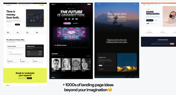
Closing the "looks good in Figma, breaks in production" gap. During component architecture, teams often spend days simplifying a complex software interface into a clean hero preview. UXMagic converts raw textual feature descriptions directly into a complete, structured landing page - sections, layout logic, and clear CTAs generated together, not a random visual output someone has to turn into a real page afterward. It exports directly to Figma or production React and HTML code, so the same generation reduces design handoff cycles from days to minutes.
Building the hero preview itself. If the goal is a working mockup of that hero preview fast, UXMagic's AI Mockup Generator turns a described idea into a polished starting point in one pass, and the AI Prototype Generator takes it further into something fully clickable - useful for testing a page with real users before committing engineering time to it.
Handling multi-step qualification flows. When a signup flow needs to be more than one screen - the exact trade-off covered in the form-friction section above - UXMagic's Signup Flow Generator builds the whole sequence as one connected flow rather than screens someone assembles separately and hopes to stay visually consistent.
Running multiple campaign variants without multiplying maintenance. When launching targeted PPC campaigns across distinct buyer personas, a single generic landing page tends to waste ad spend by speaking to nobody specifically, and engineering frequently refuses to hand-code custom pages for individual campaigns because component maintenance eats real sprint bandwidth. UXMagic's style engine generates tailored layouts for specific vertical personas while automatically maintaining core design system tokens and component rules - three targeted variants without three separate maintenance headaches.
Build Better Landing Page Heroes
Generate a production-ready landing page from your value proposition and make sure your hero clearly communicates what you offer, who it is for, and what to do next.