
Every extra field added to a form degrades conversion velocity, yet growth teams continuously push for job titles, phone numbers, and company size on initial registration. Baymard Institute's checkout benchmark database - drawn from large-scale usability testing of major US and EU e-commerce sites - puts the average checkout flow at 23.48 form elements, against an ideal closer to 12–14. That gap isn't a rounding error; it's the difference between a form people finish and one they abandon halfway through.
You already understand that excessive field count hurts conversions. This isn't a "keep forms simple" primer. It's the exact structural guidance - field threshold benchmarks, keyboard management specs, micro-copy placement rules, adaptive validation mechanics that separates a form audit from a form that actually converts differently once it ships.
Before / After: The Same Signup Form
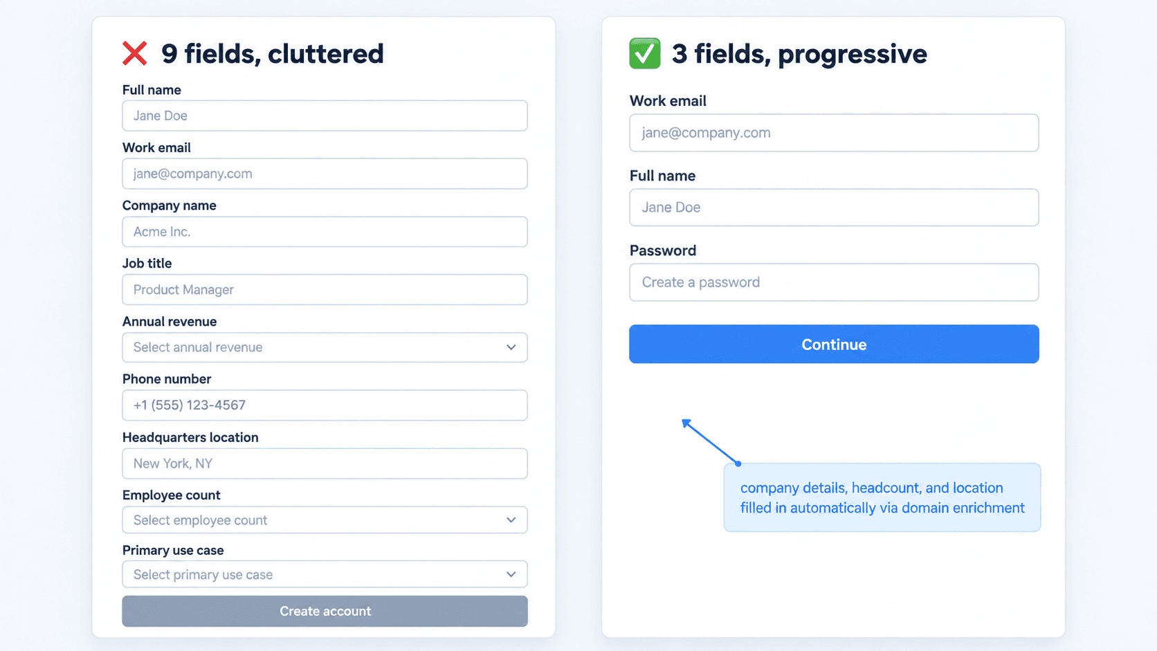
The right-hand version isn't hiding complexity - it's deferring it. The same data often still gets collected; it just happens progressively, after the user has a reason to trust the exchange, rather than all at once before they've seen any value.
The UX Science of High-Converting Web Forms
Understanding Perceived Effort vs. Actual Effort
Eliminating form fields isn't the primary driver of higher conversions on its own; reducing perceived cognitive effort is what actually moves completion metrics. A multi-step form containing eight logically grouped questions can outperform a cramped three-field layout if visual momentum aligns with user expectations. Forms tend to fail less because of raw field volume and more because of chaotic visual hierarchy, aggressive validation timing, and broken mobile interactions.
Empirical Benchmarks: Field Counts and Conversion Rates
Baymard's own published data is worth sitting with directly: the average checkout flow displays 23.48 form elements by default (14.88 if counting only actual form fields), against a benchmark ideal of roughly 12–14. Across the large-sized e-commerce sites Baymard has tested over years of checkout research, fixing documented usability issues - field count among them - has been associated with meaningful conversion gains. The specific percentage varies by site and audit scope, so treat any single number as directional rather than a guarantee for your own form.
Form Layout Architecture: Eliminating Visual Friction
Why Single-Column Layouts Outperform Multi-Column Grids
Designers frequently organize forms into multi-column grid layouts on the desktop to conserve vertical space. Rendered across varying screen sizes, this tends to introduce erratic tab navigation sequences, visual scanning errors, and input misalignments that slow completion. Standardize on a single-column layout as the default - the one real exception is tightly coupled input pairs like City/State/ZIP, where a multi-column grouping communicates the relationship itself rather than adding confusion. That exception is worth remembering precisely because it's the only one; everything else benefits from staying in a single vertical column.
Precise Label Placement: Eliminating the Placeholder Anti-Pattern
Minimalist design trends that eliminate visible structural field labels in favor of internal placeholder text create severe usability failures. The moment a user clicks into an input, the placeholder text disappears, forcing reliance on short-term memory to recall what was requested - placeholders also often carry insufficient color contrast and fail accessibility standards for screen readers. Structural label elements need to stay permanently visible, positioned directly above the input container, not disappearing the moment typing starts.
Section Grouping and White Space Hierarchy
Position persistent helper text directly below the input container so it stays visible while the field is active, not tucked away where it disappears on focus. Group related inputs into distinct visual clusters using whitespace padding or subtle border outlines - a form with twelve fields dumped into one undifferentiated block reads as more effortful than the same twelve fields organized into three clear sections, even though the actual input count hasn't changed.
Strategic Flow Selection: Single-Page vs. Multi-Step Forms
When to Implement Progressive Commitment Multi-Step Flows
Industry advice frequently claims multi-step forms universally outperform single-page layouts that oversimplifies actual user behavior. Multi-step forms tend to deliver a real conversion lift specifically when applied to dense, high-friction datasets, where grouping fields genuinely reduces cognitive load per screen. Applying a multi-step sequence to a low-friction two-field newsletter signup instead adds unnecessary click latency and can hurt conversion rather than help it. The dividing line is dataset density, not a blanket rule either direction.
Quick Decision Reference
| Scenario | Recommended Format | Why |
|---|---|---|
| 2–3 fields, low friction (newsletter signup) | Single-page | Multi-step adds click latency with no cognitive-load benefit |
| 4–5 fields, simple SaaS registration | Single-page | Still light enough that grouping doesn't help |
| 6+ fields, moderate complexity | Multi-step | Grouping reduces per-screen cognitive load |
| Dense, high-stakes data (financial onboarding, KYC) | Multi-step, with progress bar | Long single-page versions of this consistently show severe drop-off from fatigue |
| Tightly coupled fields (City/State/ZIP) | Single-page, grouped in one row | The grouping itself communicates relationship; splitting across steps would fragment it |
This is the practical version of the "dataset density, not a blanket rule" principle from the prose above - when in doubt, count the fields and cross-reference this table before defaulting to whichever format is trendier.
Step-Saving Mechanics and Progress Bar Psychology
Convert long single-page forms (six or more fields) into progressive multi-step flows with visible progress indicators and persistent state saving. A progress bar does real psychological work - it signals a finite, known-length commitment rather than an open-ended one, and local auto-saving between steps protects against the specific failure of a user losing all their progress to an accidental refresh.
Common Form UX Mistakes That Destroy Conversions
- Stakeholder field bloat - internal revenue and marketing teams continuously requesting additional data upfront, pushing forms past seven or more visible inputs and triggering immediate cognitive overload.
- Multi-column grid layouts that collapse poorly across mobile viewports, breaking tab order and visual scanning.
- Placeholder-as-label - using internal placeholder text instead of permanent, top-aligned label elements.
- Premature validation triggering - firing error states on active keypress instead of on blur, interrupting users mid-input.
- Omitted technical attributes - missing inputmode and autocomplete, forcing developers to manually retrofit keypad and accessibility behavior after the fact.
- Ambiguous field requirements - either no clear distinction between mandatory and optional fields, or every field cluttered with a required asterisk, creating visual noise instead of clarity.
Here's what fixing these looks like on three real workflows, presented as illustrative examples rather than benchmarked case studies. A B2B SaaS platform with a modest lead conversion rate on its request-a-demo page originally required nine inputs - full name, work email, company name, job title, annual revenue, phone number, headquarters location, employee count, primary use case. Restructured into a progressive three-field capture flow (work email, full name, password), with background domain enrichment deriving company details automatically and the user routed directly into an interactive demo sandbox, the team reported a meaningful lift in form completion, with qualifying details gathered progressively during onboarding instead of upfront.
An e-commerce brand with a high mobile cart abandonment rate was running a multi-column desktop grid that required horizontal scrolling on mobile, lacked native browser autocomplete, and used a single unformatted text box for card expiration and security codes. Re-architected into a single-column sequence with auto-formatting payment inputs, inputmode="numeric" invoking the correct keypad, and standard autocomplete="street-address" tagging on shipping fields, the team reported improved mobile checkout conversion and a shorter average payment completion time.
A fintech application requiring extensive identity verification - SSN, address history, employment status, annual income - presented all 22 required fields on a single scrolling page, resulting in severe drop-off from cognitive fatigue. Replaced with a multi-step sequence and visible progress bar, fields grouped logically into Personal Identity, Address Verification, and Financial Profile, with simple fields (name, email) placed first to build momentum before the harder verification steps, the team reported improved overall onboarding completion and fewer submission errors.
Where Generic AI Design Tools Fail
When prompted to build forms, standard generative AI design tools routinely introduce the exact usability flaws covered above: multi-column grid layouts that collapse on mobile, placeholder text used as labels instead of permanent structural labels, omitted inputmode and autocomplete attributes forcing manual retrofitting, and static, non-interactive mockups with no real focus or validation states - a visual approximation of a form, not a functioning one.
Technical Implementation: HTML Attributes and Validation Logic
This section is deliberately separate from the design guidance above - these are implementation details for engineering to apply once the layout and content decisions are already made, not design decisions in themselves.
Implementing Adaptive Inline Validation
The general pattern that works well for most fields is validation on blur (onBlur) - evaluating data only after the user shifts focus away from the field, rather than flagging errors mid-keystroke. That said, onBlur isn't universally the right timing for every field. A few real exceptions worth planning for explicitly:
- Password strength requirements - real-time feedback as the user types (showing which criteria are met) is often more helpful here than waiting for blur, since the user is actively working toward meeting the requirement.
- Username or email availability checks - an async check after a short typing pause (debounced, not on every keystroke) can save a user from discovering a conflict only at submission.
- Format-sensitive fields mid-entry (like credit card number formatting) - visual formatting can apply live, even if actual validation waits for blur or submission.
The underlying principle stays the same across all of these: don't interrupt a user who's still actively working toward a valid answer. onBlur is the right default; it's not the only correct timing for every field type.
Mobile Keypad Matching with Inputmode and Type Attributes
Failing to specify precise HTML input attributes forces mobile keyboards to default to standard alphanumeric layouts for numeric fields - postal codes, phone numbers, card security codes adding unnecessary keystrokes and friction. Explicitly set type and inputmode attributes for every input (type="email", type="tel", inputmode="numeric") to invoke the correct specialized mobile keyboard automatically.
Common Field Attribute Reference
| Field Type | type | inputmode | autocomplete |
|---|---|---|---|
| Email address | |||
| Phone number | tel | tel | tel |
| ZIP / postal code | text | numeric | postal-code |
| Credit card number | text | numeric | cc-number |
| Card security code (CVV) | text | numeric | cc-csc |
| Full name | text | text | name |
| First name | text | text | given-name |
| Last name | text | text | family-name |
| Street address | text | text | street-address |
| Password | password | text | new-password / current-password |
Keep this table close at hand during handoff - it's the single fastest way to eliminate the "omitted technical attributes" failure mode covered earlier without relying on memory field by field.
Leveraging Autocomplete Parameters for Zero-Keystroke Entry
Configure browser auto-fill parameters (autocomplete="given-name", autocomplete="email", autocomplete="postal-code") to enable near-zero-keystroke entry wherever a browser already has the data saved. This is a low-effort technical addition with a real, direct usability payoff - a field a user never has to manually type is a field that can't be typed incorrectly.
Accessibility Considerations
Form accessibility deserves its own explicit checklist, not an afterthought bolted onto the visual design:
- Error announcements - validation errors should be announced via ARIA live regions so screen reader users learn about a problem without having to re-scan the whole form.
- Focus management - after a failed submission, focus should move to the first invalid field automatically, not leave the user scrolling to find what went wrong.
- Keyboard navigation - every field, including custom dropdowns or date pickers, needs to be fully operable via keyboard, with a visible focus indicator at every step.
- Screen-reader labels - every input needs a properly associated label (via for/id, not just visual proximity), so assistive tech announces the correct field name.
- Error association with fields - use aria-describedby to link an error message directly to its input, so the relationship is programmatic, not just visual.
Automated Form Generation: Building Implementation-Ready UI with UXMagic
Instead of manually arranging individual auto-layout frames, tweaking field spacing, and constructing form state variations by hand, UXMagic's Flow Mode can generate an implementation-ready UI component hierarchy directly from a prompt like "Generate a high-converting, single-column SaaS signup flow with top-aligned labels, inline validation states, and mobile keypad attributes" - embedding the conversion standards covered throughout this guide automatically, rather than leaving them for a designer to remember screen by screen. Worth being precise about the claim here: this is a strong, structured starting point for engineering to build from - not a substitute for the engineering team's own review of behavior, accessibility, security, and backend logic before anything ships.
Converting a long single-page form into a multi-step progressive flow typically means building dozens of linked frames and manual state transitions by hand. UXMagic automates that specific workflow, generating complete multi-step sequences - active progress bars, auto-saved step states, responsive summary cards directly from raw field requirements, closing the exact gap the fintech onboarding scenario above ran into.
Maintaining design consistency across complex forms - uniform error states, focus rings, helper text hierarchy, tap targets - gets genuinely difficult as a design team scales. UXMagic generates accessible, WCAG-conscious form components that maintain consistent visual tokens across every web and mobile breakpoint, rather than leaving that consistency as a manual audit someone has to remember to run - though, as with any generated output, a final accessibility and security review from engineering remains part of shipping it responsibly.
Build Better Forms
Generate a single-column, validation-aware signup flow with mobile keypad attributes built in from the first prompt.