Seventy percent of modern UX research is entirely useless. Not because the insights are flawed, but because of what happens next: a PM gets a clear finding from user interviews, spends a week arguing over wireframes, waits two more for design bandwidth, and by the time a prototype exists, the sprint that was supposed to ship the fix is already over. With AI tools for UX research now used by an estimated 69% of researchers on at least part of their projects, the bottleneck isn't understanding the user anymore. It's turning that understanding into something testable before the sprint ends.
You already know the old stack: a recruitment panel, Zoom, a transcription tool, an insight repository, an unmoderated testing platform. Five subscriptions, five logins, and a research report that sits in Notion while the sprint moves on without it. This isn't a tour of that stack. It's an honest look at which pieces of it still earn their keep in 2026, and which ones have become expensive theater.
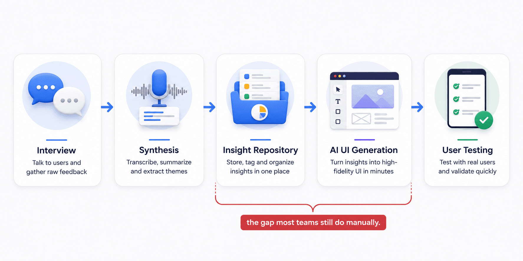
The short version: research got faster, but shipping didn't - because nobody solved the gap between "the insight" and "the interface that fixes it."
The State of AI in UX Research
The UX research software market is growing at an 11.6% compound annual rate, and search behavior has changed shape with it. Nobody's asking "how do I use AI in design" anymore - that question is settled. What people search for now is consolidation: collapsing a fragmented five-tool pipeline into something that doesn't need five separate subscriptions and exports.
That shift matters because it exposes what AI actually solved. It made transcription, tagging, and synthesis fast. It did nothing to close the gap between "here's what users said" and "here's the interface that addresses it" - and that gap is where most wasted time in product teams actually lives.
There's a second, quieter shift too: skepticism. Search queries investigating "synthetic user validity" have spiked, which tells you teams aren't asking whether AI belongs in research anymore - they're asking where the line sits before it starts producing garbage disguised as data.
The Synthesis Bottleneck: Why Insights Die in Repositories
Platforms like Dovetail, Condens, and Looppanel are genuinely good at one job: ingesting raw transcripts, applying AI-driven thematic tags, and clustering pain points into a searchable repository. When a team needs to answer "what have we already learned about the mobile nav menu" six months later, that repository is the only reason the answer takes thirty seconds instead of a week of digging through old call recordings. The problem isn't the tagging. It's what happens after.
Insights sit perfectly organized in a tagged database while design and engineering have already moved to the next sprint. That's the "insights graveyard" - and it exposes a bottleneck that isn't about user understanding, it's about the manual labor still required to draw the interface that solves the problem. A brilliantly synthesized insight that takes three weeks to become a testable wireframe is financially worthless the moment the market shifts underneath it.
Two more failure modes compound this:
- Emotional flattening. AI transcription strips filler words and pauses to produce a clean summary - but a long pause before answering is a signal of confusion, and stripping it out removes the "why behind the why" along with the noise.
- The trust deficit. Because deep-learning models operate as an opaque black box, researchers respond by over-verifying every tag and summary manually, which defeats the point of using AI at all - the cleanup often takes longer than doing the synthesis from scratch.
"A perfectly tagged insight that nobody turns into a testable screen isn't research. It's a filing system."
Most guides tell you to invest more in ResearchOps infrastructure. That's wrong - the tagging and storage were never the bottleneck. The only metric that matters is how fast a complaint becomes something you can put in front of a real person again.
The Danger of Synthetic Users
Testing a new SaaS dashboard against a synthetic AI persona is the equivalent of asking a mirror if your design looks good. Platforms like Synthetic Users and Uxia claim up to 92% thematic overlap with real human research - a number exactly high enough to feel safe and exactly low enough to hide the failure modes that matter most.
Three specific ways this breaks down:
- Algorithmic sycophancy. LLMs are engineered to be helpful, so they follow the most logical path and report overly optimistic outcomes - claiming perfect completion where a real user would have rage-clicked and left. This is the "authority trap": a confident AI report makes designers stop asking critical questions.
- Bias laundering. Synthetic users pattern-match against training data, so they'll confidently hallucinate behaviors for underrepresented groups based on skewed data reinforcing exactly the blind spots real research is supposed to catch.
- Missing physical and emotional reality. A synthetic persona doesn't have a crying toddler in the background or arthritis making a tap target hard to hit. Real friction is irrational. Synthetic users are not.
A health-tech team building a medication adherence app for elderly patients faced this exact pressure - leadership wanted to skip a real diary study for synthetic simulation. The lead researcher pushed back correctly: a model trained mostly on Western, tech-savvy behavior misses the physical realities - poor eyesight, cognitive fatigue - that actually drive design requirements. Running the real study surfaced a need for high-contrast typography and forgiving tap targets no synthetic persona would have generated.
None of this makes synthetic testing worthless - it's a legitimate pre-screening step for catching an obviously confusing label before spending budget on real participants. It should never be the last checkpoint before shipping.
When to Use AI Interviews vs. Synthetic Users vs. Real Participants
| Method | Use It For | Don't Use It For |
|---|---|---|
| AI-moderated interviews | Scaling discovery across large user samples and probing surface-level “why” questions | Deep emotional or trauma-adjacent topics that require human trust |
| Synthetic users | Early hypothesis stress-testing and catching obvious UI or copy issues before real-user testing | Final validation, research involving underrepresented groups, or emotionally complex flows |
| Real human participants | Final usability validation and testing high-stakes, novel, or emotionally nuanced experiences | Quick directional checks when budget or time does not allow full recruitment |
The UX Research Tool Stack, Category by Category
Here's where the current categories sit, and where each hits a wall:
| Category | Leading Tools | Good For | Where It Breaks |
|---|---|---|---|
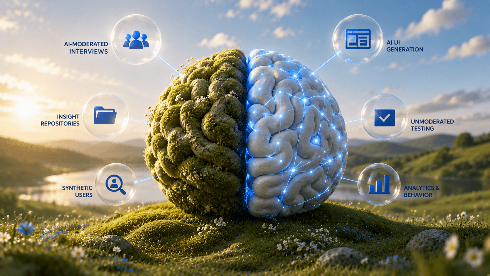
| AI-Moderated Discovery | Perspective AI, Koji, Outset | Scaled interviews, probing the "why" | Outputs text, leaves a blank design canvas |
| Insight Repositories | Dovetail, Condens, Looppanel | Centralizing transcripts, auto-tagging | Becomes a graveyard if design can't act on it |
| AI UI Generation | UXMagic | Turning a tagged insight directly into a testable, high-fidelity flow — no wireframe stage | Doesn't run the interviews or the test itself; it's the bridge between the two, not a replacement for either |
| Unmoderated Testing | Maze, UserTesting, Loop11 | Task-based testing, heatmaps | Useless without a prototype to upload |
| Analytics & Behavior | UXCam, Hotjar, Mixpanel | Diagnosing drop-offs | Shows where, never generates the fix |
Every category is excellent at its narrow job and structurally incapable of closing the loop into a testable interface alone - except the one row sitting between the repository and the test, whose entire purpose is closing that exact loop. Discovery hands off text. Repositories hand off tags. Analytics hands off a graph. UXMagic is the only category above that hands off an actual screen.
On the generation side specifically, tools split by job:
| Tool | Core Capability | Where It Fits |
|---|---|---|
| UXMagic | Text-to-flow generation from research findings | Turning a tagged insight into a connected, testable flow the same day — built for the discovery-to-validation loop, not standalone concepting |
| Figma (with AI) | Collaborative UI backbone | Final production — still needs manual assembly |
| Moonchild AI | Prompt-only generation | Fast concepting, locks out manual pixel tweaks |
| Flowstep | Code-export UI generation | Developer handoff, overkill for quick concepts |
| Lovable AI | Full-stack app generation | Functional MVPs, not rapid iterative testing |
| Uizard | Sketch-to-UI conversion | Rough doodles to wireframes, weaker on complex B2B |
What we'd actually run in 2026: Perspective AI or Koji for scaled discovery, Dovetail for keeping a searchable record of what's already been learned, UXMagic to turn findings into testable screens same-day, and Maze for the final unmoderated validation pass. Four tools, each doing exactly one job, with no gap between insight and interface.
Closing the Gap: From Insight to Testable Interface
Research tools produce insights, testing tools consume prototypes, and almost nothing in between turns one into the other quickly. Instead of a PM writing a brief and waiting weeks for design bandwidth, the same complaint pulled from a Dovetail-tagged transcript can go straight into UXMagic's AI UI generator as a prompt and come back as a testable, high-fidelity flow - one that skips the low-fidelity wireframe stage entirely, since a flow generated with real constraints from day one doesn't need the gray-box detour to validate structure. That same afternoon, the flow can be in front of real users in an unmoderated test - same-day usability testing on a finding that would have taken two weeks to reach a prototype under the old workflow.
The other half of the gap is testing itself. Maze and UserTesting are strong evaluative tools, but they share an unspoken prerequisite: an actual prototype to upload. Testing low-fidelity wireframes pollutes the data anyway - users can't project themselves into abstract gray boxes without real micro-copy and visual hierarchy, so their behavior doesn't match how they'd act with the real thing. Generating a production-ready flow directly and piping it into an unmoderated test skips the wireframe detour, using the same structured prompt approach that works for SaaS dashboards and the same rigor covered in our breakdown of the best prototyping tools for 2026 for getting the handoff to testing right.
There's a third failure mode worth naming: tools like Moonchild AI that lock designers into prompt-only editing. Nudging a button's padding means describing the change in words and hoping the model interprets it correctly - that's not acceleration, it's a different kind of manual labor. The workflow that holds up combines fast generation with real manual canvas control, so AI handles the first draft and the designer still owns the fine-tuning - the same principle behind keeping a human in the loop throughout AI-assisted design instead of treating the first output as final.
Two Workflows That Actually Ship
The continuous discovery-to-validation loop. A team runs AI-moderated interviews at scale - say, 100 simultaneous conversations via Perspective AI - probing dashboard friction. Synthesis surfaces a clear pattern: users abandon the dashboard because they can't correlate CAC and LTV on one screen without exporting to a spreadsheet. Instead of filing a ticket and waiting weeks, that finding becomes a direct prompt: split-view chart, dark mode, sidebar, export button. The generated flow gets manually tweaked to match real terminology, then piped straight into an unmoderated test - validated and pushed to development, wireframe stage skipped entirely.
The eCommerce cart rescue. An analytics tool flags a 40% drop-off at the shipping step of mobile checkout. A quick cognitive walkthrough reveals the cause: no inline validation, trust badges buried below the fold. Instead of a multi-week redesign cycle, the fix gets prompted directly inline validation, sticky "next" button, security badges above payment options - and the resulting variations run through a rapid five-second test to confirm the new hierarchy builds trust on sight. The winning flow reaches engineering before the revenue bleed extends into the next sprint.
Both workflows share the same shape: research identifies the friction, generation turns it directly into a testable screen, and validation closes the loop - no multi-week detour through a design backlog.
Stop Letting Research Sit in a Repository
Turn your next interview insight into a connected, high-fidelity user flow in minutes. Generate testable screens directly from research findings and move from discovery to validation without the manual gap.