

The product team just burned three weeks redesigning a high-fidelity checkout flow because someone finally realized the core navigation logic was broken. Skipping the low-fidelity wireframe phase to "save time" with a robust design system is the fastest way to guarantee an expensive, late-stage redesign. When teams prioritize polished pixels over structural logic, they're not moving fast - they're accumulating design debt.
This isn't a wireframing 101 post. You already know what a grey box is and why color doesn't belong in one yet. What you're actually trying to figure out is whether AI can speed up this phase without turning your wireframe into a beautiful guess that engineering can't build.
Short answer: yes, but only if the AI is generating logic, not just layout. Here's where that distinction actually matters - and what it costs you if you get it wrong.
What Is a Low-Fidelity Wireframe
A low-fidelity wireframe is a grayscale, unstyled blueprint of a screen or flow that maps layout, navigation, and information hierarchy, nothing else. No brand colors, no final typography, no real imagery. Just boxes, labels, and the sequence a user moves through to complete a task.
That absence of polish is the entire point, not a limitation. A low-fi wireframe exists to answer one question, does the structure work - before anyone spends time answering a completely different question: does it look good? Conflating the two is how teams end up debating a button's corner radius in the same meeting where they should be catching a missing checkout step.
It's also not the same thing as a mockup or a prototype. A mockup adds visual design without necessarily being interactive; a prototype adds interactivity to test flow and behavior. A low-fi wireframe is upstream of both - it's the structural draft that should exist before either one gets built.
Low-Fi vs. High-Fi vs. AI-Generated Wireframes: A Quick Comparison
| Feature | Low-Fidelity Wireframe | High-Fidelity Wireframe | Generic AI-Generated |
|---|---|---|---|
| Visual detail | Grayscale, basic shapes | Full color, real typography, branding | Full color, styled, often overpolished |
| Best used for | Validating navigation & information architecture | Late-stage testing, stakeholder sign-off, dev handoff | Quick visual concepting |
| Edge case coverage | Manual - designer decides what to map | Manual, usually only if wireframing caught it first | Rare - typically happy path only |
| Stakeholder distraction risk | Low (intentional) | High (color/branding derails logic review) | High (looks "finished," discourages critique) |
| Speed | Slow - manual drag/align work | Slowest - full component build | Fast - single screen in seconds |
| Handoff risk | Low, since logic is validated first | Low, if wireframing already happened | High - hallucinated data, unbuildable layouts |
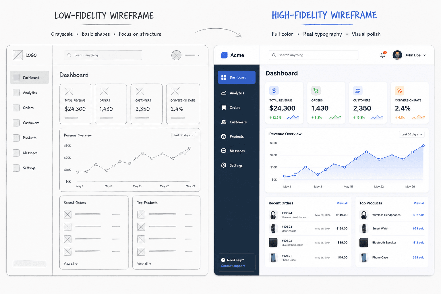
The True Purpose of a Low-Fidelity Wireframe
A wireframe isn't a rough draft of a screen. It's a structural stress test - a way to validate information architecture, navigation, and content hierarchy before anyone spends time on a hex code. Stripping away color and typography isn't an aesthetic choice, it's a forcing function: without visual polish to react to, stakeholders are left with nothing to critique except whether the flow actually makes sense.
That's the mechanism behind the "grayscale audit." Present a checkout flow in full color and a CMO will spend forty-five minutes on the corner radius of the "Complete Purchase" button. Present the same flow in strict grayscale, and that same CMO notices the flow is missing guest checkout entirely - because there's nothing else left to look at.
"A wireframe that looks finished stops getting critiqued. A wireframe that looks unfinished gets interrogated. That's the entire point of keeping it ugly."
High-fidelity mockups also create a false sense of security during user testing. A polished interface signals "finished," which makes people less likely to flag fundamental problems - they subconsciously recognize the sunk cost and offer surface-level feedback instead. Low-fidelity wireframes, by looking deliberately unfinished, invite the aggressive structural critique a product actually needs before development starts.
Why Skipping to High-Fidelity Is UX Design Debt
The most common excuse for skipping wireframing is having a mature design system. If dragging a pre-built, polished component into a canvas is just as fast as sketching a grey box, why not skip straight to high-fidelity? This is wrong, and it's expensive - not vaguely, but in numbers well documented in software engineering literature.
The most cited figure comes from Roger Pressman's Software Engineering: A Practitioner's Approach: fixing a usability problem during development typically costs 10 times more than fixing it during design, and after release it can cost up to 100 times more. That's a software cost-economics finding, not a UX talking point.
The pattern shows up in real numbers, too. American Airlines found that correcting usability problems during the design phase of their website, rather than after launch, reduced the cost of those fixes by 60–90%.
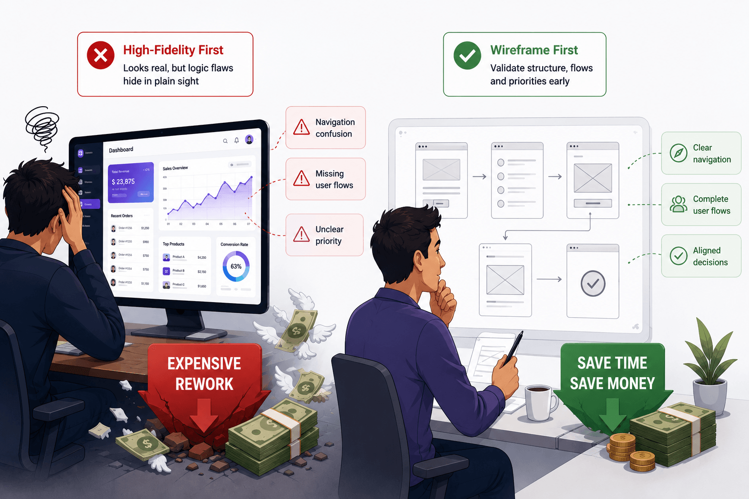
High-fidelity components carry visual weight. The moment a stakeholder sees a real button with real brand colors, the conversation shifts to aesthetics instead of logic - the same failure mode as the grayscale example above, just self-inflicted. A design system also limits early problem-solving to interaction patterns that have already been built, quietly hiding foundational navigation flaws behind familiar components.
A pattern seen across teams that lean too hard on their component library: a team skips wireframing because their design system is "robust," only to discover the core checkout logic was flawed from day one - forcing a full high-fidelity redesign, which is exponentially more expensive than adjusting a wireframe would have been. A related version: showing a client a high-fidelity mockup to "speed things up," getting an immediate sign-off, and then discovering during usability testing that users can't even find the main navigation. Polish doesn't validate logic - it just makes bad logic harder to see.
The Lorem Ipsum Trap
Common advice says to use Lorem Ipsum so stakeholders stay focused on layout instead of copy. This is backwards. Dummy text creates a pristine, idealized symmetry that has nothing to do with how real content behaves - it hides the exact problems a wireframe exists to catch.
A layout that looks perfectly balanced with placeholder text can completely break the moment real content lands. Localization is the clearest case: German and Finnish translations routinely run 20–35% longer than their English source, which is exactly the kind of expansion that shatters a layout that looked flawless with Lorem Ipsum. If a real headline runs fifteen words and the wireframe only accommodates three, that's a structural problem, and it needs to surface now.
"If your layout only survives with fake text, it isn't validated. It's decorated."
The fix is simple: use rough, actual draft copy instead of filler. A structural wireframe should stress-test character limits, translation expansion, and realistic data density. If the layout can't survive real content, it's not a working wireframe yet - it's a mockup of a wireframe.
How to Build a Wireframe Fast (Without Losing the Logic)
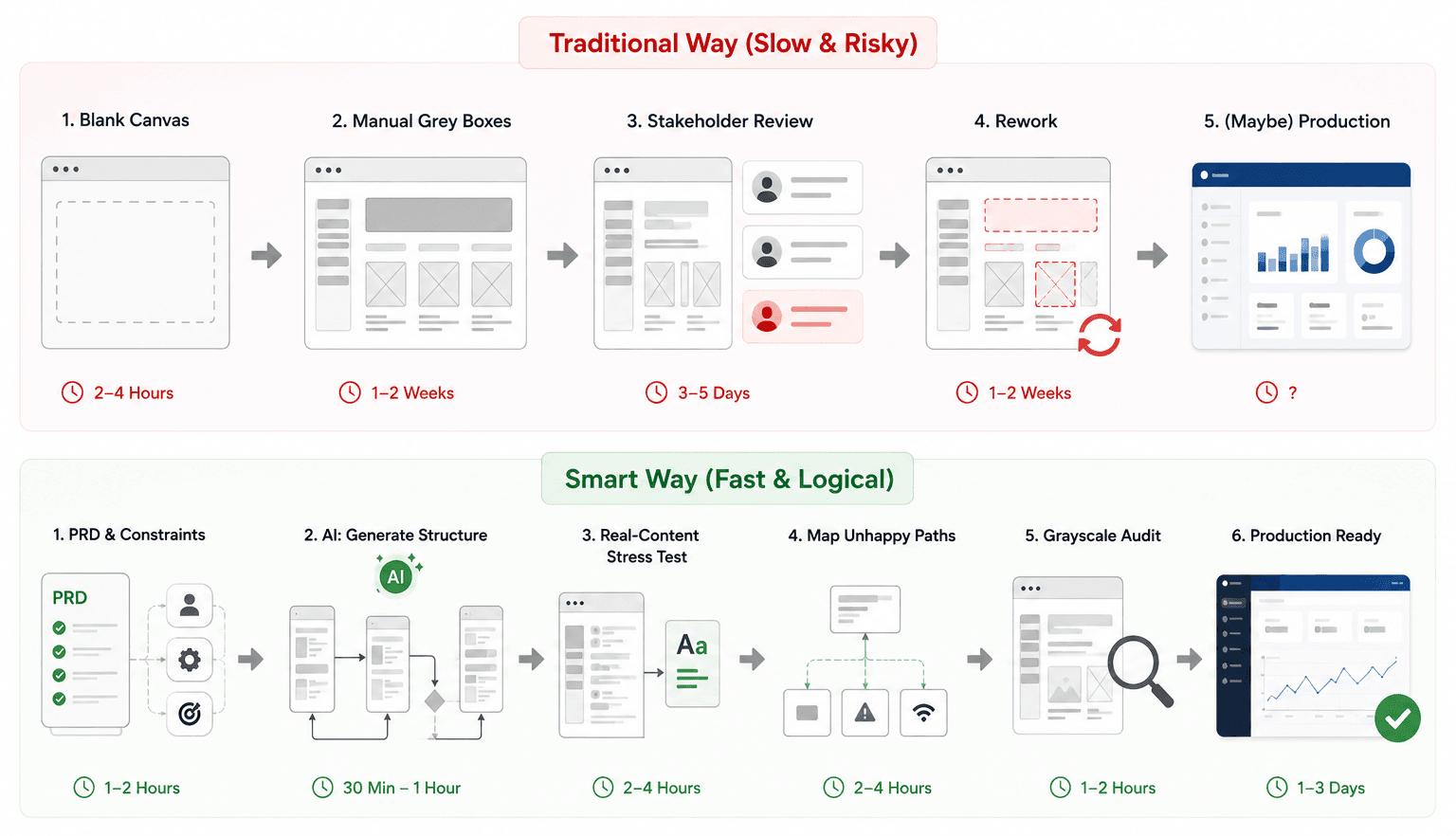
Speed and structural rigor aren't actually in conflict - the tension is between speed and manual labor. Here's the sequence that keeps both intact.
Start with constraints, not a blank canvas. The workflow begins with the PRD, user personas, and technical limitations - not shapes. The goal is defining the user flow and the job-to-be-done. Wireframing without a defined user goal guarantees a scattered interface no matter how fast you draw it.
Generate the skeletal structure, not the assembly. This is where manual labor is historically highest - dragging and aligning hundreds of grey rectangles by hand. It's also where an AI layer earns its place, but only if it's doing the right job: translating PRD logic into a prompt (e.g., "B2B SaaS onboarding flow with conditional logic for admin versus standard user roles") should return navigation, hierarchy, and sequential steps - not a single polished screen. If you're still comparing tools for this stage, we've broken down how the leading wireframing tools actually handle structure versus assembly - most of them are still built around manual layout, which is exactly the gap a tool like UXMagic fills: you prompt the flow logic and get connected structure back, while still making every actual design decision yourself.
Run the real-content stress test immediately. A generated skeleton is useless until it survives contact with reality. Swap every placeholder for actual draft copy right away, and let the layout break if it's going to break now rather than during QA.
Map the unhappy paths on purpose. A professional workflow accounts for more than the frictionless scenario - zero-result search pages, network failures, loading screens, empty dashboards. Skip this and developers improvise error logic mid-build, creating inconsistent UX and technical debt in the same sprint. This is the second place structured AI generation earns its keep over a generic tool: prompting for the full flow, including failure states, up front - see our prompt templates for SaaS dashboards for phrasing that keeps the AI from quietly skipping the unhappy paths.
Run the grayscale audit, no exceptions. Present the completed flow with a strict ban on color, final typography, and imagery. Force the review to answer three questions only: does the flow make sense, is the primary action obvious, and is anything critical missing.
Move to production only after logic is approved. Once stakeholders sign off on structure, elevate to high-fidelity with confidence that no structural revisions are coming later. If the next step involves wiring up interactions or conditional logic for testing, our breakdown of the best prototyping tools for 2026 covers which ones handle that handoff cleanly versus which ones turn into unmanageable node spaghetti.
A composite example that illustrates the stakes: a team prototyping an enterprise analytics dashboard used a generic AI tool prompted for "an enterprise analytics dashboard," and got a visually stunning layout with hallucinated 3D charts the backend couldn't support - one that collapsed on a new account's empty state. Starting instead from a low-fidelity flow that explicitly mapped the empty and loading states first, using real draft copy, surfaced a European localization problem in the data tables before a single line of code was written. Same deadline, same AI assist, different starting point - and a materially different outcome.
Where Generic AI Generators Fail
The trend of praising AI tools that jump straight from a text prompt to a fully styled, high-fidelity mockup misunderstands what product design requires. These tools execute "bottom-up" design - skipping user flow, state management, and technical constraints entirely - and the outputs are aesthetically impressive while functionally bankrupt. A wireframe that looks correct but functions incorrectly is more dangerous than no wireframe at all, because it creates a false sense of progress while misdirecting engineering with hallucinated data structures.
Here's what that difference looks like side by side:
| Category | Generic AI Workflow | Structured AI Workflow |
|---|---|---|
| Prompt | "Enterprise analytics dashboard" | "SaaS onboarding flow with admin/standard roles, including empty state and error handling" |
| Output | One polished, isolated screen | Connected, multi-screen flow |
| Edge cases | None — happy path only | Empty, error, and loading states included |
| Data assumptions | Often hallucinated, like charts the API can't produce | Prompted against known constraints |
| Stakeholder reaction | "This looks done" — distracts from logic review | Forces structural critique, since it's still unstyled |
| Engineering handoff | Rejected — API can't support what's shown | Buildable, because constraints were part of the prompt |
The pattern shows up constantly: an AI wireframe generator spits out a beautiful "happy path" screen and ignores the logged-out state, the empty state, and the 404 error state. Engineering gets blocked, forced to improvise the missing system states mid-development. That's the entire difference between a tool generating an isolated screen and a tool generating a connected flow. This is also where UXMagic fits naturally: its value isn't a nicer-looking single screen, it's generating the flow and its edge cases together, so the "unhappy path" isn't an afterthought. The distinction that matters when evaluating any AI wireframing tool:
- Isolated screens vs. connected flows - a single polished dashboard is not a validated user journey.
- Happy-path-only vs. edge-case aware - if the tool doesn't generate error and empty states by default, someone still has to invent them manually, later, under worse time pressure.
- Hallucinated data structures vs. technical-constraint awareness - a chart the API can't support isn't a design decision, it's a rebuild waiting to happen.
Key Takeaways
- Ban Lorem Ipsum. Use real draft copy so localization, character limits, and data density break the layout now - not after launch.
- Run the grayscale audit with zero exceptions. No color, no branding, no "just this one review" - that's what keeps stakeholders focused on logic.
- Map the unhappy paths before the happy path gets approved. Empty, error, and loading states aren't polish - they're what engineering will improvise if you skip them.
- Treat AI generation as a flow tool, not a screenshot tool. If it can't generate connected, multi-screen logic with edge cases, it's producing concept art, not a wireframe.
- Remember the cost curve. A fix costs roughly 10x more once it hits development and up to 100x more after launch - that's the actual argument for validating structure first.
Related guides
- Wireframe Builder Guide: How to Create Production-Aligned UI Flows Without Design Skills
- What Is a Mockup? Everything Product Teams Actually Need to Know
- Website Wireframe in SaaS: Why Gray Boxes Are Dead
- The Most Innovative AI Wireframe Platforms in 2026: A Technical Comparison
- What Is a Prototype in UX Design (And Why Most Teams Build Them Wrong)
- Wireframe Tool Cost-Benefit Breakdown (2026): What's Actually Worth Paying For
- Best Mockup Tools in 2026: Fast UI Mockups Without the Friction
- What Is Rapid Prototyping? The Modern SaaS Playbook (2026)
- User Interface Design Guide for Beginners (2026)
- AI Wireframe Generator for Mobile Apps: Best Tools & Workflows (2026)
Stop Building Screens Before Validating the Flow
Turn your next PRD into a connected, edge-case-aware wireframe before development begins. Generate complete user flows, test structure early, and move to high-fidelity with confidence using UXMagic.