“Why am I spending hours drawing gray boxes when our design system already has real components?”
If that question has crossed your mind recently, you’re not confused. You’re reacting correctly to an outdated workflow. The traditional website wireframe process wasn’t designed for design tokens, component libraries, or AI-assisted flows with persistent state memory.
Modern SaaS teams don’t need prettier wireframes. They need structural alignment between product logic, engineering feasibility, and user journeys, without creating technical debt or AI hallucinations.
The Evolution of the Website Wireframe in SaaS Design
Moving Beyond Low-Fidelity: Why Grayscale Is Dead in Modern Workflows
Most guides still insist every project must start with grayscale wireframes.
That’s wrong.
If your team already uses a component library, drawing placeholder buttons instead of real ones is pure duplication. Selecting a production-ready component takes the same time as dragging a gray rectangle. The only difference is whether your output is usable.
Traditional low-fidelity wireframes now create three problems:
- redundant redesign work later in the sprint
- stakeholder confusion during reviews
- artificial delays before prototyping begins
Fidelity isn’t a step. It’s a spectrum.
Modern teams move directly from conceptual mapping into structured layouts built with real tokens and components. If you’re still stuck staring at empty artboards, this breakdown of blank canvas syndrome explains why the workflow itself ,not your creativity is the blocker.
Structural Blueprints vs. Interactive Prototypes: Understanding the Sequence
Wireframes still matter. Just not the way bootcamps describe them.
A website wireframe is not a sketch. It’s a structural logic model that:
- exposes missing edge cases
- surfaces database implications
- validates navigation hierarchy
- stress-tests PRD assumptions
Prototypes come after structure stabilizes ,not before.
Testing static wireframes with users, however, is research malpractice. Users can’t interpret abstraction reliably. They react to unfinished visuals instead of flows, which corrupts findings and forces researchers to “guide” behavior. 🚫
Wireframes exist for internal alignment. Prototypes exist for validation.
Core Components of a High-Conversion SaaS Wireframe
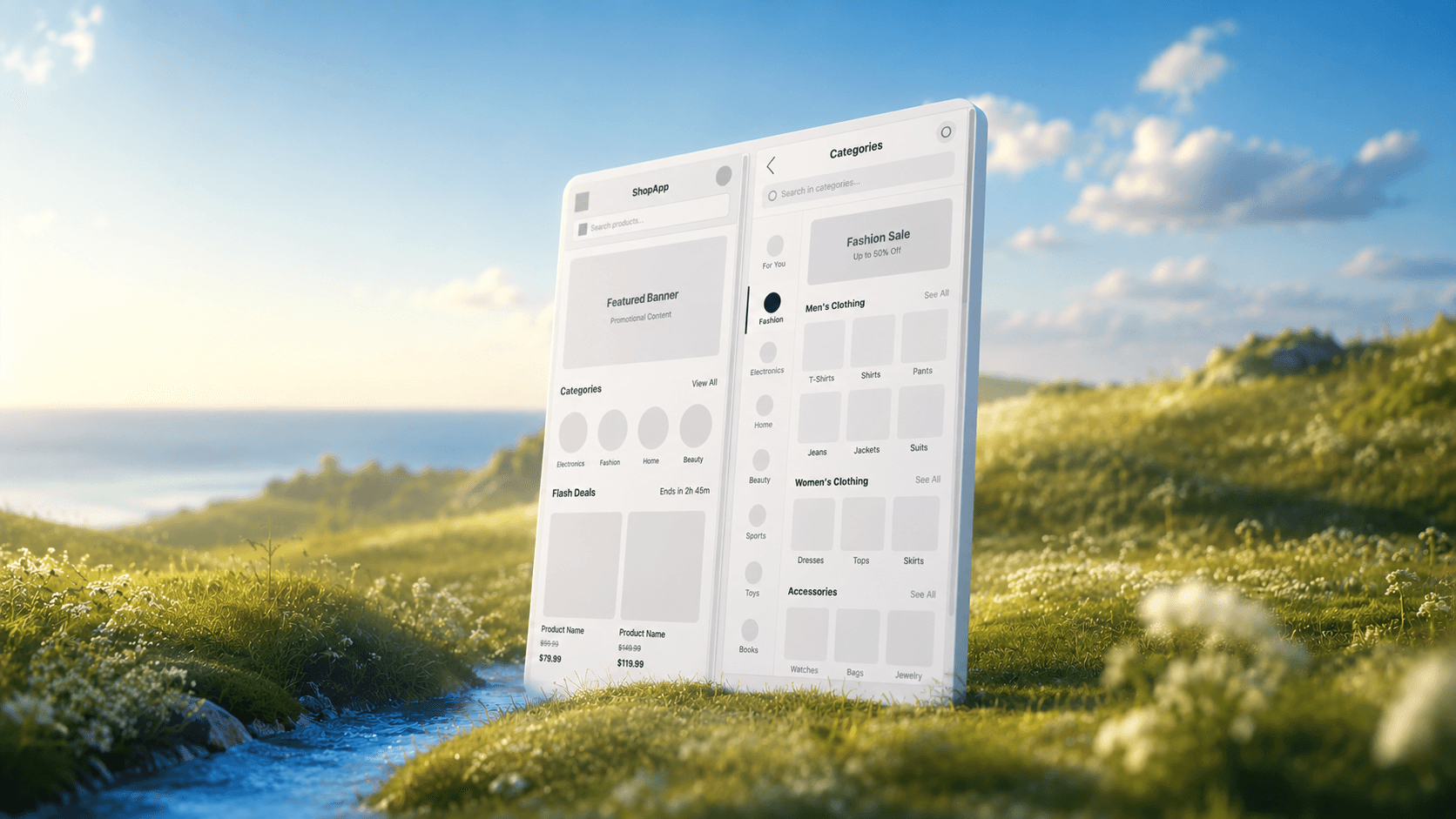
Dashboard Architecture and Complex Data Tables
SaaS dashboards fail when designers treat them like marketing layouts.
Real dashboard wireframes must define:
- filtering logic
- bulk actions
- sorting states
- CSV export pathways
- query persistence behavior
Traditional workflows spend days sketching table variants. Modern workflows spend minutes generating the grid and hours designing edge states that prevent dead ends.
Example:
Traditional approach
Stakeholders debate table row shading.
Architectural approach
Designers define:
- multi-select interaction logic
- active filter chips above grids
- empty-state recovery paths
Only one of these ships.
Mapping Edge Cases: Empty States, Permissions, and Error Handling
A wireframe that only shows the “happy path” creates a hallucination of functionality.
Developers assume complexity is low. Sprint scope expands mid-build. Deadlines slip.
Effective SaaS wireframes explicitly map:
- empty search results
- permission restrictions
- validation failures
- loading sequences
- branching onboarding logic
This is where structural design creates requirements instead of reflecting them.
Why Generic AI Design Tools Fail at Structural Logic
The Problem of Context Amnesia and Frankenstein Layouts
Prompt a generic tool with:
“Design a finance dashboard.”
You’ll get something that looks impressive and cannot be built.
Generic generators suffer from context amnesia. Each screen is produced independently. Shared data fields disappear. Navigation shifts. logic breaks between steps.
The result is what teams quietly call Frankenstein layouts:
- disconnected screens
- inconsistent routing patterns
- broken hierarchies
- unusable export code
This is why serious teams treat AI as infrastructure, not decoration. The difference becomes obvious once you understand how designers actually use AI in real projects instead of prompting isolated screens.
Technical Debt: Moving from AI “Div Soup” to Scalable Design Tokens
Another hidden failure mode: code output.
Many generators export layouts as:
- generic containers
- inline styles
- missing semantic structure
- accessibility violations
That’s instant technical debt.
Production-ready UI generation must preserve:
- semantic HTML structure
- WCAG compliance
- token consistency
- reusable component logic
This is exactly why accessibility-aware prompting workflows matter early ,not after handoff. If you’re skipping this step, start with prompting AI for WCAG-aligned UI structures before scaling layouts.
The Modern Wireframing Workflow for Product Teams
The 2026 workflow replaces “sketch → gray box → mockup” with continuous structural refinement.
Establishing Object-Oriented UX (OOUX) and Conceptual Grammars
Before layouts exist, objects exist.
Example CRM architecture:
Objects:
- Contacts
- Deals
- Companies
- Tasks
Then define:
- attributes
- actions
- relationships
- cardinality
This simultaneously shapes:
- database schema
- navigation hierarchy
- routing logic
Wireframes built without conceptual grammar produce interface noise instead of architecture.
Utilizing Flow Mode for Persistent State Memory Across User Journeys
Generic generators produce screens.
Architectural tools generate flows.
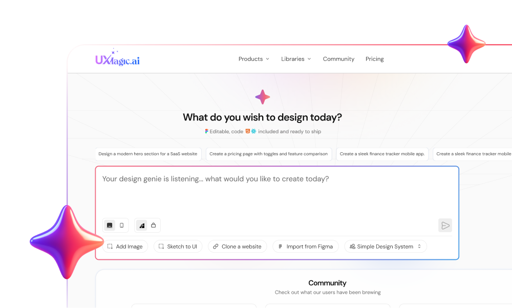
This is where UXMagic fits directly into Phase 2 of the workflow. Instead of treating each interface as isolated output, Flow Mode preserves:
- navigation logic
- shared fields
- avatar states
- component behavior
across entire journeys.
If Screen A requires verification, Screen B inherits it automatically. Teams stop designing screenshots and start designing product behavior.
That shift eliminates context amnesia entirely.
Bridging the Translation Gap: Semantic Developer Handoff
Static wireframes hide complexity.
Interactive structural prototypes expose it.
Modern handoff includes:
- token-mapped layouts
- branching logic simulation
- conditional routing visibility
- semantic React-ready exports
This removes the “verification tax” product teams normally pay when checking whether AI-generated UI is actually buildable.
It also aligns with the human-in-the-loop AI design workflow model: AI generates structure, designers enforce logic, engineers validate feasibility.
That’s the correct order.
Top Tools for Architectural UI Design and Prototyping in 2026
Most tools still optimize for visual exploration.
Architectural tools optimize for structural persistence.
Modern teams evaluate tools based on whether they:
- maintain cross-screen context
- respect design tokens
- support flow-based generation
- export semantic production-ready code
Generic prompt-based UI generators fail here consistently.
UXMagic integrates directly into this transition layer between structural mapping and high-fidelity prototyping. Instead of exporting inline styling or token-breaking layouts, it locks component consistency across flows and produces React-ready outputs aligned with design systems.
That removes entire redesign cycles from enterprise workflows. ✅
If your current process still involves rebuilding AI layouts manually inside Figma, you’re not saving time ,you’re paying twice.
Wireframes are no longer gray placeholders ,they’re architectural tools for validating logic, flows, and system constraints before code begins. Teams that replace performative low-fidelity steps with flow-aware structural generation move faster, reduce technical debt, and ship interfaces that actually survive production.
Design flows, not disconnected screens
Skip manual gray-box wireframing. Generate connected product journeys with persistent structure using UXMagic ,then move straight to production-ready layouts.