You’re not stuck because you lack ideas.
You’re stuck because starting a product means making 200 invisible decisions before a single screen exists and none of them feel like “real progress.”
So you open Figma. Stare at the grid. Close it again.
Then you try AI.
It gives you something flashy. A dashboard. A landing page. Maybe even a full app. And within 10 minutes, you realize you’ve just created more work, fixing broken spacing, inconsistent tokens, hallucinated components.
That’s not acceleration. That’s debt.
This is what blank canvas syndrome actually looks like in SaaS product design: not creative block, but architectural overload.
And the fix isn’t “better prompts.” It’s a completely different workflow.
The Psychology of Blank Canvas Syndrome in SaaS Product Design
Why Choice Overload Paralyzes Senior Designers
Blank canvas syndrome isn’t about inspiration. It’s about too many decisions too early.
Before solving any user problem, you’re expected to define:
- Grid systems
- Typography hierarchy
- Component structure
- State logic
- Accessibility constraints
That’s not creativity. That’s system initialization.
And your brain knows it.
So it delays.
Shifting from Artistic Inspiration to Systemic Execution
The worst advice you can follow here is “look for inspiration.”
Professional product design doesn’t run on inspiration. It runs on:
- Constraints
- Logic
- Systems
The blank canvas isn’t waiting for ideas. It’s waiting for structure.
Once structure exists, execution becomes trivial.
Why Generic AI Generators Fail Professional UX Workflows
The Verification Tax and AI Cleanup Fatigue
AI promised speed. What you got instead:
- Random hex colors
- Broken auto-layout
- Inconsistent spacing
- Non-reusable components
Now you’re not designing. You’re auditing.
Fixing AI output takes longer than designing from scratch.
That’s the verification tax and it kills any real productivity gain.
Context Amnesia in Multi-Screen User Journeys
First screen? Looks great.
Third screen?
- Navigation disappears
- Typography shifts
- Colors drift
- Layout collapses
AI forgets.
This “context amnesia” makes it impossible to design:
- Onboarding flows
- Checkout systems
- Enterprise workflows
You end up stitching together Frankenstein screens.
Destructive Global Regeneration vs. DOM-Aware Editing
You change one button.
The entire page regenerates.
Your nav? Gone. Your layout? Reset. Your copy? Rewritten.
Most AI tools don’t understand components, they regenerate pixels.
That makes iteration risky, slow, and honestly… unusable.
The Logic-First AI Design Workflow (The Sandwich Method)
This is where things actually change.
You don’t replace design with AI. You restructure how design happens.
Human → AI → Human.
Phase 1: Context Engineering and Token Injection
Before you generate anything, define:
- Business + user logic
- What exactly is this flow solving?
- What are the edge cases?
Example:
Not “settings page” But “enterprise account recovery with 2FA + expired token handling”
- Architectural constraints
- Backend limitations
- Data structure realities
- Design system (non-negotiable)
- Tokens (color, spacing, typography)
- Components
- Layout rules
This is where most teams fail.
They try to “discover” design using AI.
Wrong order.
Design systems must precede AI, not follow it.
Phase 2: Flow-Based Assembly Over Static Screens
Stop generating screens.
Start generating flows.
Step 1: Convert logic → structure
Use AI to define:
- User journey
- States
- Edge cases
Step 2: Structure → UI
Now generate:
- Entire flow at once
- Not isolated screens
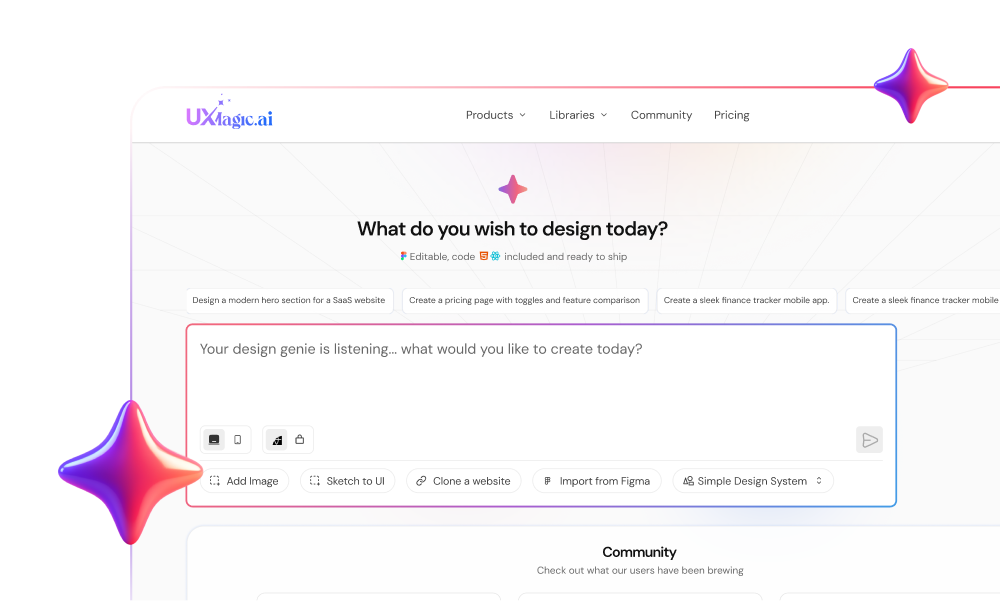
This is where tools like UXMagic actually matter.
Instead of pixel generation, it:
- Assembles UI using components
- Locks layout anchors
- Maintains token consistency
No drift. No rework.
If you’ve struggled with multi-screen inconsistency, this is the difference between guessing and actually shipping.
(If you’ve read about context amnesia in AI design workflows, this is exactly how you eliminate it.)
Phase 3: Adversarial Review and Developer Handoff
Now you come back in.
Not as a designer. As a critic.
- Break the design intentionally
- Missing states
- Error scenarios
- Accessibility gaps
- Replace fake content
- Real microcopy
- Real constraints
- Real data
- Prepare for handoff
- Clean structure
- Token alignment
- Semantic output
If your AI output needs heavy cleanup here, your earlier steps failed.
Maintaining Design Consistency at Scale with UXMagic
This is where most AI tools collapse—and where UXMagic is actually built differently.
Enforcing Figma Tokens via Component Assembly
Instead of generating pixels, UXMagic:
- Uses pre-built components
- Applies your actual design tokens
- Maintains auto-layout integrity
That means:
- No rogue styles
- No spacing inconsistencies
- No cleanup phase
You’re not fixing AI. You’re using it properly.
(If you care about scaling, you should also look into how to apply design systems to AI-generated UI, this is where most teams break things.)
Locking Structural Anchors with Flow Mode
Multi-screen consistency is where most tools fail.
UXMagic’s Flow Mode:
- Locks navigation, headers, sidebars
- Maintains layout across states
- Preserves hierarchy through flows
So your:
Dashboard → Settings → Billing → Checkout
…actually feels like one product.
Not five disconnected experiments.
Blank canvas syndrome doesn’t go away when you get better ideas.
It goes away when you stop starting from nothing.
Define the system. Constrain the machine. Then move fast, without cleaning up after it.
Stop Starting From Zero. Start Shipping Faster.
Generate structured, system-ready UI flows instead of fixing broken AI screens.