
Most AI wireframe tools do not actually design mobile apps; they generate disconnected, floating artboards that fall apart the moment you attempt to map a real user journey. When screens exist in an architectural vacuum, designers spend more time repairing broken layers and unorganized frames in Figma than if they had built the layouts manually. Eliminating manual artboard assembly requires moving away from static prompt-to-image generators and adopting flow-native UI architecture engines.
You already understand the difference between low-fidelity grey boxes and high-fidelity mockups, touch target sizing, and standard iOS/Android navigation patterns. This isn't a mobile design 101 primer. It's an evaluation of which tools actually handle mobile-specific technical constraints - narrow viewport architecture, state-driven interaction flows, prompt character limits, Auto Layout translation on Figma export rather than a generic software roundup padded with marketing feature lists.
Why Most AI Mobile Wireframe Generators Fail at User Flows
The Screen Sprawl Problem in Single-Prompt Tools
Mobile application interfaces function as interconnected state loops rather than isolated pages. Tools that process prompts artboard by artboard break user context, introduce visual inconsistencies, and create unorganized canvas sprawl. Evaluating an AI wireframing tool requires looking past single-screen visual generation and assessing its ability to construct end-to-end user flows across multi-screen journeys - a five-screen onboarding brief that comes back as five visually unrelated screens has failed the actual job, even if each individual screen looks fine in isolation.
Why Unorganized Figma Exports Waste Design Hours
Promoting Figma integration while delivering flat, absolute-positioned vectors creates hidden rework. When a vector payload lacks native Auto Layout properties, a designer spends real hours manually rebuilding component structures - the export step becomes a second production pass instead of a handoff.
Key Criteria for Evaluating Mobile AI Wireframing Software
Flow Logic and Multi-Screen Continuity
Traditional lo-fi wireframing in abstract grey boxes frequently fails during stakeholder reviews because non-designers struggle to interpret structural abstractions, routinely confusing missing visual polish with incomplete product functionality. Generating high-fidelity visual outputs immediately, on the other hand, triggers premature attachment to unvalidated UI elements and color choices before the interaction hierarchy is even agreed on. The effective middle ground is mid-fidelity, system-governed generation: wireframes that enforce clear layout hierarchy, explicit typography, and structured spacing without adding decorative artwork or brand styling too early.
Layout Governance and Auto Layout Preservation
Native Figma AI agents remain restricted by canvas integration constraints and single-screen output limits, even as Figma stays the industry standard for design systems and production handoff. Specialized flow-first AI engines tend to offer more effective rapid architectural exploration provided they also export directly to native Figma Auto Layout containers, not just a fast first draft.
Clean Export Capabilities: Figma vs. React Code
Code-first "vibe coding" platforms that bypass wireframing to produce full-stack code directly - tools like Lovable or v0 work well for quick web-based MVPs, but tend to introduce real architectural debt into a mature mobile design pipeline. Bypassing structured design creates unmaintained component tokens, risks violating platform human interface guidelines, and hands engineering a codebase that needs extensive manual refactoring later.
Top AI Mobile App Wireframe Generators in 2026 Compared
| Tool | Price | Multi-Screen Flows | Figma Export | Code Export | Free Tier |
|---|---|---|---|---|---|
| UXMagic | Free tier + paid plans | Yes, native connected flows | Native Auto Layout | Yes (React/TypeScript, MCP) | Yes |
| Visily | ~$11/editor/mo annual ($14 monthly) | Weaker — single-screen focus | Yes, two-way | No | Yes, no project cap |
| Uizard | ~$12/mo annual ($19 monthly) | Limited by 300-character prompt cap | No — SVG export only; loses prototyping | No | Yes |
| Google Stitch | Free (Labs beta) | Basic, generic layouts | Yes, one-click “Copy to Figma” | HTML/CSS only | Yes, ~350 generations/mo |
| Banani | ~$12–20/mo (verify current tier) | Yes, closer to flow-native | Yes, two-way | Yes, MCP support | Yes, ~120 credits/mo |
- UXMagic: Best for Structured Multi-Screen Mobile Flows
UXMagic's AI Wireframe Generator produces linked, state-aware mobile user journeys from a single structural text prompt - Authentication → Onboarding → Dashboard → Action Flow → Confirmation, for example - generated as one connected sequence rather than five separate prompts a designer has to stitch together afterward. That's the direct fix for the screen-sprawl problem covered earlier in this piece: navigation logic, spacing, and typography stay consistent across every screen because the whole flow is generated together, not assembled from isolated fragments.
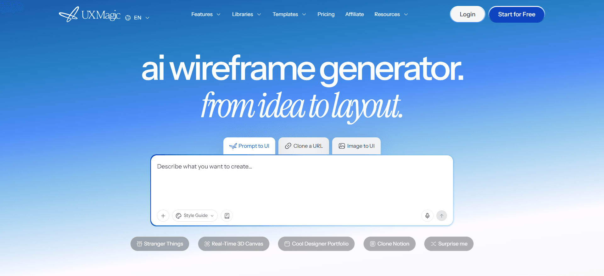
On export specifically, this is where the gap with most of the tools below actually shows up. Exported designs translate into native Figma Auto Layout containers - real flex constraints and structured layer naming intact, not flattened, absolute-positioned shapes a designer has to manually rebuild. That's the exact failure mode covered earlier with generic AI exports, and it's the same failure mode Uizard hits with its SVG-only export path. UXMagic also supports a code-centric handoff path - structured React and TypeScript components, or MCP integration directly into AI coding assistants like Cursor or Claude Code - so engineering can pick up semantic UI structures aligned to a real codebase instead of a static image.
On editing, targeted text prompts or local component edits modify a specific screen or state without regenerating the entire flow from scratch - the same "one small tweak breaks everything" problem that plagues less structured single-screen tools doesn't show up here, since edits stay scoped to what actually changed.
- Visily: Best for Quick Non-Designer Screen Drafts
Visily is genuinely fast for a non-designer sketching one screen at a time. It runs a permanent free tier with no project cap (generation limits apply), and Pro pricing lands around $11/editor/month on annual billing (roughly $14 monthly). It ships two-way Figma integration and a library of 1,000+ templates spanning mobile apps, dashboards, and e-commerce - a real head start over a blank canvas. A click-to-edit feature also lets you drag, select, and adjust generated elements without burning credits on manual tweaks, which is a genuinely nice detail for iteration. It's a weaker fit once the job becomes a connected, multi-screen mobile journey rather than a single quick draft, since that flow-level consistency isn't the tool's core strength.

- Uizard: Best for Rapid MVP Concept Sketches
Uizard's Autodesigner genuinely helps a founder rough out a quick concept - pricing runs around $12/month on annual billing (roughly $19 monthly), with a real free tier to start. But per Uizard's own official documentation, the Autodesigner prompt is capped at exactly 300 characters regardless of subscription tier, which truncates any complex, multi-screen product brief mid-sentence. Worth flagging a second real limitation too: Uizard has no native Figma export - the Pro plan allows exporting screens as SVG files for manual import into Figma, but that process loses click-through prototyping along the way. Its sketch-scan feature (converting a hand-drawn screen into a digital wireframe) is a genuinely distinctive capability most competitors don't match - a real strength, just one that comes bundled with those two structural constraints.

- Google Stitch: Best for Free Multi-Screen Exploration
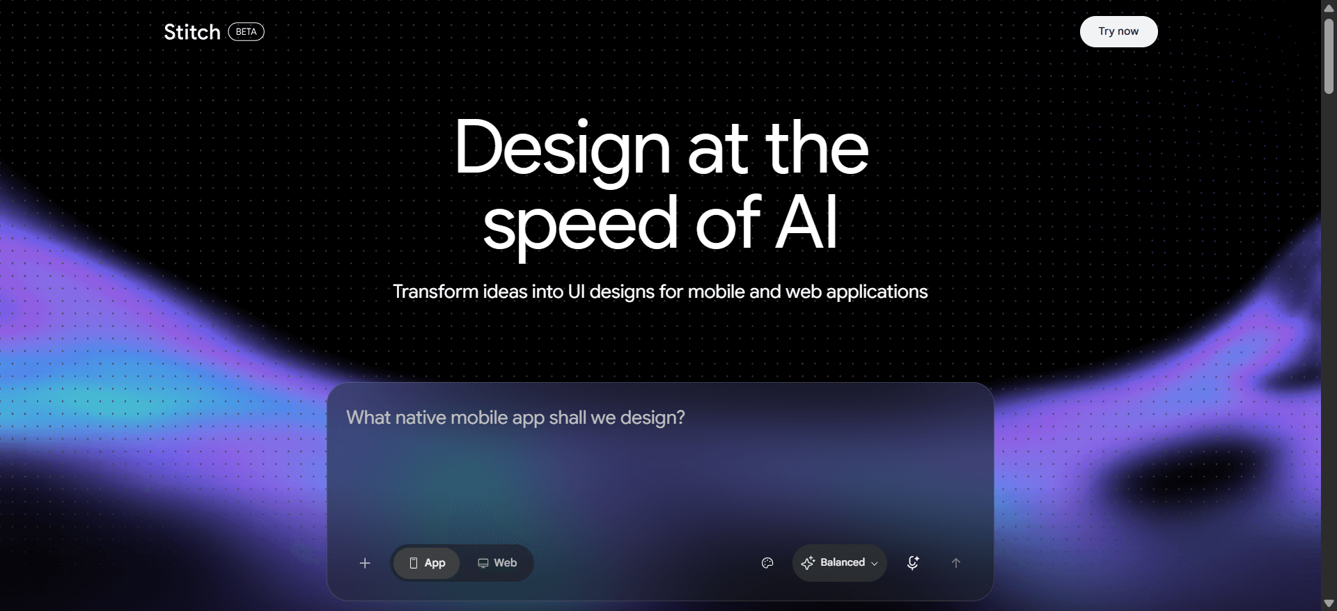
Google Stitch - the Gemini-powered evolution of the earlier Galileo AI - is completely free during its Google Labs beta, with roughly 350 generations per month, making it the most generous free tier in this category by a wide margin. It offers one-click "Copy to Figma" export and can generate both mobile and web UI from a prompt or reference image. The trade-offs worth knowing: post-generation editing control is limited compared to Visily or Banani, there's no template library to start from, and its "experimental" Labs status means its features, pricing, and long-term availability aren't guaranteed the way an established commercial products are - a real consideration if you're standardizing a workflow around it rather than just testing an idea.
- Banani: Best for Mobile-First Product Teams
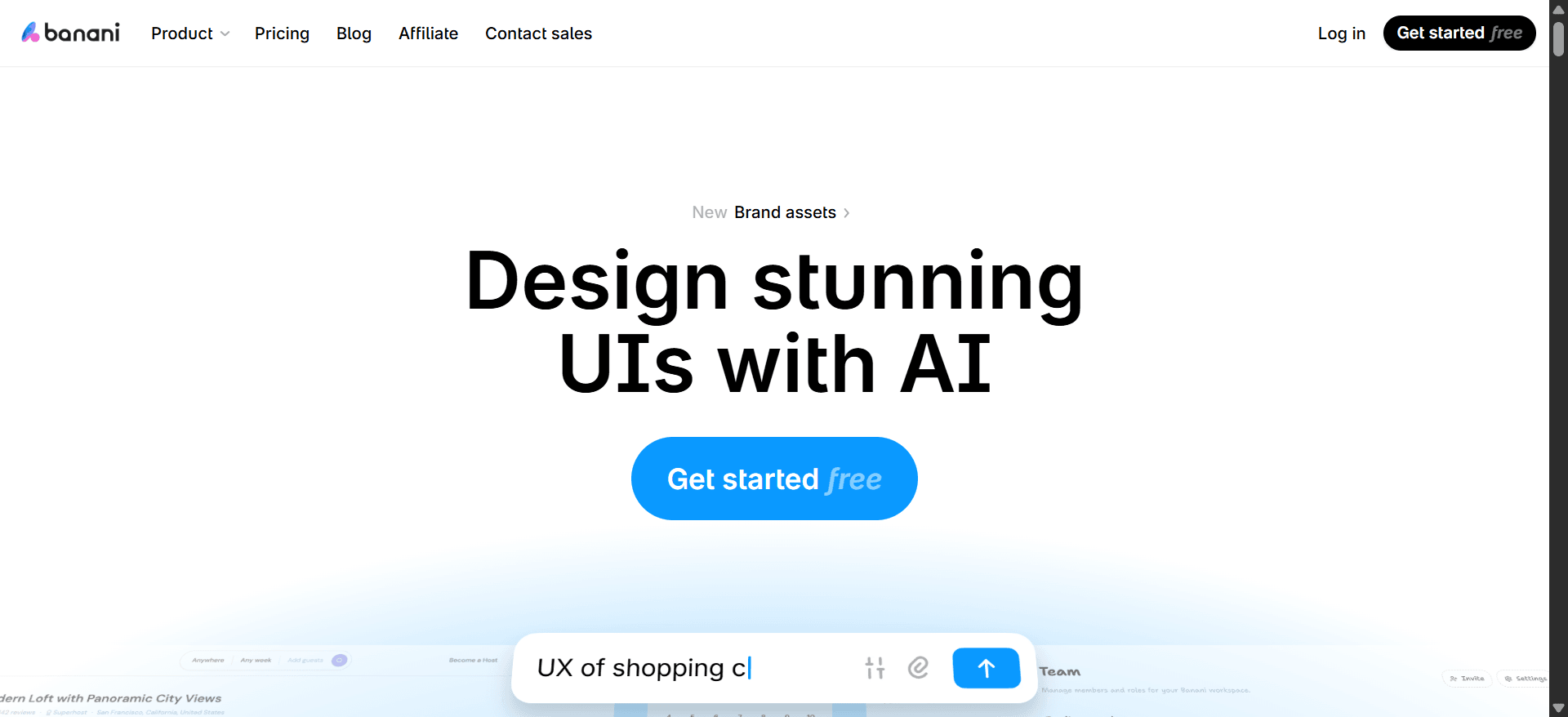
Banani leans mobile-first in its default output and leans harder into flow-building and multi-screen iteration than Google Stitch specifically, with two-way Figma integration and MCP/code export support bridging design and engineering handoff. Reported pricing varies somewhat by source - figures from roughly $12 to $20/month show up depending on billing cycle and which tier - so confirm current numbers directly before budgeting. A free tier with around 120 monthly credits is available to start. It's a reasonable fit for teams whose primary surface is a mobile app rather than a responsive web product, particularly given its emphasis on connected screens over one-off drafts.
For a broader, side-by-side breakdown of these and other tools beyond just mobile use cases, our full roundup of the best wireframing tools in 2026 covers pricing, pros, and cons in more depth.
Step-by-Step Workflow: From Text Prompt to Production-Ready Mobile UI
Step 1: Structuring Prompts for Mobile Viewports
Before invoking generative AI tools, the product team must establish clear user stories, information architecture, and system parameters - initiating generation without structural constraints leads to generic, non-functional layouts. The prompting strategy should explicitly define four parameters:
- Target viewport - specify exact mobile platform conventions (iOS Human Interface Guidelines with bottom tab bars, versus Android Material Design with top app bars)
- User context & role - define who is using the app and their immediate operational goal
- Core interaction pattern - outline the primary layout containers required (sticky action footers, search filter overlays, modal sheets)
- System edge states - explicitly instruct the model to generate validation, empty, loading, and error states across the flow, not just the happy path
Step 2: Generating and Iterating Multi-Screen Flow Logic
The prompt gets executed inside a flow-native generation engine. Rather than generating isolated screens, the AI outputs an end-to-end user sequence mapping the primary journey - Authentication → Onboarding Setup → Dashboard → Action Flow → Confirmation Overlay. Designers and product managers then review layout hierarchy, touch target spacing, and information architecture across screens. Instead of regenerating entire screens when adjusting one element, teams use local component editing or targeted text prompts to modify specific UI states while preserving the broader layout hierarchy - the fix for the "one small tweak breaks the whole screen" problem that plagues less structured tools.
Step 3: Exporting Native Auto Layout Layers to Figma
Once the core mobile flow is structurally approved, the project transitions directly into engineering implementation through one of two paths. The design-centric pipeline exports the multi-screen flow into Figma with native Auto Layout containers, structured layer naming, and defined flex constraints intact - designers map existing design system tokens onto the layout without rebuilding component structures from scratch. The code-centric pipeline exports the structured wireframe flow directly as clean React/TypeScript components, or via Model Context Protocol (MCP) integrations to AI coding assistants like Cursor or Claude Code, so engineering receives semantic UI structures that align directly with production codebases.
Practical Scenarios: Before and After
Mobile fintech app - identity verification (KYC) onboarding. A product manager at an early-stage fintech company needs to map a 5-step mobile KYC onboarding journey - ID capture, selfie verification, address confirmation, processing, and success states - for compliance and engineering review within a tight deadline. The traditional workflow means several days manually dragging pre-built components across multiple Figma artboards, or using a generic AI tool that outputs desktop-style file upload containers awkwardly wrapped inside an iPhone frame.
Using a flow-native mobile wireframing engine instead, the PM inputs a detailed user story and gets back a connected 5-screen mobile sequence - camera viewports, upload progress bars, native bottom sheets, and error banner states - generated in one pass rather than assembled screen by screen. Generic single-prompt generators tend to fail here specifically by producing isolated screens that omit back-navigation buttons, skip modal overlays entirely, or truncate the flow due to a strict prompt character limit like Uizard's.
Mobile e-commerce app - express checkout and payment integration. A UX designer needs to evaluate adding express payment methods (Apple Pay, Google Pay) to an existing retail app. The traditional workflow means building multiple static variants in Figma to compare guest checkout versus saved-user checkout paths, consuming real layout-adjustment hours.
Inputting both user scenarios into a flow-native generation tool instead produces a comparative, side-by-side mobile wireframe flow with correct hierarchy for payment sheet triggers, order summaries, and post-purchase confirmation overlays. Competitors in this space tend to fail here by merging cart item lists, shipping forms, and payment fields into a single, excessively long scrolling view - ignoring native mobile bottom-sheet conventions entirely. The same broken-Auto-Layout failure mode shows up constantly across generic AI plugins more broadly - our breakdown of the best Figma AI plugins for UI generation covers why that happens in more technical depth.
Related guides
- The Most Innovative AI Wireframe Platforms in 2026: A Technical Comparison
- Wireframe Builder Guide: How to Create Production-Aligned UI Flows Without Design Skills
- Mobile App Design: The Complete 2026 Architectural Guide
- UXMagic vs Banani (2026): Feature, Pricing, and Workflow Comparison
- State of AI in UI/UX Design 2026: What Actually Works in Production
- Sketch to Prototype: The AI Workflow From Napkin Drawing to Interactive UI
- Image to Figma Converter: 9 Free & AI Tools Compared (2026)
- Wireframe Tool Cost-Benefit Breakdown (2026): What's Actually Worth Paying For
- Google Stitch Pricing 2026: Is It Free, and What Are the Limits?
- Top 7 AI Tools for Design Consistency in 2026 (UI, UX, and Design Systems)
Build Connected Mobile Flows
Generate connected, state-aware mobile wireframes from a product brief and preserve the navigation logic across the entire flow.