TL;DR: Low fidelity answers "is the structure right?" and high fidelity answers "does it look and behave right?". Pick the lowest fidelity that can answer the question in front of you. AI has made high fidelity cheap to produce, but not cheap to review, so wireframes still earn their place when several people must agree. In UXMagic you can generate wireframes, approve them, then ask for the high-fidelity version with the structure carried over.
Every design project hits the same question sooner or later: how finished should this look right now? Show a stakeholder grey boxes and they may not see the product. Show them a polished screen and they start debating the shade of blue while the navigation is still wrong.
That is the real low fidelity vs high fidelity decision. It is not about which one is better. It is about which one gets you the feedback you need at this stage, at a cost you can afford to throw away.
We already have a longer argument for why low-fidelity wireframes still matter in the AI era, and a guide to wireframe vs mockup vs prototype that sorts out the artefacts. This post is about the dial in between: what low, mid and high fidelity actually mean, when to turn the dial up, and how AI changes the cost of doing so.
What "fidelity" actually measures
Fidelity is how closely a design resembles the finished product. People talk about it as one scale, but it is really three separate dials that you can set independently:
- Visual fidelity. Greyscale boxes at one end; final colours, typography, imagery and icons at the other.
- Content fidelity. Lorem ipsum and "Button" labels at one end; real headlines, real prices, real error messages at the other.
- Interaction fidelity. A static picture at one end; clickable flows with hover states, transitions and form validation at the other.
A paper sketch is low on all three. A static mockup is high on visual, often medium on content, and zero on interaction. A clickable greyscale prototype is low on visual and high on interaction. Once you see the three dials, a lot of the confusion goes away, because you stop asking "should this be lo-fi or hi-fi?" and start asking "which dial does this review need turned up?"
| Dial | Low fidelity | Mid fidelity | High fidelity |
|---|---|---|---|
| Visual | Sketchy boxes, no colour | Clean greyscale, real components | Brand colours, type, imagery |
| Content | Placeholder text | Realistic headings and copy lengths | Final copy and data |
| Interaction | None or paper swaps | Basic click-through | Full states, transitions, validation |
| Typical time per screen (manual) | Minutes | Under an hour | Hours |
Content fidelity is the dial teams most often forget. A wireframe with lorem ipsum hides the hardest layout problems: long product names, empty states, error messages, translated strings. Turning content up while leaving visuals down is one of the cheapest upgrades you can make, and the UX microcopy framework we use is a good place to start.
Low-fidelity wireframes and prototypes
A low-fidelity wireframe is a rough, greyscale layout of a screen: boxes for images, lines for text, rectangles for buttons. It shows what goes on the screen and roughly where. It says nothing about brand, colour or exact spacing.
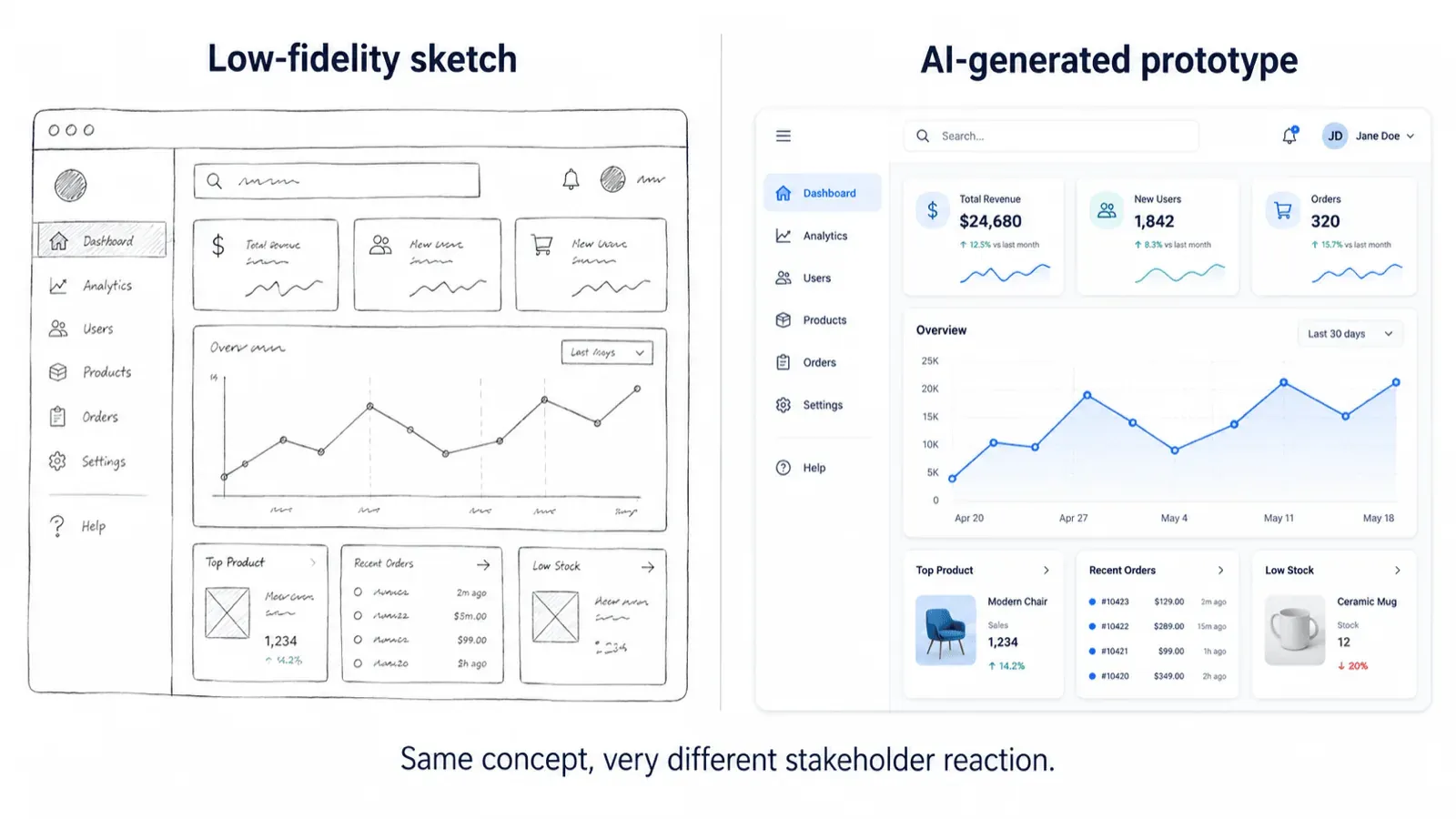
Lo-fi can be paper sketches, whiteboard photos, or quick digital wireframes. A low-fidelity prototype is the same thing linked together, whether that is paper screens swapped by hand in a test session or simple hotspots between wireframes.
The point of low fidelity is that it is obviously unfinished. Nobody feels bad about crossing out a sketch, and reviewers do not spend time on colour because there is no colour to discuss. That makes lo-fi the right tool for:
- exploring several layout options before committing to one;
- mapping a journey across screens, ideally alongside a user flow diagram;
- early usability checks on navigation, labels and task order;
- getting a group of stakeholders to agree on the screen list.
If you already have a whiteboard photo or a paper sketch, you do not need to redraw it. UXMagic's sketch to UI turns it into a digital screen, and the sketch to prototype workflow shows how to take it further.
Mid-fidelity wireframes: the level most teams actually work at
Mid fidelity rarely gets its own section in textbook comparisons, but it is where most product work happens. A mid-fi wireframe is still greyscale and unbranded, but it uses real UI components (actual input fields, tables, tabs), consistent spacing, a clear type hierarchy and realistic copy.
Mid fidelity is a sweet spot because it is precise enough for engineers to estimate from and for PMs to write acceptance criteria against, while still being clearly "not the final design". It also exposes problems that pure lo-fi hides: a table with eight columns does not fit, a settings page needs tabs, a form is twice as long as anyone thought.
When people say "wireframe" in a modern product team, they usually mean mid-fi. When they say "low-fidelity wireframe", they usually mean something rougher. It helps to agree which one you are asking for before a review. If you want a refresher on what makes a greyscale layout readable, our guide to visual hierarchy in UI design applies just as much at this stage.
High fidelity: wireframes, mockups and prototypes
High fidelity is where naming gets messy, so here are the three terms people use:
- High-fidelity wireframe. A detailed layout with accurate spacing, real components and often real content, sometimes still in a limited palette. Some teams use the phrase loosely to mean a mockup.
- Mockup. A static, pixel-accurate picture of a screen with the final visual design: colours, typography, imagery, icons. It looks finished but does not click. Our explainer on what a mockup is goes deeper.
- High-fidelity prototype. Mockups linked into an interactive flow, with states, transitions and sometimes real data. It behaves close enough to the real product that test participants forget it is not. See what a prototype is in UX design for the full picture.
High fidelity is the right level when the question is visual or behavioural: is the call to action noticeable, is the dashboard scannable, does the onboarding feel trustworthy, does the animation help or distract. It is also what developers build from, and what you put in front of investors or customers who need to see the product rather than imagine it.
Low fidelity vs high fidelity: side-by-side comparison
| Low fidelity | High fidelity | |
|---|---|---|
| Main question it answers | Is the structure right? | Does it look and behave right? |
| Looks like | Greyscale boxes, placeholder text | Final colours, type, imagery, real copy |
| Interactivity | None to basic | Full click-through, states, transitions |
| Manual cost to make | Low | High |
| Cost to change | Very low | Moderate to high |
| Feedback it attracts | Flow, hierarchy, missing screens | Visual polish, copy, brand, detail |
| Best audience | Core team, early stakeholders | Users in testing, execs, developers, investors |
| Usability testing | Navigation and task flow | Visual clarity, trust, micro-interactions |
| Developer handoff | Not enough on its own | Yes, with specs or code |
| Risk | Too vague to spot real layout issues | "False finality": people assume it is decided |
Pros and cons of each
Low fidelity
Pros
- Fast and cheap, so you can explore more options.
- Keeps feedback on structure, flow and priorities.
- Easy to throw away, which makes teams more willing to change direction.
- Anyone can make one, including PMs and founders with no design tools.
Cons
- Hard for non-designers to picture the final product, so some stakeholders disengage.
- Hides content and density problems if you use placeholder text.
- Cannot test anything visual, such as contrast, emphasis or brand feel.
- Not enough for developers to build from without a lot of follow-up questions.
High fidelity
Pros
- Everyone understands it; nobody has to imagine anything.
- Tests the details that make or break conversion: copy, emphasis, trust signals.
- Gives developers exact specifications, or even code.
- Works for pitches, sales demos and investor updates.
Cons
- Expensive to make by hand and expensive to change, so teams get attached to it.
- Pulls feedback towards colour and imagery, away from structure.
- Creates false finality: a polished screen looks decided even when it is not.
- If the structure is wrong, all the visual work on top of it is wasted.
When to use each: a decision guide
The rule we use: pick the lowest fidelity that can answer the question you are asking. Anything higher adds cost and invites feedback you did not ask for. Some common situations:
- Kick-off, discovery, or a design sprint. Low fidelity. You want many options on the table fast. Our 3-day design sprint framework leans on quick, rough screens for exactly this reason.
- Agreeing the screen list and navigation with stakeholders. Low or mid fidelity. The goal is a signed-off structure, not a signed-off look.
- Testing whether users can complete a task. Low or mid fidelity with clickable links. You are testing the path, not the paint.
- Testing whether users notice, trust or understand something. High fidelity. Visual emphasis and credibility cannot be judged in greyscale.
- Estimating engineering effort. Mid fidelity with realistic content is usually enough.
- Developer handoff. High fidelity, ideally with code. Our guide to what a design handoff is explains what developers actually need.
- Pitch, investor demo, or sales concept tomorrow. Skip straight to high fidelity. Nobody will sign off a structure; they need to see a product.
- Small change to an existing product with a design system. Often high fidelity from the start, because the visual layer is already decided and reusing components is faster than sketching.
If you are building an MVP, the same logic applies at the product level, and our MVP design guide covers which screens deserve polish first. For the research side of the decision, see our round-up of AI tools for UX research.
How AI changes the cost curve
For most of design history, the reason to start in low fidelity was economic. A wireframe took minutes; a polished mockup took hours; a clickable high-fidelity prototype took days. You did cheap work first so that expensive work was only spent on ideas that had survived.
AI tools flatten that curve. A prompt can produce a styled, multi-screen flow in a few minutes, so the gap in production cost between lo-fi and hi-fi has almost disappeared. That has two consequences that pull in opposite directions.
First, high fidelity is no longer a big bet. If generating a polished version of three layout options costs minutes, you can compare them in full colour. For pitches, concepts and quick experiments, starting high is now a reasonable default. Our guide on how to design UI with AI walks through that approach.
Second, the review cost has not changed. A polished screen still pulls a room towards colour, imagery and wording. AI makes that worse, because it fills every gap with confident-looking detail. A beautiful screen with the wrong navigation is still wrong, and now it is also persuasive. That is why the reason for wireframes has shifted from saving drawing time to getting the right kind of feedback.
The practical answer is a tool where fidelity is a switch rather than a rebuild. UXMagic's wireframe mode produces deliberately plain, greyscale screens: boxes, labels and hierarchy, no brand, no imagery and no styling opinions. You ask for it explicitly, for example "Wireframe the checkout flow: cart, shipping, payment, confirmation."
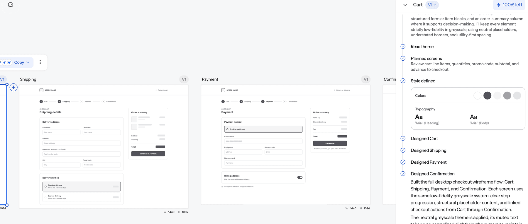
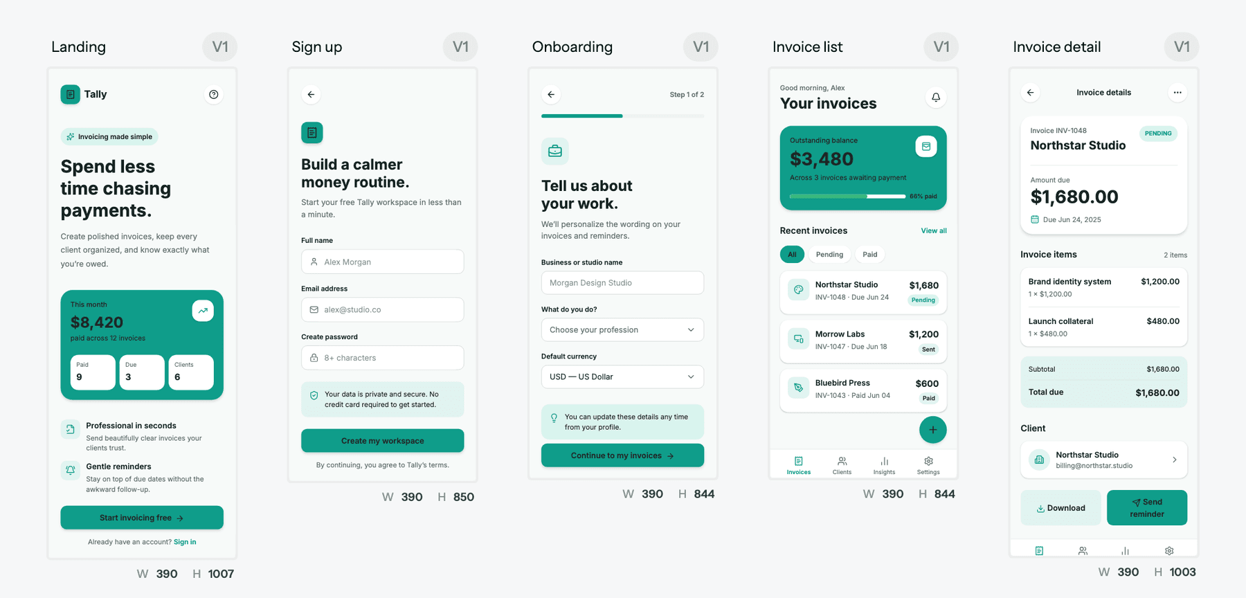
Once the structure is agreed, you ask the AI to design the high-fidelity version of the approved wireframes. The structure carries over and the theme is applied on top, so nobody redraws the layout that the team just signed off. The same approach works for a whole journey: flow mode designs every screen with a shared theme and navigation, so screen five looks like it belongs with screen one.
There is also a cost argument inside the tool. UXMagic's credit breakdown charges 1 credit to propose a screen plan and 3 to design a new screen, while multi-screen operations are charged per screen. Fixing the plan is cheap; fixing eight wrong screens is not. The low-fidelity principle survives: argue about structure while it is cheap to change.
Finally, AI shrinks the old one-way street between fidelities. If you inherit an existing product, image to wireframe converts a screenshot back into a clean wireframe so you can restructure it without the visual layer getting in the way. That is useful for redesigns, where the current colours tend to anchor everyone's thinking.
Wireframe first, go hi-fi in one step
Generate a greyscale flow, get it approved, then ask UXMagic for the high-fidelity version with the same structure. Free plan, no card needed.
A practical lo-fi to hi-fi workflow
Here is the sequence we recommend for a new feature or product, whether you draw by hand or use AI.
- Write down the job and the screen list
Before any layout, list the screens and what each one is for. In UXMagic, a new project starts with a screen plan that you can approve, edit or reject before anything is designed. This is the lowest fidelity there is, and the cheapest place to catch a missing step.
- Wireframe the flow in greyscale
Generate or sketch the screens as wireframes. Keep them greyscale on purpose. Use realistic copy where it matters (headings, button labels, error states), even if the rest is placeholder. The AI wireframe generator handles the whole flow from one prompt, and for mobile products our guide to AI wireframes for mobile apps covers the specifics.
- Review structure only
Share the wireframes and ask reviewers structural questions: is anything missing, is the order right, is the most important thing the most prominent? UXMagic's share a preview link and comments and feedback keep the discussion attached to the screens. Do not move on until the structure is signed off.
- Define the visual system once
Decide colours, type, spacing and component style in one place, rather than screen by screen. A style guide generator gets you a starting point; in UXMagic, themes and style guides apply across every screen, and theme changes cost no credits.
- Turn up the fidelity
Ask for the high-fidelity version of the approved wireframes. You now have mockups built on the structure you agreed. The AI mockup generator is the same engine used for this step if you are starting from a description instead.
- Add interaction where the test needs it
Link the screens into a clickable prototype for usability testing or a demo. UXMagic's AI prototype generator handles this step inside the same project. If you are comparing dedicated tools for this step, our best prototyping tools of 2026 round-up covers the field.
- Hand off in the format developers use
Export to Figma for designers who want to keep refining, or to code for developers. The export to Figma guide and design to code generator cover both routes.
Common mistakes when choosing fidelity
Jumping to high fidelity to "save time". It feels faster until the structure turns out to be wrong and every polished screen has to change. This is the most expensive mistake on the list.
Staying in low fidelity too long. Some teams iterate on wireframes for weeks because nothing feels final. Once structure is agreed, move on. Wireframes cannot answer visual questions no matter how many rounds you run.
Mixing fidelities in one review. Show one screen in full colour and the rest in greyscale, and every comment will be about the coloured one. Keep a review set at one fidelity.
Using lorem ipsum everywhere. Placeholder text hides the layout problems that real content creates. Turn up content fidelity early, even while visuals stay low.
Asking the wrong questions. Showing a wireframe and asking "what do you think?" invites comments on its greyness. Tell reviewers what the fidelity is for: "we are only deciding the order of these steps today."
Treating AI output as finished because it looks finished. An AI-generated screen can be high on visual fidelity and wrong on structure. Review it as if it were a wireframe first. Our piece on why single-screen AI design is a dead end explains why flows matter more than individual screens.
Forgetting the design principles underneath. Fidelity changes how a design looks, not whether it follows basic usability rules. The laws of UX apply at every level, from sketch to shipped product.
Where UXMagic fits
UXMagic is an AI design tool built around flows rather than single screens. For the fidelity question specifically, it does three useful things: it produces wireframes on request and keeps them plain on purpose, it turns approved wireframes into high-fidelity screens without rebuilding the layout, and it keeps a shared theme across a multi-screen flow. You can start from a prompt, a sketch or a screenshot, and hand off to Figma or code at the end.
Where it is not the right fit: if you want deliberately hand-drawn, sketch-style output as a team ritual, a classic tool from our best wireframing tools list may suit you better. If you already work entirely in Figma, our Figma Make tutorial covers AI generation inside that file. And if you need a working app with a backend rather than a design, see our guide to AI app builders for non-developers.
The Free plan includes 20 credits a day, refreshed daily, so you can try the wireframe-to-high-fidelity workflow on a small flow without paying. Details are on the pricing page.
The short version
Fidelity is a tool for getting the right feedback, not a stage you have to pass through. Low fidelity is for structure, high fidelity is for look and behaviour, and mid fidelity is where most real product decisions get made. AI has made high fidelity cheap to produce, which means you can afford to start high for pitches and concepts, but it has not made polished screens any easier to review honestly. When several people need to agree on a flow, wireframe it first, then turn the dial up.
Related guides
- Website Wireframe in SaaS: Why Gray Boxes Are Dead
- Wireframe Builder Guide: How to Create Production-Aligned UI Flows Without Design Skills
- Wireframe Tool Cost-Benefit Breakdown (2026): What's Actually Worth Paying For
- Design Thinking Process: A Practical Guide for Product Teams
- How to Validate a Product Idea: 7 Tests, With Templates
- What Is Rapid Prototyping? The Modern SaaS Playbook (2026)
- Visily AI Review 2026: Is It Worth It for Non-Designers?
- What Is Feature Creep? Causes, Warning Signs and How to Stop It
- Paper.design Review 2026: HTML Canvas, MCP, Pricing and Limits
- 15 Best UX/UI Design Tools for 2026, Plus a Startup Stack
From wireframe to high fidelity, same project
Plan the screens, wireframe the flow, then apply your theme to every screen at once. Start on the Free plan with 20 credits a day.