The most dangerous advice in modern product development is the decade-old Lean Startup mantra: “If you aren’t embarrassed by your first version, you launched too late.” In 2026, launching an embarrassing UI guarantees users leave before your hypothesis is even tested. An MVP no longer means ugly. It means constrained.
If your team is still debating whether UI polish is “out of scope” for validation, you’re not building an MVP. You’re sabotaging your own product-market fit experiment.
This guide explains what MVP actually means in SaaS design today and how to ship one without scope creep, wireframe waste, or backend theater.
What Does MVP Actually Mean in SaaS Design? (2026 Edition)
In SaaS design, an MVP is not the smallest thing you can ship. It’s the smallest thing that can prove or disprove your riskiest assumption through real behavior.
The original Lean Startup framing by Eric Ries centered on the build-measure-learn loop. That still matters. What changed is the environment around it. Users now expect polished interfaces by default, and competitors already exist for almost every workflow category.
That means a modern MVP must:
- validate one core workflow
- produce measurable behavioral data
- avoid feature-parity distractions
- maintain credible UI quality from day one
Most guides stop here. That’s where they fail designers.
Because the real friction isn’t understanding MVP theory. It’s surviving stakeholder pressure while executing it. If your Figma file already looks like an enterprise dashboard before sprint one ends, you’re not testing hypotheses, you’re negotiating politics.
This is why teams increasingly rely on structured AI-assisted workflows instead of manual translation layers. If you’re still sketching gray boxes to “align stakeholders,” you’re re-creating the exact bottleneck described in Blank Canvas Syndrome.
The Toxic Myth of the “Crappy” MVP
The idea that an MVP should look unfinished is outdated—and operationally dangerous.
In saturated SaaS markets, users don’t tolerate friction long enough to validate your idea. They bounce. Leadership misreads the churn. Then the wrong conclusion follows: the idea failed.
No. The interface failed.
MVP vs. MLP vs. MAP: Understanding the Modern Spectrum
A modern product spectrum looks like this:
- MVP: tests the riskiest assumption with minimum workflow coverage
- MLP (Minimum Lovable Product): adds aesthetic credibility and emotional clarity
- MAP (Minimum Awesome Product): differentiates through delight and speed
In practice, most successful MVPs now behave like MLPs. Not because teams want polish, but because they need trust fast.
This shift is driven by the Aesthetic Usability Effect. Users assume attractive interfaces are more reliable. They assume broken-looking ones are unstable.
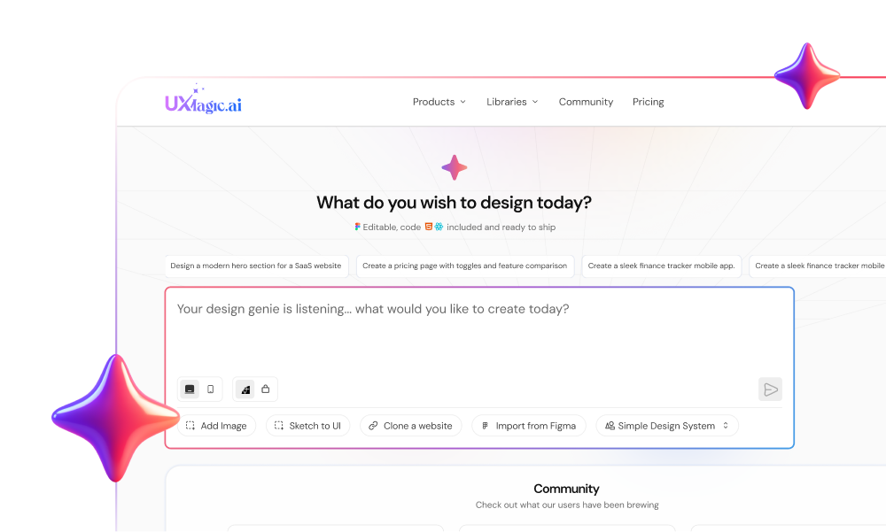
Historically, teams shipped ugly MVPs because fidelity was expensive. That constraint is gone. Tools like UXMagic generate production-ready UI flows directly from text requirements, removing the time tax that used to justify visual shortcuts.
That changes the definition of “minimum.”
Why SaaS Startups Fail in the First 90 Days
Early churn is rarely product-market failure. It’s empathy failure.
Typical pattern:
- engineering prioritizes backend stability
- onboarding is deferred
- loading states are missing
- CTA clarity collapses
- users leave in seconds
Leadership interprets the signal incorrectly.
If users say they “like the idea” but never execute the primary CTA, the design failed, not the concept.
This is exactly why behavioral validation not survey feedback drives modern MVP iteration. A practical breakdown of how designers embed AI into real delivery workflows is covered in How Designers Actually Use AI in Real Projects.
Core MVP Design Failures: Case Studies in Friction
Most MVP failures aren’t technical. They’re strategic avoidance disguised as iteration.
Backend Over-Engineering vs. Frontend Famine
Teams routinely prepare infrastructure for one million users before onboarding their first ten.
You’ll see:
- multi-tenant Kubernetes clusters
- decoupled event systems
- microservices orchestration
But no password reset flow.
An MVP exists to validate learning, not scalability. Concierge-style logic and manual operations are correct early decisions.
Complex architecture without usable UI is theater.
The Competitor Parity Trap
Founders compare their version-one product to a fifteen-year competitor and panic.
Result:
- analytics dashboards added too early
- automation engines forced into sprint one
- workflow branching before baseline validation
This destroys velocity.
A better move is narrowing the wedge.
One SaaS team stripped fifteen requested charts down to a single cash-flow line graph and a Connect Bank CTA. Validation began immediately instead of three months later.
That’s what MVP discipline looks like.
The 6-Step Designer’s Workflow for Rapid MVP Development
This is where most MVP guides collapse into theory. Execution requires structure.
Step 1: Pre-Design Validation and the “Riskiest Assumption”
Before opening Figma, identify the assumption that could kill the business model.
Use:
- structured interviews
- behavioral questioning
- 5 Whys analysis
- SWOT framing
Testing “Do users prefer dark mode?” is noise.
Testing “Will enterprises trust us with financial data?” is strategy.
Everything else is secondary.
Step 2: Ruthless Feature Attrition
Feature prioritization must be explicit, not emotional.
Use DACI:
- Driver defines execution
- Approver finalizes scope
- Contributors support input
- Informed stay aligned
Then classify features into:
- Core workflow
- Quality-of-life enhancements
- Competitor-parity delusions
Most scope creep starts when Phase-2 items sneak into sprint planning disguised as “quick wins.”
They aren’t quick. They’re avoidance.
Step 3: Bypassing Wireframes with Generative AI Prototyping
Low-fidelity wireframes are increasingly performative.
Stakeholders misinterpret them. Designers redraw them. Developers rebuild them. Everyone loses time.
Instead, validated requirements can now move directly into generative UI workflows. This eliminates the translation layer between idea and testable interface.
Platforms like UXMagic convert structured prompts into developer-ready layouts instantly, while preserving design-system alignment through Figma-level editing control. That shift is why modern teams skip weeks of gray-box iteration and move straight into behavioral testing.
If you want a deeper breakdown of prompt-level execution strategies, see Real Prompts We Use.
Step 4: The Human–AI Refinement Sandwich
AI generates structure. Designers enforce intent.
The workflow:
- generate baseline flow
- refine tokens and hierarchy
- validate logic continuity
- apply brand constraints
Optimal ratio: 80% automation, 20% direction
Rejecting AI entirely wastes time. Accepting output blindly creates design debt.
The balance is documented clearly in the Human-in-the-Loop AI Design Workflow.
Step 5: High-Velocity Validation via Feature Flagging
Opinion is not validation.
Behavior is validation.
Deploy flows behind feature flags to:
- test alternative onboarding paths
- isolate CTA placement impact
- compare navigation patterns safely
Dogfooding helps internally but familiarity bias hides real friction.
Watch what users do, not what they say.
Step 6: The Iterative Feedback Loop
Once behavioral signals stabilize, refine toward Minimum Marketable Product status.
Common mistake:
responding to every piece of subjective feedback individually
Correct move: identify recurring friction clusters
Then fix the workflow, not the request list.
How to Fight Scope Creep and Maintain Alignment
Scope creep during MVP design isn’t inevitable. It’s a decision failure.
It usually appears when teams avoid choosing what the product actually is.
Instead:
lock the riskiest assumption define one workflow protect it aggressively
Visual clarity accelerates this process.
When a non-technical founder demands marketplace features, messaging tools, and community forums in version one, abstract debate rarely works. A generated ticketing flow shown live during a stakeholder call ends the argument immediately. High-fidelity prototypes shift conversations from imagination to reality.
This is where fast generation tools like UXMagic change team dynamics. Showing the actual minimal interface collapses theoretical feature negotiations into concrete UI critique within minutes.
If stakeholder alignment keeps drifting, the problem is rarely design quality. It’s expectation framing. That’s why structured approaches to scope negotiation—like those discussed in Mastering Stakeholder Management for UX Designers, matter as much as execution speed.
Accessibility should also remain inside MVP scope, not postponed. Early prompting strategies make this practical without slowing delivery, as outlined in Prompting for Accessibility.
An MVP isn’t the smallest version of your product. It’s the sharpest version of your hypothesis. Teams that ship fast today aren’t cutting fidelity; they’re cutting assumptions. If your workflow still starts with gray boxes and ends in scope debates, you’re not validating ideas, you’re delaying them.
The fastest teams aren’t the ones shipping more features. They’re the ones testing fewer assumptions, faster.
Generate Your MVP Flow in Minutes
Stop translating requirements into wireframes manually. Try UXMagic free and generate your first MVP flow in minutes instead of weeks.