Output Comparison: Side-by-Side Design Quality
Design a SaaS analytics dashboard for a social media performance tool. The dashboard should have a left navigation bar with icons + labels for Overview, Content, Engagement, Audience, and Reports. The main Overview page should show KPI cards (follower growth, engagement rate, impressions, CTR) with bold, large typography and clean data visualization using line charts, bar graphs, and donut charts. Use a cool, professional color palette (deep blue, white, and accents of electric cyan). Include a top bar with date range filter, user profile dropdown, and notifications. Layout should be fully responsive with an airy, grid-based structure.
UXMagic.ai
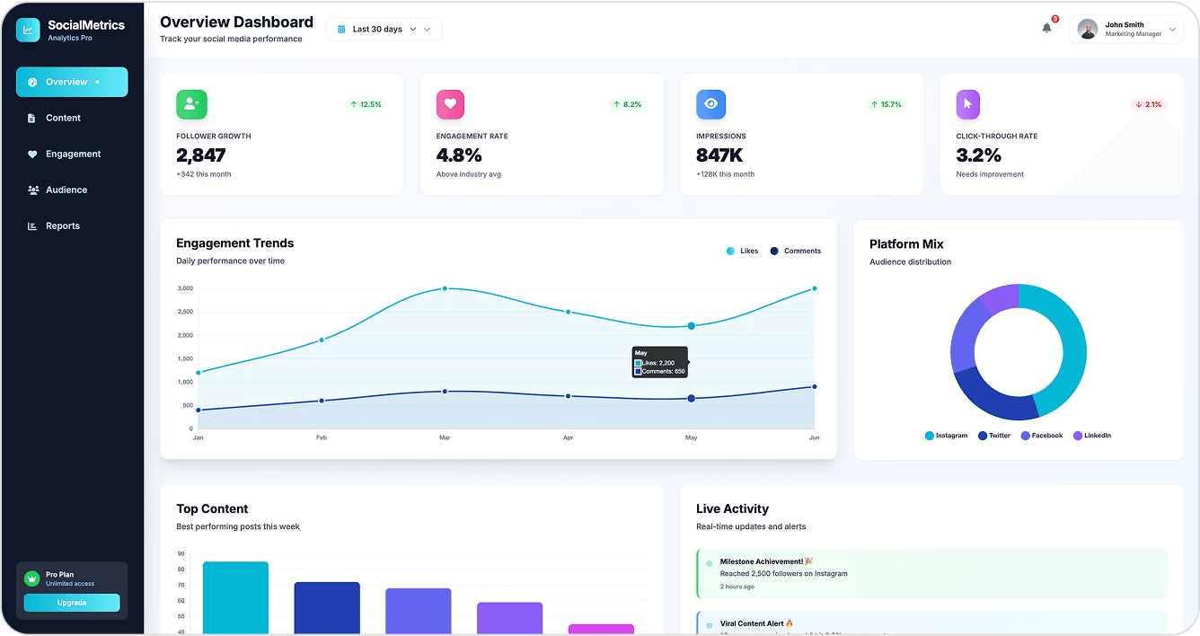
Strong color palette match with deep blue, white, and electric cyan accents.
Bold typography for KPI cards, making metrics stand out.
Slightly denser layout in some sections; could be more airy.
Can be a little more compact to show more info in a single fold.
Figma Make
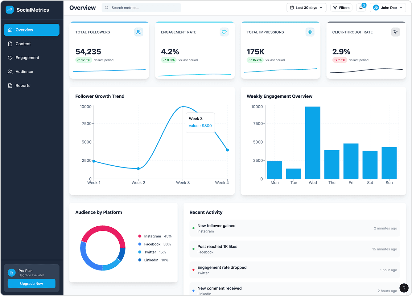
Airy layout with more whitespace, making it visually light.
Good use of typography hierarchy for section headings.
Color palette drifts from prompt (reds/pinks instead of electric cyan).
Less emphasis on KPI card boldness; metrics feel less impactful.
Design a modern mobile banking app for eco-conscious users. The UI should feel fresh, clean, and minimal, using soft green and beige tones inspired by nature. Include a dashboard home screen with account balances, spending categories (with iconography for food, travel, shopping, utilities), and a "carbon footprint" tracker. Add a transaction detail screen that shows a map view of purchase location, merchant info, and "eco score" for each transaction. Typography should be elegant and highly readable on small screens. All elements must follow a rounded card-based layout with soft shadows and micro-interactions in mind.
UXMagic.ai
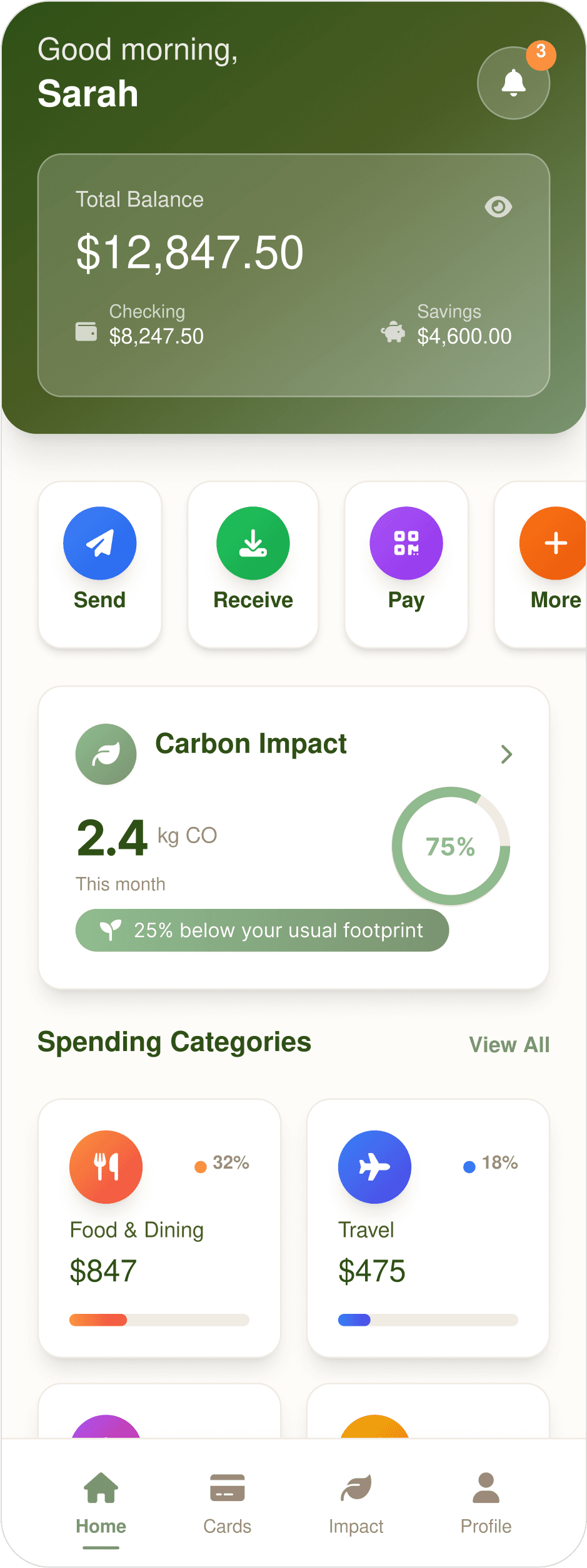
Rounded cards with soft shadows, matches prompt. Has better visual hierarchy.
Quick-action buttons ("Send,""Receive,""Pay") are included.
Bright colors might clash with soft green/beige palette.
Carbon tracker uses kg instead of tons, inconsistent with prompt wording.
Figma Make
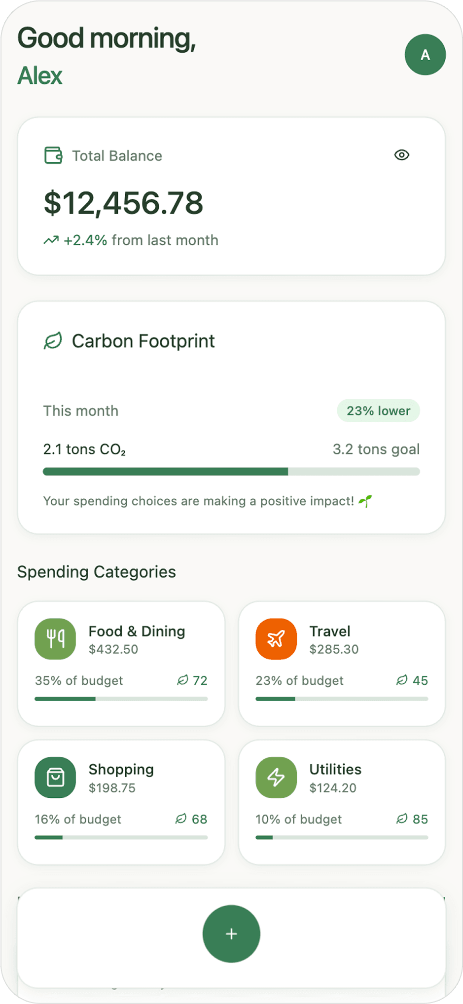
Fully consistent with soft green/beige eco tones.
Includes all requested categories (food, travel, shopping, utilities).
Flat design, lacks card depth. Slightly less polish in visual hierarchy.
No quick banking actions present.

About UXMagic
UXMagic is your AI-powered design copilot, built for creators who need to ship fast. It helps you go from prompt to responsive UI, clone entire websites, or generate screens from images, sketches, or URLs. With support for Figma, React, HTML, Webflow, and more, it’s ideal for teams that design in one tool and build in another. Whether you're ideating or deploying, UXMagic accelerates your entire pipeline. Explore its features or pricing to learn more.

About Figma Make
Figma Make is Figma’s AI-driven prototyping tool, powered by Anthropic’s Claude Sonnet model. Integrated directly into Figma, it transforms text prompts, images, and Figma frames into functional prototypes. It’s designed to help teams quickly explore interactions, validate concepts, and collaborate in real time. However, its outputs are aimed at prototyping, not production, and access is tied to Figma’s most expensive “Full seat” subscription tiers.
Feature Comparison
| Feature | UXMagic Copilot | Figma Make |
|---|---|---|
| Prompt to UI | Generate multi-screen UI from natural language | Generate UI from text prompts |
| Image to UI | Convert screenshots/images to editable UI |
Pricing Comparison
Free – $0/month
5 project, 120 free credits (one-time), upto 20 screens, 1 Figma export
Premium – $14/month
20 projects, 480 credits (monthly), upto 80 screens, 80 Figma exports, React/HTML exports
Ultimate – $28/month
Unlimited projects, 1500 credits (monthly), upto 250 screens, 250 Figma exports, unlimited React/HTML exports
Final Verdict
In UXMagic vs Figma Make, the better choice depends on your bottleneck.
If you need interactive, collaborative prototypes to validate experiences and you’re already paying for Figma Full seats, is compelling.
got questions?we have answers.
UXMagic focuses on speed, flexibility, and production-ready exports, while Figma Make specializes in high-fidelity interactive prototypes inside Figma.
For many workflows, yes — especially if you need clean, exportable code. But for deep interactive prototyping, Figma Make still offers unique strengths.
No. While functional, Figma Make’s code is considered prototype-grade and typically needs a full rewrite before deployment.
UXMagic — it supports exports to Figma, HTML, React, Webflow, and more, while Figma Make is limited to web prototypes.
UXMagic often has better ROI because it reduces rebuild time. Figma Make can be costly if you need multiple Full seats.


