
TL;DR: To design UI with AI, start from the job the interface must do, not from a blank prompt. Pick an input (a prompt, screenshot, sketch, URL or Figma file), approve a screen plan, generate the whole flow in one theme, then refine with cheap targeted edits and export to Figma or code. In UXMagic, that whole loop runs on one canvas, from prompt to UI to Figma export.
Most people who try an AI UI generator for the first time do the same thing: type "a dashboard for my app", get something that looks fine, then spend an hour trying to make screen two match screen one. The tool is not the problem. The order of operations is.
This guide walks through how to design UI with AI the way product teams actually get usable results: brief first, plan before pixels, one theme for every screen, and small edits instead of rerolls. We use UXMagic for the examples because it is our product and we know exactly what each step costs, but the workflow carries over to most tools. If you are brand new to interface design itself, start with our user interface design guide for beginners and come back.
What "designing UI with AI" means in 2026
Two years ago, AI UI design meant generating a single pretty screen from a sentence. That solved the blank canvas and not much else. In 2026 the useful tools do something different: they hold a product's context across many screens, so a sign-up flow, a dashboard and a settings page share the same colours, type, navigation and components.
In practice, designing UI with AI now looks like this:
- You direct, the AI drafts. You own the problem, the flow and the final call. The AI produces layouts, copy, imagery and variations fast.
- Inputs are mixed. A prompt, a competitor screenshot, a whiteboard photo, a live URL, an existing Figma frame or a PRD can all be the starting point, and you can combine them in one message.
- Output is editable, not a picture. Real screens you can restyle, export to Figma, or ship as HTML and React.
- Flows beat screens. Asking for a journey gives you consistent screens; asking for screens one at a time gives you drift. We explain why in why single-screen AI design is a dead end.
If you want the underlying design vocabulary (hierarchy, layout, spacing) before you start prompting, our primer on what UI design is covers it.
The step-by-step workflow
Here is the full loop, in the order we recommend. Each step links to the matching help article so you can follow along in the product.
Step 1: Define the job before you open the tool
The biggest quality lever sits outside the AI. Before you prompt, write four or five lines that answer:
- What is the product, and who uses it?
- What does this interface have to let them do? (One verb per screen is a good test.)
- Which screens does that require?
- What is non-negotiable: a legal notice, a required field, a specific call to action?
That is a tiny product requirements document. If you already have a real one, do not retype it into a prompt. UXMagic can design from a PRD or brief: upload the document, ask it to design the screens it describes, and the AI reads it as the source of truth for screens, content and terminology. Listing and reading documents is free; only the screens cost credits. No PRD yet? Our AI PRD generator drafts one, and our guide on what a PRD is explains what a good one contains.
Step 2: Pick a starting input
Every input lands in the same place (an editable screen with a project theme), so choose the one that carries the most of what you already know.
| Start from | Use it when | What to say alongside it |
|---|---|---|
| Text prompt | Starting fresh with a rough idea | Product, screens, audience, visual direction, constraints |
| Screenshot | You want to rebuild or restyle an interface you can see | Rebuild exactly, or keep the structure in your brand |
| Sketch | You whiteboarded the layout already | What the boxes mean and the look you want |
| Website URL | A live site's structure is the starting point | Straight clone, or clone restyled to your brand |
| Figma frame | You have designs and want to iterate faster | Import its styles or map onto your theme |
| PRD or brief | Requirements are already written | Which section to design first |
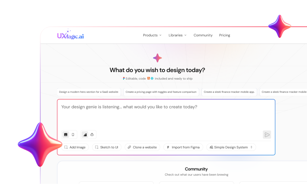
Text prompt. The default path. With text to UI, state brand values forcefully: "primary #1B4DFF, headings in Inter, no other accent colours" gets followed; "bluish" gets interpreted.
Screenshot. Upload a JPEG, PNG or WebP and say what to do with it. The phrasing matters more than people expect: "rebuild this exactly", "rebuild this layout in our brand colours" and "design ours in the same structure" produce three different results. One trap worth knowing: in an existing project, the screenshot does not override your theme unless you ask. The screenshot to UI guide covers it, and the feature page for image to UI shows examples.
Sketch. Photograph it straight on in even light, label your boxes ("hero", "chart"), and draw hierarchy with size. Line drawings read better than shaded ones. See sketch to UI for the details, or read our longer sketch-to-prototype AI workflow.
URL clone. Paste a public URL and UXMagic captures the live page (sections, colours, fonts, images) and rebuilds it as an editable screen with a matching theme. It will not capture pages behind a login or bot protection, or content that appears only after a click. Use cloning for structure and research, not to copy someone's brand wholesale. The website cloner and our guide on how to clone a website with AI go deeper.
Figma import. Connect Figma once, copy a link to the selected frame, and choose whether its styles become your theme. Frames built with auto-layout import most accurately. See import from Figma.
You can also combine inputs: a competitor screenshot plus your brand colours, or a PRD plus a reference URL, in one message.
Step 3: Approve the screen plan before anything is designed
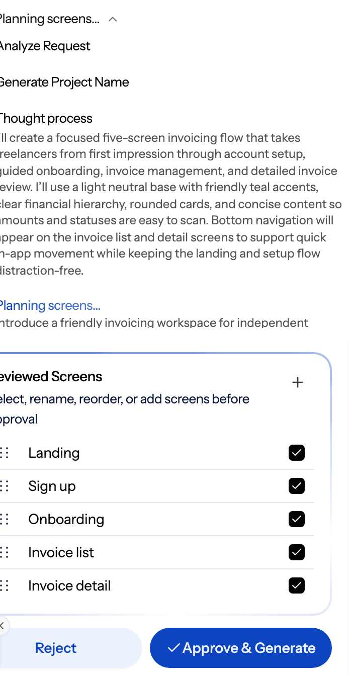
For a new project, UXMagic proposes a screen plan first: a named list of screens with a one-line purpose each. You can approve it, edit it (rename, reorder, add, remove) or reject it and re-describe what you want. Nothing is designed until you approve.
Take this step seriously, because it is where the economics of AI UI design are decided. Proposing a plan costs 1 credit. Fixing a wrong screen list after eight screens exist means redoing eight screens. The flow mode and screen plans article puts it plainly: planning is cheap, designing is not.
Things to check in the plan:
- Is every step of the journey there, including the unglamorous ones (forgot password, empty dashboard, error)?
- Does each screen have exactly one job?
- Are there screens you do not need yet? Cut them now.
Step 4: Generate the whole flow, not one screen at a time
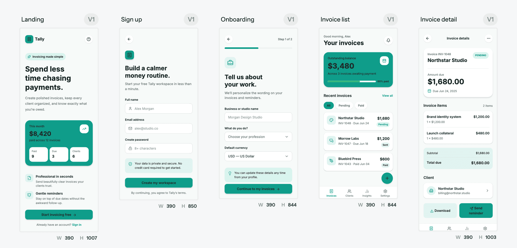
Once the plan is approved, generate the journey in one go. Flow mode designs every screen with a shared theme and navigation structure, and screens appear on the canvas as they complete, so you can start reviewing screen one while screen four is still being drawn.
Describe the journey rather than listing layouts: "browse restaurants, restaurant detail, cart, checkout, order tracking" tells the AI how screens connect, which is what keeps navigation and components consistent. We wrote a full piece on this habit: prompting for user flows, not screens.
On cost: flows are charged per screen, at 6 credits per screen, so a five-screen flow is 30 credits. Check your balance before a large run, because a run that stops halfway leaves you with half a flow. You also do not have to plan everything up front; asking later for "a forgot password screen and an empty state for the order list" designs them into the existing theme.
Not ready for high fidelity? Ask for a wireframe instead. Wireframe mode produces greyscale boxes and labels so stakeholders argue about structure instead of colour, and you can turn approved wireframes into hi-fi screens later. Our AI wireframe generator page shows what that output looks like.
Step 5: Set the theme and style guide once
Every UXMagic project has a theme: tokens for colours, typography, radii and spacing that every screen references. That is what keeps twenty screens looking like one product, and it is the step most people skip.
- Small changes: "make the primary colour #1B4DFF" or "the background is too cold, warm it up" merges into the existing theme and moves every screen at once.
- A whole new look: "give the whole project a dark theme" or "redesign with our new brand: deep green primary, cream background, serif headings" builds a new token set.
- Scoped changes: say "only on the landing page" if you want one screen to differ.
Building or updating a theme costs 0 credits. Recolouring screens one at a time through edits is both slower and how projects drift out of sync. Ask for a style guide to get a rendered screen of the palette, type scale and core components. The themes and style guides article covers the details, and the AI style guide generator page shows the output.
Step 6: Iterate with targeted edits, not rerolls
This is where most credits and most patience get wasted. When a screen is 80% right, the instinct is to regenerate it. Don't. Regeneration is one of the most expensive actions and it throws away the 80% that was already good.
UXMagic gives you three ways to change a screen, and editing a screen explains when to use each:
- Edit mode for content. Click into a screen to change text, swap images and adjust simple properties. It does not call the AI, so it is instant and free.
- Chat for structure. "Add a testimonials section between features and pricing." "Make the hero shorter and move the CTA above the fold."
- Theme for anything visual and global. Colours, fonts, radii.
Here is why this matters, using UXMagic's published credit costs:
| Action | Credits |
|---|---|
| Targeted edit (find and replace) | 0.2 |
| Rewrite a whole screen | 2 |
| Design a new screen | 3 |
| Regenerate a screen, variations, flow screen or device conversion | 6 per screen |
| Build or update a theme | 0 |
| Edit text or images in edit mode | 0 |
A targeted edit is 30 times cheaper than regenerating the same screen. Across a real project with dozens of small fixes, that is the difference between a Free plan being enough for an afternoon and running dry in ten minutes.
How to write edits that land, from our chat editing guide:
- Name the screen or select it first, so the AI does not guess.
- Say what is wrong, not that it is wrong. "The hero is too tall and the headline competes with the subhead" beats "the hero is bad".
- Two or three changes per message. Long lists interact unpredictably.
- Say "on every screen" when you mean it; project-wide operations exist for that.
Every AI edit creates a new version, so you can experiment and step back any time through versions and history. Want to compare two directions? Ask for variations and keep both.
Step 7: Check hierarchy, states and accessibility
AI output looks finished before it is finished. Before you export, review each screen the way a senior designer would:
- Hierarchy: Is the most important action the most visible thing on the screen? Our guide to visual hierarchy has a quick checklist, and UI layout design principles covers spacing and grids.
- States: AI generates the happy path by default. Ask explicitly for empty, loading, error and success states. Empty states are the ones people forget most.
- Accessibility: UXMagic validates theme colour pairings for readable contrast before applying them, but contrast is only one criterion. Check focus order, touch target sizes, labels on icon-only buttons and text alternatives for images. Our post on prompting for WCAG 2.2 accessible UI includes prompts you can reuse.
- Devices: When the desktop design is settled, make mobile versions. Each device variant is a new screen with a genuinely rearranged layout, charged per screen, so do conversions last rather than after every change. See responsive and device variants.
Step 8: Export to Figma or code, or publish
When the screens are right, get them out of the tool in the form your team needs:
- To Figma. Select screens and choose Export → Figma. You get editable frames with auto-layout, live text layers and real fills, not a screenshot. The Free plan includes 1 Figma export; Pro includes 250 a month.
- To code. Export a single screen as HTML or a React component, or a whole project as a multi-screen React project. Styling is Tailwind with your theme as tokens. It is a front end, so you still wire in routing, data and state. Our design to code generator page and the export code article cover the options, and how to export a Figma design to clean HTML walks through the reverse direction.
- To a repo. GitHub sync commits exported code straight to a repository and branch, and pushing again updates the same files.
- To an AI coding agent. The UXMagic MCP server lets assistants like Claude and Cursor read your screens and theme directly.
- Live. Publish your first site on a uxmagic.io subdomain with HTTPS, a preflight check for broken links and placeholder content, and one-click rollback.
Design your first flow with AI
Describe a product, approve the screen plan, and get consistent, editable screens you can export to Figma or code. The Free plan refreshes 20 credits every day.
Prompt examples you can copy
These follow the five-part structure from writing a prompt that gets what you want: product, screens, audience, visual direction, non-negotiables. Swap in your own details.
A new product flow from scratch
A B2B invoicing tool for freelancers called Ledgerly. Plan and design: marketing landing page, sign-up, a 3-step onboarding, an invoice list dashboard, and an invoice detail page. Audience is solo freelancers, not enterprises. Visual direction: calm and trustworthy, deep green primary (#0F3D2E), cream background (#F5F1E8), generous whitespace, Inter for everything. Do not introduce other accent colours. The landing nav must have a "Start free" button. Show me the screen plan first.A dashboard with real data density
Design a desktop analytics dashboard for a subscription SaaS. Top row: 4 KPI cards (MRR, active subscribers, churn rate, trial conversions) with change vs last month. Below: a 12-month MRR line chart on the left, a churn-reason breakdown on the right. Then a table of the 10 most recent cancellations with plan, tenure and reason. Left sidebar navigation. Dense but readable, neutral greys with one blue accent.Screenshot restyle
This is a competitor's pricing page. Keep the section structure and the 3-tier layout, but design ours in our project theme. Our tiers are Starter, Team and Scale. Highlight Team as most popular. Replace their copy with plain placeholder copy about project management.Sketch to screen
A photo of our onboarding sketch. The large box top-left is a product video, the three stacked boxes on the right are setup steps with checkmarks, the wide box at the bottom is a "Skip for now" link and a primary "Continue" button. Modern SaaS look, purple accent, light background.Targeted edits after generation
On the invoice list screen: add an empty state for users with no invoices yet, with a short explanation and a "Create your first invoice" button. Keep everything else unchanged.On every screen, change the nav CTA to "Start free" and make the primary button corners 8px.States and accessibility pass
For the sign-up screen, create variants for: inline validation errors on email and password, a loading state on submit, and a server error banner. All error text must not rely on colour alone, and every input needs a visible label.For more, we keep libraries of tested prompts: prompt templates for SaaS dashboards, real prompts we use to generate product flows, and the broader guide to prompting for UI that ships.
Common mistakes when designing UI with AI
Starting with a vague prompt and fixing it screen by screen. "Make me an app" produces an average of every app. Spend two minutes on the brief in step 1.
Skipping the plan. A plan costs 1 credit to fix. Eight wrong screens cost 24 to 48 credits to redo, plus your time.
Regenerating for a partial miss. If the layout is right and the hero is wrong, ask for the hero change. Regeneration discards the parts that worked.
Recolouring individual screens. It works for that screen and the next generated one won't match. Change the theme instead.
Vague feedback. "Make it pop" and "make it better" give the AI no axis to move on. Name the problem: too much contrast, CTA hard to find, headline too long.
Ten changes in one message. When one lands badly you cannot tell which instruction caused it. Batch two or three.
Converting to mobile too early. Device variants are separate screens and cost per screen. Finish the desktop design, then convert once.
Treating output as final. AI does the happy path well. Empty states, errors, accessibility and real copy are still your job. Our take on how AI fits into a real UX design workflow covers where human review earns its keep.
Which AI UI generator should you use?
The workflow above works in most modern tools, but they differ in what they optimise for. A short orientation:
| Tool | Best for | Output | Pricing note |
|---|---|---|---|
| UXMagic | Multi-screen product UI with a shared theme, Figma and code export | Editable screens, Figma, HTML/React, hosted site | Free: 20 credits/day. Pro: $35/mo or $17.50/mo billed annually |
| Google Stitch | Fast UI drafts from Google | Screens, Figma and code export | Free with a Google account at the time of writing |
| Figma Make | Teams already living in Figma | Prompt-to-app prototypes inside Figma | Included with Figma Professional full seat ($16/mo) |
| Lovable | Turning an idea into a working full-stack app | Running app code | Free plan: 5 daily credits, up to 30 a month |
| Uizard | Non-designers doing quick mockups | Editable mockups | Pro $12/mo billed annually, 500 AI generations/mo |
Google Stitch is quick for single concepts and free to use, but it is a draft tool first. Read our Google Stitch review, or see the options in Google Stitch alternatives.
Figma Make suits teams whose files and libraries already live in Figma. Our explainer on Figma AI features covers what it does and doesn't do.
Lovable is an app builder rather than a design tool: great when you want working code, weaker when you want to explore and refine UI before committing. See our Lovable review and the list of Lovable alternatives.
Uizard is approachable for non-designers and quick mockups. Our Uizard review and Uizard alternatives compare it with newer options.
For the full field, including v0, UX Pilot and Visily, see our ranking of the best AI design tools in 2026.
Where UXMagic fits, honestly
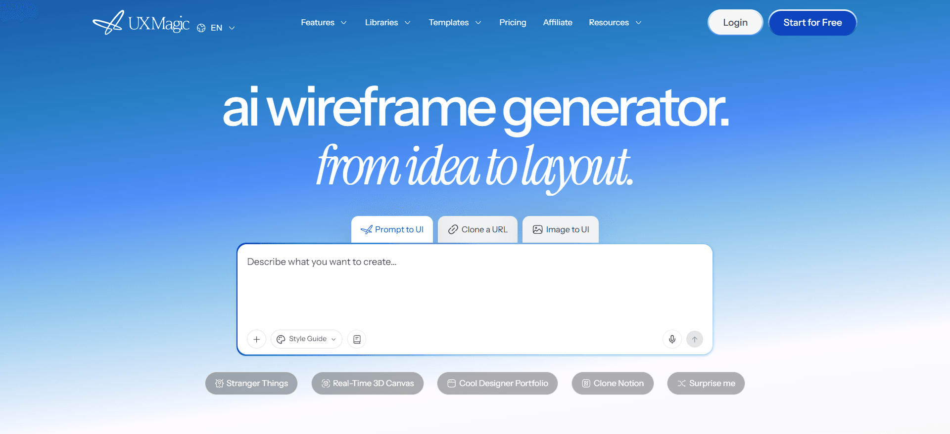
UXMagic is built for the workflow in this guide: plan the screens, generate the flow with one theme, refine cheaply, hand off to Figma or code. It is a strong fit for product teams, founders and designers who need consistent multi-screen UI fast and want to keep editing it afterwards.
It is not a backend builder. Exported code is a front end without data, routing or state management, so if you need a working app with a database on day one, pair it with your own stack or an app builder. And on the Free plan, 20 credits a day covers up to three new screens, which is plenty for trying the workflow and too little for a full product in one sitting. Pro's 2,400 monthly credits cover up to 400 screens. Current plans and limits are on the pricing page.
If you would rather start from a finished layout than a prompt, browse the UXMagic templates and make one your own.
Related guides
- Vibe Designing: Why Vibe-Coded Apps Look the Same, and the Fix
- MVP Design: How to Design a SaaS MVP Users Actually Adopt (2026)
- What Is DESIGN.md? A Practical Guide With a Copyable Template
- 9 Best UX Pilot Alternatives in 2026, Grouped by Use Case
- How to Validate a Product Idea: 7 Tests, With Templates
- Base44 vs Lovable (2026): Which AI App Builder Fits Your Project?
- 10 Best Figma Make Alternatives in 2026, Grouped by Use Case
- 10 Best Magic Patterns Alternatives in 2026, Grouped by Workflow
- ChatGPT for UI/UX Design: What It Does Well, and 10 Prompts
- Best Wireframing Tools in 2026: 10 AI, Free and Classic Picks
Go from brief to editable UI today
Plan screens, generate a consistent flow, and export to Figma or React, all on one canvas.