TL;DR: DESIGN.md is a Markdown file that gives AI agents your exact colours, type, spacing, radii and component rules, plus the reasoning behind them. Google Stitch introduced it and open-sourced the spec in April 2026. Copy the template below, put it in your repo root, and point Claude Code or Cursor at it. If your UI already lives in UXMagic, your project theme holds the same tokens, and the UXMagic MCP server lets agents read them directly.
Ask three coding agents to "build a clean, modern pricing page" and you get three pricing pages that look like the same template: a purple-to-blue gradient, Inter at every size, rounded-2xl cards, and a random shadow on each one. The agents are not being lazy. They have no idea what your product looks like, so they fall back to the average of everything they were trained on.
DESIGN.md is the fix the AI tooling world has settled on. It is one file that tells an agent, in terms it can act on, what your interface is supposed to look like. This guide covers where the format came from, what goes in it, a full template you can copy, how Claude Code, Cursor and Google Stitch use it, and how to write one from a product you already have.
What is DESIGN.md?
DESIGN.md is a plain-text file that describes a visual identity to coding agents. It has two layers:
- YAML front matter at the top, between
---fences, holding the machine-readable design tokens: colour values, typography objects, a radius scale, a spacing scale and component definitions. - A Markdown body below it, holding the human-readable reasoning: what the brand should feel like, which colour is for what, when to use elevation, and what never to do.
The split is the useful bit. Tokens give an agent exact values, so it stops guessing hex codes. The prose tells it how to apply them, which is where most AI-generated UI goes wrong. A token list says your accent is #B8422E. The prose says the accent is reserved for the single primary action on a screen, which is what actually keeps a page from turning orange.
If you have read our explainer on design systems vs style guides vs component libraries, DESIGN.md sits closest to the style guide. It is not a component library and it does not replace one. It is a compact brief for the visual layer, written for a reader that is a model rather than a person.
Where DESIGN.md came from
The idea grew out of a habit coding-agent users already had. Teams were writing an AGENTS.md or CLAUDE.md file to tell agents how to build and test their repo, and they started stuffing visual rules in there too. Those files got long, and design rules got mixed up with lint commands.
Google Stitch turned that habit into a format. When Google relaunched Stitch as an AI-native canvas in March 2026, one of the additions was DESIGN.md: a file for exporting a project's design rules and importing them into another project or tool. On April 21, 2026, Google Labs open-sourced the draft specification so it could be used outside Stitch. The spec and CLI live on GitHub under the Apache 2.0 licence.
Two things are worth knowing before you commit to it:
- It is alpha. The repo labels the format version
alphaand warns that the spec, token schema and CLI will change. Treat it as a useful convention, not a frozen standard. - It is optional structure. Agents read Markdown regardless. A DESIGN.md that ignores the spec still helps. Following the spec gets you validation, diffing and token export for free.
Our Google Stitch review covers the rest of the March relaunch, and our round-up of Google Stitch alternatives explains where Stitch fits against other AI UI tools.
DESIGN.md vs AGENTS.md vs CLAUDE.md
These files get confused because they all live in the repo root and all talk to agents.
| File | Answers | Read by |
|---|---|---|
| AGENTS.md | How do I work in this repo? Build, test, conventions | Codex, Cursor, Jules, Copilot and 20+ others |
| CLAUDE.md | Same job, Claude Code's own file | Claude Code, loaded automatically |
| DESIGN.md | What should the interface look like, and why? | Any agent you point at it; Stitch natively |
AGENTS.md is now stewarded by the Agentic AI Foundation under the Linux Foundation and is supported by a long list of agents. DESIGN.md does not replace it. The cleanest setup is one line in AGENTS.md or CLAUDE.md that says "all UI work follows DESIGN.md", so the design brief gets loaded every time without bloating the main instructions.
What goes in a DESIGN.md file
The spec defines five token groups in the front matter and eight optional body sections. Sections can be left out, but the ones you include should appear in this order.
Front matter tokens:
- colors: named colours in any CSS format (hex,
rgb(),oklch()). Include aprimary, or the linter warns that agents will invent one. - typography: named text styles, each an object with
fontFamily,fontSize,fontWeight,lineHeightandletterSpacing. - rounded: your corner radius scale.
- spacing: your spacing scale.
- components: named components with properties such as
backgroundColor,textColor,typography,rounded,paddingandheight. Values can reference other tokens with{colors.primary}syntax. Hover and pressed states are separate entries.
Body sections, in order: Overview, Colors, Typography, Layout, Elevation & Depth, Shapes, Components, and Do's and Don'ts.
The Do's and Don'ts section tends to do the most work. Agents follow explicit prohibitions well ("never use gradients on buttons") and follow vague aesthetic words ("premium", "clean") badly. That matches what we found writing about whether AI can follow design tokens: exact values plus explicit rules beat adjectives every time.
A full DESIGN.md template you can copy
Here is a complete, spec-shaped template for a fictional B2B invoicing product called Ledgerly. Replace the values with yours and delete anything you do not need.
---
version: alpha
name: Ledgerly
description: Calm, precise interface for small-business invoicing.
colors:
  primary: "#0F766E"
  on-primary: "#FFFFFF"
  primary-hover: "#115E59"
  secondary: "#475569"
  surface: "#FFFFFF"
  background: "#F8FAFC"
  border: "#E2E8F0"
  text: "#0F172A"
  text-muted: "#64748B"
  success: "#15803D"
  warning: "#B45309"
  error: "#B91C1C"
typography:
  display:
    fontFamily: Inter
    fontSize: 2.5rem
    fontWeight: 700
    lineHeight: 1.1
    letterSpacing: -0.02em
  h1:
    fontFamily: Inter
    fontSize: 2rem
    fontWeight: 600
    lineHeight: 1.2
  h2:
    fontFamily: Inter
    fontSize: 1.5rem
    fontWeight: 600
    lineHeight: 1.3
  body-md:
    fontFamily: Inter
    fontSize: 1rem
    fontWeight: 400
    lineHeight: 1.5
  body-sm:
    fontFamily: Inter
    fontSize: 0.875rem
    fontWeight: 400
    lineHeight: 1.45
  label:
    fontFamily: Inter
    fontSize: 0.75rem
    fontWeight: 600
    letterSpacing: 0.04em
  numeric:
    fontFamily: JetBrains Mono
    fontSize: 0.875rem
    fontWeight: 500
rounded:
  sm: 4px
  md: 8px
  lg: 12px
  full: 9999px
spacing:
  xs: 4px
  sm: 8px
  md: 16px
  lg: 24px
  xl: 32px
  2xl: 48px
components:
  button-primary:
    backgroundColor: "{colors.primary}"
    textColor: "{colors.on-primary}"
    typography: "{typography.body-sm}"
    rounded: "{rounded.md}"
    padding: 10px 16px
    height: 40px
  button-primary-hover:
    backgroundColor: "{colors.primary-hover}"
  button-secondary:
    backgroundColor: "{colors.surface}"
    textColor: "{colors.text}"
    rounded: "{rounded.md}"
    height: 40px
  input:
    backgroundColor: "{colors.surface}"
    textColor: "{colors.text}"
    rounded: "{rounded.md}"
    height: 40px
  card:
    backgroundColor: "{colors.surface}"
    rounded: "{rounded.lg}"
    padding: 24px
  badge-success:
    backgroundColor: "#DCFCE7"
    textColor: "{colors.success}"
    rounded: "{rounded.full}"
---

## Overview

Ledgerly helps small-business owners send invoices and get paid. The
interface should feel calm, trustworthy and quick to scan: closer to a
well-kept ledger than a marketing site. Density is medium. Numbers are
the hero; decoration is not.

## Colors

- Primary (#0F766E) is deep teal. Use it for the one main action per
  screen, active navigation and links. Never for large background areas.
- Background (#F8FAFC) is the page canvas. Surface (#FFFFFF) is for
  cards, tables and inputs that sit on it.
- Text (#0F172A) for body and headings; Text Muted (#64748B) for
  metadata, helper text and table captions only.
- Success, Warning and Error are status colours for invoice states
  (Paid, Due soon, Overdue). Never use them decoratively.

## Typography

Inter for all interface text. JetBrains Mono (numeric) for amounts,
invoice numbers and dates in tables so columns align. One h1 per
screen. Labels are uppercase with tracking; nothing else is uppercase.

## Layout

8px grid. Desktop content max width 1200px with a 240px left sidebar.
Page padding 32px desktop, 16px mobile. Gap between cards is 24px.
Tables are full width inside a card; right-align all currency columns.

## Elevation & Depth

Mostly flat. Cards use a 1px border (#E2E8F0), no shadow. Only menus,
popovers and modals get a shadow: 0 8px 24px rgba(15, 23, 42, 0.12).

## Shapes

8px radius for buttons and inputs, 12px for cards and modals, full
radius only for badges and avatars. No sharp corners, no pill buttons.

## Components

- Buttons: 40px tall. One primary button per view; everything else is
  secondary or a text link. Icon + label, icon on the left.
- Inputs: 40px tall, label above, helper or error text below.
- Status badges: pill shape, tinted background with coloured text.
- Empty states: short headline, one sentence, one primary action.

## Do's and Don'ts

- Do right-align numbers and show currency symbols.
- Do keep one primary action per screen.
- Don't use gradients, glassmorphism or drop shadows on cards.
- Don't introduce new colours; derive tints from the palette above.
- Don't use more than two font weights on a single screen.
- Don't centre-align body text or table content.
Before you commit it, run Google's linter:
npx @google/design.md lint DESIGN.mdIt flags token references that do not resolve, a missing primary colour or typography, sections out of order, and component text and background pairs that fall below WCAG AA contrast. The same CLI has a diff command for spotting token changes between two versions, and an export command that turns the tokens into a Tailwind v3 theme, a Tailwind v4 @theme block or W3C DTCG tokens.
A note on the colour choices: the linter's contrast check only covers components you define, so it will not catch muted text on a tinted background inside a custom layout. Our accessibility heuristics checklist covers the pairs worth checking by hand, and our guide to a UI colour palette that survives production explains how to pick status colours that stay readable.
How coding agents use DESIGN.md
The file does nothing on its own. Each tool has its own way of loading it, and the common failure is a DESIGN.md that sits in the repo and never gets read.
Claude Code
Claude Code loads CLAUDE.md automatically at the start of a session. It does not load DESIGN.md unless you tell it to. The reliable way is to import it from CLAUDE.md with a line like @DESIGN.md, plus a sentence such as "Follow DESIGN.md for every UI change; do not introduce colours, fonts or radii that are not in it." For a one-off, mention the file in your prompt: "Build the invoice list page using @DESIGN.md."
Cursor
Cursor reads its project rules and supports AGENTS.md. Add a rule that points at DESIGN.md for anything under your components or pages folders, or reference @DESIGN.md in chat when you ask for UI work. Our comparison of AI coding assistants for frontend developers goes deeper on how Cursor and Claude Code differ in the way they pick up project context.
Google Stitch
Stitch is the one tool that treats DESIGN.md natively. Google describes it as a way to export or import design rules from project to project, so a system you set up once carries into the next exploration. If you are designing in Stitch and building elsewhere, exporting the DESIGN.md is the simplest bridge into your repo.
App builders
Lovable, Bolt, v0 and similar builders do not have a dedicated DESIGN.md slot, but they all accept project knowledge or attached files. Paste the file into the project instructions or knowledge area and reference it in prompts. Our Lovable review and roundups of Lovable alternatives and v0 alternatives cover where each tool stores that kind of context.
What DESIGN.md will not fix
A style file gives an agent the right values. It does not give it good layout judgment, a sense of hierarchy or a coherent flow across ten screens. Agents still invent spacing in places the file does not cover, and they still drift on long sessions as context fills up. That is why vibe-coded apps look generic even with a design brief, which we dig into in our post on vibe designing and in what vibe coding means for designers. The practical answer is to hand agents real screens, not only rules, which is where the next two sections come in.
How to write a DESIGN.md from an existing product
You do not need to invent a design system to write one. Most products already have one, spread across a Tailwind config, a Figma file and a few people's heads. The job is to collect it.
- Pull the tokens from code first. Your
tailwind.config, CSS custom properties or theme file is the most accurate source, because it is what ships. Copy colours, font families, the type scale, radius and spacing values. - Name colours by role, not by hue.
primary,surface,text-mutedanderrortell an agent what a colour is for.teal-700does not. If you use shadcn/ui, its variable names are already role-based; our shadcn/ui explainer shows the pattern. - Audit what is actually on screen. Take your five most-used screens and note every button, input and card style. If you find four button heights, pick one and write it down. The file should describe the system you want, not every accident you shipped.
- Write the Overview in two or three sentences. Who uses the product and what it should feel like. Skip brand-book language; describe density, tone and what matters most on screen.
- Write Do's and Don'ts from real mistakes. Look at the last few UI changes an agent made that you had to fix. Each fix is a rule.
- Lint, then test it. Run the linter, then ask your agent to build one screen you already have. Compare the result to production. Every gap is either a missing token or a missing rule.
- Version it with the code. Update DESIGN.md in the same pull request that changes the theme. Use the CLI's
diffcommand in review so token changes are visible.
If you are starting from nothing, our playbook on building a design system from scratch and our guide to going from an AI prompt to a design system cover the decisions you need to make before any of this is worth writing down. If you are copying the feel of an existing site, UXMagic's website cloner can rebuild a page as editable screens with a theme you can then transcribe.
How UXMagic's theme and style guide relate to DESIGN.md
UXMagic does not export a DESIGN.md file. What it has is the same idea built into every project, plus two ways to get it into your repo and your agent.
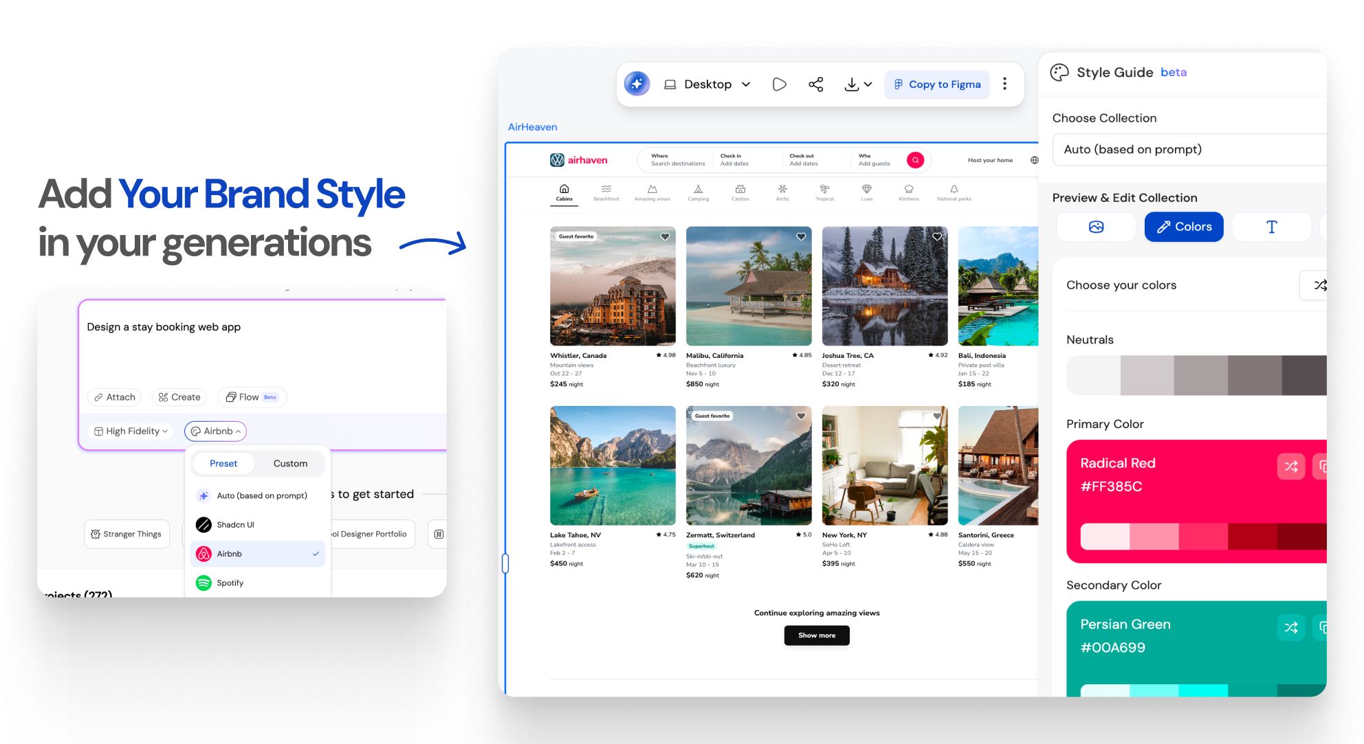
Every project has a theme. According to our help article on themes and style guides, each project's theme is a set of design tokens for colours, typography, radii and spacing, and screens reference those tokens rather than hard-coded values. That is the front matter of a DESIGN.md, minus components. Change the primary colour once and every screen follows.
A few details from the help docs that matter here:
- Small edits merge into the existing theme ("make the primary colour #1B4DFF"), while asking for something like a dark theme builds a complete new token set.
- Theme changes apply project-wide by default. You can scope one to a single screen by saying so in the prompt.
- Themes are checked for readable colour pairings before they are applied.
- Building or updating a theme is free. Only generating screens costs credits, as our credits guide explains.
- You can ask for a rendered style guide screen showing the palette, type scale and core components.
That rendered style guide screen is the easiest thing to turn into a DESIGN.md by hand. Generate it, then copy each value into the template above: palette into colors, type scale into typography, and the button, input and card specs into components. Add your Overview and Do's and Don'ts in prose. It takes a few minutes, and you end up with a file that matches what your designs actually use. For a standalone brand system, the AI style guide generator produces colours, typography, spacing and components you can transcribe the same way. Fonts have their own options, covered in fonts and typography.
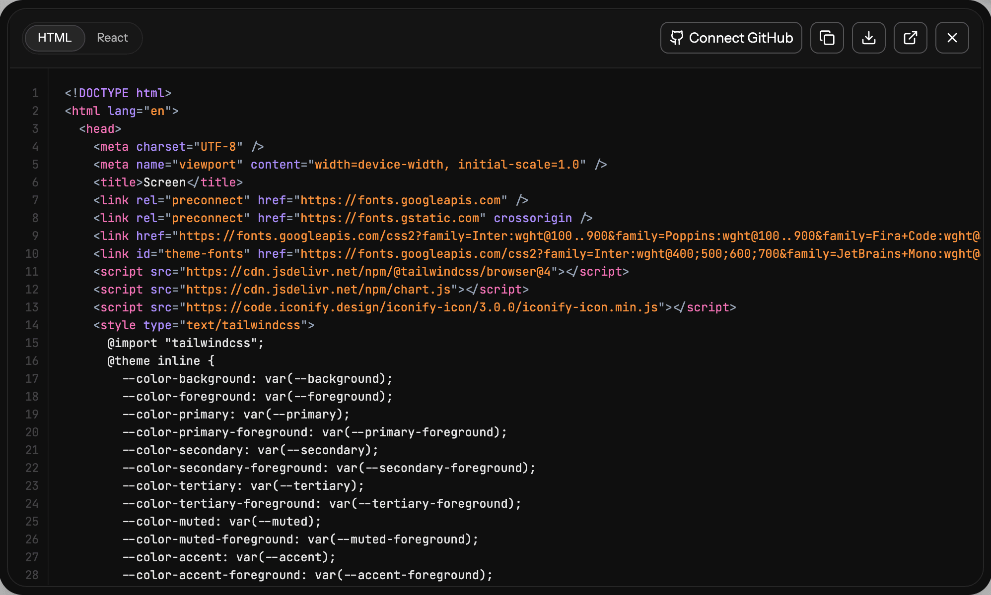
Exported code carries the tokens. When you export code from UXMagic, styling is Tailwind CSS with your project theme expressed as design tokens, so the code carries the same system the canvas does. If you then write a DESIGN.md, the values in the file and the values in the Tailwind theme should match exactly. That gives your agent both the rule and a working example of it. The Figma to HTML and code page shows what the export looks like, and GitHub sync pushes it straight into a repo.
DESIGN.md vs MCP: rules or the real design?
A DESIGN.md is a description. However careful you are, the agent still has to imagine the screen from it. That works for small components and falls apart on full pages, where layout, hierarchy and content order matter as much as tokens.
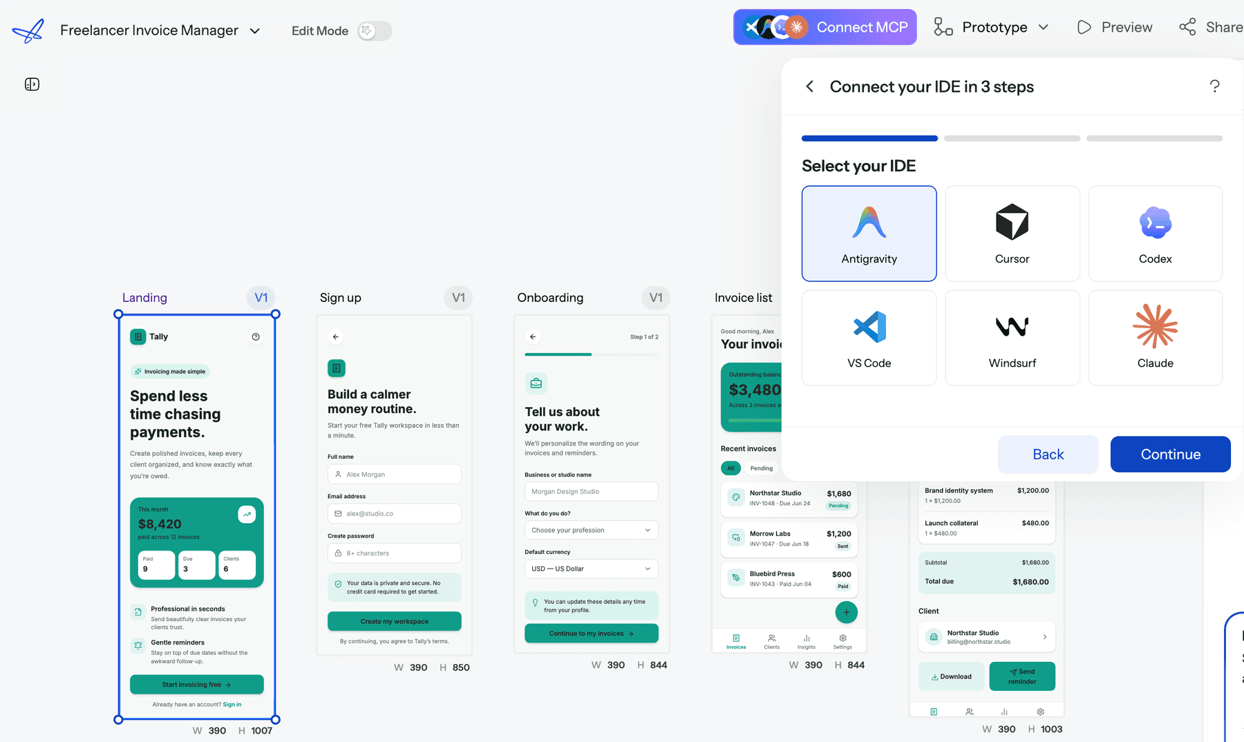
The UXMagic MCP server takes the other route. It connects Claude, Cursor, VS Code, Windsurf, Codex or Antigravity to your UXMagic projects so the assistant reads the real design instead of a summary of it. Once connected, it can list your projects and screens, read a screen's HTML, read the project's theme, and read project documents such as PRDs. Read operations are free. A typical prompt from the help docs: "Read the Pricing screen from my Ledgerly project and implement it as a React component using our design tokens."
In practice the two work together:
- DESIGN.md is the standing rule. It lives in the repo, costs nothing to load, and covers every small UI change an agent makes between design sessions: a new settings toggle, an extra table column, an error state.
- MCP is the source of truth for whole screens. When you are building a page that was designed, the agent reads the actual markup and theme, not a paraphrase.
For Claude users there is a no-key option: connect UXMagic to Claude as a connector, as described on the Claude MCP page. IDEs use an API key pasted into the IDE's MCP settings; the MCP page generates the config.
Design the screens, then let your agent read them
Generate a themed multi-screen flow in UXMagic, then connect Claude or Cursor through MCP so it builds from the real design and tokens.
A workflow that uses both
Here is the setup we recommend for a team shipping UI with coding agents:
- Design the flow first. Describe the feature in UXMagic's flow mode, approve the screen plan, and let it design the screens on one shared theme. Our guide on how to design UI with AI walks through the prompts.
- Lock the theme. Adjust colours, type and radii at the theme level, never on individual screens. If a change does not stick, see style guide did not apply.
- Write DESIGN.md from the theme. Transcribe the tokens, add component specs and write your Do's and Don'ts. Lint it and commit it to the repo root.
- Import it from CLAUDE.md or AGENTS.md. One line, so every session picks it up.
- Connect MCP for page builds. When implementing a designed screen, have the agent read it through MCP instead of working from a screenshot.
- Keep them in sync. When the theme changes in UXMagic, update DESIGN.md in the same pull request and run the
diffcommand in review.
This is the design-first version of the workflow we describe in vibe coding in 2026. If you are comparing tools for the code half, our guide to AI design-to-code tools and our list of Figma Dev Mode alternatives cover the options. For earlier-stage work, such as research and microcopy before any screens exist, see ChatGPT for UI/UX design.
Common DESIGN.md mistakes
- Adjectives instead of values. "Modern, clean, premium" gives the agent nothing to act on. Every claim in the Overview should be backed by a token or a rule.
- Hue names instead of roles.
blue-500invites the agent to use it anywhere.primarywith a usage note does not. - No component tokens. Colours and fonts alone leave the agent to invent button heights and card padding, which is where screens start to diverge.
- A file nobody loads. If it is not imported from CLAUDE.md, AGENTS.md or your tool's rules, most sessions never see it.
- Letting it drift. A DESIGN.md that disagrees with the shipped Tailwind theme is worse than none, because the agent now has two sources of truth. Our piece on why consistency beats creativity in SaaS UI explains why that drift is expensive.
- Trying to encode everything. Keep it to the visual layer. Flows, copy guidelines and product logic belong in a PRD or in real designs, not in a style file.
Should you use DESIGN.md?
If agents write any of your UI, yes. It is cheap to write, it removes the most common source of generic output, and the spec gives you linting and token export for free. Treat it as alpha: follow the structure, but do not build tooling that breaks when the schema changes.
Just be clear about its limits. DESIGN.md makes agents consistent. It does not make them good designers. For that, give them real screens to build from: design the flow in UXMagic, keep the tokens in the project theme, write the DESIGN.md from it, and let your agent read the actual designs through MCP. If you are weighing design tools for that first step, our best AI design tools of 2026 and Claude Design alternatives round-ups compare the options, and pricing shows what the free plan includes.
Related guides
- Paper.design Review 2026: HTML Canvas, MCP, Pricing and Limits
- Pencil.dev Review 2026: Now pen.dev, Features, Pricing, Alternatives
- Figma Agent Review 2026: What the Beta Does, Costs and Misses
- Galileo AI Is Now Google Stitch: Here's the 2026 Review
- 12 Replit Alternatives in 2026, Grouped by the Job You Need Done
- MVP Design: How to Design a SaaS MVP Users Actually Adopt (2026)
- 9 Best MagicPath Alternatives in 2026, Grouped by How You Work
- 10 Best Magic Patterns Alternatives in 2026, Grouped by Workflow
- UI Color Palette Generators: 10 Tools That Actually Scale (2026)
- Figma Make Tutorial 2026: Prompt, Edit, Publish and Export Code
Get a theme worth writing down
Start a project in UXMagic, set your colours, type, radii and spacing once, and every screen follows. Then hand it to your coding agent.