TL;DR: Vibe designing means directing AI to design your interface (screens, flow, theme) before a coding agent builds it. Vibe-coded apps look alike because every builder starts from the same component defaults and the model fills gaps with the most common pattern. Plan the screens, generate the flow in one theme, fix it with targeted edits, then hand it to Lovable, Bolt or Cursor through code export or the UXMagic MCP server. The full loop is below, with prompts you can copy.
If you have shipped anything with an AI app builder, you have probably had this moment: the app works, the demo goes fine, and then you notice it looks exactly like the last three apps someone posted on X. Same sidebar. Same soft cards. Same purple.
That is not a skills problem. It is an ordering problem. Most vibe coders ask a coding agent to invent the design and the logic at the same time, and the agent spends its attention on the logic. Vibe designing flips the order: you settle what the product looks like and how it flows first, with an AI tool built for that job, and then give the builder something specific to implement.
This guide explains what vibe designing is, why the "same-looking app" problem happens, and the exact design-first workflow our team recommends, step by step in UXMagic. If you are new to the coding side, read our explainer on what vibe coding is first, then come back.
What is vibe designing?
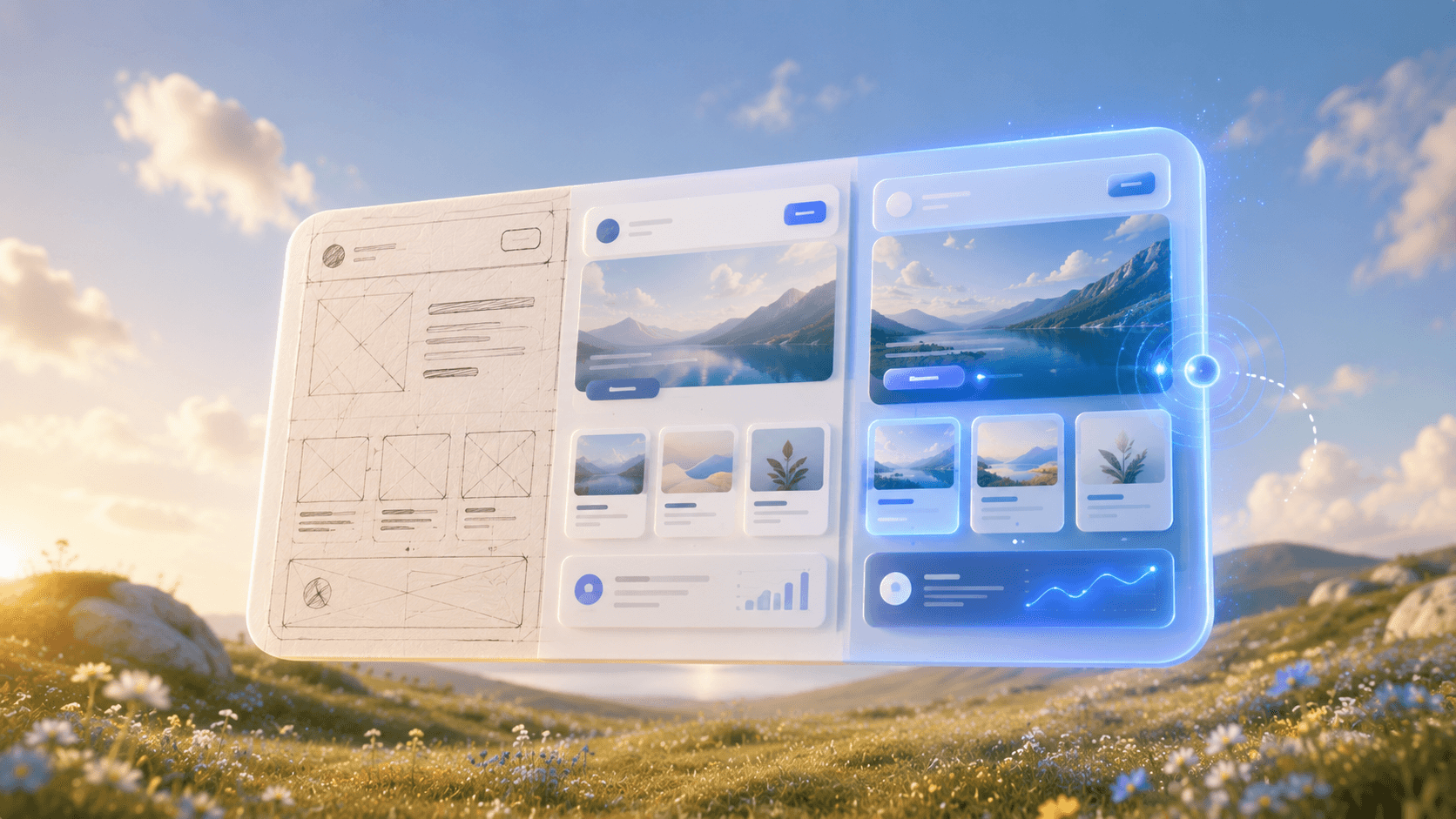
Vibe designing is designing an interface by describing intent rather than drawing it. You tell an AI design tool what the product is, who it is for, how it should feel and which journey it needs to support, and it produces real, editable screens. You then steer with short instructions ("tighten the hero", "warmer palette", "add an empty state") until it is right.
The term borrows from vibe coding, and it went mainstream when Google relaunched Stitch as an AI-native design canvas and leaned on the phrase "vibe design" to describe it. Our Google Stitch review looks at how that plays out in practice.
Three things separate vibe designing from asking a chatbot for HTML:
- The output is a design, not a reply. Screens sit side by side on a canvas where you can see the whole journey.
- It keeps a system. Colours, fonts, radii and spacing live as shared tokens, so ten screens look like one product.
- It hands off. The result goes to Figma, to code, or straight to your coding agent.
Vibe coding vs vibe designing
Both use the same families of large language models. They just point them at different jobs.
| Vibe coding | Vibe designing | |
|---|---|---|
| Produces | A running app: logic, data, auth, deploy | Screens, flow, hierarchy, colour and type |
| Typical input | Feature requests, bug reports | Product brief, mood, screenshots, sketches |
| Typical tools | Lovable, Bolt, Cursor, Replit | UXMagic, Google Stitch, Figma Make |
| What "done" means | It works | It is clear, consistent and yours |
| Cost of a change late | High: every repaint touches code | Low: edits and theme changes are cheap |
The last row is the whole argument. Changing a colour in a design tool is one instruction. Changing it in a half-built app can mean a dozen prompts, each one risking a regression somewhere else. Our write-up on the real vibe coding workflow in 2026 reaches the same conclusion from the engineering side.
Why vibe-coded apps all look the same
The pattern is easy to spot once you have seen it: a dark or white left sidebar, a grid of rounded cards with thin borders, a hero with a violet-to-blue gradient, an indigo primary button, Inter everywhere, and a pricing section with three tiers and a "Most popular" badge in the middle. None of it is bad. All of it is generic.
Four forces produce it.
1. Everyone starts from the same stack. Lovable, for example, generates React with Tailwind CSS and shadcn/ui components by default, and many other builders sit on the same or a very similar foundation. That is a sensible engineering choice. It also means the starting point for every app is the same set of components with the same default styling. Our explainer on shadcn/ui covers why that library became the default.
2. Models pick the most common answer. When a prompt says "build a dashboard" and nothing about how it should look, the model fills the gap with the pattern it has seen most often. That pattern is, by definition, the one everybody else already has.
3. Design gets decided screen by screen. A coding agent builds one page, then the next. Each page is styled in the moment, so decisions drift, and the easiest way to stay consistent is to fall back on the defaults. We explain this failure mode in why single-screen AI design is a dead end.
4. Nobody wrote down a system. Without tokens for colour, type and spacing, there is nothing to hold a direction in place. The agent cannot follow a brand it was never given. Our honest answer to whether AI can follow design tokens is "yes, when you give it real ones".
The result looks fine for an internal tool or a weekend prototype. It hurts when real users have to trust the product, pay for it or remember it. We looked at the wider quality gaps in the hidden problems in AI-generated interfaces.
The design-first workflow, step by step
Here is the loop we recommend. It takes an hour or two for a small product, and every step links to the matching help article. For a broader version that is not specific to vibe coders, see our sibling guide on how to design UI with AI.
Step 1: Write a five-line brief
Before you open any tool, write down:
- What the product is and who uses it.
- The one journey that matters most (signing up, creating an invoice, booking a class).
- How it should feel, in two or three adjectives, plus one thing it should not look like.
- Brand constraints you already have: a colour, a font, a logo.
- Platform: mobile, desktop web, or both.
Line 3 is the anti-generic line. "Calm, editorial, trustworthy; not a purple SaaS dashboard" does more for distinctiveness than any amount of later polishing. If you want help drafting it, our guide on writing a good prompt has a worked example.
Step 2: Approve a screen plan before anything is drawn
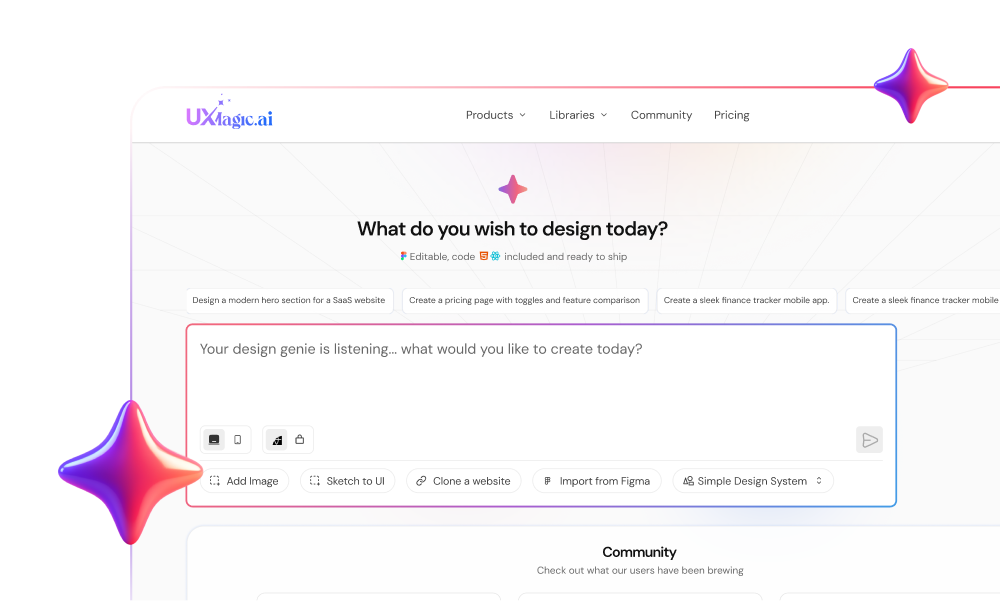
In UXMagic, a new project starts with a screen plan: a named list of screens, each with a one-line purpose. You can rename, reorder, add or remove screens, or reject the plan and describe what you want again. Nothing is designed until you approve it.
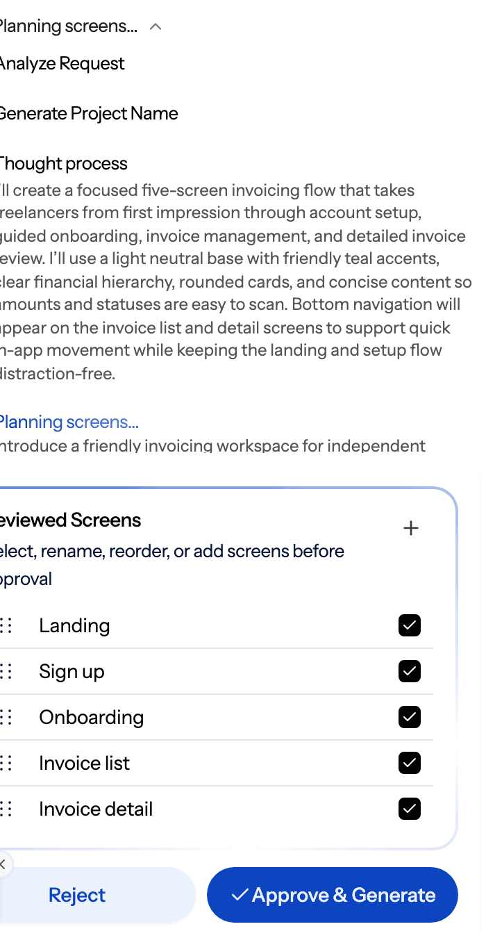
This is the cheapest place to catch mistakes. Proposing a plan costs 1 credit; fixing a wrong screen after it has been designed costs far more. The flow mode and screen plans article covers the details. Vibe coders who skip this step usually discover a missing onboarding or empty state two days into the build.
Step 3: Generate the whole flow in one theme
Describe the journey, not individual screens, and let flow mode design every screen with a shared theme and navigation. Screens appear on the canvas as they finish, so you can start reviewing before the run ends.
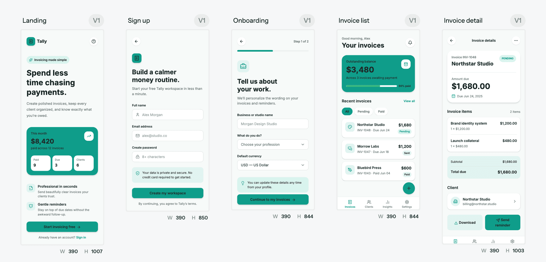
This is where you escape the same-looking-app trap. Because the flow is generated against one theme, the direction you gave in your brief applies everywhere at once, instead of being reinvented page by page. If you prefer to settle structure in greyscale first, switch on wireframe mode and move to high fidelity once the layout is right. Our post on prompting for user flows, not screens goes deeper on phrasing.
You do not have to start from a prompt, either. A screenshot of a site you admire, a whiteboard sketch or a live URL all work as starting points through image to UI or the website cloner.
Step 4: Make the theme yours
Now fix the part the defaults got wrong. Every UXMagic project stores colours, typography, radii and spacing as tokens that every screen references. Tell it what you want:
- "Primary colour #0F766E, warm off-white background, charcoal text."
- "Headings in a serif, body in a humanist sans, larger line height."
- "Less rounded: 6px radius on cards and buttons."
Theme changes cost 0 credits and move every screen together, which makes this the most valuable step in the whole workflow. Ask for a style guide if you want a rendered sheet of the palette, type scale and components. See themes and style guides for how it works, and the AI style guide generator for what the output looks like. If you are picking colours from scratch, our guide to a UI colour palette that survives production helps.
Step 5: Refine with targeted edits, not rerolls
When a screen is 80% right, do not regenerate it. Ask for the specific change. UXMagic gives you three levels:
- Edit mode for text and images: click into the screen and change them directly. Free.
- Chat edits for structure: "move the CTA above the fold", "add a filter row above the table". A targeted edit costs 0.2 credits.
- Theme for anything global, as in step 4.
The chat editing and editing a screen guides explain when to use each. The credit costs make the case on their own: a targeted edit is 0.2 credits, rewriting a whole screen is 2, and regenerating is 6 per screen.
While you are here, check the things coding agents tend to skip: empty states, error states, loading states and long text. It is far cheaper to design them now than to prompt for them later. Our empty states guide has patterns worth stealing.
Design the app before you vibe code it
Plan the screens, generate the whole flow in one theme and refine it for free on the daily allowance. Then hand it to your builder.
Step 6: Hand off by export or MCP
Now the design becomes the spec. You have three routes, and which one you use depends on your builder.
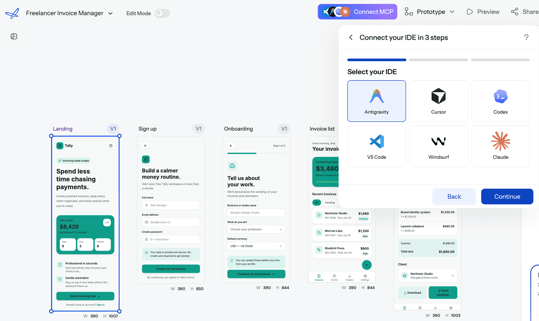
For Cursor, Claude Code, VS Code, Windsurf, Codex or Antigravity: MCP. Connect the UXMagic MCP server and your assistant can list your projects, read each screen's HTML and read the project theme. You then ask it to implement a screen against your components. No screenshots, no re-describing the design. Reading screens and themes over MCP is free. If you work in Claude, the Claude connector signs you in without an API key.
For any codebase: code export. Export a screen as HTML or React, or a whole project as a multi-screen React project, styled with Tailwind and your theme as design tokens. The export code article covers the details, and GitHub sync pushes the result straight into a repository.
For Lovable and Bolt: code or Figma. Both builders accept design input from Figma (Lovable through its Figma import options, Bolt by starting a project from a Figma frame), so exporting to Figma is one route. The other is pasting the exported code for a screen, together with your theme tokens, into the builder as the reference to implement.
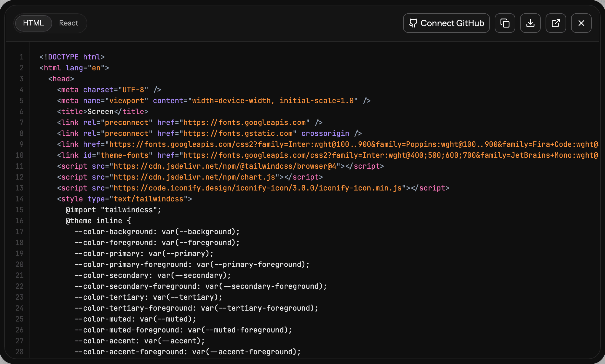
One thing to plan for: exported code is a front end. It has no data layer, routing or state management, which is exactly the part your builder is good at. For a deeper comparison of handoff routes, see our sibling guides to AI design-to-code tools and Figma Dev Mode alternatives.
Step 7: Build in Lovable, Bolt or Cursor
With a design in hand, the coding agent's job shrinks to what it does best: data, auth, integrations and logic. Your prompts get shorter and more precise, and you spend your builder's credits on functionality instead of repainting. Our Lovable review, Bolt.new review and Lovable vs Bolt comparison will help you pick a builder, and our comparison of AI coding assistants covers Cursor and its rivals.
Copyable vibe design prompts
Paste these into UXMagic (or any AI design tool) and replace the brackets.
The brief prompt (use for the first message):
Design [product name], a [mobile app / web app] for [who] that helps them [main job].
Journey: [screen 1], [screen 2], [screen 3], [screen 4], [screen 5].
Feel: [adjective], [adjective], [adjective]. It must not look like a generic SaaS dashboard.
Brand: primary [hex], background [hex], headings in [font or style], body in [font or style].
Include empty, loading and error states where data appears.
The anti-default prompt (when the first result looks generic):
This looks like a default template. Keep the layout, but:
- replace the purple accent with our primary [hex] and remove all gradients
- use a [serif / condensed / rounded] heading font with tighter letter spacing
- reduce card borders and shadows; separate sections with spacing instead
- make the hero asymmetric, with the product visual on the right
Apply to every screen.
The theme prompt:
Update the theme: primary [hex], secondary [hex], background [hex], text [hex].
Radius 6px on cards and buttons. Body line height 1.6. Apply everywhere.
The targeted edit prompt:
On the [screen name] screen only: move the primary button above the fold,
shorten the headline to one line, and add an empty state for the [list/table]
with a one-line explanation and a single call to action.
The handoff prompt (in Cursor or Claude, with the UXMagic MCP connected):
Read the [screen name] screen and the theme from my UXMagic project "[project name]".
Implement it as a React component in [path], using our existing [Button, Card, Input]
components and mapping the theme colours to our Tailwind config. Do not invent new styles.
Then list anything in the design you could not map.
For more patterns, see prompting for UI that ships. If you want your coding agent to follow the design system across sessions, our sibling guide on DESIGN.md files shows how to write one.
Before and after: what to look for
We are not going to show you a staged "ugly vs pretty" pair. Instead, here is what actually changes when you design first, so you can judge your own before and after.
| Check | Typical vibe-coded default | After a design-first pass |
|---|---|---|
| Accent colour | Indigo or violet, often a gradient | Your brand colour, used sparingly |
| Typography | One sans for everything | A deliberate heading and body pairing |
| Layout | Sidebar plus card grid on every page | Layout chosen per job (list, detail, form) |
| Hierarchy | Every card equally loud | One clear primary action per screen |
| States | Happy path only | Empty, loading and error states designed |
| Consistency | Drifts page by page | Shared tokens on every screen |
| Copy | Placeholder marketing language | Specific to your product and user |
Run your current app against this table. Three or more rows in the left column means a design pass will pay for itself. For the underlying principles, see our guides to visual hierarchy and UI layout design principles.
Common vibe designing mistakes
Skipping the brief. "Make me a fitness app" produces the average fitness app. Two sentences of intent and one sentence of "not this" change the result more than any later edit.
Designing one screen at a time. Each screen then gets its own interpretation of your brand. Generate the flow in one pass and add screens into the existing theme later.
Rerolling instead of editing. Regenerating a nearly good screen throws away what was right and costs thirty times more than a targeted edit in UXMagic.
Fixing colours screen by screen. Change the theme once. Per-screen recolouring is how projects drift.
Handing off screenshots. A coding agent guessing from a picture reinvents spacing, colours and components. Give it the real markup and tokens through code export or MCP.
Letting the builder redesign. Once the design is settled, tell your coding agent explicitly not to invent new styles, and to report anything it could not map. Human direction is the point; we make that case in why AI design fails without human direction.
Designing devices too early. Do mobile and desktop conversions last, once the design is stable. See responsive and device variants.
Which tools work for vibe designing?
Any tool that turns intent into editable screens qualifies, but for vibe coders three capabilities matter most: multi-screen flows, a shared theme and a handoff your builder can consume.
- UXMagic plans flows, keeps one theme, exports Figma, HTML and React, and connects to coding assistants over MCP. It does not build your backend.
- Google Stitch is free through Google Labs and popularised the term; our Google Stitch alternatives list covers how it compares.
- ChatGPT is good for the brief, copy and flow outline, less so for the screens themselves. See ChatGPT for UI/UX design.
- App builders such as Lovable and Bolt can design as they build, which is where the sameness comes from. Our vibe coding tools comparison and Lovable alternatives list cover that side.
Where UXMagic fits, honestly
UXMagic is the design half of the workflow. It plans the product, generates every screen against one theme, lets you refine cheaply, and hands the result to Figma, your repo or your coding agent. It is not an app builder: it will not set up your database, auth or payments, and we would rather say that plainly than have you find out halfway through a build. Pair it with the builder you already like.
On cost, the Free plan gives 20 credits a day with no card, which is enough to plan a flow and design a few screens. Theme changes and reading screens over MCP are free. The Pro plan is on the pricing page. If you are building an MVP, the AI MVP builder page shows the whole journey from idea to handoff.
Vibe coding made building fast. Vibe designing makes what you build look like it was meant to exist. Do it first.
Related guides
- MVP Design: How to Design a SaaS MVP Users Actually Adopt (2026)
- 12 Replit Alternatives in 2026, Grouped by the Job You Need Done
- 10 Best a0.dev Alternatives for Building Mobile Apps with AI (2026)
- Bolt.new Pricing 2026: Plans, Tokens, and What You Really Pay
- 11 Best v0 Alternatives in 2026, Grouped by the Job You Need Done
- 12 Best Base44 Alternatives in 2026, Grouped by Use Case
- Base44 vs Lovable (2026): Which AI App Builder Fits Your Project?
- Paper.design Review 2026: HTML Canvas, MCP, Pricing and Limits
- Figma Agent Review 2026: What the Beta Does, Costs and Misses
- Replit Pricing 2026: Plans, Credits, and What an App Really Costs
Give your vibe-coded app a face of its own
Design the whole flow in UXMagic, then send it to Cursor, Claude, Lovable or Bolt through code export or MCP.