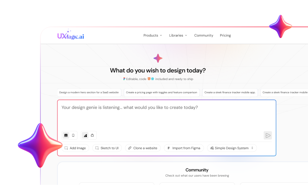
The UI looked perfect in the demo.
Then engineering opened the code.
Hardcoded hex values. Broken DOM structure. Zero accessibility. Nothing mapped to your design system.
This is the uncomfortable truth about AI-generated UI: It’s optimized to look right, not to work right.
And if you’re evaluating AI based on visuals alone, you’re measuring the wrong thing.
Why Most AI UI Quality Fails in Production Workflows
AI UI doesn’t fail because it’s “bad.”
It fails because it’s structurally disconnected.
The Danger of Context Amnesia and Token Drift
You generate Screen 1 → everything aligns.
Screen 3 → new colors, new spacing, new layout.
That’s context amnesia.
Why it happens:
- Limited context windows
- No persistent system memory
- Heuristic reconstruction instead of referencing a source of truth
What it causes:
- Token drift (colors, spacing, typography change randomly)
- Broken navigation patterns
- Inconsistent multi-screen flows
If your AI can’t maintain state, it can’t maintain product integrity.
The Frankenstein Handoff Problem
This is where AI-generated UI actually breaks teams.
What AI gives you:
- Inline styles
- Hardcoded hex values
- Disconnected components
What engineers need:
- CSS variables
- Token-based systems
- Reusable components
So instead of speeding things up, you get:
- Full frontend rewrites
- Bloated codebases
- Delayed releases
This is the handoff tax.
And it kills ROI.
Accessibility Debt: The Silent Killer
Most AI-generated UI fails accessibility instantly.
Common issues:
- 12px text
- 2.5:1 contrast ratios (fails WCAG)
- No ARIA roles
- No keyboard focus states
Why?
Because AI is trained on the internet and the internet is not accessible.
If you’re not enforcing constraints, you’re shipping liability.
The Vibe Coding Illusion vs Real Product Architecture
AI is great at:
- Happy paths
- Clean dashboards
- Simple forms
AI breaks at:
- Error states
- Role-based permissions
- Complex data flows
Because real products aren’t screens.
They’re systems.
If your workflow treats UI like isolated artboards, your product will collapse under real usage.
Evaluating AI Design Output: Ideation Tools vs Production Systems
Not all AI tools are solving the same problem.
And treating them the same is where teams get burned.
Visual Exploration: The Limits of Galileo and Uizard
These tools are good for:
- Fast ideation
- Stakeholder demos
- Early concept validation
They output:
- Static visuals
- Unlinked components
- No token binding
Which means: They’re not meant for production.
They’re meant for thinking, not shipping.
Logic-First Generation: How UXMagic Enforces Structure
Production-grade tools flip the model.
Instead of generating pixels, they:
- Assemble components
- Bind to design tokens
- Maintain flow-level consistency
This is where UXMagic fits:
- Flow Mode → locks layout anchors across screens
- Component assembly → prevents token drift
- Structured output → aligns with real code
It’s not trying to “design better.”
It’s trying to make sure your design doesn’t break in production.
If you’re still struggling with inconsistency, this is exactly what [enforce multi-screen design system consistency] workflows are built to solve.
A Professional Workflow for AI-Generated SaaS Dashboards
If you’re still prompting screens one by one, you’re doing it wrong.
You need a system.
Phase 1: Context Engineering (Not Prompt Engineering)
Stop writing longer prompts.
Start building better constraints.
Before generation:
- Define a Canonical Project State
- Map design tokens (not hex values)
- Define state matrices (hover, error, empty, etc.)
- Establish accessibility rules
This is the shift toward [context engineering over prompt engineering].
Without this, AI will improvise and improvisation creates debt.
Phase 2: Flow-First Generation (Not Screen-First)
Don’t generate screens.
Generate flows.
Example:
- Input Email → Check Inbox → Reset Password → Success
This ensures:
- Logical continuity
- Consistent navigation
- Proper state handling
If you’re still designing isolated screens, you’re stuck in a dead-end workflow. This is why teams are shifting toward [flow-based design vs static screens].
Phase 3: Sectional Editing and Anchor Locking
Never regenerate everything.
Instead:
- Lock headers, sidebars, layout grids
- Edit only the content zone
This prevents:
- Context amnesia
- Layout drift
- System inconsistency
UXMagic’s Flow Mode exists specifically for this—locking structure so iteration doesn’t break your system.
Phase 4: Design QA Before Handoff
This is non-negotiable.
Audit for:
- Token violations (no raw hex values)
- Accessibility (4.5:1 contrast, ARIA roles)
- Typography minimums (16px baseline)
If you skip this, engineering will catch it—and fix it.
Slowly.
Phase 5: Structured Code Export
The final output should not be:
- PNGs
- Figma files
- Redlines
It should be:
- Semantic React/HTML
- Token-bound styles
- Component-based architecture
This is how you eliminate the handoff tax.
Is AI UI Good Enough for Real-World Development?
Yes.
But only under strict conditions.
AI UI is production-ready only if:
- It binds to real design tokens
- It maintains multi-screen consistency
- It passes accessibility constraints
- It outputs structured, usable code
If not?
It’s just a demo.
AI didn’t lower the bar for UI quality. It exposed how fragile your system is. Because when generation becomes instant, the only thing that matters is what holds up after.
Stop evaluating AI by how good it looks.
Start evaluating it by how little your engineers have to fix.