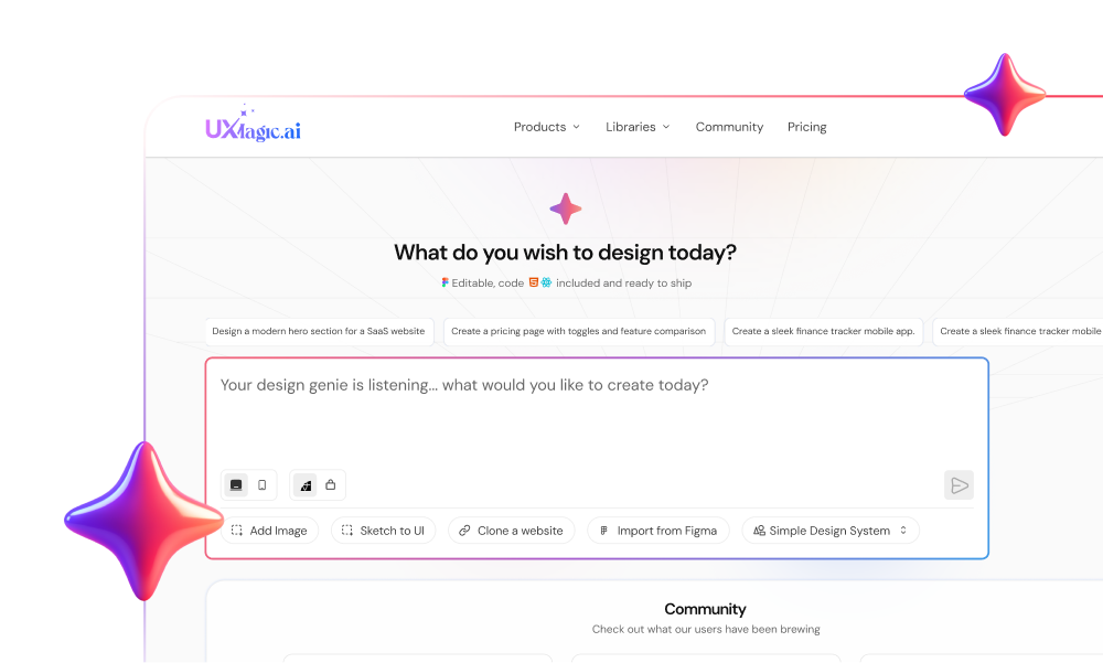
Most software layouts fail not because designers lack visual taste, but because static grid rules break the moment dynamic data enters production. Spending hours manually adjusting nested auto-layout frames and spatial gutters in a design tool indicates a structural workflow failure, not a skill gap. When responsive breakpoints disintegrate visual hierarchy, product teams waste sprint cycles fixing padding instead of shipping features.
What is UI layout design, briefly: it's the discipline of arranging interface elements - buttons, text, images, containers so users can scan a screen, understand what matters, and act without friction. That's the plain-language version. Everything below assumes you already know what alignment and hierarchy are and gets into the operational system: managing dynamic auto-layout frames, spatial token scales, and responsive breakpoint collapses without breaking your design system's logic.
Strict adherence to traditional graphic design grids can actively work against modern SaaS user experiences. Print layouts rely on static visual balance; digital interfaces need dynamic spatial relationships that prioritize cognitive density over geometric symmetry.
Quick Reference
| Principle | Purpose |
|---|---|
| Grid system | Creates alignment and structural consistency |
| Spacing tokens | Maintains predictable, mathematical rhythm |
| Proximity | Signals functional relationships between elements |
| Hierarchy | Guides attention to what matters first |
| Responsive rules | Prevents layout breakage across viewports |
Tactical Execution of UI Layout Design Principles
Visual Hierarchy: Establishing Visual Anchors and Focal Zones
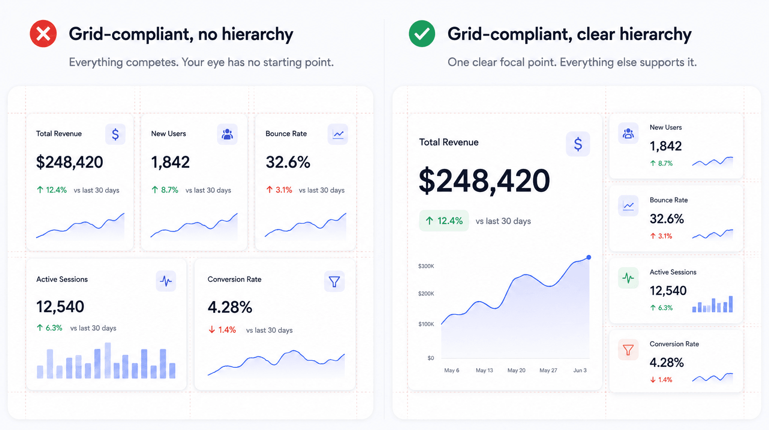
The 8pt grid system is often used as a substitute for visual hierarchy, and that substitution tends to fail. Designers frequently lean on strict 8pt spatial multiples to validate a composition that otherwise fails to communicate priority. An interface can adhere perfectly to an 8pt token system while remaining hard to read if visual dominance, typographic contrast, and focal points are mismanaged. Spatial consistency provides structural order - it doesn't replace hierarchy on its own.
Grid Systems, Margins, and Gutters: Defining Spatial Frameworks
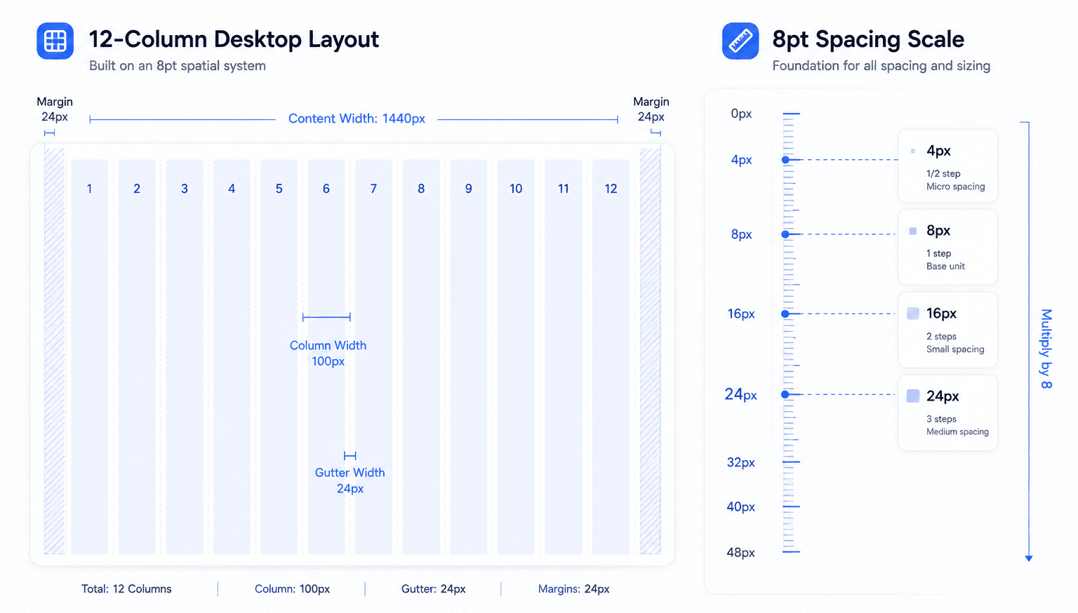
A grid establishes structural consistency, spatial alignment, and visual rhythm across screens - standardized column widths, margins, and gutters that simplify front-end handoff and let interfaces scale across display resolutions. That's the mechanical foundation everything else in this guide sits on top of.
Proximity and Alignment: Organizing Interfaces for Low Cognitive Load
Proximity is critical because spatial distance directly communicates functional relationships between components. Grouping related controls closely while separating distinct sections with white space lets users process interface structure instantly, without reading every label. Marketing wants an expressive asymmetric hero layout, but front-end engineering claims it violates the 8pt token structure that tension is usually a proximity problem in disguise, not a genuine grid violation.
Implementing Spatial Tokens and Responsive Breakpoint Rules
Standardizing Spatial Rhythm: The 8pt Token Scale
Design systems provide official spacing tokens, but team members keep introducing arbitrary pixel values like 13px or 21px in production anyway. Standardize padding and margins on a mathematical 8pt scale - 4px, 8px, 16px, 24px across every component library, and enforce it, because an unenforced token system is just a suggestion.
Asymmetric Layouts vs. Rigid Grid Symmetry
Symmetrical layouts can create passive interfaces that lower SaaS conversions. Standard advice routinely recommends symmetrical balance for aesthetic harmony. In practice, symmetrical SaaS landing pages and dashboards often generate visual monotony, and user scanning behavior decays as a result. Asymmetrical layouts anchored by strong proximity and directional visual lines force the eye toward primary conversion targets instead, when the imbalance is intentional rather than accidental.
Common Layout Mistakes
A dedicated list of the failures that show up repeatedly across product teams:
- Too many containers. Nesting frame inside frame inside frame past what the content actually needs adds fragility - every extra wrapper is another place Auto Layout can break on variable content.
- Inconsistent spacing. Mixing tokenized values (8px, 16px) with arbitrary ones (13px, 21px) in the same file destroys the mathematical rhythm the token system exists to protect.
- Designing desktop-first without real constraints. Building a wide, comfortable desktop layout first and only later "making it responsive" almost guarantees a broken mobile collapse, since nothing was designed to flex from the start.
- Ignoring content length variation. Testing a layout only against short, tidy placeholder text hides the exact failure mode that surfaces the moment localized or dynamic content runs longer.
- Overusing symmetry. Defaulting to symmetrical balance because it looks tidy in a static mockup, even when the actual goal is directing attention toward one specific action.
Structural Pitfalls in Modern Product Interfaces
Over-Nested Container Layouts in Component Libraries
Figma Auto Layout breaks every time variable text length expands across localized viewports - a nested container built around English-length copy collapses the moment German or Finnish text runs 40% longer. This is exactly where preserving multi-screen spatial consistency matters: a layout tested against one language and one dataset isn't tested at all.
Multi-Column Layout Failures in Mobile Viewports
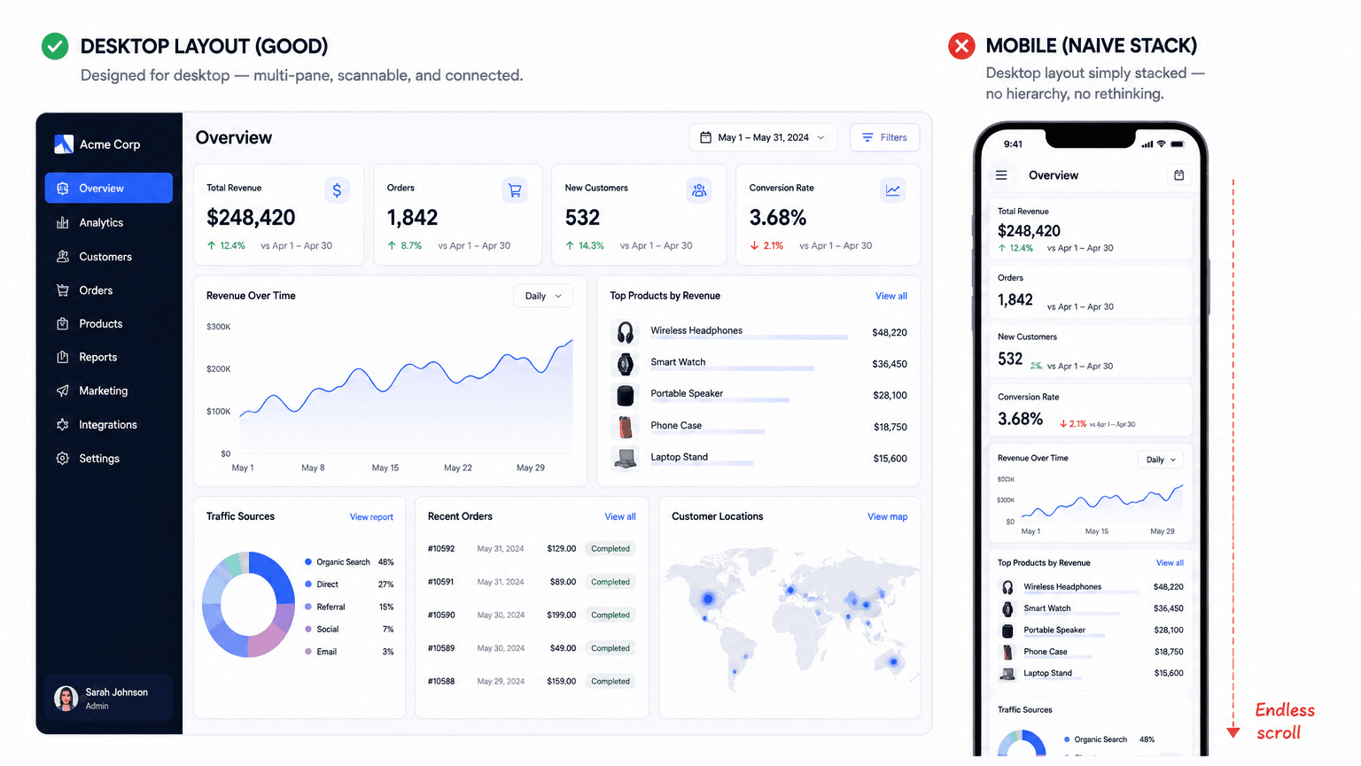
Mobile-first frameworks need real adaptation when applied to complex enterprise SaaS interfaces. Mobile-first design works well for consumer platforms. Applied without adjustment to enterprise SaaS, it can produce degraded desktop interfaces - high-density admin platforms need multi-pane desktop layouts displaying complex datasets simultaneously, and stacking components for a narrow viewport first risks destroying the spatial relationships desktop productivity actually depends on.
UI Layout Design vs. Related Disciplines
UI layout design vs. visual design. Layout design is the structural skeleton - grid, spacing, hierarchy, proximity. Visual design covers the surface layer on top of that skeleton - color, typography choices, iconography, imagery. A layout can be structurally sound and visually plain, or visually polished and structurally broken; the two need to work together, but they're solving different problems.
Grid systems vs. freeform layouts. A grid system enforces alignment and predictability, which is what most product UI needs for scalability and developer handoff. Freeform layouts (common in editorial or marketing contexts) prioritize expressive, one-off composition over reusability - reasonable for a single hero section, risky as a pattern for an entire application.
Auto Layout vs. traditional positioning. Traditional absolute positioning fixes elements at exact coordinates, which breaks the moment content length or viewport size changes. Auto Layout (or equivalent flexbox-style systems) defines relationships - "this element fills the remaining space," "this group hugs its content" so the layout adapts instead of shattering.
Responsive design principles for SaaS apps. Beyond generic responsive design, SaaS specifically needs to account for data density that varies wildly by user (an empty account vs. an account with years of data), role-based view differences, and the enterprise desktop use case that consumer-focused responsive advice often ignores.
The Five-Stage Layout Workflow
Stage 1 - Information Architecture and Priority Mapping.
Define primary CTAs, content tiers, and visual focus zones before touching an artboard. Non-technical founders routinely place primary CTA buttons in random visual zones, destroying the core hierarchy of the flow - this stage exists specifically to prevent that.
Stage 2 - Structural Grid Definition.
Establish responsive column frameworks, baseline margins, and gutter widths tailored to the actual target viewports, not a generic desktop default.
Stage 3 - Spatial Tokenization and Proximity Grouping.
Apply the standard spacing scale to group related functional components logically, closing the gap where arbitrary pixel values usually creep in.
Stage 4 - Responsive Breakpoint Adaptability.
Configure fluid constraints and auto-layout rules so components rearrange predictably across mobile, tablet, and desktop not just "shrink and hope."
Stage 5 - Component Token Handoff and Engineering Validation.
Verify that layout constraints, spatial values, and hierarchies map directly to front-end code components before calling it done.
Here's what breakdown at any single stage looks like in practice. An enterprise analytics dashboard built on a rigid, uniform grid - metric cards, complex charts, and dropdown filters sharing identical dimensions and padding - forces users to read every label sequentially just to locate key data, since nothing signals priority. The optimized version uses an asymmetrical hierarchy instead: high-contrast KPI cards in bold typography with generous padding, the main chart occupying two-thirds of the upper desktop grid, secondary filters grouped into a sidebar with tight proximity tokens. Generic prompt tools generate a non-editable raster image with garbled metric text and flattened containers here - output that can't be translated into real Figma auto-layout components at all.
A second case: a multi-step SaaS onboarding form spans the full desktop width, with field labels aligned far from their inputs and action buttons planted at opposite corners - an erratic eye-tracking path that fights the user at every step. The fix is a centered, single-column form with top-aligned labels and explicit vertical proximity, input containers constrained to 480px–600px, step indicators anchored at the top, and CTAs sticky at the bottom. Standard AI tools tend to output decorative wide multi-column inputs with floating labels that break entirely once collapsed onto a mobile viewport - exactly the mobile-first mismatch from the section above.
Automating Production-Ready Layout Generation
Manual auto-layout frame configuration in design tools is becoming a genuinely automatable skill, worth saying plainly. Constructing multi-layered auto-layout containers by hand can consume up to 40% of a UI designer's tactical output. Measuring spatial gutters, setting padding tokens, configuring hug-versus-fill frame behavior - these are mechanical execution steps, not design judgment.
Product designers routinely lose sprint hours to manually configuring nested container frames and adjusting alignment constraints one screen at a time. Converting natural language directly into structured layouts with pre-configured auto-layout rules, grid margins, and spatial tokens already applied removes that manual overhead at the source, rather than leaving it as a cleanup pass after the fact.
Maintaining consistent margins, spatial tokens, and hierarchy across an entire multi-screen journey is genuinely hard to do by hand - Flow Mode enforces the same unified spatial system and component placement rules across every screen generated in a sequence, protecting design system integrity instead of letting it drift screen five to screen twelve. Rather than manually resizing artboards to verify how a layout behaves at each breakpoint, instant responsive stress-testing generates the desktop, tablet, and mobile variations directly, so the mobile-collapse failure mode from earlier gets caught before handoff instead of after a user reports it.
Generating Your Spatial Token System With UXMagic's Style Guide Generator
Every principle in this guide - the 8pt scale, proximity grouping, hierarchy assumes a token system already exists somewhere your whole team can reference. In practice, most teams never formally define one; they just accumulate whatever values individual designers happen to use, which is exactly how 13px and 21px sneak into production alongside the "official" 8px and 16px.
UXMagic's Style Guide Generator generates that foundation directly - colors, typography, spacing, and components from a text prompt, a screenshot, or a URL, rather than requiring someone to manually document tokens after the fact. The output isn't just a color palette; it includes real spacing and layout system logic, so the spatial rhythm this guide argues for gets defined once and enforced everywhere, instead of living as a convention people forget to follow.
Two details matter most for teams scaling past a single designer. First, the generated system enforces cross-consistency automatically the same spacing and typography rules apply whether a new screen comes from Flow Mode, a fresh prompt, or an imported Figma file, closing the exact drift problem covered in the responsive breakpoint section above. Second, if a design system already exists, UXMagic can import your existing Figma styles and extend or regenerate the style guide around it, rather than forcing a rebuild from zero - genuinely useful for a rebrand or redesign project where the goal is evolving the token system, not replacing it wholesale.
Pre-Ship Layout Checklist
Run every layout against this before it reaches engineering:
☐ Does every section have a clear, singular purpose?
☐ Are all spacing values tokenized (no arbitrary pixel values)?
☐ Does content overflow correctly with realistic, longer text?
☐ Does the layout hold up across mobile, tablet, and desktop breakpoints?
☐ Is there one clear visual anchor per screen, not several competing ones?
☐ Have you tested against localized or translated content length?
☐ Can developers reproduce the spacing and structure without guessing?
Related guides
- Dashboard UI Design: Examples, Patterns, and Best Practices (2026)
- How to Export a Figma Design to Clean HTML (No Plugins Needed)
- Form UX That Actually Converts: The Field-Level Playbook
- Wireframe Builder Guide: How to Create Production-Aligned UI Flows Without Design Skills
- Mobile App Design: The Complete 2026 Architectural Guide
- Sketch to Prototype: The AI Workflow From Napkin Drawing to Interactive UI
- When You Should Not Use AI for Design
- What Is UX Design in 2026? A Practical Guide for Shipping Faster
- Why AI Is Not Replacing UX Designers
- AI Design Myths Designers Still Believe
Generate Production-Ready Layouts Faster
Stop manually configuring auto-layout variations. Create spatially consistent, responsive UI layouts from a single prompt with UXMagic.