If you just spent the last three hours manually adjusting pixel padding and renaming nested layers in Figma, you are not practicing UX design, you are doing digital data entry. The definition of what is UX design has changed faster than most bootcamps admit.
In 2026, your value isn’t how fast you can push pixels. It’s how efficiently you can architect usable systems with AI enforcing layout constraints while you make the real decisions.
Most guides still describe UX like it’s 2012. Product teams today don’t need sticky notes, they need interfaces that survive developer handoff by Friday.
What Actually Is UX Design in 2026?
UX design is no longer the craft of drawing wireframes. It’s the discipline of structuring user journeys so products become usable faster and fail less often.
Most legacy definitions focus on empathy exercises and persona workshops. That misses the real job. Modern UX is:
- defining information architecture
- reducing cognitive load
- enforcing usability heuristics
- accelerating Time-to-Value (TTV)
- preventing churn in the zero-data state
The shift is simple: designers moved from interface creators to constraint editors.
AI didn’t remove UX. It removed the manual drafting layer between ideas and testable interfaces. If your workflow still starts with blank Figma frames, you’re working slower than necessary. This is exactly why teams now rely on structured prompting workflows instead of sketch-first layouts (explained in [How Designers Actually Use AI in Real Projects](https://uxmagic.ai/blog/ai-in-ux-design-workflow)
UX vs. UI Design: The Critical Difference
UX design structures behavior. UI design shapes appearance.
Think architecture vs interior decoration:
| UX Design | UI Design |
|---|---|
| Defines user journey mapping | Defines typography and colors |
| Reduces friction hotspots | Styles buttons and components |
| Organises information architecture | Adjusts spacing and layout rhythm |
| Controls onboarding sequence | Controls visual hierarchy |
| Optimizes activation metrics | Optimizes aesthetics |
A dashboard can look beautiful and still fail UX if users don’t know what to click first.
Most beginners optimize UI too early. That’s backwards. Structure always comes before polish.
The Core Principles of User Experience
Usability and Managing Cognitive Load
Usability means users can complete tasks without confusion.
The fastest way to destroy usability is feature density. Stakeholders love dashboards packed with charts. Users bounce from them.
Miller’s Law reminds us working memory handles about 7 ± 2 elements. Ignore that and your interface becomes noise.
Instead:
- prioritize one primary action per screen
- reduce decision branches
- sequence tasks logically
- design onboarding before analytics views
Good UX minimizes thinking. It doesn’t maximize information.
Accessibility and Inclusive Design
Accessibility isn’t compliance theater. It’s retention strategy.
AI-generated layouts frequently break contrast ratios and container constraints unless guided correctly. Designers who treat accessibility as optional end up paying the verification tax later.
Practical accessibility means:
- readable typography scales
- predictable navigation patterns
- responsive layouts that respect constraints
- contrast-safe UI tokens
If you're prompting AI layouts, accessibility must be explicit in your constraints (see Prompting for Accessibility: https://uxmagic.ai/blog/prompting-ai-wcag-22-accessible-ui).
Consistency and Token-Based Design Systems
Consistency is what makes interfaces feel trustworthy.
Token drift destroys that trust fast:
- button radii change between screens
- hex values shift subtly
- typography scales break mid-flow
Manual enforcement doesn’t scale. Systems enforcement does.
Modern teams rely on flow-aware generation workflows instead of screen-by-screen editing. That’s why structured prompting approaches outperform isolated layout generators (explained in Real Prompts We Use: https://uxmagic.ai/blog/production-ready-ai-design-prompts-saas).
The Modern UX Design Process (Traditional vs. AI-Assisted Workflow)
User Research and Problem Synthesis
Traditional UX research often meant weeks of persona drafting and affinity mapping.
Modern workflows prioritize extracting Jobs-to-Be-Done from:
- support tickets
- user interviews
- onboarding analytics
- sales objections
The goal is decision clarity, not research volume.
Analysis paralysis isn’t insight. It’s delay.
Teams now synthesize feedback faster so they can prototype earlier and validate with real users, not synthetic personas generated by LLMs.
AI accelerates synthesis. Humans still validate outcomes.
Information Architecture and Beating the Blank Page
Blank canvas paralysis wastes more time than any other stage.
Most designers don’t struggle with ideas. They struggle with layout starting points.
Legacy workflow:
- sketch boxes
- redraw in Figma
- rebuild auto-layout
- iterate manually
Modern workflow:
- define screen intent
- specify required components
- generate structural layout instantly
Component-aware tools like UXMagic generate editable nodes compatible with real layout logic instead of static concept art. That eliminates the “vibe coding” trap described in Blank Canvas Syndrome: https://uxmagic.ai/blog/blank-canvas-syndrome-ai-ux-workflow
The difference is structural generation vs visual guessing.
Prototyping and Flow Generation
Traditional prototyping breaks at scale.
Five screens become fifteen. Fifteen become forty. Token drift begins.
Flow-aware generation solves that by enforcing consistency across:
- typography
- spacing
- component hierarchy
- interaction logic
UXMagic’s Flow Mode locks tokens across entire journeys instead of individual frames. That prevents the context window degradation common in generic generative UI tools.
Consistency stops being manual memory. It becomes infrastructure.
Usability Testing and Iteration
Iteration used to mean redrawing screens after stakeholder comments.
Now it means editing components directly.
Section-level agentic editing allows designers to:
- modify a pricing card
- restructure a settings panel
- add a permissions table
without destroying the surrounding layout.
This shifts UX work from drafting to curating.
The designer becomes the constraint enforcer inside a rapid generation loop. That’s the essence of human-in-the-loop design workflows: https://uxmagic.ai/blog/human-in-the-loop-ai-design-workflow
The Biggest UX Mistakes SaaS Startups Make
Ignoring the “Empty State” Onboarding
Most dashboards are designed for imaginary users with full datasets.
Real users log in and see nothing.
That creates:
- confusion
- friction
- abandonment
- churn
Good UX designs the zero-data state first.
Effective empty states include:
- checklist onboarding steps
- primary CTAs
- contextual tooltips
- progress indicators
Empty-state UX reduces Time-to-Value immediately.
Breaking Familiar UI Patterns for “Creativity”
Novel layouts impress stakeholders. They confuse users.
Users expect:
- navigation in predictable positions
- consistent button hierarchy
- recognizable interaction patterns
Breaking conventions increases cognitive load without increasing clarity.
Originality isn’t innovation. Clarity is.
Overwhelming the User with Feature-Creep
Stakeholders love putting everything on one screen.
That destroys usability.
A common scenario:
CEO requests analytics, billing, permissions, and pricing summaries on the same dashboard before a demo.
Manual redesign breaks layout systems under pressure.
Modern workflows restructure sections instantly using component-aware editing instead of rebuilding entire grids.
UX isn’t saying “no” to features. It’s sequencing them correctly.
How to Start Applying UX Principles Today
Start with structure, not visuals.
Practical steps:
- define the zero-state experience first
- map user journeys before screens
- prompt constraints instead of styling guesses
- enforce tokens across flows
- validate with humans, not synthetic users
Then generate layouts that reflect those constraints.
This is where component-aware systems outperform visual generators. UXMagic produces editable interface logic rather than flattened concept art, which keeps prototypes usable during developer handoff.
Stop treating UX like illustration. Treat it like architecture.
Prediction: In the next 12 months, the designers who succeed won’t be the ones who draw faster, they’ll be the ones who define constraints clearly enough that machines can draw for them.
UX design in 2026 isn’t about drawing cleaner screens, it’s about defining clearer constraints. The teams moving fastest today aren’t pushing pixels manually; they’re generating structured layouts, enforcing consistency across flows, and validating decisions with real users instead of assumptions.
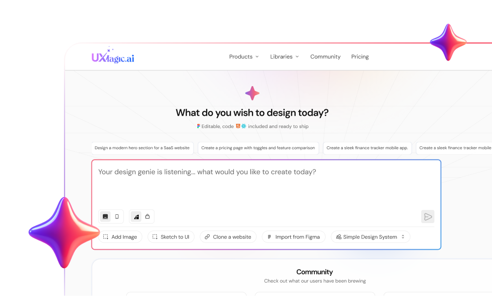
Stop Designing From Scratch
Generate structured, production-ready layouts instead of rebuilding grids manually. Try UXMagic free and create your first multi-screen flow in minutes.