AI Dashboard GeneratorBuilt for Real Data
See How AI GeneratesDashboards Instantly
Trusted by Designers and Developers
Faster than manual design
Responsive by default
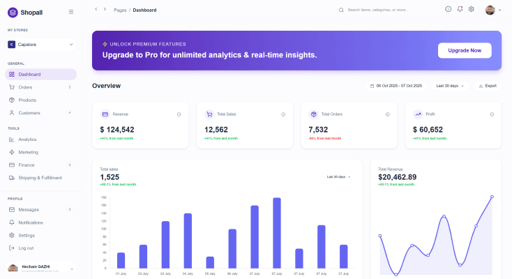
eCommerceAnalytics Dashboard
Design a premium light-mode eCommerce analytics dashboard called Shopall with clean white surfaces, rounded cards, and modern purple accents. Include KPI cards for Revenue, Sales, Orders, and Profit, sales analytics charts, a detailed orders table, and realistic business metrics. Use a left sidebar, refined spacing, strong hierarchy, and modern SaaS aesthetics inspired by Shopify, Stripe, and Linear. Ultra-detailed, production-ready, Pinterest-worthy dashboard design.
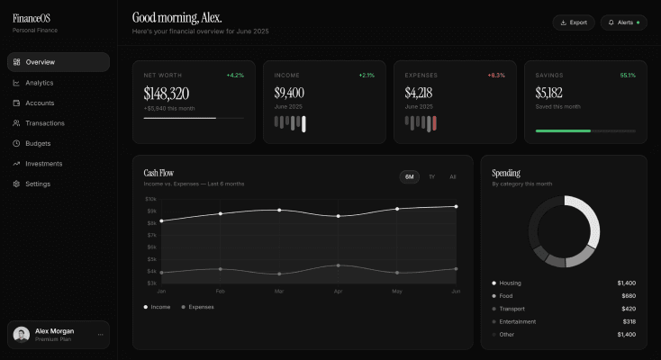
PersonalFinance Dashboard
Design a premium dark-mode FinanceOS dashboard with luxury fintech styling, elegant typography, and spacious layouts. Showcase Net Worth, Income, Expenses, Savings, cash flow analytics, spending insights, portfolio performance, transactions, and financial goals using realistic data, refined spacing, and subtle green/red indicators. Inspired by Apple, Linear, and modern wealth management platforms. Ultra-detailed, production-ready, Pinterest-worthy dashboard design.
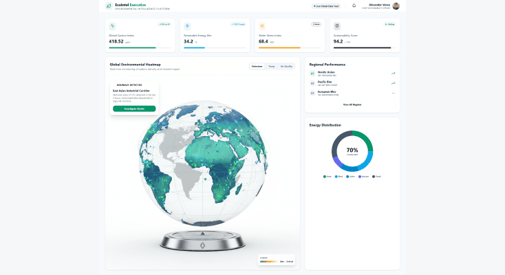
EnvironmentalIntelligence Dashboard
Design a premium light-mode sustainability intelligence dashboard tracking carbon emissions, renewable energy, climate indicators, air quality, and environmental impact. Include geographic maps, heatmaps, sustainability scorecards, energy analytics, and forecasting modules with realistic environmental data. Use clean layouts, elegant typography, strong visual hierarchy, and modern enterprise aesthetics. Ultra-detailed, executive-grade, Pinterest-worthy dashboard design.
HospitalityOperations Dashboard
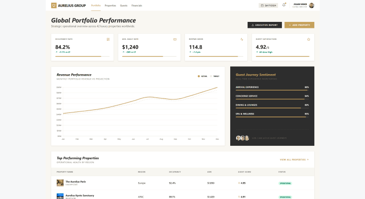
Design a premium light-mode hospitality dashboard for a luxury hotel group featuring guest satisfaction, occupancy rates, booking trends, revenue performance, concierge activity, and service analytics. Include elegant KPI cards, premium charts, guest journey insights, and property overview modules with realistic operational data. Use refined typography, luxury-inspired layouts, strong visual hierarchy, and world-class hospitality aesthetics. Ultra-detailed, executive-grade, Pinterest-worthy dashboard design.
How to create dashboards with UXMagic
Describe your dashboard
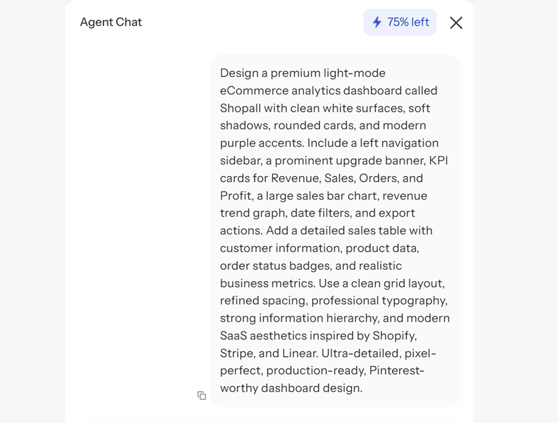
Tell UXMagic what you are building and what data it needs to show. Sales metrics, user analytics, financial reporting, operations tracking, whatever the use case, describe it in plain language.
Review the generated layout
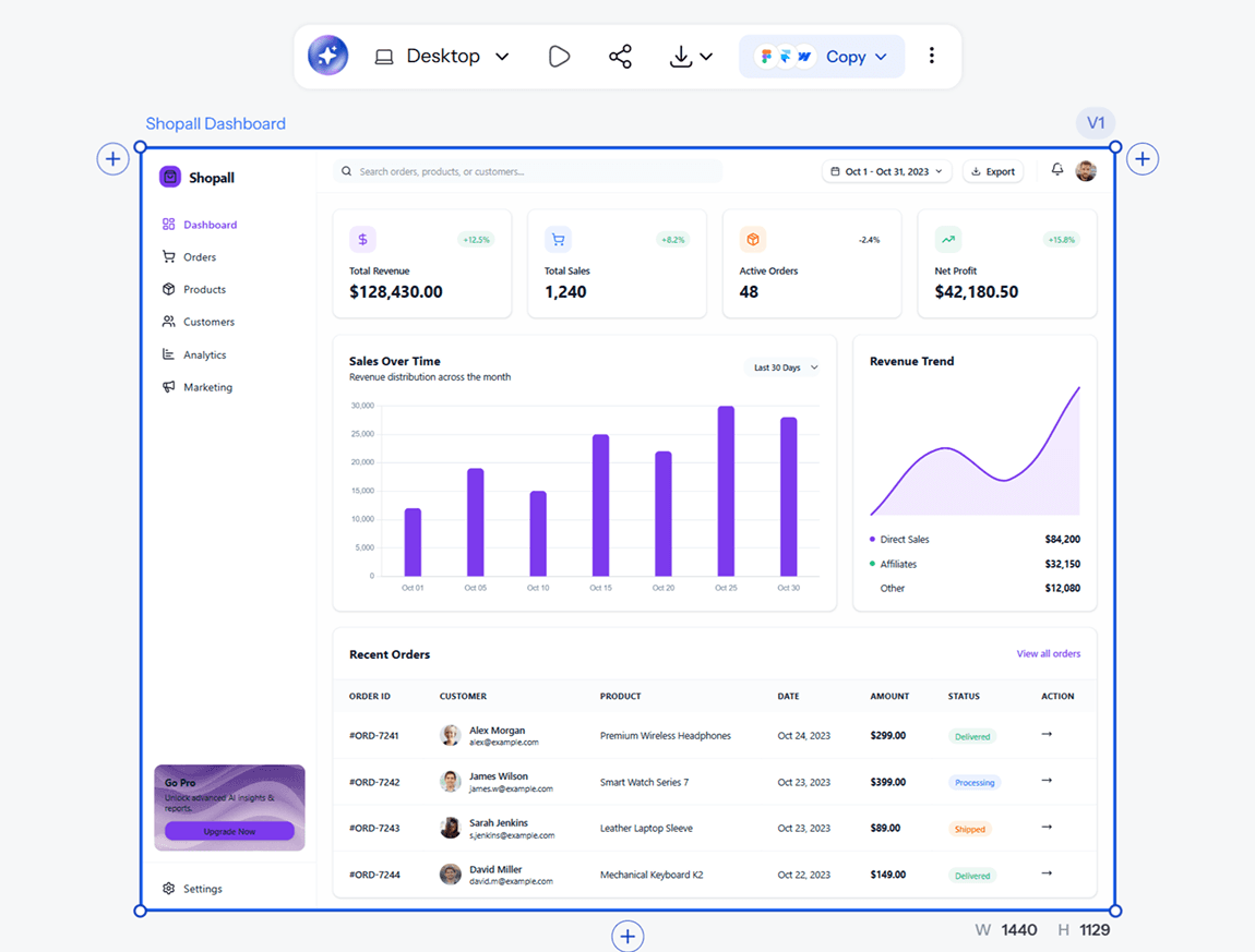
UXMagic builds the full dashboard with charts, KPI cards, tables, and navigation already structured around your data. Swap chart types, rearrange sections, or refine specific widgets with AI chat.
Export and build
Download your dashboard as an implementation-ready file, or hand it directly to a developer. No watermark, no extra steps standing between your design and shipping it.
Describe your dashboard
Tell UXMagic what you are building and what data it needs to show. Sales metrics, user analytics, financial reporting, operations tracking, whatever the use case, describe it in plain language.
Review the generated layout
UXMagic builds the full dashboard with charts, KPI cards, tables, and navigation already structured around your data. Swap chart types, rearrange sections, or refine specific widgets with AI chat.
Export and build
Download your dashboard as an implementation-ready file, or hand it directly to a developer. No watermark, no extra steps standing between your design and shipping it.
What you walk away with
A dashboard that handles real complexity
Dense data does not mean a messy layout. UXMagic structures information so the most important numbers are immediately visible, not competing for attention with everything else on the screen.
A dashboard you can actually build from
Every output comes with clean, structured files ready for development, not a static image that needs to be rebuilt from scratch before anyone can use it.
Room to adjust before you commit
Swap chart types, rearrange KPI cards, and refine the layout with AI chat until the structure actually matches how your team or your users need to read the data.
UXMagic vs Figma vs UXPilot vs Banani vs Uizard vs Google Stitch
A dashboard generator needs to do more than look good in a screenshot. Here is what actually matters:
| Feature | Figma (native AI) | UXPilot | Banani | Uizard | Google Stitch | UXMagic |
|---|---|---|---|---|---|---|
| AI prompt to dashboard | ||||||
| Built-in charts, KPIs, and tables | ||||||
| Works without a Figma account | ||||||
| Realistic sample data preview | ||||||
| Edit with natural language | ||||||
| Optimized for data-heavy layouts | ||||||
| Consistent structure across multi-screen dashboards | ||||||
| Export to Figma | ||||||
| Implementation-ready code export |
got questions?we have answers.
built by real people.remixed endlessly.
Be the first to publish something here