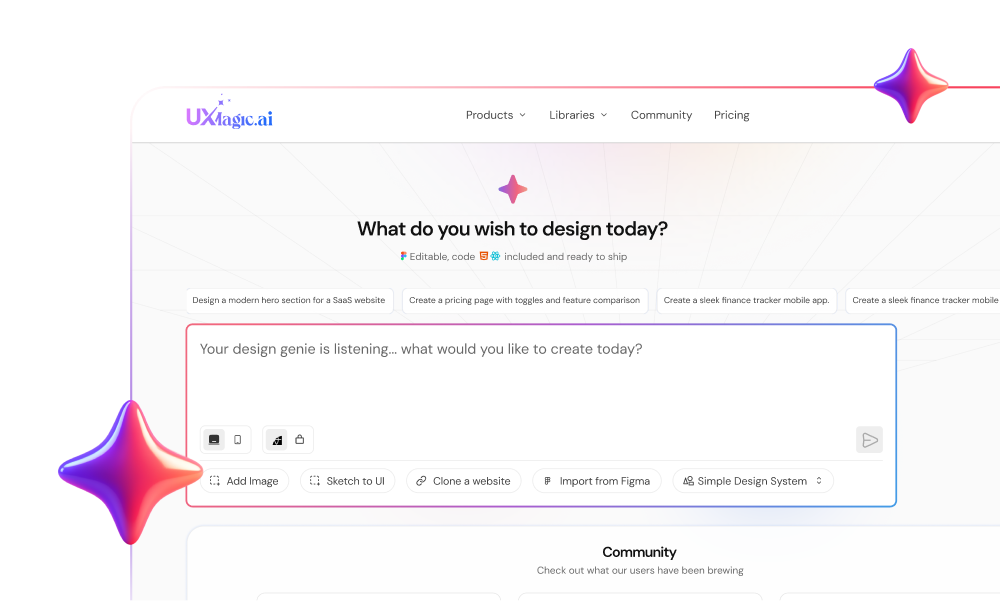
Most software interfaces don't suffer from missing features - they suffer because every element on the screen competes for attention at the exact same visual volume. When a SaaS application gives identical visual weight to a primary conversion button and a minor settings link, users experience real cognitive fatigue and are more likely to abandon the flow. Mastering visual hierarchy is about deliberately controlling where a user's eyes go first.
Visual hierarchy vs. visual design, quickly: visual design is how an interface looks - colors, type choices, imagery. Visual hierarchy is what a user notices first, second, and last. A screen can be visually polished and still have zero hierarchy if every element carries equal weight; the two need to work together, but they're solving different problems.
You already know that primary headlines need to be larger than body text. This isn't a Gestalt-theory primer. It's the practical specifications - saturation tiers, type scale limits, spatial grouping rules that separate a dashboard users can actually parse from one that just looks organized in a static mockup.
Quick Reference
| Element | Low Priority | High Priority |
|---|---|---|
| Size | Small, body-level text | Larger scale, clearly stepped up |
| Color | Muted gray, low saturation | High saturation, reserved for the one thing that matters |
| Spacing | Crowded, tight to neighbors | More isolation, generous whitespace |
| Weight | Regular | Bold, used sparingly |
Visual Hierarchy vs. Visual Design: What's the Difference?
Visual design is the surface layer - the specific colors, typography choices, iconography, and imagery a product uses. Visual hierarchy is the underlying structure that determines what a user's eyes land on first, second, and last, regardless of how attractive the individual elements are.
A related distinction worth naming: visual hierarchy vs. information hierarchy. Information hierarchy is the logical, content-level priority of what matters most (decided during content strategy or IA work). Visual hierarchy is how that priority actually gets expressed on screen through scale, color, and spacing. A product can get information hierarchy right in a spec doc and still fail visual hierarchy if the design doesn't express those priorities visually.
The Cognitive Science of Visual Weight: Pre-Attentive Processing
Color saturation can often override scale during early visual processing, which runs against a common assumption in UI advice. Many tutorials treat scale as the primary driver of visual attention. Research into pre-attentive visual processing suggests that saturation and high contrast tend to register very quickly - often before the typographic scale gets fully evaluated.
A small, highly saturated button can end up commanding more focal attention than a large heading styled in low-contrast gray. The practical takeaway for a design system: saturation tiers deserve at least as much deliberate planning as font-size decisions, not an afterthought applied after the type scale is already locked.
The 6 Core Principles of UI Visual Hierarchy
- Scale and Proportion: Managing Visual Rank
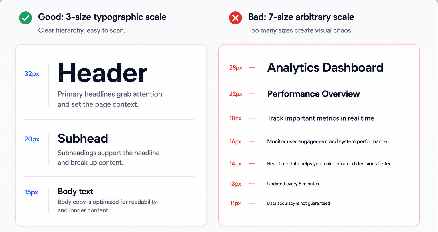
Restrict typographic hierarchies to a maximum of three distinct size tiers - a header around 32px, a subhead around 18–22px, body text around 14–16px. This establishes immediate rank order across text-heavy interface views without introducing the type-scale drift that comes from accumulating arbitrary sizes over time.
- Color Saturation and Contrast: The Fast-Processing Window
Reserve high color saturation strictly for primary CTAs, using moderate saturation for secondary actions and muted grays for tertiary copy. This three-tier system is what actually creates a clear attention hierarchy, rather than leaving every element competing at full intensity.
- Typographic Scale: Structuring Systemic Reading Order
Restrict bold treatments exclusively to primary section titles and active conversion button labels. Bold signals structural priority without requiring excessive size scaling - stacking both bold and oversized text on the same element is redundant emphasis, not stronger emphasis.
- Whitespace and Figure-Ground Spatial Isolation
Increase spatial margins around high-priority elements to create visual isolation. This elevates focus through figure-ground relationship shifts - an element surrounded by generous whitespace tends to read as more important than one crowded by neighbors, independent of its own size or color.
- Layout Positioning and the Top 40% Rule
Position critical conversion elements within the top 40% of the viewport, where the bulk of initial attention tends to land before a user scrolls. Placement alone does real hierarchy work before a user reads a single word.
- Proximity and Gestalt Grouping Architecture
Cluster related controls inside shared visual containers or distinct spatial boundaries. This reduces cognitive load by consolidating items into single mental units instead of forcing users to mentally group scattered controls themselves.
Scanning patterns are worth treating as secondary to deliberate visual weight placement, which runs against some common advice. Design articles routinely recommend structuring pages around rigid F-pattern or Z-pattern reading grids. In functional product design, natural reading patterns tend to dominate mainly when visual weight across the layout is fairly uniform - introduce one high-contrast focal point, and it can override the default scanning path, which means layout grid patterns are often secondary to intentional visual weight distribution, not the deciding factor.
Common Visual Hierarchy Failures in SaaS Interfaces
Product teams hit the same handful of failures repeatedly:
- The feature completeness trap. Product managers insist on placing every available feature on the main interface, turning a dashboard into a noisy visual grid where no single action stands out.
- Contrast fatigue. Designers over-saturate competing components - high-contrast badges, primary fills, accent borders everywhere which neutralizes visual emphasis across the entire screen instead of creating it.
- Type scale drift. Design files accumulate dozens of arbitrary font sizes over time, destroying the structural reading path between headers, labels, and supporting copy.
- Responsive breakpoint degradation. A layout with clean visual priority on desktop frequently collapses into a monotonous, unindented vertical stack on mobile.
- Ambiguous action hierarchy. Primary conversion CTAs, secondary filters, and destructive action triggers share identical border weights or fills, leading directly to user misclicks.
- Manual grid alignment overhead. Designers lose real production time manually adjusting Auto Layout padding, column gutters, and component containers by hand.
Dashboard usability often benefits from fairly aggressive information hiding, which runs against the instinct to show everything at once. Software teams frequently compromise usability trying to present all functional metrics simultaneously during a product demo. Effective dashboard architecture generally leans on progressive disclosure - hiding a meaningful share of tertiary data behind contextual hover states or secondary drill-down screens to preserve clean hierarchy on the primary view.
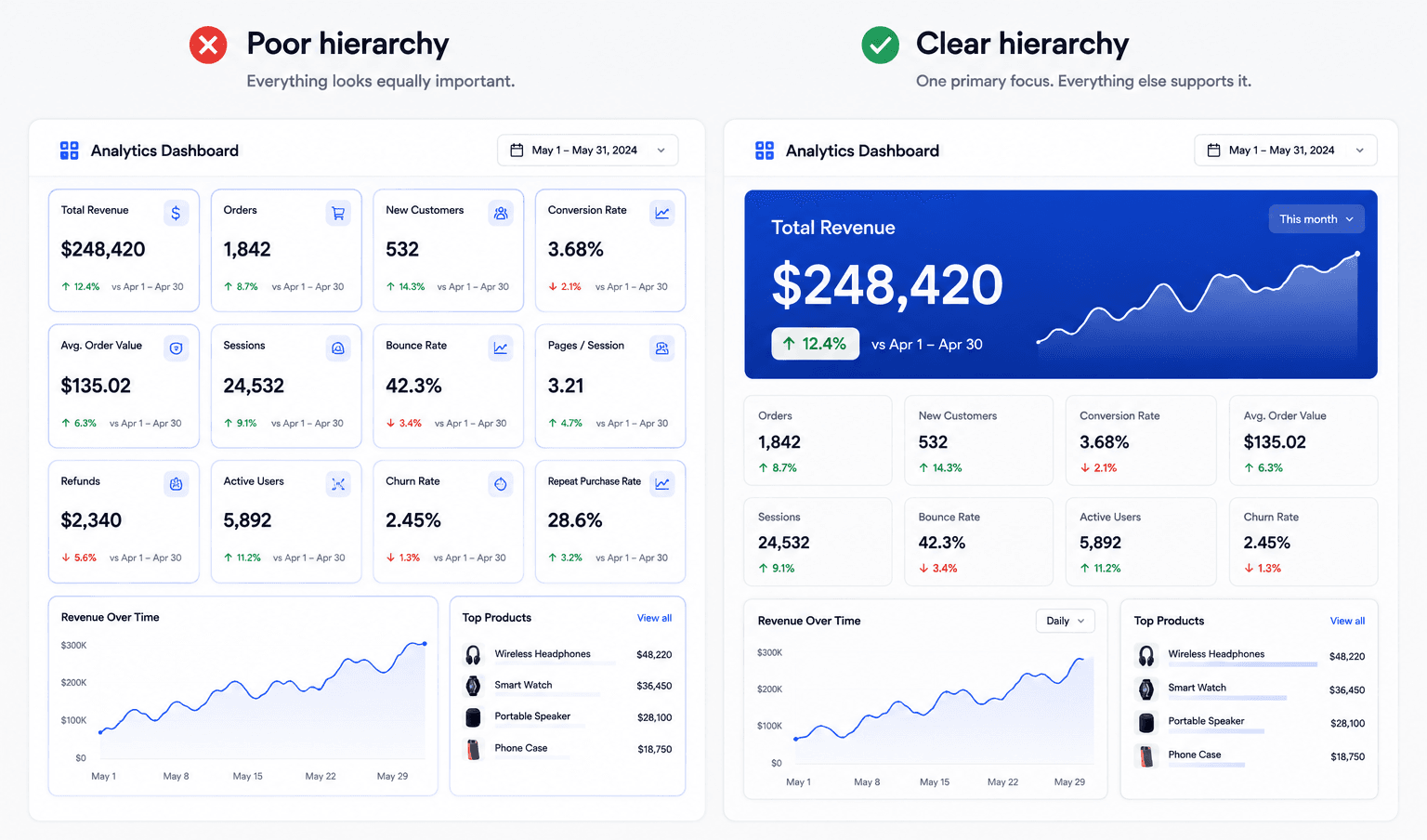
Scenario 1: B2B SaaS Analytics Dashboard. The unstructured version shows 12 identical metric cards with equal white backgrounds and bright blue borders, filter buttons and export options sharing identical font weights, and charts using bright saturated colors across every data series simultaneously - users tend to experience higher cognitive load here, which can delay time-to-insight and increase bounce rates. The optimized version scales a single hero KPI card to double width with a high-contrast fill, consolidates global controls into one secondary dropdown with low-contrast outline styling, and features one saturated brand data line against light gray secondary trends - teams generally see faster time-to-insight and better navigation efficiency as a result.
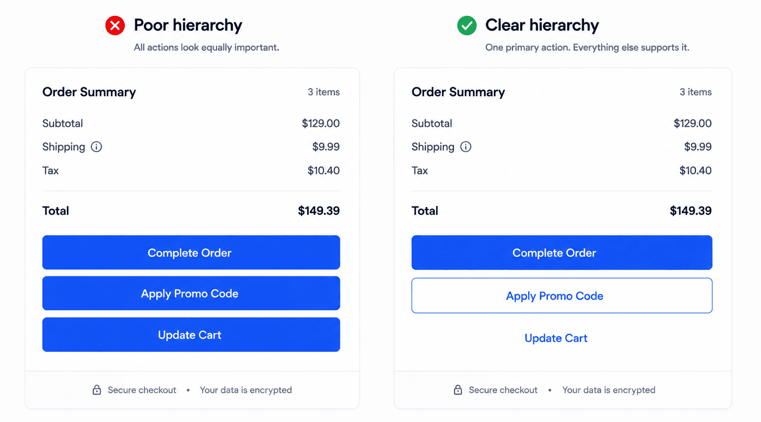
Scenario 2: Mobile E-Commerce Checkout Flow. The unstructured version gives "Complete Order," "Apply Promo Code," and "Update Cart" identical full-width solid button fills, with promo inputs and cart edits occupying prominent positions in the main scroll - this kind of setup tends to increase drop-off from competing visual targets and accidental promo clicks. The optimized version makes "Complete Order" the sole solid-fill button at full brand saturation, converting secondary actions to low-contrast outline buttons or simple text links - a change that has been associated with meaningful conversion improvements through streamlined CTA clarity alone, though the exact lift will vary by product and audience.
Where generic AI image generators fail here specifically: they tend to produce flat raster images rather than structured UI systems - unreadable sub-pixel typography, broken column alignment, arbitrary color variations, and no real distinction between an interactive button and a passive text label.
Step-by-Step Workflow: Structuring Action Priority in Product Flows
Phase 1 - Information architecture and decision mapping. Before drafting visual screens, categorize every component into three explicit tiers: Primary (the single core action or metric users must engage first - an onboarding activation button, the main revenue metric), Secondary (supporting controls - date filters, section subheads), and Tertiary (compliance or navigation context - footer links, metadata badges).
Phase 2 - Systematic application of core design properties. Apply the six properties above - scale, saturation, typographic weight, whitespace, grid placement, proximity to create real visual weight differentials across the screen.
Phase 3 - Spatial architecture and grid setup (how to build this in Figma). Structure the layout on a responsive 12-column grid with fixed gutter widths and strict vertical Auto Layout spacing. Keep desktop layout containers within roughly 80px–120px max-width bounds to prevent visual dispersion across large displays - this is the same Auto Layout discipline that keeps hierarchy from collapsing when content length changes.
Phase 4 - Practical hierarchy validation. Run the Squint Test - blur the finished screen and confirm only the primary CTA and headline remain clearly distinguishable. Follow with first-click usability testing, checking whether uninstructed users click the intended primary CTA quickly and without hesitation.
Manual component layout construction tends to be a genuinely slow part of this workflow when done entirely by hand. Designers often spend a significant share of early-stage wireframing time manually calculating padding values, configuring layout containers, and aligning grid frameworks. Generative UI engines can now produce mathematically balanced visual structures directly, shifting more of a designer's time toward strategic hierarchy validation instead of manual pixel placement.
During initial wireframing specifically, Prompt to UI converts natural language directly into structured, responsive layouts, applying the mathematical hierarchy rules from Phase 2 and 3 automatically - cutting down the manual Auto Layout configuration that otherwise eats a large share of early design time. Instead of hand-placing a 12-column grid and manually stepping through three saturation tiers, describing the hierarchy in a prompt gets the scale, spacing, and contrast rules applied at generation time, not fixed in a cleanup pass afterward.
The multi-screen version of this problem is separate but related: generic UI tools tend to produce inconsistent visual weights across sequential screens, so a hero KPI card that reads correctly on screen one loses saturation discipline by screen five. Flow Mode exists specifically to close that gap - generating the entire flow from one prompt instead of screen by screen, so nothing has the chance to drift between screens in the first place.
That consistency depends on a real token system sitting underneath it, not just good intentions. UXMagic's Style Guide Generator defines the actual saturation tiers, type scale, and spacing values once - as a real, reusable system and Flow Mode enforces those same tokens across every generated screen, from the first onboarding step through the most complex dashboard state. For teams with an existing brand system already locked in Figma, importing those styles directly keeps the hierarchy rules from this guide anchored to real brand tokens instead of a generic default.
Related guides
- UI Layout Design Principles: A Tactical Guide for Product Teams
- Dashboard UI Design: Examples, Patterns, and Best Practices (2026)
- Dark Mode UI Design: The Definitive Architectural Guide (2026)
- UI Color Palette Generators: 10 Tools That Actually Scale (2026)
- How to Design a Fintech App: UX Best Practices for 2026
- Form UX That Actually Converts: The Field-Level Playbook
- Landing Page Design Examples That Convert: The 2026 Strategy Guide
- B2B SaaS UI Design Trends in 2026: The Operational Shift
- What Is Glassmorphism? The Production CSS Guide for 2026
- State of AI in UI/UX Design 2026: What Actually Works in Production
Build Balanced UI Hierarchies Faster
Generate mathematically balanced layouts with consistent spacing, saturation, and visual hierarchy from a single prompt.