
TL;DR: The laws of UX are research-backed rules about how people move, decide, perceive and remember. The 14 below cover almost every layout decision you make, from button size (Fitts) to menu length (Hick) to how cards group content (Gestalt). Each section gives the origin, a UI example, the mistake teams make, and a one-line prompt you can use in an AI UI generator so the principle ends up in the design instead of in a review comment.
Most interface arguments are really arguments about human behaviour. "Should this be a dropdown or radio buttons?" is a question about decision time. "Why does nobody click the upgrade link?" is often a question about target size and position. The laws of UX give those debates a shared vocabulary and, more usefully, a way to predict the answer before you test it.
This guide is written for product teams: PMs, founders, designers and developers who make layout calls every week. We cover where each law came from, because several of them are routinely misquoted, then show what it looks like on a real screen and how to state it when you are prompting an AI design tool. If you are newer to the discipline, our explainer on UI vs UX and the practical guide to UX design are good primers.
The laws of UX at a glance
| Law | In one line | Where it bites most |
|---|---|---|
| Fitts's law | Big, close targets are faster to hit | Primary buttons, mobile tap areas |
| Hick's law | More choices, slower decisions | Menus, pricing tables, settings |
| Jakob's law | Users expect your product to work like others | Navigation, checkout, forms |
| Miller's law | Working memory is small, so chunk | Long forms, codes, onboarding |
| Tesler's law | Some complexity cannot be removed, only moved | Configuration, pricing, admin tools |
| Doherty threshold | Responses under ~400ms keep people engaged | Search, filters, AI generation |
| Aesthetic-usability effect | Attractive UI is perceived as easier | First impressions, trials |
| Peak-end rule | People remember the peak and the ending | Onboarding, checkout, errors |
| Von Restorff effect | The item that differs gets remembered | CTAs, pricing highlights |
| Serial position effect | First and last items are recalled best | Nav bars, lists, tab bars |
| Postel's law | Accept messy input, output clean results | Forms, search, imports |
| Pareto principle | ~80% of use comes from ~20% of features | Roadmaps, dashboards, nav |
| Law of proximity | Close items look related | Forms, cards, spacing |
| Law of similarity / common region | Matching or boxed items look grouped | Buttons, tags, card layouts |
The rest of this guide takes each law in turn. The Gestalt principles come last because they underpin most of the spacing and grouping advice in our guide to UI layout design principles.
Laws about moving and acting
- Fitts's law
Definition. The time it takes to reach a target depends on the distance to it and its size. Close, large targets are fast; small, distant ones are slow and error-prone.
Origin. Psychologist Paul Fitts published the finding in 1954 in the Journal of Experimental Psychology, based on experiments where participants tapped between two targets of varying width and separation. The relationship is logarithmic, so doubling a button's size does not halve the time, but tiny targets are disproportionately costly.
UI example. A mobile checkout with a full-width "Pay now" button pinned to the bottom of the screen, within thumb reach. On desktop, context menus that open at the cursor and toolbar items at screen edges (which act as infinitely deep targets) are both Fitts's law at work.
Mistake to avoid. Making the destructive action as large and as close as the primary one. Fitts's law cuts both ways: if "Delete account" sits right next to "Save" at the same size, people will hit it by accident. Size and proximity should follow importance and safety, not symmetry. Pair this with the tap-target guidance in our accessibility heuristics checklist, since small targets are also an accessibility failure.
Prompt tip. "Make the primary action full-width at the bottom on mobile, at least 44px tall, and keep destructive actions smaller and separated."
- Hick's law (Hick-Hyman law)
Definition. The more options a person has to choose from, the longer the decision takes. For equally likely options, decision time grows roughly with the logarithm of the number of choices.
Origin. British psychologist William Edmund Hick (1952) and American psychologist Ray Hyman (1953) ran separate reaction-time experiments that showed the same relationship, which is why it is often called the Hick-Hyman law. The original studies measured simple stimulus-response choices, not browsing a web page, so treat it as directional rather than a formula you can plug a nav bar into.
UI example. A pricing page with three plans and one visually recommended option, rather than six plans and a feature matrix above the fold. Onboarding that asks one question per step instead of a twelve-field profile form.
Mistake to avoid. Hiding everything behind "More" until the product becomes a scavenger hunt. Hick's law applies to unfamiliar, equally weighted choices. A long list sorted alphabetically (like a country picker) is fast because users search rather than compare. Reduce competing choices, not every choice. Our form UX design guide covers when to split a form into steps and when that just adds clicks.
Prompt tip. "Show at most three plan options with one marked recommended; move secondary settings into an 'Advanced' section."
Laws about expectations and complexity
- Jakob's law
Definition. Users spend most of their time on other sites and apps, so they expect yours to work the same way as the ones they already know.
Origin. Jakob Nielsen stated it in his July 2000 Alertbox column, The End of Web Design, where he called it Jakob's Law of the Internet User Experience. His point was that conventions, not originality, make a site usable.
UI example. The logo in the top-left links home. The cart sits top-right. A search field has a magnifying glass. Settings live behind an avatar menu. None of these are laws of nature; they are learned conventions that users now rely on. Pattern libraries like the one we cover in our Mobbin review exist largely because of Jakob's law.
Mistake to avoid. Treating Jakob's law as "never innovate". The cost of an unfamiliar pattern is learning time, so a new pattern needs to be clearly better and should be introduced gradually. A second mistake is copying a competitor's layout without their context. Match the convention, not the whole screen.
Prompt tip. "Use standard SaaS conventions: logo top-left, primary nav in a left sidebar, account menu top-right, search at the top of the content area."
- Tesler's law (law of conservation of complexity)
Definition. Every system has a certain amount of complexity that cannot be removed. The only question is whether the system absorbs it or the user does.
Origin. Larry Tesler articulated it while working on interaction design at Xerox PARC in the mid-1980s. It reached a wide design audience through an interview in Dan Saffer's book Designing for Interaction, where Tesler argued that an engineer should spend an extra week reducing complexity rather than make millions of users spend an extra minute.
UI example. Address autocomplete that fills city, postcode and country from one field. Timezone detected from the browser instead of a 400-item dropdown. Smart defaults in a report builder that let most people skip configuration entirely.
Mistake to avoid. Over-simplifying until the complexity reappears somewhere worse, such as in support tickets or in a confusing "magic" behaviour that users cannot control. Hide complexity behind good defaults, but keep an escape hatch for the 10% of users who need it. This trade-off shows up in almost every principle in our list of design principles for scalable SaaS products.
Prompt tip. "Pre-fill everything we can infer (timezone, currency, company from email domain) and put overrides in a collapsed section."
- Pareto principle
Definition. Roughly 80% of effects come from 20% of causes. In products, a small share of features usually accounts for most of the usage.
Origin. Economist Vilfredo Pareto observed in the 1890s that around 80% of land in Italy was owned by about 20% of the population. Quality-management pioneer Joseph Juran later generalised the idea and named it after Pareto. The 80/20 split is a rule of thumb, not a constant; real ratios vary.
UI example. A dashboard whose top row shows the three metrics everyone checks daily, with deeper reports one click away. A mobile tab bar that holds the four most-used destinations and nothing else. Our dashboard UI design guide is essentially a long application of this idea.
Mistake to avoid. Deleting the "80% of features" that only 20% of users need. Those power features are often what your highest-value customers pay for. Pareto tells you what to put up front, not what to remove.
Prompt tip. "Put the three most-used actions in the main view; move everything else into a secondary menu, but keep it reachable."
- Postel's law (robustness principle)
Definition. Be liberal in what you accept and conservative in what you send. In UX terms: accept messy, varied input from people, and return clean, consistent output.
Origin. Internet pioneer Jon Postel wrote it into the January 1980 TCP specification, RFC 761, as "be conservative in what you do, be liberal in what you accept from others." It was a networking rule long before it was a design rule.
UI example. A phone field that accepts spaces, dashes and brackets and formats the number itself. A date field that understands "tomorrow" or "12/10". A search that tolerates typos. Import flows that take CSV, XLSX or a pasted table.
Mistake to avoid. Accepting anything silently. Being liberal with input still means telling people what you understood ("We read this as 12 October") so misinterpretation does not become a data bug. Write that confirmation carefully; our guide to UX microcopy that converts covers helper and error text.
Prompt tip. "Inputs should accept any reasonable format and show the normalised value back, with inline validation instead of errors on submit."
Laws about speed and feeling
- Doherty threshold
Definition. Productivity rises sharply when a system responds in under about 400 milliseconds, fast enough that neither the person nor the computer is waiting on the other.
Origin. Walter J. Doherty and Ahrvind J. Thadani published the research in the IBM Systems Journal in 1982. At the time the accepted standard for response time was two seconds; their data suggested that much faster responses changed how productively, and how willingly, people worked.
UI example. Filters that update results instantly as you click. Optimistic UI that shows a "liked" state before the server confirms. Skeleton screens and progress indicators for anything slower, so the wait at least feels active. See our guide to UI micro-interactions for feedback patterns under and over the threshold.
Mistake to avoid. Using a spinner as a fix. A spinner communicates that something is happening, but it does not make the task faster. For operations that genuinely take seconds (reports, AI generation), stream partial results or show real progress. The patterns in our AI chat interface design guide apply to any slow generation step.
Prompt tip. "Show skeleton loaders for the results list and an optimistic state for toggles; never block the whole screen with a spinner."
- Aesthetic-usability effect
Definition. People perceive attractive designs as easier to use, and are more tolerant of small usability problems in them.
Origin. Masaaki Kurosu and Kaori Kashimura at the Hitachi Design Center tested 26 variations of an ATM interface with 252 participants in 1995. Ratings of visual appeal correlated more strongly with perceived ease of use than with actual ease of use.
UI example. A trial user's first screen: consistent spacing, a restrained colour palette and clear type make the product feel trustworthy before they have done anything. Our guide on building a UI colour palette that survives production is a practical place to start.
Mistake to avoid. Letting polish hide problems during testing. Because good-looking prototypes get kinder feedback, test flows at low fidelity first, then polish. That is exactly the trade-off covered in our comparison of low fidelity vs high fidelity design.
Prompt tip. "Use one accent colour, a single type scale, and consistent 8px spacing; favour clarity over decoration."
- Peak-end rule
Definition. People judge an experience mostly by how they felt at its most intense moment and at its end, rather than by the average of every moment.
Origin. Daniel Kahneman, Barbara Fredrickson, Charles Schreiber and Donald Redelmeier published "When More Pain Is Preferred to Less: Adding a Better End" in 1993. Participants who kept a hand in cold water for longer, but with a slightly less painful final stretch, preferred to repeat that trial over a shorter one.
UI example. A clear, celebratory confirmation after checkout or setup. A helpful, human error state at the worst moment (a failed payment) that tells people exactly what to do next. Well-designed empty states often become the peak moment in a new user's first session.
Mistake to avoid. Spending all the polish on the landing page and none on the last step. Cancellation, export and payment confirmation are ends, and they are remembered. Our SaaS onboarding flow guide shows where to place the first "win" so the peak is positive.
Prompt tip. "Design the success screen and the payment-failed screen as carefully as the main flow, each with one clear next step."
Laws about attention and memory
- Miller's law
Definition. Working memory holds only a small number of items at once, so information is easier to process when it is grouped into meaningful chunks.
Origin. George Miller's 1956 paper in Psychological Review, "The Magical Number Seven, Plus or Minus Two", reviewed experiments on memory span and absolute judgement. Miller himself was cautious about the number. Later work by Nelson Cowan, in The Magical Number 4 in Short-Term Memory (2001), argued that the real limit is closer to about four chunks for young adults.
UI example. Phone numbers and card numbers split into groups of three or four digits. A long settings page broken into labelled sections. A one-time code shown as six separate boxes.
Mistake to avoid. This is the most misapplied law on the list. Miller's research is about remembering, not seeing. A menu or a nav bar is visible, so users do not need to hold its items in memory, and capping every list at seven items has no research behind it. Use Miller's law for things people must carry between steps (a code, a plan name, a comparison), and chunk them. Lists on screen are better handled by Hick's law and visual hierarchy.
Prompt tip. "Split the long form into three titled sections, and show the verification code in grouped boxes rather than one field."
- Von Restorff effect (isolation effect)
Definition. When several similar items are shown together, the one that differs is the one people notice and remember.
Origin. German psychiatrist and paediatrician Hedwig von Restorff described it in 1933, using lists where one item was distinctive from the rest.
UI example. The "Most popular" plan with an accent border on a pricing page. The single filled button among outlined ones. A red badge on one inbox item. High-converting pages in our landing page design examples almost always have exactly one visually isolated call to action.
Mistake to avoid. Making everything stand out. Three highlighted buttons cancel each other out. Also, never rely on colour alone to create the contrast; colour-blind users need a second signal such as weight, size or an icon.
Prompt tip. "Only the primary CTA uses the accent colour and a filled style; all other buttons are secondary or ghost."
- Serial position effect
Definition. People remember the first items (primacy) and last items (recency) of a sequence best, and the middle items least.
Origin. Hermann Ebbinghaus observed it in his 19th-century memory experiments, and Bennet Murdock's 1962 free-recall studies mapped the U-shaped curve that designers cite today.
UI example. Mobile tab bars that put Home first and Profile or the most important action last. Navigation menus that open with the core product and end with Pricing or Sign in. Feature lists that lead and close with the strongest points.
Mistake to avoid. Burying the most important item in the middle of a long list, such as the key setting in the fifth of nine tabs. If something must be in the middle, give it visual weight so the Von Restorff effect compensates.
Prompt tip. "Order the nav as Dashboard first and Settings last; put the most valuable feature in the first or last card of the feature grid."
Gestalt principles: how people group what they see
The Gestalt psychologists, led by Max Wertheimer, Kurt Koffka and Wolfgang Köhler, described in the early 20th century how the brain organises visual elements into groups before we consciously read anything. Three of their principles do most of the work in interface layout. They are the foundation for spacing and structure in any design system built from scratch.
- Law of proximity
Definition. Elements that are close to each other are perceived as belonging together.
Origin. One of the grouping principles Max Wertheimer set out in his 1923 paper on perceptual organisation.
UI example. A label sitting 4px above its input and 24px away from the previous field. A product card where price and title sit tightly together while the "Add to cart" button has more breathing room. Our ecommerce UX guide shows how much product-page clarity comes down to spacing.
Mistake to avoid. Equal spacing everywhere. When a label is the same distance from the field above and the field below, users cannot tell which it belongs to. Spacing should get larger as the relationship gets weaker.
Prompt tip. "Use tight spacing within groups and at least double that spacing between groups; labels sit directly above their fields."
- Law of similarity and law of common region
Definition. Elements that look alike (colour, shape, size, style) are perceived as related, and elements inside a shared boundary, such as a card or a shaded panel, are perceived as a group.
Origin. Similarity is another of Wertheimer's classic grouping principles. Common region was added much later by cognitive psychologist Stephen Palmer in a 1992 Cognitive Psychology paper, which showed that a shared region can override proximity and similarity.
UI example. All links share one colour and all tags share one pill style, so users learn what is clickable. Settings grouped into bordered cards ("Profile", "Billing", "Notifications"). A consistent component library, like the ones in our React component library, is similarity enforced at scale.
Mistake to avoid. Styling unrelated things identically, like a non-clickable tag that looks exactly like a button, or nesting cards inside cards until every region is a region. Our piece on why consistency beats creativity in SaaS UI goes deeper on keeping similarity meaningful.
Prompt tip. "Group each settings category in its own card with a heading; interactive elements share one style that nothing static uses."
Put the laws of UX into your first draft
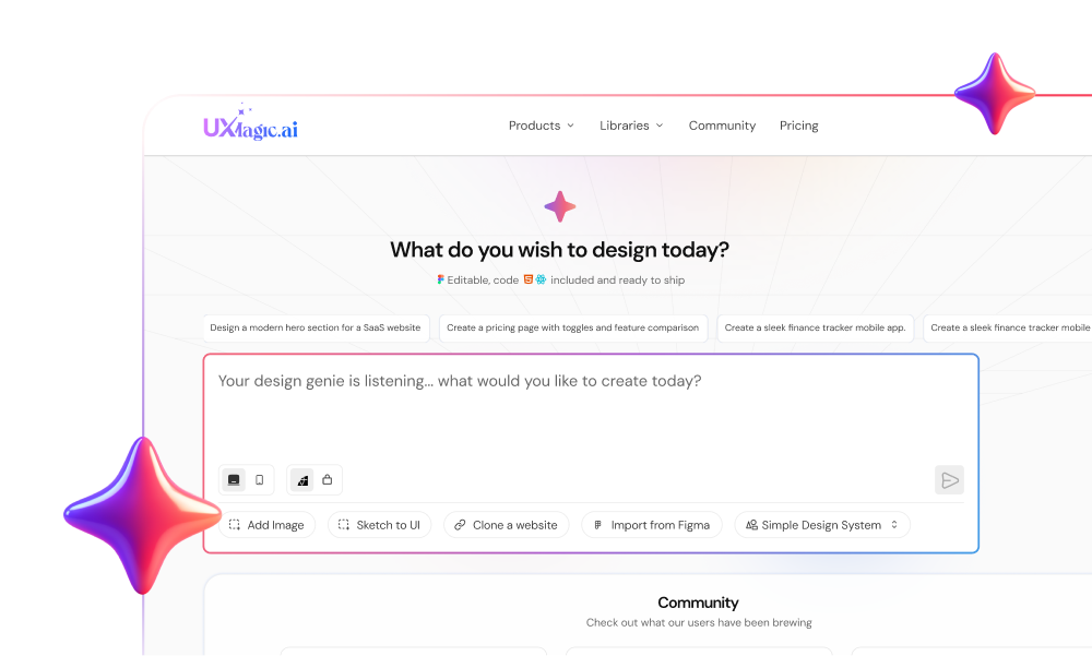
Describe your screens, add the constraints from this guide, and UXMagic generates an editable, consistent flow you can refine on a canvas.
How to use the laws of UX when designing with AI
AI UI tools are trained on huge amounts of existing interfaces, so they tend to follow Jakob's law by default. The other laws are less reliable. A model will happily produce three competing primary buttons (Von Restorff broken), eight equally weighted plan cards (Hick broken) or perfectly even spacing (proximity broken) unless you say otherwise. We cover this pattern in more depth in how to design UI with AI and in our piece on vibe designing.
Here is the workflow we recommend:
- Write the principles into the brief, as outcomes. "One primary action per screen" is clearer to a model than "apply Von Restorff". Our help article on writing a good prompt shows where these constraints belong. For more examples, see prompting for UI that ships.
- Check the flow before the pixels. Peak-end and serial position are flow-level laws; you cannot fix them on one screen. In UXMagic, Flow Mode proposes a screen plan you approve before anything is designed, so you can make sure the success and error screens exist. The screen plan help article explains how to edit that plan.
- Test structure at low fidelity. Because of the aesthetic-usability effect, start with the AI wireframe generator or wireframe mode to judge grouping and hierarchy without polish distracting reviewers.
- Encode similarity in a theme, not in prompts. Colours, type and spacing stored as design tokens keep similarity consistent across every screen. Set them once with the AI style guide generator or in themes and style guides.
- Fix violations with targeted edits. When a screen breaks a law, ask for the specific change ("make the secondary buttons ghost style", "increase spacing between the billing and shipping groups") with chat editing rather than regenerating the whole screen.
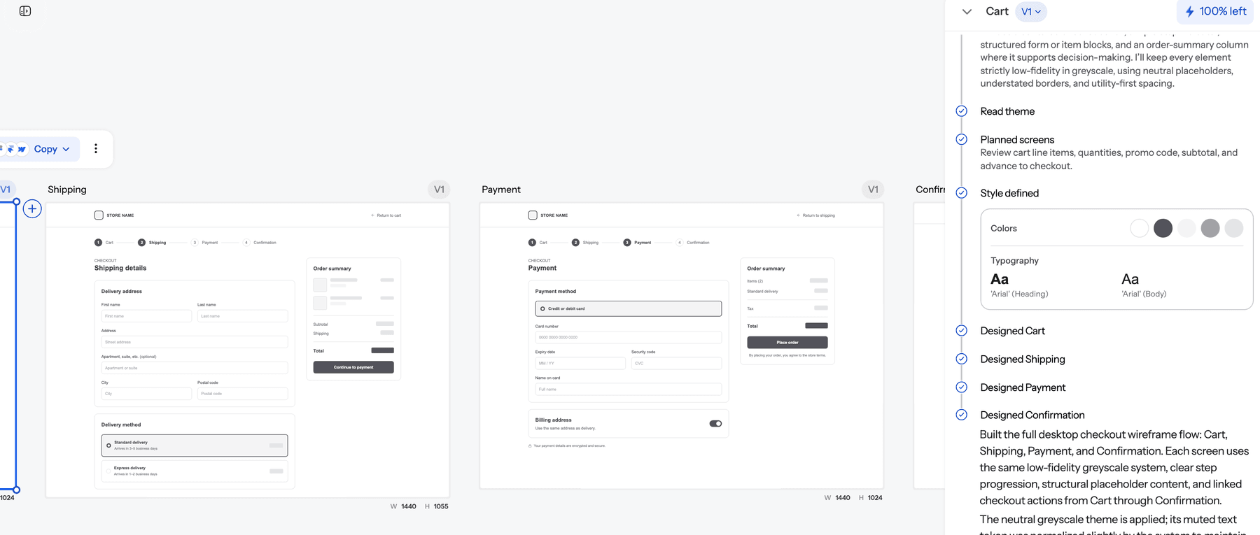
A checkout is a good test case because nearly every law applies at once: Postel's law in the address fields, proximity in the form groups, Fitts's law on the pay button, Doherty on the payment response and peak-end on the confirmation. If you want to try it, the signup flow generator and AI prototype generator are quick ways to get a multi-screen flow you can then click through and critique.
A copy-paste UX laws prompt block
Add a block like this to the end of any prompt, and trim the lines that do not apply to your screen:
UX constraints:
- One primary action per screen, filled accent style; all other actions secondary.
- Primary action at least 44px tall; on mobile, full width at the bottom.
- No more than three options in any single choice group; extras go in "More".
- Standard conventions: logo top-left, nav left or top, account menu top-right.
- Tight spacing inside groups, double spacing between groups; related settings in cards.
- Pre-fill anything that can be inferred; accept any reasonable input format.
- Include loading (skeleton), empty, error and success states.
- Most important item first or last in any list or nav.
This works in UXMagic, and it works just as well if you are using a general assistant; our guide to ChatGPT for UI/UX design covers where general chat tools fall short. If your team keeps rules like these in a shared file for coding agents, the same list fits naturally into a DESIGN.md file.
Using the laws in a UX review
The laws are just as useful after a design exists. When you run a UX audit, walk each key screen with a short checklist:
- Moving: Is the primary action the largest, most reachable target? Are destructive actions small and separated? (Fitts)
- Deciding: How many equally weighted choices does each screen present? (Hick, Pareto)
- Expecting: Does anything behave differently from the products our users already use, and is the difference worth it? (Jakob)
- Waiting: Which interactions exceed 400ms, and what does the user see while they wait? (Doherty)
- Remembering: What must users carry from one step to the next, and is it chunked? (Miller)
- Grouping: Can you tell which elements belong together with the text blurred out? (Gestalt)
- Ending: What is the last screen of each key flow, and how does it feel? (Peak-end)
Pair this with the accessibility heuristics and prompting for WCAG 2.2 accessible UI, since several laws (target size, colour-only contrast) overlap with accessibility requirements. When the review finds a costly pattern, our round-up of bad UX examples and their business costs is useful for making the case to stakeholders.
Where the laws of UX stop helping
The laws describe average human behaviour in controlled conditions. They are strong defaults, not guarantees. A few honest limits:
- Context beats law. Expert users of a trading terminal want density that would break Hick's law for a consumer app. Know your audience first, which is why a user flow diagram and real research come before layout rules.
- Laws conflict. Jakob's law says use the familiar pattern; Von Restorff says make the key item different. Both are right in different places.
- Numbers are approximate. 400ms, 7±2 and 80/20 are useful anchors, not thresholds to measure compliance against.
- Testing still wins. When a law and your usability test disagree, believe the test and look for the reason.
Build with the laws of UX in UXMagic
UXMagic will not apply these laws for you automatically, and no AI tool can guarantee a layout is usable. What it does is make the principles cheap to act on. You can describe constraints in a prompt, generate a whole consistent flow in one theme, check structure in wireframes, fix individual violations with small edits, and export to Figma or code when the design holds up. For dashboards and landing pages, the AI dashboard generator and AI landing page generator are good places to see Pareto and Von Restorff in action, and the templates gallery gives you a starting point to critique against this list.
If you are comparing tools before you pick one, our list of the best wireframing tools and the wider guide for beginners to user interface design are the next reads. Plans and credit costs are on the pricing page.
Related guides
- What Is Feature Creep? Causes, Warning Signs and How to Stop It
- MVP Design: How to Design a SaaS MVP Users Actually Adopt (2026)
- How to Validate a Product Idea: 7 Tests, With Templates
- Prompting for User Flows Not Screens
- Mobile App Design: The Complete 2026 Architectural Guide
- What Is UI Design? A Beginner’s Complete Guide (2026 Edition)
- 15 Best AI UX Research Tools in 2026, by Research Phase
- The UX Case Study Template Hiring Managers Actually Read
- UX Design Methodologies Explained (And Which Ones Still Matter in 2026)
- Figma Make Tutorial 2026: Prompt, Edit, Publish and Export Code
Design flows that follow the laws of UX
Generate a multi-screen flow from one prompt, check it in wireframe mode, then refine with targeted edits and export to Figma or code.