Shipping a poorly validated interface isn't a temporary usability compromise. It's a permanent financial liability. Just ask the global financial institution that accidentally wired $900 million because its enterprise software required users to check three obscure boxes just to stop a payment. Bad UX doesn't just annoy people, it sabotages the bottom line.
This isn't a list of Netflix's autoplay hover or Zara's minimalist homepage. Those are annoyances. What follows are 10 cases where a bad interface decision produced a specific, documented dollar figure - market cap wiped out, regulatory fines issued, revenue evaporated overnight. If you're trying to justify a design budget to leadership, this is your ammunition.
The pattern behind all 10 is the same: teams treated interface decisions as cosmetic, right up until the cost showed up on a balance sheet.
The Real Business Cost of Bad Design
"User error" is a myth organizations use to protect bad processes. When someone clicks the wrong button or misreads a form field, they're operating on established logic and habit - if the system doesn't match that logic, the interface is defective, not the user. A system that requires an extensive manual to prevent a catastrophic action isn't sophisticated. It's broken.
This is the gap Don Norman described as the Gulf of Execution - the space between what a user intends to do and what the interface actually lets them do clearly. When that gap is wide, people don't fail gracefully. They check the wrong box, or the only box that seems obviously labeled, and the system does something they never intended.
There's a second contrarian point worth stating plainly: removing all friction is not always the goal. Deleting an account, transferring a large sum of money, or changing critical infrastructure settings should require deliberate cognitive load - a confirmation phrase, a modal, a second factor. Frictionless design on high-stakes actions isn't elegant. It's how a $900 million mistake happens with a three-person approval process already in place.
10 Famous Bad UX Examples That Destroyed Revenue
- Citibank: The $500 Million Checkbox Error
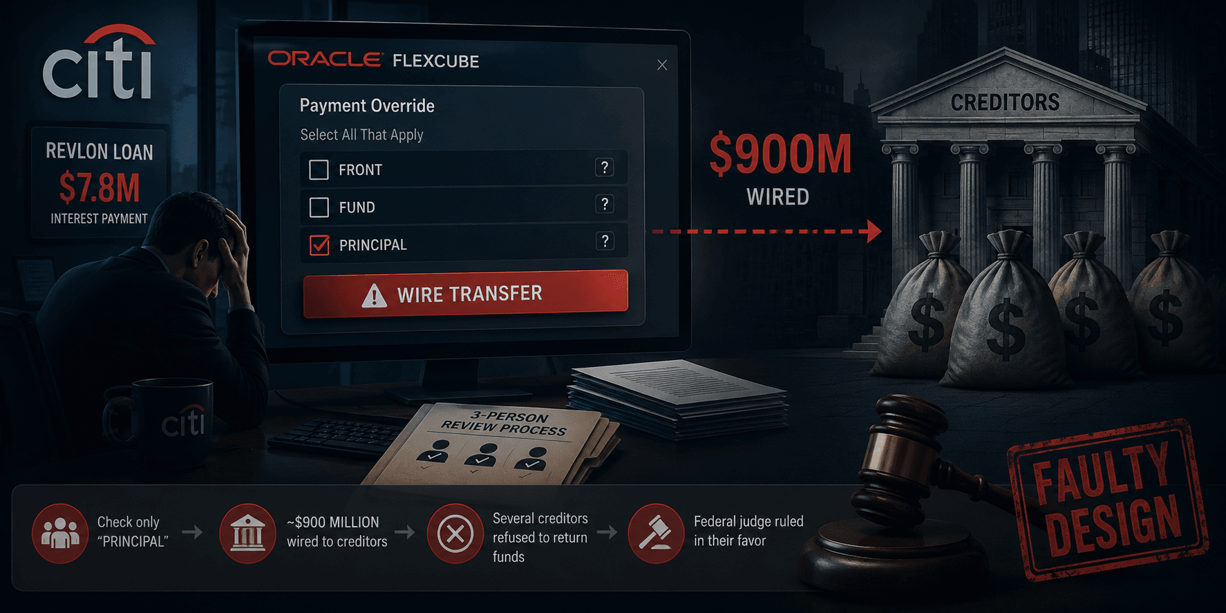
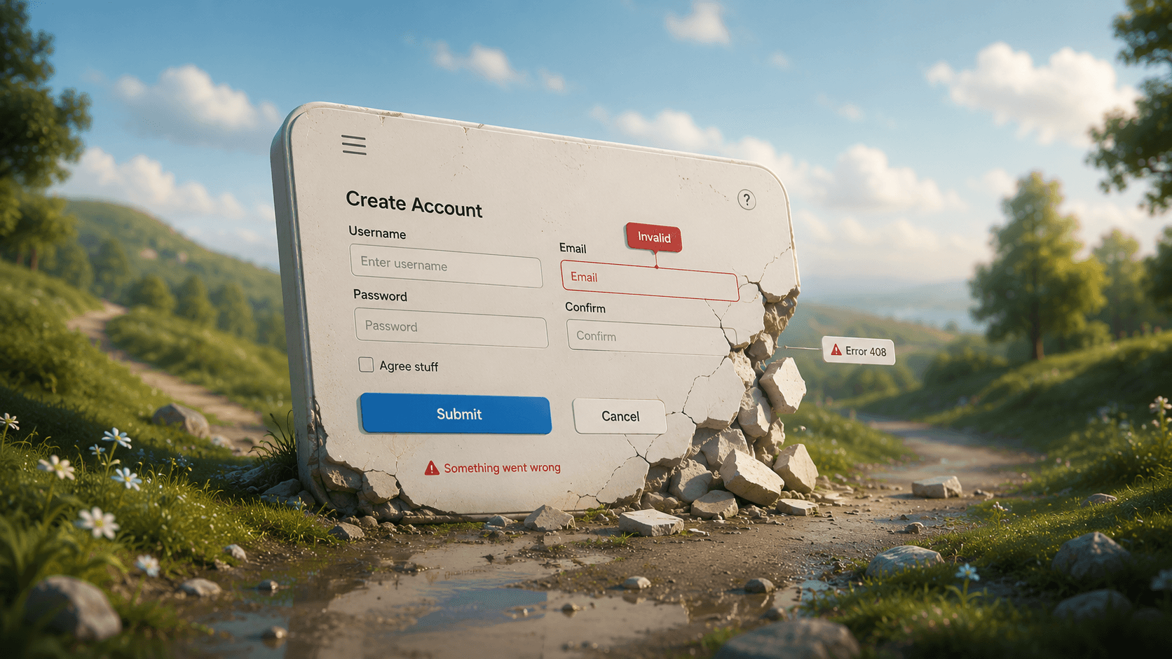
In 2020, Citibank employees needed to wire $7.8 million in interest payments on a Revlon loan using Oracle's Flexcube software. The interface required manually checking three vaguely labeled checkboxes - "FRONT," "FUND," and "PRINCIPAL" - just to override the system's default of paying out the entire loan principal. The team checked only "PRINCIPAL," and the system wired nearly $900 million of Citibank's own money to creditors.
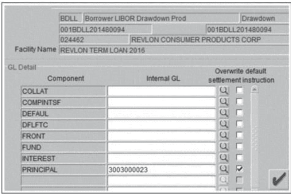
Several creditors refused to return the funds, and a federal judge ruled in their favor, explicitly citing the software's flawed design as a root cause. This is what happens when the user's mental model and the system's conceptual model don't match on a high-stakes, low-frequency task - a three-person review process is meaningless if none of the three understand what the checkboxes actually do.
- Sonos: Evaporating $500M in Market Cap Overnight
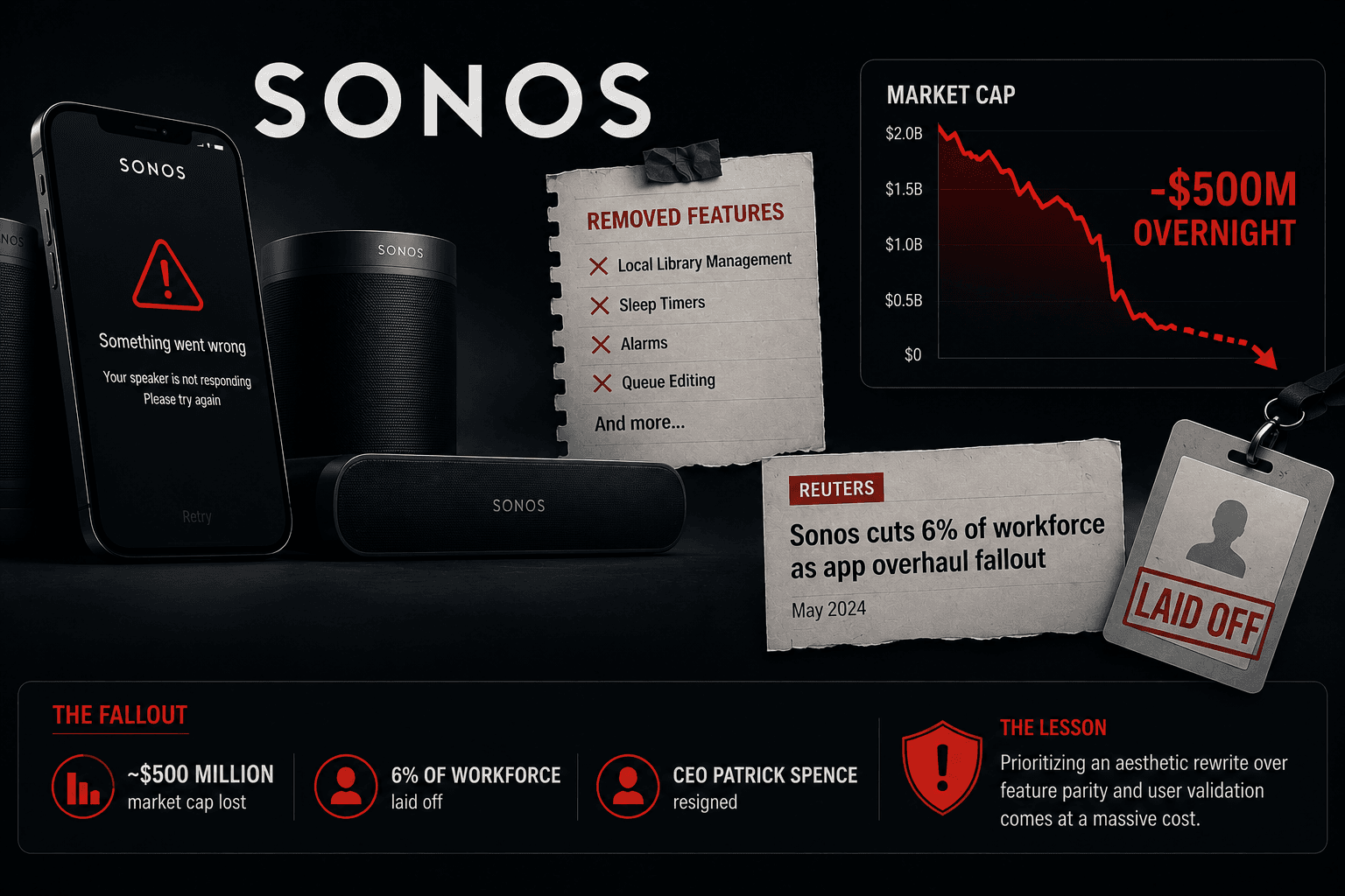
In May 2024, Sonos pushed a complete rewrite of its mobile app to every user simultaneously, in pursuit of a "courageous" new aesthetic and cleared technical debt. The redesign stripped out core functionality loyal users relied on daily, local library management, sleep timers, alarms, queue editing while volume controls lagged and speakers dropped off the network entirely.
The fallout was immediate: roughly $500 million in market capitalization gone, 6% of the workforce laid off, and CEO Patrick Spence's eventual resignation. This is the textbook cost of prioritizing an aesthetic rewrite over feature parity and user validation.
- British Airways: A £20M GDPR Fine for Missing MFA

In 2018, attackers compromised the personal and financial data of over 400,000 British Airways customers by entering through a third-party supplier's credentials - credentials that had no Multi-Factor Authentication flow protecting them. British Airways also stored passwords in unencrypted plain text to "aid functionality" for internal users.
The Information Commissioner's Office initially signaled a £183 million fine, later settling at £20 million. The lesson: designing a frictionless workflow for developers or third parties at the expense of basic security friction is a direct path to a regulatory fine, not just a technical footnote.
- Marks & Spencer: The £150 Million Redesign That Tanked Sales
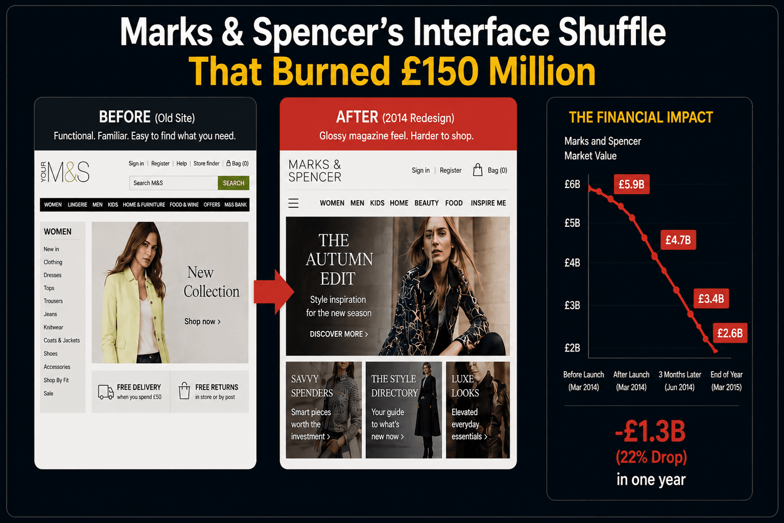
In 2014, Marks & Spencer launched a fully rebuilt website after two years of secretive, non-iterative development. The migration forced all 6 million existing users to re-register and create new passwords from scratch, while the navigation was redesigned to resemble a glossy magazine - burying basic search and filter functions.
Customers abandoned carts in frustration, and the company saw an 8.1% plunge in online sales along with a corresponding drop in share price. Treating a redesign as one monolithic launch event instead of an iterative rollout is what turned a technology upgrade into a revenue disaster.
- Snapchat's Interface Shuffle That Burned $1.3 Billion
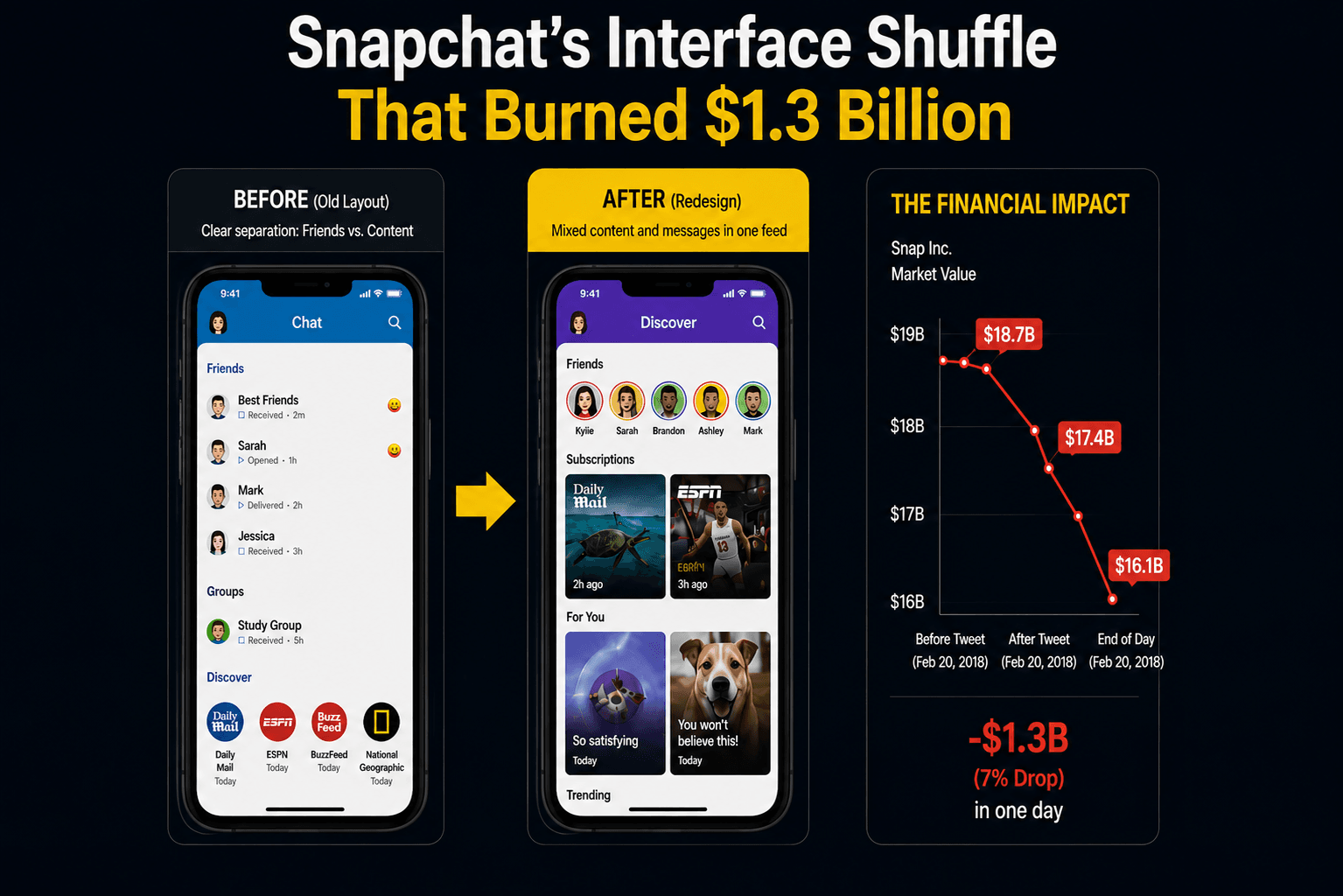
In 2018, Snapchat restructured its core layout to boost ad revenue, merging algorithmic publisher content with personal messages from friends - destroying the clear boundary users relied on between communication and content. The change shipped with no opt-in period and no phased rollout.
A petition against the redesign gathered 1.2 million signatures, and after a viral tweet from Kylie Jenner about abandoning the app, Snap Inc. lost $1.3 billion in market value in a single day. The company was eventually forced to revert the design. Breaking an established mental model without warning is financial self-sabotage, not innovation.
- Healthcare.gov and the $1.7 Billion Form Failure
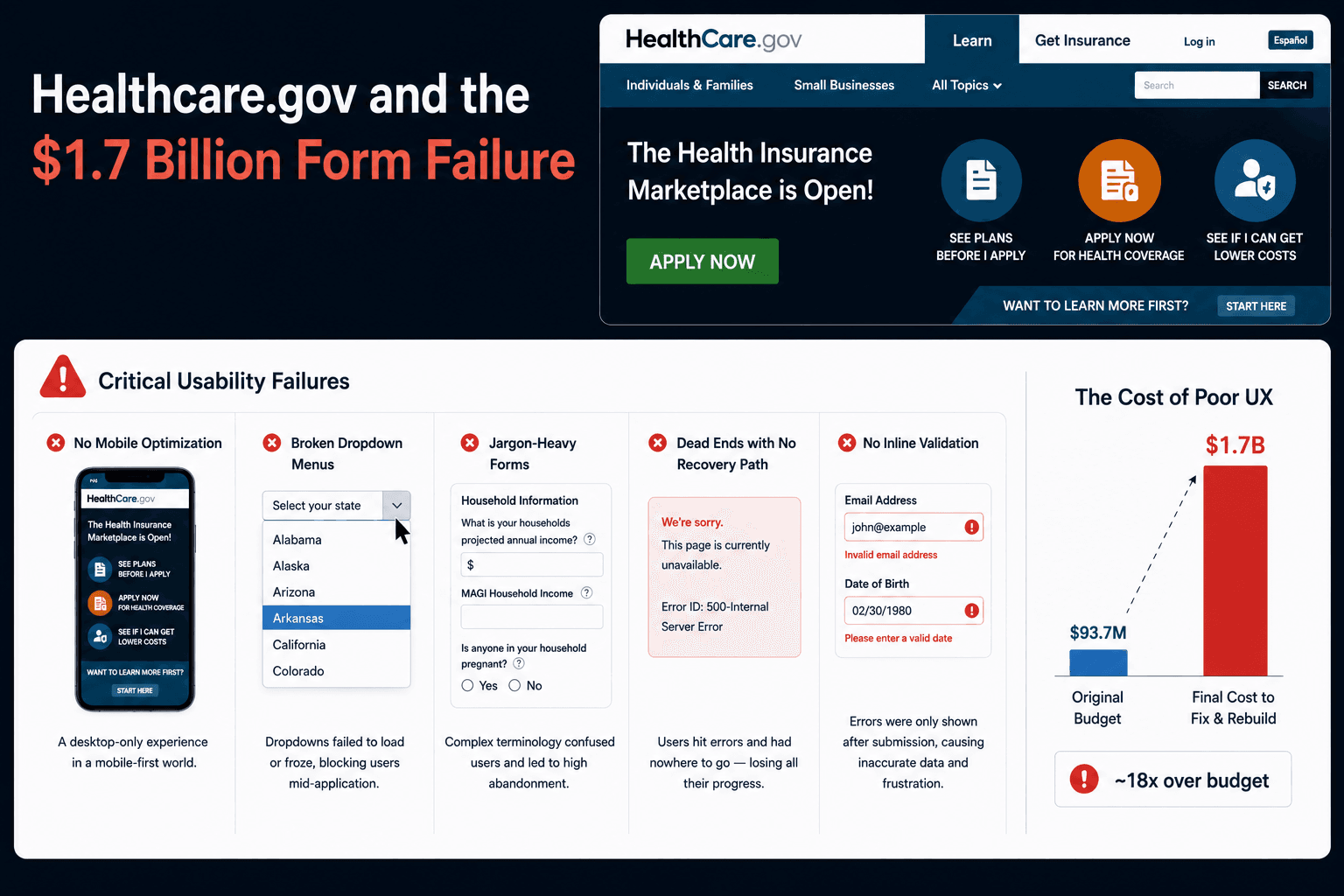
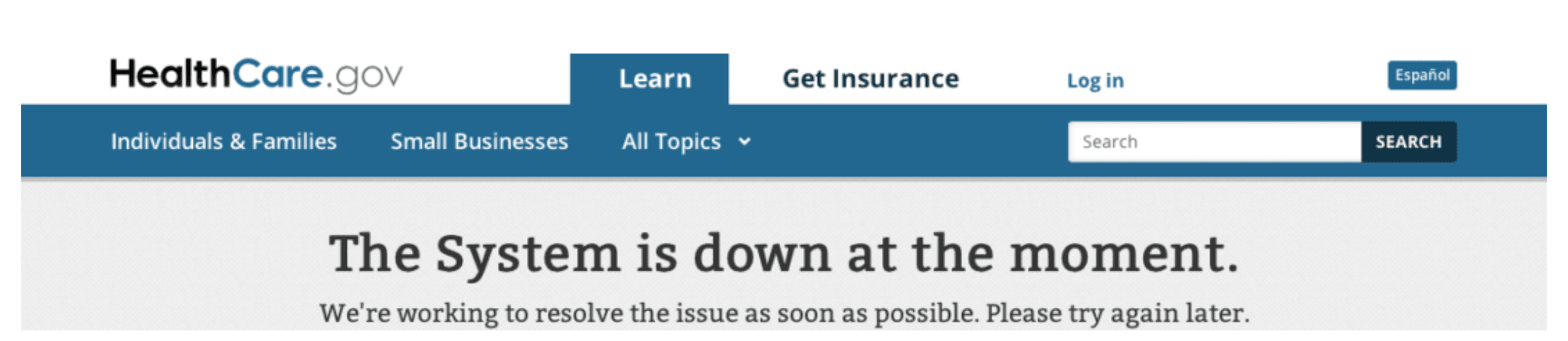
The 2013 launch of Healthcare.gov became a historic UX failure - not primarily because of traffic overload, but because of fundamental usability defects. The platform had no mobile optimization, broken dropdown menus, and jargon-heavy forms that led users into dead ends with no recovery path, while missing inline validation meant data sent to insurers was frequently inaccurate.
A project that started with a $93.7 million budget ballooned to $1.7 billion just to rebuild the broken user flows. Skipping preliminary user testing at that scale doesn't save time - it defers the cost and multiplies it.
- The $300 Million Checkout Button Fix
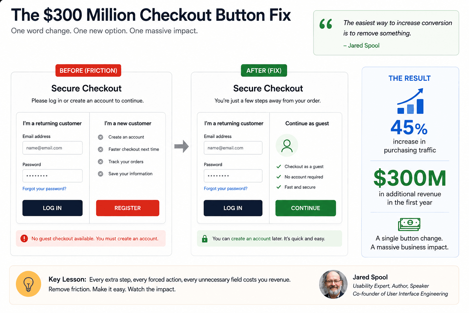
A major e-commerce retailer required users to either log in or create a new account before checkout, forcing forgotten-password recovery flows onto people who just wanted to buy something. Usability expert Jared Spool's team made one change: replacing the "Register" button with "Continue," adding guest checkout with a short note that registration wasn't required.
That single change increased purchasing traffic by 45% and generated an additional $300 million in revenue in the first year. It's the cleanest example on this list of how much revenue a single unnecessary friction point can quietly destroy.
- Workday and the Hidden Cost of Enterprise Friction
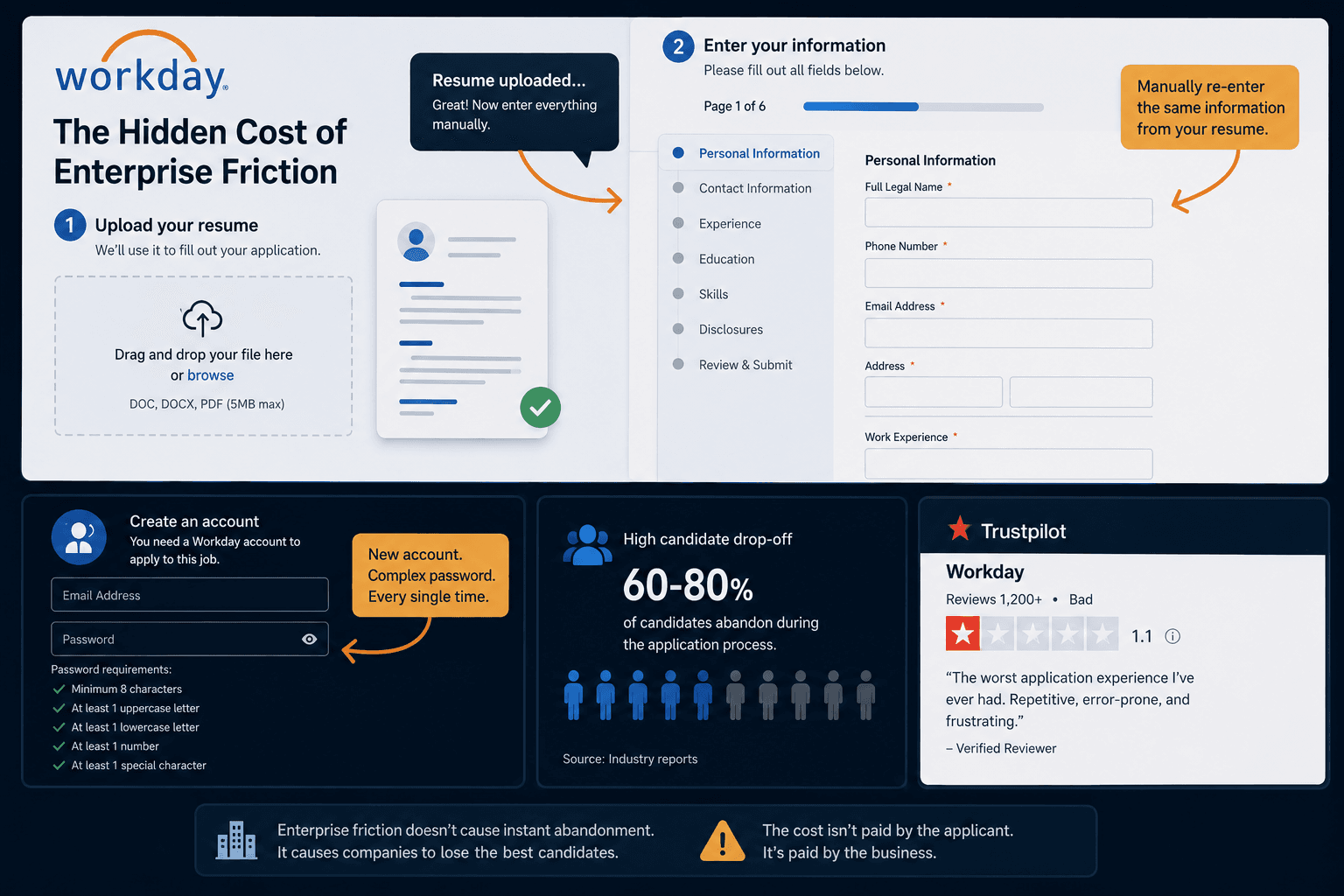
Workday's job application flow asks candidates to upload a formatted resume, then presents a multi-page form demanding the same information be typed out manually anyway - because the automated parsing is notoriously inaccurate and mixes up dates and fields. Applicants also need a new account with a complex password for every company using the platform.
The result is heavy candidate drop-off and an abysmal 1.1 rating on Trustpilot. Enterprise software doesn't lose users to instant abandonment the way consumer apps do - the cost shows up as client companies losing top candidates unwilling to tolerate the process.
- Ryanair and Amazon: The Price of Dark Patterns
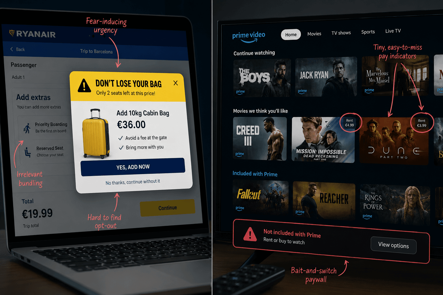
Ryanair uses high-contrast, fear-inducing pop-ups to push expensive luggage add-ons, deliberately burying opt-out buttons and bundling unrelated options to force upsells. Amazon Prime Video mixed paid rental content into the feed of free subscription content, relying on tiny, easily missed icons to distinguish the two - a bait-and-switch that surprises users with an unexpected paywall.
These tactics can inflate short-term metrics, but they increase cart abandonment and erode loyalty over time, while regulators increasingly treat deceptive consent flows as a legal liability rather than a growth hack.
- WhatsApp and the Anxiety of Incomplete Features
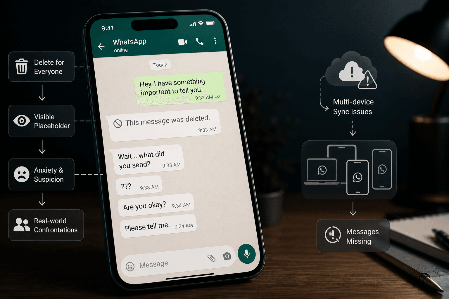
WhatsApp's "Delete for Everyone" feature was meant to help users recover from sending a message to the wrong person. Instead of removing it silently the way Telegram does, WhatsApp leaves a visible placeholder - "This message was deleted" which creates anxiety and suspicion for the recipient and frequently causes real-world confrontations.
Combined with a multi-device sync architecture that routinely drops message history, this shows how a feature can be well-intentioned and still actively degrade trust at billions-of-users scale.
Why Multi-Billion Dollar Companies Keep Shipping Bad UX
The failure pattern is nearly identical across all 10 cases, and it starts upstream of design entirely. Requirements get dictated by business goals - more ad revenue, more registrations - rather than user needs, so the architecture gets built around database logic instead of how a person actually thinks through the task.
From there, the damage compounds through a predictable sequence:
- Wireframing bottleneck: manual prototyping in tools like Figma is slow, so teams under deadline pressure design only the "happy path" and skip error states, edge cases, and empty states entirely.
- Sunk cost lock-in: once engineering hard-codes the single untested path, the cost of changing it multiplies, and QA tests whether the button fires the API - not whether the user understands what it does.
- Immediate fallout at launch: users hit the Gulf of Execution (not knowing how to act) and the Gulf of Evaluation (not understanding the system's feedback), which shows up as support tickets, abandoned carts, and in enterprise contexts, real financial mistakes.
- Reactive patching: instead of fixing the flawed architecture, teams bolt on tooltips and warning banners, which only adds cognitive load on top of an already broken core.
Here's a more natural version that incorporates your internal blog links without sounding forced.
How to Prevent Catastrophic UI Failures Before Development
Every case above was preventable at the prototyping stage, before a line of production code existed. The M&S disaster happened because two years of monolithic redesign work went untested. Modern teams can avoid that by rapidly exploring multiple user flows before development begins. Using the right prototyping tools makes it practical to validate several approaches with real users instead of committing engineering resources to the first idea.
The Citibank failure is an even sharper example. Nobody adequately tested the obscure "interest-only payment" edge case because designing override flows and error states manually is slow and expensive. Today, designers can use structured AI prompts to generate and review uncommon scenarios long before development starts. If you're looking for practical examples, our collection of AI prompt templates for SaaS dashboards and complex product flows shows how teams prototype these situations in minutes instead of hours.
A few concrete habits that would have stopped several of these disasters outright:
- Retire the phrase "user error." Repeated mistakes on the same interaction indicate a design problem, not a training problem. That's the entire Citibank story in one sentence.
- Tie friction to a business metric. Measure support tickets, abandonment, and completion rates against individual screens, just as Jared Spool's team did before changing a single checkout button.
- Never force a redesign without an opt-in. Sonos, Snapchat, and Marks & Spencer all skipped phased rollouts and paid the price within days.
- Prototype edge cases - not just the happy path. Error states, permissions, failed payments, and override scenarios deserve the same attention as your primary flow. Starting with the right wireframing tools makes these journeys much easier to visualize and test before they become production issues.
- Add friction intentionally for high-risk actions. A confirmation step, secondary approval, or explicit acknowledgement may feel slower, but it's infinitely cheaper than reversing a catastrophic mistake like a $900 million wire transfer.
Related guides
- How to Design a Fintech App: UX Best Practices for 2026
- How to Conduct a UX Audit: The 5-Step Framework From Friction to Fixed
- AI Chat Interface Design: The Patterns That Prevent Abandonment
- How to Validate a Product Idea: 7 Tests, With Templates
- Form UX That Actually Converts: The Field-Level Playbook
- Low-Fidelity Wireframes in the AI Era: What Still Matters
- The Most Innovative AI Wireframe Platforms in 2026: A Technical Comparison
- MVP Design: How to Design a SaaS MVP Users Actually Adopt (2026)
- What Is Feature Creep? Causes, Warning Signs and How to Stop It
- Healthtech UX Design: A Practical Guide for Product Teams
Catch UX Failures Before They Become Million-Dollar Mistakes
Don't ship only the happy path. Use UXMagic to generate edge cases, error states, and alternate user flows before engineering starts building. Fix problems in design - not after your users find them.