Product teams are routinely burning weeks waiting for basic UI flows because traditional design processes still treat every new screen like an artisanal masterpiece instead of a functional business requirement. The reality is that manual, pixel-perfect drafting is now the primary bottleneck in modern product development.
If you searched what is UI design, you’re not looking for a dictionary definition. You’re trying to figure out how interfaces actually get built today fast enough to validate ideas before competitors ship first.
UI design in 2026 is no longer about drawing rectangles. It’s about orchestrating systems, enforcing design tokens, and directing AI to generate scalable interfaces engineers can ship without rewriting everything from scratch.
The Reality of UI Design in 2026: From Pixel Pusher to AI Orchestrator
The biggest misunderstanding about UI design is that it’s still a manual craft. It isn’t.
Modern UI design is the process of directing AI to generate consistent, accessible, system-ready interfaces from structured requirements. The screen is no longer the output. The system behind the screen is.
Most beginner guides still tell you to:
- open Figma
- draw gray boxes
- refine typography
- iterate visually
That workflow is obsolete for anything except polishing.
Today’s teams start with orchestration, not drafting.
Instead of pushing pixels, they define:
- user flow logic
- hierarchy constraints
- accessibility requirements
- component reuse rules
- token architecture
Then they generate interfaces from those constraints.
This shift exists because product velocity matters more than visual originality. A screen that ships in three days beats a perfect layout that ships in three weeks.
And that’s exactly where most teams get stuck.
The real bottleneck is not creativity. It’s translation.
Product managers know what they want.
Engineers know what’s possible.
Designers know what’s usable.
But translating those ideas into screens traditionally required manual effort in the middle. That translation layer is now automated.
The modern UI designer acts more like a director than a painter.
They:
- define structure
- enforce consistency
- validate usability
- audit accessibility
- refine outputs
Instead of drawing every element.
If this sounds abstract, it isn’t. It’s the same shift explained in detail in How designers actually use AI in real projects ,where orchestration replaces drafting as the default workflow.
The myth that “UI is dead” misses the point
You’ll see people claim interfaces are disappearing entirely. They aren’t.
What’s disappearing is manual interface production.
Interfaces are becoming:
- faster to generate
- easier to test
- cheaper to iterate
- more system-driven
The skill shift isn’t from UI to “no UI.” It’s from UI creation to UI orchestration.
Designers who understand this move faster than teams still debating gradients.
UI vs. UX: The Critical Difference Between Architecture and Interior Design
UX defines what should happen.
UI defines how it appears and responds.
That distinction sounds obvious until you try shipping a product.
Think of UX as architecture and UI as interior design.
Architecture determines:
- room layout
- structure
- navigation paths
- accessibility routes
Interior design determines:
- lighting
- furniture placement
- material finish
- visual clarity
Both shape experience. Only one defines interaction surfaces.
Here’s the difference in practice:
| Aspect | UI Design | UX Design |
|---|---|---|
| Focus | Visual interface and interaction states | User journey and behavioral logic |
| Goal | Clear, consistent interaction surfaces | Friction-free task completion |
| Outputs | Tokens, layouts, prototypes, style systems | Personas, flows, research synthesis |
| Tools | UXMagic, Figma, component libraries | Analytics, interviews, journey maps |
You can absolutely ship:
- beautiful UI with broken UX
- excellent UX with weak UI
Both fail users differently.
Why the distinction matters more in the AI era
AI tools generate screens easily.
They don’t generate strategy easily.
If you skip UX thinking, you’ll produce attractive nonsense faster than ever before.
That’s why the strongest teams treat UI as execution infrastructure, not decoration.
And it’s also why accessibility and structure must appear inside prompts not after generation. If you haven’t already explored it, prompting for WCAG-compliant accessible UI shows exactly how early constraints prevent expensive rebuilds later.
UI is where strategy becomes visible.
UX is where strategy becomes logical.
Confusing the two creates products users abandon quietly.
The 4-Step UI Design Workflow (The Modern AI-Assisted Approach)
Modern UI design follows four predictable phases.
Skip one and the entire interface collapses later.
Step 1: Research Synthesis and Requirement Mapping
UI design doesn’t start in a canvas.
It starts in evidence.
Product teams collect:
- interview insights
- analytics signals
- behavioral friction points
- market constraints
Then they synthesize them into structural requirements.
Modern teams accelerate this step with tools like Notion AI or Dovetail’s Magic Suite, which compress hours of transcripts into usable themes within minutes.
Beginners skip this phase constantly.
They assume they already understand the user.
That assumption guarantees building elegant solutions to the wrong problem.
A clean interface that solves nothing still converts nothing.
Step 2: Prompt Orchestration and Flow Generation
Once requirements exist, the next step is translation.
Instead of drawing components manually, teams write structured prompts describing interaction logic.
Example: Generate a three-step B2B SaaS checkout flow emphasizing enterprise security trust signals with high-contrast primary actions.
This turns UI production into instruction writing.
The difference between strong and weak prompts determines whether outputs are usable.
Weak prompt:
“Make a finance dashboard.”
Strong prompt:
“Generate a multi-screen analytics dashboard with clear hierarchy, primary KPI emphasis above the fold, and modular filtering controls.”
Specific constraints create predictable outputs.
This is also where most designers encounter blank-canvas paralysis. Instead of drafting layouts manually, teams increasingly generate structural starting points immediately exactly the workflow described in Blank Canvas Syndrome in AI UX workflows.
Instead of losing hours arranging navigation, they begin editing within minutes.
Some teams now generate their first usable flow directly from a single structured prompt using UXMagic, shifting effort from layout creation to decision refinement.
That’s a productivity shift most legacy tools can’t replicate.
Step 3: Enforcing Systemic Consistency and Design Tokens
Generating screens isn’t enough.
Consistency determines whether engineers can ship them.
Most AI generators fail here because they output:
- inline styles
- hardcoded spacing
- inconsistent radii -mismatched typography
This creates technical debt disguised as speed.
Production-ready UI requires token enforcement across:
- spacing
- typography
- hierarchy
- color
- interaction states
Without tokens, every screen becomes a maintenance liability.
This is why systemic workflows matter more than single-screen generation. Tools that support multi-screen flow consistency reduce rework dramatically. UXMagic’s Flow Mode, for example, keeps style parameters consistent across entire journeys instead of resetting them every screen.
That difference determines whether outputs scale or collapse.
If you want examples of how structured prompting supports reusable components, the breakdown in production-ready AI design prompts for SaaS interfaces shows how teams enforce consistency from the first generation.
Consistency is not polish.
Consistency is infrastructure.
Step 4: Rapid Validation and Developer Handoff
Most teams validate too late.
They polish screens privately instead of testing flows publicly.
That’s backwards.
High-performing teams generate interactive prototypes quickly and expose them to:
- stakeholders
- internal users
- pilot customers
before investing in refinement.
This produces faster insight loops.
After validation, design tokens and CSS structure support engineering implementation.
The goal isn’t perfection.
The goal is confirmation.
And when PMs generate interactive flows themselves, designers can focus on behavioral complexity instead of drawing baseline layouts. That shared workflow is part of what a human-in-the-loop AI design process enables across roles, as outlined in Human-in-the-loop AI design workflow.
When everyone works from the same interactive blueprint, iteration cycles shrink dramatically.
5 Common UI Design Mistakes That Will Actively Destroy Conversions
Most UI problems don’t come from bad intentions.
They come from outdated habits.
Here are the biggest ones.
Mistake 1: Designing for Dribbble Instead of Users
Dribbble rewards aesthetics.
Products reward clarity.
Interfaces overloaded with gradients, shadows, and animations often fail:
- accessibility contrast checks
- engineering feasibility
- readability thresholds
A visually boring interface can outperform a beautiful one.
Utility beats novelty every time.
Mistake 2: Generating Screens Without Design Systems
Single-screen generation looks fast.
Until screen two breaks everything.
Without token enforcement:
- spacing shifts
- typography changes
- buttons mutate
- navigation fragments
That’s not acceleration.
That’s debt.
Generating UI without a system is professional malpractice in 2026.
Mistake 3: Treating Accessibility as a Post-Launch Fix
Accessibility is not a checklist.
It’s a constraint system.
If contrast ratios fail during generation, reject the output immediately.
Waiting until after release forces expensive rewrites.
Accessibility must dictate aesthetics not follow them.
Mistake 4: Waiting Weeks for Design Queue Approval
PMs shouldn’t wait weeks for structural prototypes.
They should generate flows themselves.
Then validate them.
Then involve designers for refinement.
Iteration speed determines product survival.
Not role boundaries.
Mistake 5: Measuring Productivity by Screens Produced
Old metric:
Screens per day.
New metric:
Validated flows per week.
If your workflow rewards drafting volume instead of insight speed, it’s outdated.
Why Generic AI UI Generators Create Unscalable Technical Debt
Not all AI UI tools are equal.
Most generate isolated screens.
Few generate systems.
Here’s the difference.
Typical generators output:
- static visuals
- disconnected layouts
- inline CSS
- inconsistent hierarchies
These look impressive.
Until engineering opens the file.
Then they become rewrite projects.
Professional teams need outputs tied to reusable tokens.
Otherwise scaling becomes impossible.
This is the exact failure scenario many founders hit when validating MVPs.
A visually strong prototype without:
- interaction states
- hierarchy logic
- accessibility compliance
- component reuse
is unusable in production.
That’s why orchestration-based generators outperform sketch-style generators in real workflows.
They produce flows instead of snapshots.
And flows are what products actually ship.
Stop Designing Screens. Start Generating Systems.
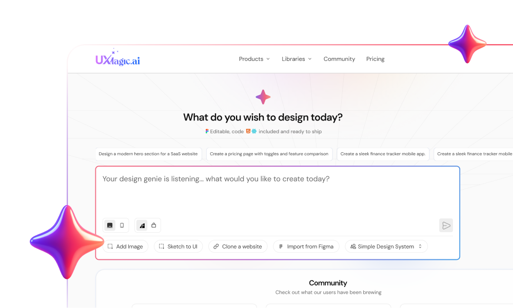
Stop wiring flows manually. Try UXMagic free and generate your first structured multi-screen interface from a single prompt in minutes.
UI design is no longer about manually crafting screens, it’s about directing systems that generate them consistently, accessibly, and fast enough to support real product decisions. Designers who shift from pixel production to flow orchestration will move faster, validate earlier, and ship interfaces engineers can actually build.
UI design isn’t disappearing. It’s becoming the discipline that decides whether your product ships this quarter or next year.
Generate Your First UI Flow in Minutes
Stop waiting on wireframes. Use UXMagic to generate a structured multi-screen interface from one prompt and move straight into validation.