
Most UX audits produce 80-slide presentation decks that sit untouched in shared drives because findings get evaluated in isolation rather than as functional user journeys. Product managers prioritize fixing conversion bottlenecks over reviewing raw heuristic violations. A lean audit framework cuts out academic documentation and ships actionable UI updates straight to production instead.
You already understand foundational design vocabulary, standard metrics like bounce rate and retention, and basic usability heuristics. This isn't a primer on what user experience means. It's the operational framework - flow-first evaluation, severity-versus-effort prioritization, dev-ready remediation - that separates an audit engineering actually acts on from one that gets archived.
What Is a UX Audit and Why Do Product Teams Need One?
Strategic Audit Triggers: Conversion Drop-offs and Design Debt
Evaluating standalone screens against static usability checklists is often a less effective use of design time than it seems. Conversion drop-offs frequently occur during the transitions, state changes, and cognitive friction between steps - not because a single page violates a minor alignment rule. Real UX audits evaluate behavioral momentum across complete user journeys, not isolated frames, since a flow can pass every single-screen checklist and still fail at the transition between two compliant screens.
Analytics can tell you a meaningful share of trial users drop off on step two of setup, but Google Analytics can't tell you whether it's a confusing form label, bad button placement, or broken validation. That's the actual gap an audit needs to close - connecting a quantitative drop-off signal to a specific, fixable interface cause. Every feature ship without maintained component cohesion is another legacy screen quietly accumulating design debt, and a structured audit is what catches that before it compounds.
When to Conduct a UX Audit
A few specific triggers worth treating as genuine audit prompts, not just "whenever there's time":
- Before a major redesign - establish a documented baseline of what's actually broken before deciding what to rebuild.
- After a major feature launch - new features frequently introduce inconsistency with existing flows; catch it early rather than letting it compound.
- When conversion metrics drop - a sudden or sustained funnel drop-off is a direct signal something changed for the worse.
- When support tickets increase - a spike in a specific category of ticket often maps directly to a usability failure, not just user confusion.
- During a design-system migration - moving components to a new system is exactly when visual and interaction drift creeps in unnoticed.
The 5-Step UX Audit Framework: From Friction to Production-Ready Fixes
Step 1: Scoping the Journey and Analyzing Quantitative Drop-off Data
Define the specific business metric targeted for improvement - trial conversion, onboarding completion, checkout completion. Select one or two core user flows tied to that metric rather than attempting to audit the entire product catalog at once.
Pull from a real spread of quantitative signals before forming any hypothesis, not just a single top-line funnel number:
- Funnel drop-off - the specific step where users exit
- Task completion rate - whether users who start a flow actually finish it
- Rage clicks - repeated clicking on an unresponsive or confusing element, a strong signal of interaction failure
- Form abandonment - where specifically within a form users stop
- Session recordings - watching real sessions to see hesitation and backtracking a funnel report can't show
- Error rates - how often users hit a validation or system error mid-flow
Layering these signals together is what actually points to a cause, rather than just a symptom.
Step 2: Flow-First Usability Evaluation and Accessibility Auditing
Step through the target user journey while simulating a specific user persona, not a generic "user." Evaluate the experience against usability heuristics, navigation structures, visual hierarchy, error recovery paths, and accessibility standards across both mobile and desktop viewports. Record each issue with screenshots, a descriptive problem note, the specific heuristic violated, and precise viewport details - vague notes are exactly what turns an audit into an unactionable slide deck later.
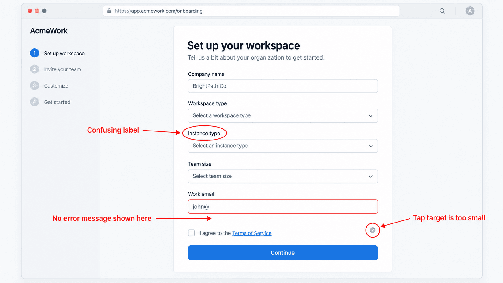
Accessibility checks worth including explicitly, beyond touch target size:
- Keyboard navigation - can every interactive element be reached and operated without a mouse?
- Focus states - is there a visible, non-ambiguous focus indicator at every step?
- Screen reader labels - are interactive elements properly labeled, not just visually implied?
- Contrast - does text and meaningful UI meet WCAG contrast ratios in both light and dark contexts if both exist?
- Error identification - are errors communicated in text, not color alone?
- Text scaling - does the layout hold up when a user increases browser text size?
On touch target sizing specifically: WCAG 2.2's Level AA Success Criterion 2.5.8 requires interactive targets to be at least 24×24 CSS pixels (with some exceptions for inline links and equivalent alternative controls). The stricter AAA-level criterion (2.5.5) raises that to 44×44. Separately, mobile platform guidelines set their own, larger conventions - Apple recommends 44×44 points, Google's Material Design recommends 48×48dp - which is where the "48px" figure some teams use actually comes from. It's a solid platform-level target, but it's not itself the WCAG AA requirement; worth citing the right number for the right standard when documenting a finding.
Step 3: Prioritizing Audit Findings with an Impact vs. Effort Matrix
Map every documented issue onto a 2x2 matrix weighing business severity against engineering implementation effort:
- Quick Wins (High Impact / Low Effort) - schedule for the immediate upcoming sprint
- Major Initiatives (High Impact / High Effort) - add to the product roadmap as a strategic initiative
- Low Priority (Low Impact / Low Effort) - tackle only once core flows are already optimized
- Ignored (Low Impact / High Effort) - drop entirely to protect team focus for high-leverage work
A note on what "severity" and "impact" mean here, since the two terms tend to blur: severity is a measure of how badly a given issue disrupts task completion - does it block the user entirely, or just add mild friction? Business impact is a separate, related question - how many users does this issue actually touch, and what's the downstream cost (lost conversion, support burden) of leaving it unfixed? A high-severity issue affecting 2% of traffic and a moderate-severity issue affecting 40% of traffic can land in genuinely different quadrants. A simple scoring approach: rate severity 1–3 (cosmetic / functional friction / blocking) and estimate impact by the percentage of the target flow's traffic affected - multiplying the two gives a rough, repeatable priority score rather than a purely subjective call.
Skipping this step is exactly how forty-five findings become forty-five equally-weighted bullet points nobody can act on. Without a structured framework tied directly to business metrics, a design audit reads as subjective preference to the people who have to prioritize it against everything else on the roadmap.
Step 4: Rapid Flow Remediation and Generating Replacement UI
Redesign problematic screens and step sequences to resolve the friction points identified in Step 2. Focus on structural adjustments - converting a complex form into progressive steps, simplifying navigation, clarifying visual hierarchy - and ensure replacement designs conform to established design system rules so the fix doesn't quietly introduce new visual debt of its own.
This is where product teams typically hit the real operational bottleneck. Designers often spend days manually redrawing screens in Figma, which stalls developer handoff and delays the entire release cycle. Transforming documented audit friction points directly into updated, functional UI flows using plain text prompts closes that gap - prompting something like "convert this 5-step settings modal into a clean, tabbed single-page settings interface" generates a production-ready UI component in a fraction of the time manual redrawing takes, moving the team from issue identification to solution handoff in the same session instead of the following sprint.
Ad-hoc UI fixes frequently introduce new visual debt when different team members apply inconsistent component patterns to solve the same underlying problem. Using Flow Mode instead, teams generate replacement screens that conform to established brand guidelines, typography scales, and component structures - preserving visual consistency across the application rather than trading one form of debt for another. Teams auditing a product with an existing, established design system can import those Figma styles directly, so every generated fix stays anchored to real production tokens rather than introducing a second, competing visual language.
Step 5: Documenting Developer Specs and Annotating State Logic
Synthesize findings into an executive dashboard accompanied by the updated UI flows themselves, not screenshots of the old broken state alone. Annotate state changes, form behaviors, and logic requirements directly within the deliverable to streamline engineering implementation - a flow that shows the before, the finding, and the dev-ready after in one artifact is what actually gets built, versus a document that leaves the "how do we fix this" question for engineering to invent on their own.
The UX Audit Template
Log every finding against this structure - it's the single artifact that turns a scattered list of observations into something a product lead can actually triage:
| Field | What Goes Here |
|---|---|
| Issue | A one-line description of the specific problem |
| Evidence | Screenshot, session recording clip, or analytics data supporting the finding |
| Severity | 1–3 scale: cosmetic / functional friction / blocking |
| Impact | Estimated % of target flow traffic affected |
| Effort | Rough engineering estimate: low / medium / high |
| Recommendation | The specific fix being proposed |
| Proposed solution | Link to the actual redesigned UI flow, not just a description |
| Owner/status | Who owns the fix and its current state (backlog, in progress, shipped) |
Before / After: One Real Finding
Issue: Step three of a B2B onboarding wizard demands manual team invitations, complex organization naming, and extensive profile fields before granting any product access - violating Nielsen's Flexibility and Minimalist Design heuristics by requiring high upfront effort before demonstrating any value.
Severity: Blocking (users abandon before reaching the product at all)
Impact: High - affects every new signup attempting setup
Effort: Medium - requires reordering existing steps, not building new functionality
Proposed solution: Reduce setup to a two-step flow using progressive profiling. Move team invitations to post-activation. Auto-fill organization parameters via domain lookup instead of requiring manual entry.
That's the shape every entry in the template above should take - a specific, evidenced problem, paired directly with a specific, buildable fix, not a general observation left for someone else to interpret.
Common UX Audit Pitfalls That Derail Product Shipping
A few recurring mistakes worth naming directly, since they're the specific reason many audits never turn into shipped fixes:
- Auditing isolated screens instead of complete flows - missing the cumulative cognitive load a user experiences across a multi-step journey, which is often where real drop-off actually happens.
- Running unmoderated user testing before an internal heuristic pass, by default - this isn't a universal rule against user testing early, but a prioritization recommendation: spending participant budget to confirm flaws an experienced designer can likely spot in two hours using structured heuristics is often lower-value than saving that budget for validating complex, high-effort architectural revisions where expert judgment alone is less reliable.
- Presenting findings without solution flows - handing over screenshots of broken interfaces forces non-designers to invent UI workarounds themselves, which tends to produce a bloated backlog and mediocre fixes.
- Including every minor cosmetic nitpick - cluttering an executive report with non-essential visual tweaks distracts stakeholders from the functional blockers that actually move business metrics. If it doesn't affect task completion, accessibility, or conversion, it doesn't belong in the summary.
Real-World Scenarios
B2B SaaS onboarding drop-off. A project management platform sees a significant user drop-off during step three of its setup wizard, which demands manual team invitations, complex organization naming, and extensive profile fields before granting any product access at all - a direct violation of Nielsen's Flexibility and Minimalist Design heuristics, asking for high upfront effort before demonstrating any value. The remediation reduces setup to a two-step flow using progressive profiling: team invitations move to post-activation, and domain lookup auto-fills organization details instead of requiring manual entry. Generic AI image generators fail here specifically by producing non-functional visual ideas that ignore layout grids, existing design systems, and responsive component logic.
E-commerce mobile checkout abandonment. A mobile store sees high cart abandonment during payment entry, driven by mandatory account registration, undersized tap targets, shipping fees hidden until final review, and generic error messages on payment failures - a real violation of User Control and Freedom, Error Recovery, and accessibility target-size standards. The remediation implements guest checkout, increases tap targets to a clear, comfortable size well above the WCAG AA floor, adds a sticky order summary, and introduces real-time inline field validation. Standard AI image generators fail here differently - producing single-screen mockups that break cross-platform visual consistency and lack the multi-step state logic a real checkout flow depends on. UXMagic's Signup Flow Generator is purpose-built for the guest-checkout and account-creation restructuring this specific fix calls for.
Turn UX Findings Into Fixes
Convert UX audit findings into production-ready UI flows and move from identifying friction to a solution in the same session.