
TL;DR: A RICE score ranks product ideas by value per unit of effort: (Reach x Impact x Confidence) / Effort. Intercom created it so ideas could be compared consistently instead of by who argues loudest. Below you get the scales, a five-feature worked example, a copyable template, how RICE compares with ICE, MoSCoW and Kano, and why a cheap clickable prototype is the fastest way to raise Confidence before you commit engineers.
Every product backlog grows faster than the team that has to build it. Sales wants an integration, support wants a bulk action, the founder wants a redesign, and one enterprise prospect wants something nobody else has asked for. Without a shared way to compare those requests, the roadmap ends up reflecting whoever spoke last. That is how products bloat, a problem we unpack in our guide to feature creep.
The RICE scoring model is one of the simplest ways out. It forces four questions about every idea, turns the answers into one number, and puts ideas on a common scale. This guide is for founders, PMs and designers who decide what gets built next. If you are still defining the product itself, start with our explainer on what an MVP is and come back when you have a backlog to rank.
What is a RICE score?
A RICE score is a number that estimates how much value an idea delivers for each unit of work it costs. The name is an acronym for its four inputs:
- Reach: how many people the idea affects in a fixed time period.
- Impact: how much it changes the outcome you care about for each of those people.
- Confidence: how sure you are about the Reach and Impact estimates.
- Effort: how much team time it takes to ship.
Reach, Impact and Confidence together describe the expected benefit. Effort is the cost. Divide benefit by cost and you get a score you can sort by. The higher the score, the more value you expect per person-month of work.
Where RICE came from
RICE came out of Intercom's product team. Product manager Sean McBride described it in a January 2018 post on the Intercom blog, RICE: Simple prioritization for product managers. The team had tried other scoring systems and struggled to find one that compared very different ideas consistently, so they built their own and shared a spreadsheet version.
Two details from the original post are worth keeping, because many summaries lose them. First, Confidence exists explicitly to curb enthusiasm for exciting but ill-defined ideas. Second, McBride says the scores are not a hard rule: a lower-scoring project can go first because another project depends on it, or because it is table stakes for a customer segment.
The RICE formula
RICE score = (Reach x Impact x Confidence) / EffortEnter Confidence as a decimal (80% = 0.8) and Effort in person-months. The result is "impact per time worked", which is exactly the trade-off a roadmap has to make.
Because the inputs multiply, a weak value in any one factor drags the whole score down. An idea that reaches everyone but changes nothing will not float to the top, and neither will a high-impact idea nobody believes in.
The four RICE factors, with scales
The scales below follow Intercom's original definitions. You can adapt them, but the whole team must use the same version, or the scores stop being comparable.
Reach
Reach is the number of people or events affected in a set time window, usually a quarter. Use a real metric: customers per quarter, signups per quarter, transactions per quarter. Pull it from analytics wherever you can.
A useful way to estimate it is funnel maths. If 600 users reach the billing settings page each month and about a quarter of them would use a new option, Reach is 600 x 0.25 x 3 = 450 per quarter. Keep the window identical across every idea you compare.
Impact
Impact is how much the idea moves your goal for each person it reaches. The goal should be specific: activation, conversion to paid, retention, fewer support tickets. Because impact is hard to measure precisely, RICE uses a fixed multiple-choice scale:
| Score | Meaning |
|---|---|
| 3 | Massive impact |
| 2 | High impact |
| 1 | Medium impact |
| 0.5 | Low impact |
| 0.25 | Minimal impact |
Note that the floor is 0.25, not zero. Some templates online use 0 for minimal, which silently removes an idea from contention instead of ranking it low.
Confidence
Confidence is a percentage that reflects how much evidence backs your Reach and Impact numbers. It is the factor that keeps a persuasive pitch from beating a well-evidenced one.
| Score | Meaning | Typical evidence |
|---|---|---|
| 100% | High | Analytics for Reach plus test or research data for Impact |
| 80% | Medium | Solid data for one estimate, a reasoned guess for the other |
| 50% | Low | Mostly intuition or a single customer request |
| Below 50% | Moonshot | Treat as a bet and consider researching before scoring |
Write down the evidence next to the number. "80% because 14 of 20 interviewees raised it" can be challenged and improved. "80% because it feels right" cannot.
Effort
Effort is the total team time needed to ship, in person-months, across product, design and engineering. Intercom recommends whole numbers, or 0.5 for anything well under a month. One designer for a week, one engineer for three weeks and a PM for a few days rounds to about 1.
Effort is the only factor that divides, so it rewards small, well-understood work. It is also the factor most often underestimated, especially when nobody has sketched the screens yet.
A worked RICE example
Here is a hypothetical backlog for a B2B invoicing app. The time window is one quarter, Reach is customers per quarter and Effort is person-months.
| Idea | Reach | Impact | Confidence | Effort | RICE score |
|---|---|---|---|---|---|
| Automatic late-payment reminders | 1,500 | 2 | 100% | 1 | 3,000 |
| Redesigned onboarding checklist | 3,000 | 2 | 50% | 3 | 1,000 |
| Bulk invoice export to CSV | 1,200 | 1 | 80% | 1 | 960 |
| Payment links inside invoices | 900 | 3 | 80% | 4 | 540 |
| Dark mode | 4,000 | 0.25 | 80% | 2 | 400 |
A few things this table shows that raw opinion would miss:
- Late-payment reminders win clearly. Moderate reach, strong impact, proven demand and small effort. That combination is what RICE is built to surface.
- The onboarding redesign has the biggest reach but a 50% Confidence. It lands second, but its score could double or collapse depending on evidence nobody has gathered yet. It is a candidate for a quick prototype test rather than an immediate build.
- Payment links have the highest impact but the heaviest effort. A thinner first version would score much higher, which is often the real lesson of a middling RICE score.
- Dark mode reaches everyone and still ranks last, because it barely changes the business outcome the team is measuring this quarter.
How to calculate a RICE score, step by step
- Pick one goal and one time window. "Increase paid conversion this quarter" gives Impact a meaning. Mixing goals makes every score meaningless.
- Write each idea as an outcome-sized item. "Reminder emails for overdue invoices" is scoreable; "improve billing" is not. If an idea needs a spec first, draft a short PRD or generate one with the AI PRD generator.
- Estimate Reach from data. Use analytics, funnel numbers or support ticket counts. Record the source.
- Score Impact against the goal, using only the five allowed values.
- Set Confidence from evidence, and write the evidence down. If it is below 50%, decide whether the idea needs research before it deserves a score.
- Estimate Effort with the people who will do the work. Include design and QA, not just engineering.
- Calculate and sort. Then read the list critically: dependencies, commitments and table-stakes work can justify moving something up.
- Re-score on a schedule, monthly or quarterly, and whenever new evidence arrives.
Steps 3 and 5 are where most of the real work happens. Our round-up of AI tools for UX research covers tools that speed up interview synthesis, and user personas help you agree on whose Reach you are counting.
Free RICE score template
Copy this into a spreadsheet. With the header in row 1, the score formula in column F is =ROUND(B2*C2*D2/E2, 0), with Confidence entered as a decimal.
Idea,Reach (per quarter),Impact (0.25/0.5/1/2/3),Confidence (0-1),Effort (person-months),RICE score,Reach source,Confidence evidence,Owner,Last scored
Automatic late-payment reminders,1500,2,1.0,1,=ROUND(B2*C2*D2/E2,0),Overdue invoices report,Top support request; 3 churn interviews,PM,2026-09
Redesigned onboarding checklist,3000,2,0.5,3,=ROUND(B3*C3*D3/E3,0),Signups per quarter,No test yet,Design lead,2026-09
Bulk invoice export to CSV,1200,1,0.8,1,=ROUND(B4*C4*D4/E4,0),Accounts with 50+ invoices,12 feature requests,PM,2026-09
Payment links inside invoices,900,3,0.8,4,=ROUND(B5*C5*D5/E5,0),Accounts on card payments,Competitor parity; sales notes,PM,2026-09
Dark mode,4000,0.25,0.8,2,=ROUND(B6*C6*D6/E6,0),Monthly active users,Survey,Eng lead,2026-09
The last three columns matter as much as the score. They make every estimate traceable, so the next scoring session starts from evidence instead of memory. Intercom's post also links its own spreadsheet version if you prefer to start there.
Test the idea before you score it
Turn a backlog item into a clickable multi-screen prototype in minutes, show it to users, and put real evidence behind your Confidence number.

Pros and cons of RICE prioritization
Why teams like it
- It makes assumptions visible. Every score decomposes into four numbers someone can question.
- It penalises unfounded enthusiasm. Confidence explicitly discounts ideas without evidence.
- It rewards small wins. Dividing by Effort surfaces cheap, high-value work that big initiatives tend to crowd out.
- It is quick. A team can score twenty ideas in an hour once definitions are agreed.
- It is easy to explain to stakeholders, which helps when you have to say no to a request.
Where it falls short
- Garbage in, garbage out. Precise-looking scores built on guesses create false certainty.
- Impact is still subjective. The fixed scale helps consistency but does not remove judgement.
- It ignores dependencies, strategy and timing. Infrastructure work and platform bets often score badly but enable everything else.
- It can be gamed. Anyone who wants an idea to win can nudge Confidence up by 30 points.
- Effort estimates are fragile, especially for work nobody has designed yet.
RICE vs ICE vs MoSCoW vs Kano vs value/effort
RICE is one of several prioritization frameworks, and they answer slightly different questions.
| Framework | Inputs | Output | Best for | Main weakness |
|---|---|---|---|---|
| RICE | Reach, Impact, Confidence, Effort | Numeric score | Ranking a mixed product backlog | Needs reach data and honest estimates |
| ICE | Impact, Confidence, Ease (often 1 to 10) | Numeric score | Fast growth experiments | Ignores how many users are affected |
| MoSCoW | Must, Should, Could, Won't | Four buckets | Scoping a fixed release or deadline | No ranking inside a bucket |
| Kano | Survey of how users feel with and without a feature | Categories such as must-be, performance, delighter | Understanding what satisfies users | Survey effort; says nothing about cost |
| Value vs effort | Value and effort, usually plotted on a 2x2 | Quadrants (quick wins, big bets and so on) | Workshops and quick triage | Coarse; easy to argue about placement |
ICE is usually credited to growth practitioner Sean Ellis and is popular with growth teams running many small experiments. It is faster than RICE but treats a change seen by 100 people and one seen by 100,000 the same unless you fold reach into Impact yourself.
MoSCoW was developed by Dai Clegg in 1994 for rapid application development and later became central to the DSDM agile method. It is a scoping tool rather than a ranking tool, which makes it a good partner for RICE: rank with RICE, then decide what is a Must for this release with MoSCoW. It is also a natural companion to MVP design, where the hardest call is what to leave out.
Kano, developed by Noriaki Kano in the 1980s, classifies features by how they affect customer satisfaction. It can feed RICE directly: a must-be feature that is missing often deserves a high Impact score even if nobody asks for it by name.
Value vs effort is the 2x2 many teams sketch in a design sprint or workshop. RICE is essentially a more careful version of it, with Value split into Reach, Impact and Confidence.
In practice, many teams combine them. Use Kano or research to understand the problem, RICE to rank solutions, and MoSCoW to cut a release. Our overview of UX design methodologies shows where each fits in the wider product process.
Common RICE mistakes
- Changing the time window between ideas. Monthly Reach for one idea and quarterly for another makes the ranking wrong by a factor of three.
- Inventing Impact values. A 1.5 or a 4 breaks comparability. Stick to the five values.
- Rounding Confidence up out of optimism. If the evidence is one customer email, it is 50%.
- Counting only engineering in Effort. Design, QA, docs and rollout are real time.
- Scoring vague ideas. "Better reporting" cannot be scored honestly. Break it into shippable pieces first.
- Treating the score as the decision. It is an input. Dependencies, commitments and strategy still apply, as Intercom's own post says.
- Never re-scoring. A score from six months ago reflects six-month-old evidence.
- Scoring alone. One person's estimates encode one person's bias. Score as a group and compare.
How prototypes raise Confidence and sharpen Effort
The two weakest inputs in most RICE sheets are Confidence and Effort, and they share a cause: nobody has seen the idea yet. A backlog item is a sentence. People imagine different screens, different flows and different scope, so their estimates diverge and Confidence stays at a polite 50%.
A clickable prototype fixes both at once:
- Confidence goes up, or the idea drops. Put a prototype in front of five or six target users and you learn whether they understand it, want it and would use it. That is evidence, and evidence is what moves Confidence from 50% to 80%. Sometimes it shows the idea is weaker than it sounded, which is just as valuable. Our guide to what a prototype is in UX design covers what to test at each stage.
- Effort estimates get concrete. Engineers estimate far better from actual screens than from a paragraph. A prototype shows how many screens, states and edge cases the feature really has, which is exactly the hidden work that inflates Effort later.
- Scope shrinks. Seeing the flow often reveals a thinner first version that delivers most of the value, which cuts Effort and lifts the score.
Go back to the worked example. The onboarding redesign sat at 1,000 with 50% Confidence and 3 person-months. Suppose a prototype test shows users complete setup faster and like the checklist (Confidence to 80%), and the screens reveal that two of the planned steps can be dropped (Effort to 2). The score becomes 3,000 x 2 x 0.8 / 2 = 2,400, and the item moves up the roadmap with evidence behind it. If the test had gone badly, the idea would have dropped before costing a quarter of engineering time.
The catch has always been that prototypes cost time, so teams skipped them for anything below the top of the list. That is the part AI has changed. The broader argument is in our piece on rapid prototyping, and our comparison of AI prototyping tools covers the wider market.
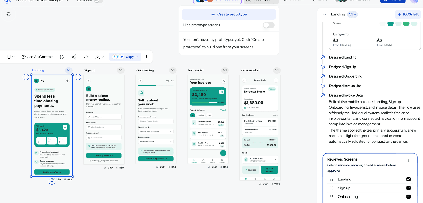
Using UXMagic to test ideas before you score them
UXMagic is an AI design tool that turns a text description into editable, multi-screen UI. For RICE, its job is simple: make testing an idea cheap enough that you do it for every uncertain item, not just the big bets.
A workflow that fits a scoring cycle:
- Start from the backlog item or its spec. Paste the idea as a prompt, or design from a document such as an existing PRD.
- Approve the screen plan. UXMagic proposes a named list of screens before designing anything, which is itself a quick Effort check. See flow mode and screen plans, or the flow mode AI UI generator for an overview.
- Stay low fidelity if structure is the question. Wireframe mode and the AI wireframe generator keep attention on flow rather than colour. Our comparison of low vs high fidelity helps you pick.
- Make it clickable and share it. Link the screens into a prototype, then share a preview with test users and collect notes with comments and feedback.
- Update the RICE sheet with what you learned and the evidence behind it.
- Hand the winners to engineering with real screens attached. The design-to-code generator exports code that gives developers a head start.
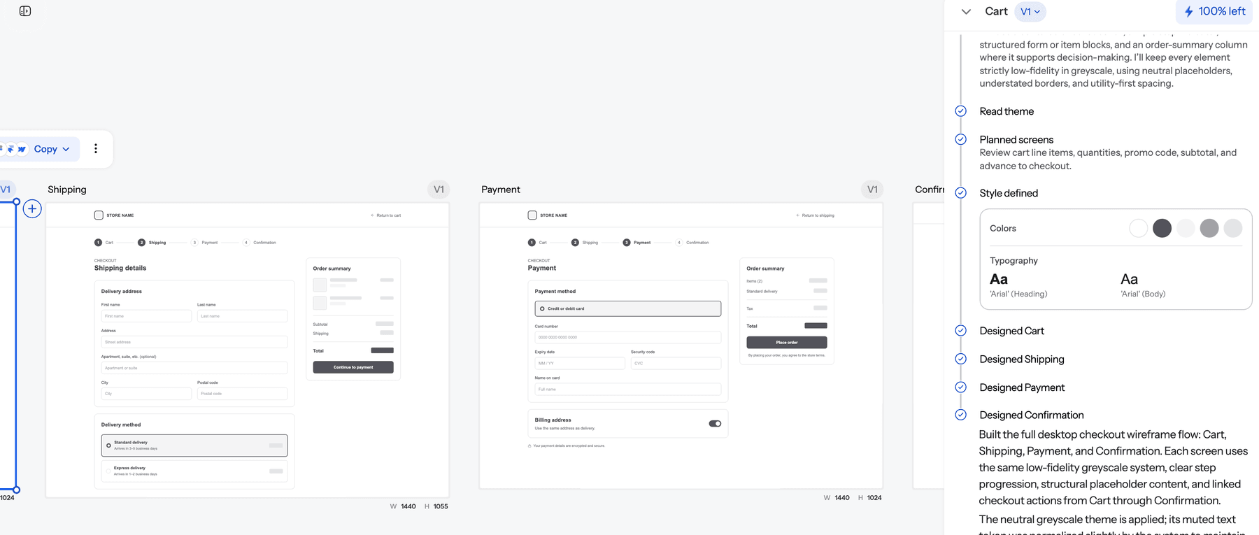
On cost: in UXMagic, proposing a screen plan costs 1 credit, designing a new screen costs 3, and a targeted edit costs 0.2, as listed in how credits work. The Free plan refreshes 20 credits every day (plans and limits), which is enough to test a small idea without a budget conversation. Larger teams can compare options on the pricing page.
What UXMagic does not do: it will not score your backlog, pull Reach from analytics or run user sessions for you. It removes the design cost of getting evidence. The judgement stays with your team.
For the wider PM toolkit around this workflow, see our list of AI tools for product managers and the spec-driven design workflow for PMs. Founders working without a designer may also find how to ship faster without a design team useful.
When to use RICE, and when not to
RICE works best when:
- you have a long backlog of comparable, reasonably well-defined ideas;
- you can estimate Reach from real usage;
- you need to explain roadmap choices to stakeholders or customers.
Reach for something else when:
- you are pre-product and have no users to count, where a focused AI MVP builder and direct customer conversations teach more than a spreadsheet;
- the work is a strategic bet or a platform dependency, where the reasoning matters more than the score;
- you are cutting scope for a fixed deadline, where MoSCoW is more direct.
Final thoughts
RICE is not clever. Its value is that it makes a team write down four estimates, the evidence behind them, and the cost of acting on them, then compare ideas in the same units. The score will be wrong sometimes. The conversation it forces is almost always better than the one it replaces.
The easiest way to make that conversation better is to bring evidence into it. Score the backlog, pick the items with high potential and low Confidence, prototype them, test them, and score again. With AI design tools, that loop now takes days rather than a sprint, so there is little reason to let a guess sit at 50% on your roadmap. If you want to see the cost side of that argument, read our breakdown of what it costs to build a SaaS MVP.
Related guides
- How to Validate a Product Idea: 7 Tests, With Templates
- How to Conduct a UX Audit: The 5-Step Framework From Friction to Fixed
- The Cost of Slow Design in SaaS
- How to Build a UX Portfolio That Gets You Hired in 2026
- Customer Journey Map Complete Guide: From Emotions to Wireflows
- 10 SaaS Onboarding UX Examples Doing It Right (And How to Implement Them)
- The UX Case Study Template Hiring Managers Actually Read
- ChatGPT for UI/UX Design: What It Does Well, and 10 Prompts
- 10 Bad UX Examples and the Catastrophic Business Costs They Trigger
- What Is a Product Requirements Document (PRD)? A Designer’s Take
Put evidence behind your roadmap
Describe a feature, get a multi-screen prototype you can test with users today, and score it on what you learned instead of what you assumed.