
TL;DR: To validate a product idea, list the assumptions it depends on and test the riskiest one first, cheapest method first: problem interviews, then a landing page or fake-door test, a clickable prototype test, and finally a pre-sale. Every step below comes with a copy-paste template. Only build the MVP once people have given you time, contact details or money, not compliments.
Most founders do not lack ideas. They lack a way to find out, quickly and cheaply, whether an idea is worth the next six months. The usual pattern is to build first and ask later, which is the most expensive way to learn that nobody wanted the thing.
This guide is the practical version: seven tests, in the order we would run them, each with a template you can paste into a doc today. It covers startup idea validation for software products, apps and SaaS, and it doubles as an answer to the question we hear most from first-time founders: "I have an app idea, where do I start?" We are the UXMagic team. We build an AI design tool, so where a step needs a landing page or a prototype, we show how to make one in UXMagic, and we say plainly where our tool does not help.
Why validate a product idea before building it
Building is no longer the hard part. AI app builders like Lovable and Bolt can put a working app in front of you in a weekend, and our look at what AI has done to SaaS MVP costs shows how far the price of a first version has fallen. What has not changed is the price of building the wrong thing: months of attention, runway and morale.
The evidence on this is consistent. In CB Insights' 2026 analysis of 431 failed venture-backed startups, running out of capital was the most common final cause, but poor product-market fit appeared in 43% of the cases where a reason could be identified. Money runs out because the market never showed up.
Validation reduces that risk in three ways:
- It kills bad ideas while they are cheap. A failed interview round costs a week. A failed launch costs a year.
- It sharpens good ideas. The problem customers describe is rarely the one you imagined, and the difference usually decides your positioning.
- It stops scope from ballooning. When you know the one job users care about, it is much easier to say no to everything else, which is the main defence against feature creep.
What counts as validation: the evidence ladder
The single most useful idea in validation is that not all positive signals are equal. Someone saying "I'd use that" costs them nothing. Someone paying a deposit costs them money. We rank signals on a ladder, from weakest to strongest:
- Opinions. "Sounds great." Almost worthless on its own.
- Stories. Specific past behaviour: "Last month I spent two evenings rebuilding that spreadsheet." Useful for understanding the problem.
- Clicks. A visitor clicks a call to action or a fake-door button.
- Contact details. A visitor leaves an email or joins a waitlist.
- Time. Someone books a demo, joins a pilot or sits through a 30-minute prototype test.
- Reputation. Someone introduces you to their boss or a colleague.
- Money. A pre-order, deposit, letter of intent or paid pilot.
A validated idea has evidence from the top half of the ladder, from people who match your target customer. Keep this ladder in mind for every test below: the goal of each one is to move people up a rung.
The 7 validation tests at a glance
| Test | Question it answers | Typical cost | Typical time | Strongest signal |
|---|---|---|---|---|
| 1. Assumption map | What must be true? | Free | 1 hour | None (it is a plan) |
| 2. Desk research | Is there existing demand? | Free | 1–2 days | Search and community activity |
| 3. Problem interviews | Is the problem real and painful? | Free to low | 1–2 weeks | Specific stories, referrals |
| 4. Landing page test | Will strangers care? | Low (ads optional) | 1–2 weeks | Emails, waitlist sign-ups |
| 5. Fake-door test | Will users want this feature? | Low | 1–2 weeks | Clicks in context |
| 6. Prototype test | Can people use the solution? | Low | 1 week | Task success, time spent |
| 7. Pre-sale | Will they pay? | Low | 1–3 weeks | Money or signed commitment |
You do not need every test for every idea. A feature inside an existing product might go straight to a fake door and a prototype test. A new startup should run at least interviews, a demand test and a pre-sale before writing much code.
Step 1: Write your assumptions down
Every idea is a stack of bets. Write them down so you can test them one at a time, instead of testing "the idea" as a whole and learning nothing specific.
ASSUMPTION MAP: <idea name>

Customer:    We believe <specific segment> ...
Problem:     ... struggles with <problem> at least <frequency> ...
Current fix: ... and today they solve it with <workaround>, which costs them <time/money/pain>.
Solution:    We believe <solution> removes that pain better than the workaround.
Channel:     We can reach them through <channel> for less than <cost> per lead.
Value:       They will pay <price> per <month/seat/order>.

Riskiest assumption (the one that kills the idea if false): ______
Cheapest test for it: ______
Pass mark, decided BEFORE the test: ______
Rank the assumptions by two things: how much the idea depends on each one, and how little evidence you have for it. Test the top-right corner first. If you want a more structured score, the confidence term in a RICE score is exactly this idea: low confidence means "test before you commit".
Two documents help here. A lightweight user persona template keeps the "customer" line honest, and a one-page product requirements document captures the solution once it firms up. If you would rather start from a paragraph, UXMagic's AI PRD generator turns a product description into a structured PRD with matching screens.
Step 2: Do quick desk research
Before talking to anyone, spend a day or two finding out what already exists. You are looking for evidence that people are actively trying to solve the problem.
- Competitors and substitutes. List direct competitors and the spreadsheets, agencies or habits people use instead. Read their one- and two-star reviews: complaints are free problem research.
- Search demand. Keyword tools and Google Trends show whether people search for the problem, and in what words.
- Communities. Subreddits, Slack groups, forums and LinkedIn threads where your customer complains in public.
- Job posts and pricing pages. If companies hire people to do the task manually, or competitors charge real money for it, the problem has a budget.
Competition is usually good news: it proves a market. What you need is a sharp reason someone would switch. Mapping the customer's current process as a customer journey map makes the painful moments easy to see. Our roundups of AI tools for UX research and AI tools for product managers cover the tools that speed up this reading and synthesis.
Step 3: Run problem interviews
Interviews are the highest-value, lowest-cost validation step, and the easiest to get wrong. The best practical guide is Rob Fitzpatrick's book The Mom Test, whose core advice is to talk about the customer's life rather than your idea, ask about specific things that already happened rather than hypothetical futures, and listen far more than you talk. People are polite; they will praise an idea they would never pay for.
Recruit people who match your segment, not friends. Aim for 20 to 30 minutes each. Do not show a product or a mockup yet.
PROBLEM INTERVIEW SCRIPT (20–30 min)

Intro (2 min)
"I'm researching how <role> handle <task>. I'm not selling anything.
There are no wrong answers, and I'm most interested in real examples."

Context (5 min)
1. Walk me through your role. Where does <task> fit in your week?
2. When did you last do <task>? Talk me through exactly what happened.

Problem (10 min)
3. What was the hardest part of that last time?
4. Why was it hard? What did it cost you (time, money, stress)?
5. What have you tried to fix it? What happened?
6. What are you using today? What do you like and dislike about it?
7. Have you paid for anything to solve this? How much? Who approved it?

Priority (5 min)
8. Where does this rank among the problems you're dealing with right now?
9. If you could wave a magic wand, what would change?

Close (3 min)
10. Who else deals with this that I should talk to?
11. Can I show you something rough in a couple of weeks?

AFTER: note the exact words they used, the workaround, the cost,
and whether they agreed to #10 and #11 (these are ladder rungs).
After each batch of five, look for patterns. A validated problem sounds like this: people describe it without prompting, in similar words, they have already tried to fix it, and they give you referrals. A weak one sounds like "yeah, that's annoying sometimes". If answers vary wildly, your segment is too broad; narrow it and interview again. Many teams run this step inside a compressed design sprint or the "empathise" phase of the design thinking process.
How many interviews? Nobody has an official number. Our rule of thumb is to keep going until new conversations stop surprising you, which is often in the 10 to 20 range for a single segment.
Step 4: Test demand with a landing page
A landing page test (sometimes called a smoke test) asks strangers to act on your promise. You describe the product as if it exists, send targeted traffic, and measure how many visitors take the next step: joining a waitlist, requesting early access or clicking a pricing plan.
The classic example is Buffer. In 2010, founder Joel Gascoigne put up a two-page site explaining the idea and tweeted it. When people left emails, he added a pricing page in between to check whether they would still click through once they saw a price. They did, and he then built the first version in seven weeks; by his own account the first paying customer arrived four days after launch.
LANDING PAGE TEST PLAN

Hypothesis:  <segment> will join a waitlist for <promise>.
Page:        Headline = the outcome, in the customer's interview words
             Subhead  = who it's for + how it works in one line
             3 benefits, 1 screenshot or mockup, 1 call to action
             Optional: pricing section with plans that lead to the waitlist
Traffic:     <channel>, <budget>, targeting <segment>. Aim for a few
             hundred targeted visitors before reading results.
Measure:     Visitor → CTA click → email submitted (→ pricing click)
Pass mark:   Decide before launch. Compare two headlines, not one page
             against an industry average.
Follow-up:   Email every sign-up within 24 hours and ask for a call.
A few rules of thumb (ours, not industry standards). Traffic quality matters more than design polish: warm traffic from a community where you already answered questions will convert very differently from a cold ad. Test the promise, not the colour of the button; if two very different headlines perform the same, neither is resonating. And the follow-up email is where the real validation happens, because a sign-up who agrees to a call has climbed two rungs.
For page structure, our guides to SaaS landing page design and landing page examples that convert cover the anatomy, and UX microcopy that converts helps with the call to action.
Building the test page in UXMagic
You do not need a designer or a website builder for this. Describe the product in the AI landing page generator, or start from a SaaS landing page template or an AI SaaS landing page template, then edit the copy in chat with the phrases your interviewees used. Our guide to writing a good prompt helps you get closer on the first try.
When it reads right, click Publish. The publish your first site guide walks through it: pick which screens become pages, choose a subdomain on uxmagic.io, run the preflight check and publish, with HTTPS included. Each deployment also gets a preview URL, which is useful for checking the page before you send traffic. The subdomains and URLs article explains naming, and you can later move the page to your own domain with custom domains. Want to test a second headline? Edit, publish again, and use redeploy and rollback if you need the previous version back.
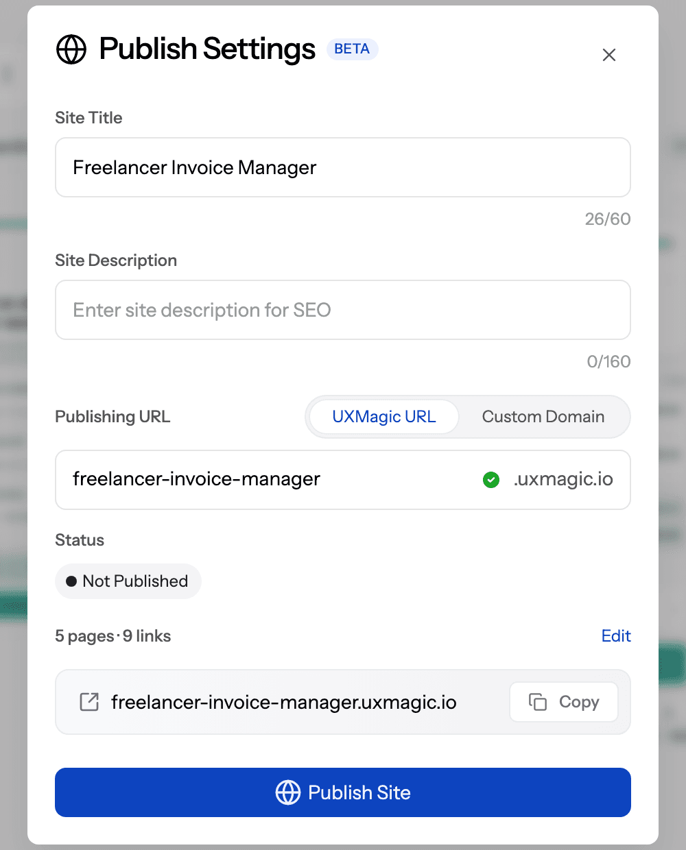
Be honest about scope: UXMagic builds and hosts the page, but you will still need a form or waitlist service to collect emails and an analytics tool to count visits. Publishing works on the Free plan within its published-site limit; removing the UXMagic badge needs a paid plan, as the plans and limits page explains.
Build your validation landing page today
Describe your idea, get a landing page, edit it in chat and publish it to a live URL, no code required.

Step 5: Run a fake-door test
A fake-door test (also called a painted-door test) puts an entry point for a feature that does not exist yet where real users will see it: a menu item, a button, an extra pricing tier. You count clicks, then show an honest message. It is the best way to validate a new feature inside an existing product, or an upsell on a landing page, because it measures intent at the moment of use rather than in a survey.
FAKE-DOOR TEST PLAN

Feature:     <feature name>
Door:        <where it appears: nav item / button / pricing tier>
Audience:    <which users see it, % of traffic>
Duration:    <1–2 weeks or N exposures>
Metric:      unique clicks ÷ unique users who saw the door
Pass mark:   <decided in advance, ideally vs. an existing feature's click rate>

Message shown after click:
"Thanks for your interest! <Feature> isn't ready yet. We're deciding
what to build next. Want early access? [Join the waitlist]
Tell us what you hoped it would do: [short text field]"

Ethics: never take payment for a fake door, never hide that it's
not ready, and remove the door when the test ends.
Two cautions. First, a fake door measures curiosity as well as need, so pair it with the follow-up question ("what did you hope it would do?") and a few interviews. Second, do not overuse it on the same users; repeated dead ends erode trust. If a fake door wins, feed the result into your prioritisation, for example as the Reach and Confidence inputs of a RICE prioritisation, before the feature goes on the roadmap. That discipline is what keeps an MVP from sprouting every feature that got a few clicks.
Step 6: Test a clickable prototype with real users
Interviews tell you the problem is real. A demand test tells you people want the promise. A prototype test tells you whether your solution actually works for them. It is also the cheapest place to discover that your flow has an extra step nobody understands.
Jakob Nielsen's widely cited Nielsen Norman Group article argues that testing with about five users uncovers most usability problems (he estimates around 85%), and that several small rounds beat one large one. For validation, that means: test with five people, fix what broke, test again.
PROTOTYPE USABILITY TEST PLAN

Goal:        Can <segment> complete <core job> without help?
Prototype:   <link>, <N> screens, the one core flow only
Participants: 5 per round, matching the segment (not teammates)
Session:     30 min, remote or in person, recorded with consent

Script
- Warm-up (3 min): "We're testing the design, not you. Please think aloud."
- Scenario: "Imagine you <context>. Use this to <goal>."
- Tasks (15 min):
  T1 <first key action>      success = <end screen reached, no hints>
  T2 <second key action>     success = <...>
  T3 <find/understand X>     success = <...>
- Debrief (7 min):
  "What was that for, in your own words?"
  "What would stop you using this?"
  "What would you expect to pay? Who would sign off on it?"

Record per task: completed (Y/N), hints needed, time, quotes.
Fix the top 3 issues, then run round 2.
Keep it to one flow. The point of an MVP is a single job done well, and our guide to MVP design covers which screens that usually means. If you are unsure how polished the prototype needs to be, low- versus high-fidelity and wireframe vs mockup vs prototype explain the trade-off: rough is fine for testing structure, but pricing and trust questions land better on something that looks real.
Building the prototype in UXMagic
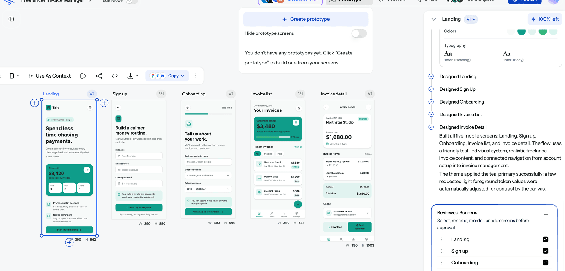
This is the step UXMagic is built for. Describe the journey rather than individual screens, and the AI proposes a screen plan (a named list of screens, each with a one-line purpose) that you can approve, edit or reject before anything is designed. After approval, flow mode designs the screens on one shared theme and navigation; the flow mode and screen plans help article covers the details, and the Flow Mode generator page shows examples. If you want to settle structure first, wireframe mode produces greyscale layouts; if you already have a spec, you can design from a document.
When the screens are ready, the Prototype button in the canvas top bar opens prototype mode, where you link the screens into a clickable flow. Send testers a link with share a preview, and collect notes from teammates with comments and feedback. Between rounds, make targeted edits in chat rather than regenerating screens: the how credits work page shows that a targeted edit costs 0.2 credits against 3 for designing a new screen.
Where UXMagic stops: it does not recruit participants, run moderated sessions or record them. Use a research platform for that; our AI UX research tools roundup lists options. For a wider view of prototyping tools, see the best prototyping tools of 2026, and for the underlying method, what a prototype is in UX design.
Step 7: Ask for money with a pre-sale
Everything so far measures interest. A pre-sale measures commitment, the top rung of the ladder. Ask a subset of your most engaged interviewees, sign-ups and testers to pay before the product exists, or to sign something that commits budget.
A well-known early version comes from Zappos: founder Nick Swinmurn tested whether people would buy shoes online by photographing shoes in local stores and posting them on a simple site, then buying the pairs at retail when orders came in. The orders were the validation; the warehouse came later. This is a "Wizard of Oz" or concierge approach, and both are standard MVP types worth reading up on before you commit to code.
PRE-SALE OFFER TEMPLATE

To: <interviewee or waitlist sign-up who described the pain>

"When we spoke, you said <their exact words about the problem>.
We're building <product> to <outcome>. Here's what it looks like: <prototype link>.

We're opening <N> founding-customer spots:
- <price> for the first <period> (normally <price>)
- Direct input into what we build first
- Full refund if we don't deliver <core outcome> by <date>

Would you like a spot? I can send a payment link or a short
letter of intent for your team."

Track: offers sent → replies → calls → payments / LOIs
For B2B, a signed letter of intent or a paid pilot counts; a verbal "we'd definitely buy" does not. For consumer apps, a refundable deposit or a crowdfunding pre-order plays the same role. If nobody pays, ask why. The answers ("not a priority this quarter", "my boss decides", "we'd need X first") are among the most useful data you will collect.
How to decide: persevere, pivot or stop
Set your pass marks before each test, then review the evidence together. We use a simple scorecard.
VALIDATION SCORECARD

Problem   [ ] 10+ interviews in one segment describe the pain unprompted
          [ ] They already spend time or money on a workaround
Demand    [ ] Landing page / fake door beat the pass mark you set in advance
          [ ] Sign-ups agree to follow-up calls
Solution  [ ] 4 of 5 testers complete the core task in round 2 without hints
Value     [ ] At least a few paid pre-orders, deposits or signed LOIs

All boxes:        build the MVP (one flow, nothing extra)
Problem, no value: change price, buyer or segment, then re-test
No problem:       stop or pivot to the problem people did describe
These thresholds are our rules of thumb, not industry standards; adjust them to your market and price point. Once you have a live product with users, switch to a post-launch measure. The best known is Sean Ellis's product-market fit survey, which asks users how they would feel if they could no longer use the product; his benchmark is that products with strong traction usually have more than 40% of users answering "very disappointed".
Persevering means building the smallest real version. A signup flow generator handles the onboarding screens every MVP needs, and the spec-driven design workflow for PMs shows how to turn the validated scope into a buildable spec. Resist adding the ideas that got a few clicks in passing; every extra feature delays the moment you learn whether the core one works.
Common validation mistakes
- Asking friends and family. They love you, which makes their feedback useless as evidence.
- Pitching in interviews. The moment you describe your solution, people start being polite.
- Counting compliments. Opinions are the bottom rung. Count actions.
- Moving the goalposts. Deciding the pass mark after seeing the result means the test cannot fail.
- Testing everything at once. A landing page that changes the audience, price and promise simultaneously tells you nothing about which one mattered.
- Building "just a quick MVP" first. With AI builders it feels cheap, but code creates commitment and sunk cost. Test the flow as a prototype before you generate a backend.
- Treating AI personas as users. Simulated interviews can sharpen your questions. They cannot tell you whether a real buyer has budget.
Where AI helps (and where it doesn't)
AI is genuinely useful for the making parts of validation and weak at the deciding parts.
It helps you move faster through desk research and synthesis, draft interview guides (then edit out the leading questions), cluster interview notes into themes, write landing page variants and build the pages and prototypes you test with. UXMagic covers the design side: the AI MVP builder and AI prototype generator turn a description into a connected set of screens, the AI website generator handles multi-page marketing sites, and sketch to UI converts a whiteboard drawing into a screen. Our walkthrough of how to design UI with AI shows the workflow end to end, and vibe designing explains why we plan screens before generating them.
AI app builders are a different category: they generate working code, which is useful once the idea has earned it. Compare the options in our AI app builders for non-developers guide, our Lovable alternatives roundup, and, for mobile ideas, our a0.dev alternatives list. If you prefer to design inside your code editor, our Pencil.dev review covers that route. None of these tools validates anything by itself: only people spending time or money does.
I have an app idea: where do I start? A two-week plan
If you have an idea and no clear next step, this is the order we would follow. It assumes a few focused hours a day.
Days 1–2: write and research. Fill in the assumption map. Spend a day on competitors, reviews and communities. Draft a one-page brief; a quick user flow diagram of the core job helps.
Days 3–7: interview. Book 10 to 15 problem interviews with people in one segment. Rewrite your promise in their words.
Days 6–8: build the test assets. Generate a landing page and publish it. Design the core flow as a clickable prototype. Our guide for founders shipping without a design team covers doing this solo, and mobile app design covers app-specific patterns.
Days 8–12: run demand and prototype tests. Drive targeted traffic to the page. Run two rounds of five prototype sessions with sign-ups and interviewees.
Days 12–14: ask for money and decide. Send the pre-sale offer to your most engaged people. Fill in the scorecard. Build, change or stop.
The cost is mostly your time. On UXMagic's Free plan you get 20 credits a day; a landing page and a short flow fit within a few days of that allowance, and the pricing page lists what Pro adds if you need more screens.
Related reading
- What is an MVP? Minimum viable product meaning, types and examples
- MVP design: which screens to build first
- RICE score explained, with a worked example
- What is feature creep, and how to stop it
- The best AI tools for product managers
- User persona template for AI-ready UX workflows
- What is rapid prototyping?
- Sketch to prototype: the AI workflow
Turn your idea into something people can test
Generate a landing page and a clickable prototype from one description, then publish and share them with real users.