
Most user flow diagrams are dead on arrival because product teams spend hours connecting floating shapes instead of mapping actual UI logic. By the time a whiteboard flowchart is formatted, product requirements have already shifted, leaving designers with visual clutter that engineering ends up ignoring. This guide outlines a modern execution framework for building structured, edge-case-proof user flows that transition directly into shipping software.
Where traditional diagrams still earn their place: whiteboards and abstract flowcharts remain genuinely useful for early ideation - quickly sketching a concept with a team in a room, before any real screens exist to reference. What this guide argues against isn't the whiteboard itself; it's treating that early sketch as if it were a finished specification, then paying the cost twice: once to draw it, and again to manually rebuild the same logic in Figma.
You already understand digital product design and wireframing tools. This isn't an explanation of what a rectangle or an oval represents in a flowchart. It's the operational framework - connector syntax, sub-flow isolation, generative multi-screen assembly - that separates a user flow engineering actually builds from versus one that gets nodded at in a review and quietly discarded.
Traditional Flow vs. Modern Wireflow
| Feature | Traditional Diagram | Modern Wireflow |
|---|---|---|
| Input | Manually drawn shapes and connectors | Text prompt, PRD, or sketch |
| Representation | Abstract boxes, diamonds, arrows | Actual UI screens with real components |
| Edge cases | Often mapped late or skipped under time pressure | Generated alongside the primary flow |
| Editing | Manual repositioning of every affected element | Prompt-based regeneration, styles preserved |
| Figma handoff | Requires full manual reconstruction | Exports with auto-layout intact |
| Engineering handoff | Static image, logic reconstructed by hand | Structured code or spec, ready for implementation |
Why Traditional User Flow Diagrams Fail Product Teams
The Problem with Decision Diamonds and Visual Spaghetti
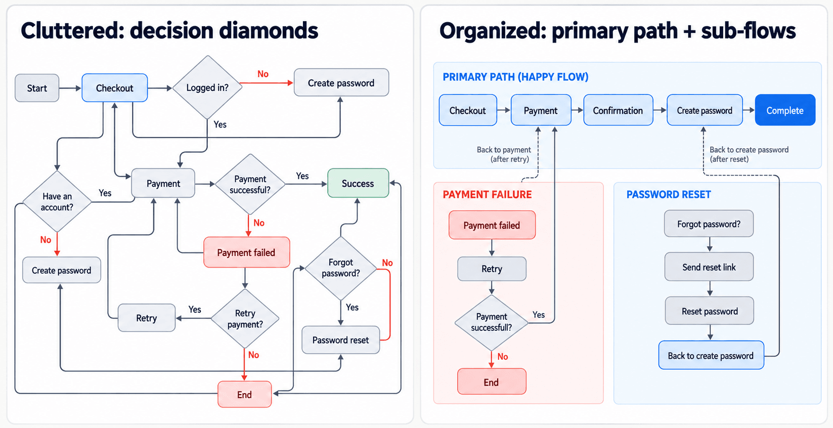
Conventional flowcharting standards mandate diamond shapes for decision forks. A common usability observation among practitioners is that decision diamonds tend to increase line-crossing and reduce visual clarity as branching logic scales - worth treating as a general pattern worth watching for rather than a precisely quantified rule, since the actual degree varies by diagram complexity and tool. Product teams often get more mileage replacing decision diamonds with linear split-path rectangles or dedicated sub-flows - this preserves left-to-right reading momentum and reduces the spatial clutter that turns a flow into "visual spaghetti" the moment a second or third branch enters the picture.
Abstract Boxes vs. Production-Ready Wireflows
Industry advice suggesting teams draft low-fidelity box diagrams before touching UI layouts introduces a redundant step into modern design workflows. Generative UI engines eliminate abstract shape mapping by letting practitioners generate structured multi-screen wireflows directly from text requirements - manual shape mapping as an isolated first step wastes discovery cycles that could go straight into evaluating real interface logic instead.
Static whiteboard flowcharts are genuinely useful for open ideation; they tend to fail as production artifacts specifically. Static vector diagrams require manual screen reconstruction in Figma, which is exactly how component inconsistencies and lost layout logic creep in - the diagram said one thing, and the rebuilt screen quietly drifted from it.
The 5-Phase Framework for Edge-Case-Proof User Flows
Step 1: Mapping Entry Context and User Intent
Establish user entry conditions using product analytics and telemetry data. Categorize entry channels - organic search landing pages, direct app launches, deep-linked emails, third-party single sign-on redirects - to anchor user context before screen generation starts. A flow built without knowing where users actually enter from tends to assume a single clean starting point that doesn't match reality.
Step 2: Isolating Sub-Flows to Prevent Line Crossing
Map primary paths while isolating complex operations into distinct sub-flows. High-friction sequences - payment checkout, subscription tier changes, account role updates - get decoupled into self-contained sub-flows specifically to protect the main diagram's readability. Bundling every exception into the primary flow is the fastest way to turn a clean diagram into an unreadable one.
Step 3: Generating Multi-Screen UI Layouts with AI
Bypass abstract box drawing by generating structured multi-screen wireflows using generative UI engines. Natural language prompts and product specifications convert directly into UI layouts with responsive spacing systems, visual hierarchy, and component consistency built in - not patched on after the fact. This is where UXMagic's Prompt to UI fits directly into the framework: instead of spending hours assembling wireframe components or drawing abstract shapes, product managers and designers input raw PRD text or sketches directly, and the platform outputs fully connected multi-screen UI flows with native auto-layout structure and editable vector layers - a strong, structured starting point for implementation, though still one that benefits from the validation covered later in this guide. For teams working from an existing live product rather than a blank prompt, Clone Website pulls a real reference page's structure directly into the same generative pipeline.
Step 4: Standardizing Connector Syntax and Annotations
Apply standardized visual rules across every connection:
- Primary connector (bold, solid line) - the main forward path, screen to screen
- Secondary connector (dotted line) - return or "go back" navigation
- System annotation (small inline label near the connector) - a brief note on what triggers the transition (e.g., "on successful payment," "after 15 min idle")
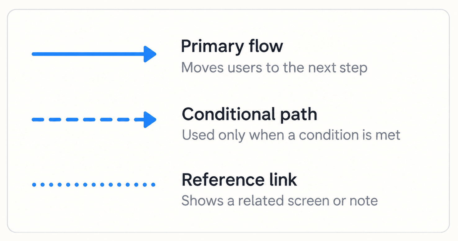
Consistency here is what makes a flow scannable at a glance - a reader shouldn't have to guess whether a given line means "next step" or "go back."
Step 5: Bridging Handoff to Figma and Front-End Code
Validate the flow for technical feasibility and sync screens directly into product environments. Layouts should transfer to Figma with auto-layout constraints intact or export as clean React, HTML, and CSS code components ready for front-end integration - not a flat vector image someone has to manually reconstruct on the other end of the handoff. Worth being precise about the term here: this output is best described as implementation-ready or structured for handoff - genuinely usable as a real starting point, but still requiring engineering's own validation before it ships as production code.
User Flow Diagram Examples by Product Category
B2B SaaS Onboarding and Permission Architecture
A product team designing a multi-step enterprise setup flow - workspace creation, domain verification, role-based permissions - using traditional methods often drafts shape diagrams that miss real edge cases, like single sign-on domain conflicts, until they surface as missing screen revisions during engineering sprints. Applying a generative workflow instead, the team inputs the onboarding requirements into a prompt-driven UI tool, and the engine builds a complete multi-screen flow containing form fields, team invite modals, error states, and responsive auto-layout structures in one pass - the SSO conflict edge case gets mapped as a real screen state upfront, not discovered mid-sprint. UXMagic's Signup Flow Generator is purpose-built for exactly this account-creation-and-verification sequence.
E-Commerce Guest Checkout and Exception Paths
A mobile retail team aiming to reduce checkout abandonment while capturing post-purchase account registrations hits a related failure mode with legacy diagrams: multiple decision diamonds for payment checks and password setup create real line-crossing confusion. The optimized approach maps checkout linearly from left to right, placing exception loops - like card payment failures - below the main axis rather than tangled into it. Generating real interface layouts directly, rather than abstract shapes, eliminates ambiguity for front-end development at the same step.
Where Basic AI UI Tools Fail at This Specific Job
Standard AI design tools frequently produce non-functional outputs by rendering static raster mockups. They tend to fail at maintaining component consistency across sequential screens, generate broken button alignments, and lack responsive layout structure - forcing designers to manually rebuild generated assets, which negates whatever time the tool was supposed to save in the first place.
The Edge Cases Most Flows Miss
A happy-path-only flow is a common and costly gap. Beyond the payment-failure and SSO-conflict examples above, a few specific states worth mapping deliberately in almost any flow:
- Session expiration - what happens if a user's session times out mid-task, especially on a multi-step form
- Duplicate submission - what the interface does if a user double-clicks submit or resubmits after a network hiccup
- Offline state - how the flow behaves if connectivity drops partway through, particularly on mobile
- Permission denied - what a user sees when they attempt an action their role doesn't allow
- Partial completion - whether progress is saved if a user abandons a multi-step flow and returns later
None of these are exotic - they're common enough that skipping them is usually what generates the "engineering keeps catching missing edge cases during sprint planning" complaint in the first place.
How to Generate UI Flows Directly from Text Prompts
Converting a raw PRD or sketch into a wireflow is the core mechanical shift this whole framework is built around. When edge cases surface - payment failures, session timeouts, validation errors - UXMagic generates supplementary screens while preserving existing visual styles and component systems, so a newly discovered exception state doesn't require rebuilding the flow's visual language from scratch.
During engineering handoff specifically, UXMagic exports React, HTML, and CSS code directly from the visual flow, bypassing manual redrawing and accelerating front-end implementation. Teams working from an early hand-drawn sketch rather than a text prompt can use Sketch to UI to carry that same generative discipline back to the earliest stage of the process - the input format changes, but the output stays structured either way. And for teams whose PRD itself still lives as scattered notes rather than a real document, UXMagic's PRD Generator produces the requirements doc and the matching screens together, so Step 1's entry-context mapping has a real spec behind it before generation even starts.
What Still Needs Human Validation
Generated flows are a genuinely strong starting point - they're not a substitute for a few specific kinds of judgment that still need a human:
- Business rules - a generated flow can structure a permission check visually; it can't know your specific business logic for who gets which access level
- Conditional logic - complex branching tied to real backend state needs explicit specification, not an assumption baked into the generation
- Accessibility - generated screens can look structurally sound without automatically guaranteeing contrast ratios, keyboard navigation, or screen reader behavior
- Technical feasibility - whether a proposed flow is actually buildable against your existing architecture is an engineering call, not a design-tool output
Build Better User Flows
Generate connected, edge-case-aware UI flows from your PRD and move from entry point to implementation-ready handoff without rebuilding diagrams manually.