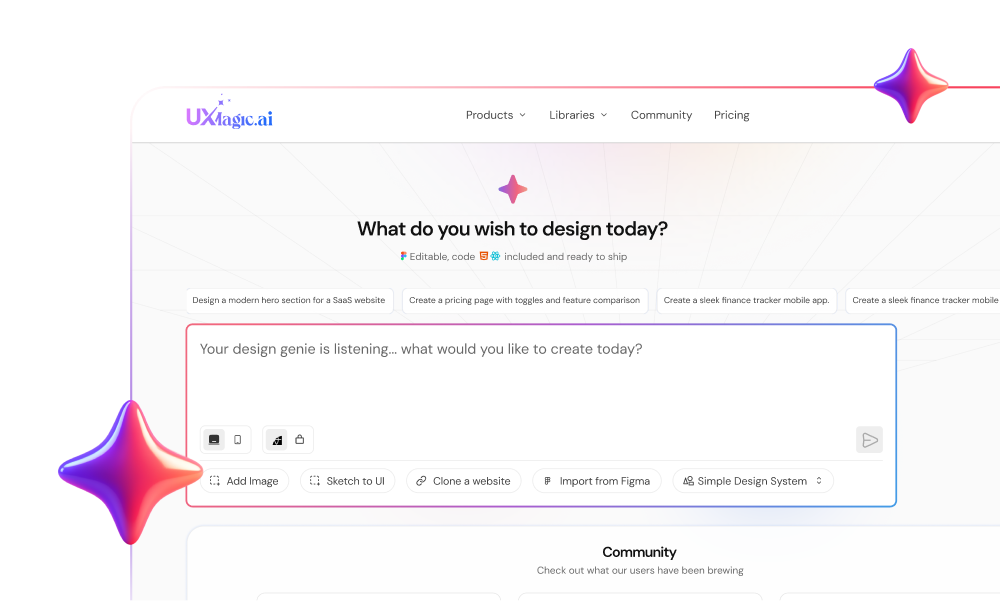
Design teams routinely lose real chunks of active sprint time to repetitive UI scaffolding, hunting down outdated Figma links, and rebuilding component states that engineering already coded around. Throwing more designers at a broken process just scales your operational overhead. Real Design Operations cleans up this process drag, turning design from a production bottleneck into a genuinely automated execution pipeline.
Design Operations (DesignOps), in one sentence: it's the discipline of managing the people, processes, and tools around design work - intake, tooling, handoff, governance - so designers spend their time on actual design decisions instead of administrative and mechanical overhead.
You already understand auto-layout, component libraries, design systems, and agile rituals. This isn't a "what is a prototype" primer. It's the practical strategy - automated scaffolding, token synchronization, structured intake - that lean product teams use to scale design output without linearly scaling headcount.
Before / After: The Workflow This Guide Is Built Around
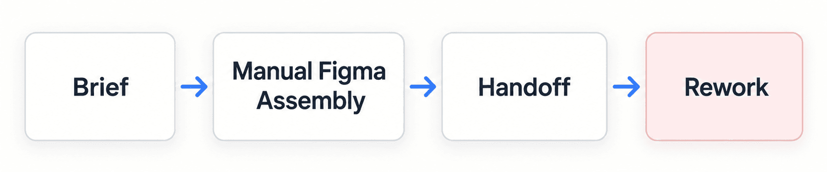
versus

The difference isn't that AI removes a step - it's that "Manual Figma Assembly" (days of drawing frames) collapses into a fast first draft, freeing the time that used to go into layout mechanics for an actual design review instead. "Rework" disappears from the second path specifically because state coverage (empty, error, hover, mobile) gets generated upfront, not discovered mid-sprint.
The Operational Bottleneck: Why Design Teams Stall as Headcount Grows
The Hidden Cost of File Fragmentation and Manual UI Scaffolding
"Which Figma link is the actual production checkout flow?" is a genuinely common Slack message, and it's a symptom, not the real problem. Unstructured requests submitted via informal chat or incomplete backlog tickets introduce scope ambiguity that costs real iteration cycles. A meaningful share of design bandwidth on many teams goes toward routine screen construction - standard form layouts, auto-layout frame configuration, standard dashboard components - mechanical assembly that limits the time actually available for user flow testing and edge-case mapping.
Design System Drift: The Growing Divide Between Figma and Code
When vector component libraries drift away from production code repositories, the design system loses its authority as a single source of truth. "Dev built custom CSS because the Figma UI kit was outdated" is exactly what happens next - developers bypass outdated design files with their own styles, creating visual inconsistencies and accumulating frontend technical debt nobody explicitly decided to take on.
The DesignOps Maturity Model
Most teams sit somewhere on this spectrum, and knowing where you are matters more than jumping straight to "automated":
| Stage | What It Looks Like | Typical Tools/Processes |
|---|---|---|
| Manual | Ad hoc requests, no shared token source, every screen hand-built | Chat-based intake, disconnected Figma files, no formal handoff spec |
| Standardized | Intake templates exist, a design system exists, but enforcement is manual | Intake forms, a documented (if inconsistently followed) design system |
| Automated | Token sync enforced in tooling, AI-assisted scaffolding for routine screens | Synced design tokens, prompt-driven UI generation, automated state coverage |
| Scaled | Automation handles routine production; human effort concentrates on strategy and governance | Everything above, plus measurement (the metrics table below) feeding continuous process refinement |
Most of this guide is about the jump from Standardized to Automated - that's where the real time savings live, and it's also the stage most teams skip past too fast, jumping straight to hiring before the tooling actually supports scale.
Redefining Design Operations: Mindset First, Headcount Second
Moving Beyond Enterprise Bureaucracy: Lean Operations for Mid-Sized Teams
Hiring a dedicated DesignOps manager is often a poor early move for scaling an early-to-mid-stage design team. Real design velocity doesn't come from adding administrative oversight; it comes from automating low-fidelity visual scaffolding and synchronizing tokens directly with code. If your process relies on manual oversight meetings to enforce design quality, that's usually a sign the operational model needs fixing before the org chart does.
On the hiring threshold specifically: there's no single universal headcount number where a dedicated DesignOps hire becomes necessary - it depends on team complexity, not just raw size. As a practical range: teams under roughly 10 designers almost always get more value from automation-first tooling than from a dedicated hire. Between 10 and 20, the right call depends on how much cross-functional coordination the team actually needs - a highly complex, multi-product org might justify a hire earlier; a single-product team with good tooling might comfortably wait past 20. Past roughly 20 designers, most organizations find dedicated DesignOps genuinely pays for itself. Treat that as a range to evaluate against your own complexity, not a hard trigger.
Process Governance That Automates Rather Than Gatekeeps
Traditional DesignOps implementations often introduce heavy approval gates, mandatory sign-off rituals, and rigid review stages. When governance relies on manual oversight, it tends to delay shipping velocity and limit designer autonomy. Operations work better focused on automating tedious assembly tasks - auto-layout setup, grid alignment, standard component state generation - freeing designers to spend energy on actual user experience strategy instead.
Design teams also often invest real months writing exhaustive design system handbooks that developers rarely open. Static documentation degrades quickly as requirements evolve. Operational rigor holds up better when it's built on single-source token architectures that sync visual properties across design canvases, generative UI engines, and production repositories - governance embedded directly in the software, not stored in a wiki nobody references. UXMagic's Style Guide Generator is built specifically around this - defining colors, typography, and spacing as a real, structured token system from a prompt, screenshot, or URL, so the token source lives inside the tools people actually use daily, not a separate reference doc.
The Three Pillar Execution Framework for Scalable Design
- Intake Standardization: Eliminating Ambiguous Requirements
Every feature request should route through a standardized intake template requiring a problem statement, target user profile, key performance indicators, and technical constraints. Product leads review submitted tickets against sprint capacity, and requests lacking required user stories or success metrics get routed back to the submitter for refinement before entering design - before, not during, the design cycle. UXMagic's PRD Generator gives this step a real, structured output - producing a requirements document and a matching set of screens together, so intake standardization doesn't stop at a form nobody fills in properly.
- AI-Assisted UI Production: Transforming Briefs into Generative Flows
The core design phase shifts from manual vector drawing to prompt-assisted flow scaffolding and component refinement. Designers input validated product specifications into an AI generation tool to instantly produce editable multi-screen layout flows, with the generative engine building layouts against preset design tokens to keep colors, typography, and spacing consistent from the first draft - not patched in after the fact.
- Automated Token Governance: Synchronizing Assets with Engineering
Assets should undergo automated checks confirming every layout element uses production tokens rather than hardcoded visual overrides. Designers generate complementary system states - loading displays, empty data views, hover behaviors, mobile breakpoints - to complete the specification package before it ever reaches engineering, closing the exact gap that turns a clean handoff into a mid-sprint Slack thread.
What AI Actually Replaces and What It Doesn't
Worth being direct about the boundary here, since it's easy to overstate. AI-assisted scaffolding genuinely reduces time spent on repetitive UI production - routine layouts, standard component states, mobile breakpoint variations. It does not replace user research, prioritization decisions, core UX judgment, or design leadership. A generated flow still needs a human to decide whether the underlying feature is worth building, whether the interaction model actually serves the user, and whether the visual hierarchy communicates what matters most. The time saved is specifically in mechanical assembly - not in the thinking that determines what gets assembled.
Step-by-Step Guide: Implementing Design Operations in Product Sprints
Step 1: Auditing Workflow Bottlenecks and Tooling Overhead
Audit team workflows to identify where design time is actually lost - file hunting, manual layout assembly, unvetted project requests. Many organizations pay for four separate design tools while everyone ends up just exporting PNGs between them; fragmented context across disconnected platforms inflates software costs and loses project records nobody can reliably find later.
Step 2: Establishing a Single Source of Truth for Design Tokens
Establish one canonical token source syncing visual properties across design files, generative tools, and production code - not three slightly different versions of "the brand blue" living in three different places. Teams with an existing Figma-based system don't need to rebuild this from scratch - importing those styles directly keeps every newly generated screen anchored to the real, existing tokens instead of introducing a second, competing source.
Step 3: Automating Wireframe Scaffolding and UI Flow State Generation
This is where prompt-driven UI generation earns its place in the pipeline. Instead of manually drawing every frame, product managers and designers convert approved requirement documents directly into visual layouts using a text-to-UI engine - transforming feature briefs into structured, multi-screen wireframe flows instantly, so team discussion can move straight to evaluating interaction logic and business validation instead of waiting on layout assembly.
For complex SaaS applications needing consistent screen sequences - checkout procedures, settings panels, reporting tables - Flow Mode generates connected multi-screen UI sequences that maintain visual style rules, typography hierarchies, and spacing tokens across every frame, enforcing systematic token rules during generation rather than letting drift creep in across a rapid iteration cycle.
Step 4: Structuring Friction-Free Engineering Handoff Rituals
Prior to developer handoff, generate the layout states that routinely get skipped under deadline pressure - responsive tablet and mobile views, empty data states, input error displays, hover behaviors - so engineering receives complete layout specifications instead of discovering the gaps mid-sprint. On the code side specifically, UXMagic's React Component Library is what that handoff actually produces - real, structured components with props and hierarchy, closing the gap between a validated design and code engineering can build from directly.
The DesignOps Tool Stack
A useful way to think about tooling is by function, not brand - each of these needs to exist somewhere in your stack, even if one tool covers multiple functions:
- Intake - a structured form or ticketing system that captures problem statement, target user, and success metrics before work begins
- Design system - the canonical source of tokens, components, and patterns everything else references
- UI generation - the layer that turns validated briefs into first-draft layouts, ideally token-aware from generation
- Documentation - living reference material, kept minimal since static docs degrade fast (see the earlier point on token sync over handbooks)
- Developer handoff - the mechanism carrying structured specs (states, tokens, responsive rules) to engineering, not just static screenshots
- Analytics/measurement - tracking the metrics in the table below, so operational changes get evaluated against real data, not vibes
Measuring DesignOps: A Metrics Table
| Metric | What It Measures | How Often to Track |
|---|---|---|
| Intake-to-wireframe cycle time | How long from validated brief to first reviewable layout | Per project |
| Sprint turnaround time | Overall design cycle velocity | Per sprint |
| Post-handoff engineering rework hours | How often missing states or drift cause mid-sprint fixes | Per sprint |
| Component/token adoption rate | Whether generated and manual work actually stays on-system | Monthly |
| Designer productivity/satisfaction | Whether the operational changes are actually reducing friction people feel | Quarterly |
| Tool stack cost vs. usage | Whether paid tools are earning their subscription | Quarterly |
Set a baseline for each before changing anything, and a specific target tied to your own team's actual pain points - a generic industry benchmark matters less than whether your own numbers are moving in the right direction.
Real-World Case Studies: Operational Velocity in Action
A note on the numbers below: these are illustrative, project-specific results from individual teams, not independently benchmarked or peer-reviewed data. Treat the direction (large reduction in cycle time, fewer missing states) as the useful signal, not the exact figures as a guarantee for your own team.
Enterprise SaaS: Scaling Complex Permission Workflows
A mid-sized B2B SaaS platform needed to overhaul its multi-tenant user management interface - granular permission toggles, team role assignments, audit logging displays. Under the traditional workflow, a senior designer spent roughly ten business days manually constructing wireframe variants for user tables, dropdowns, modals, and permission trees, and skipped empty states and mobile variations under sprint pressure. Engineering hit missing specifications mid-development, leading to unaligned custom CSS overrides and an extended four-week release cycle.
Using an operational model integrated with generative UI tools instead, the product manager submitted a structured brief detailing the permission hierarchy. The team converted that brief into a prompt, generating an editable multi-screen UI flow in minutes rather than days, with applied design tokens ensuring every table, toggle, and button matched production standards. Supplementary empty and error states generated immediately, and the team reported engineering handoff completing in about a week instead of four - with zero custom Figma overrides introduced, versus twelve in the legacy version.
Startup Growth: Launching an Onboarding Wizard
A growth-stage fintech startup needed a five-step onboarding flow featuring identity verification, account selection, and document upload. Without a dedicated design team, a non-technical founder initially attempted to draft interfaces in basic whiteboarding software - the resulting screens lacked visual hierarchy, ignored grid standards, and used non-standard component dimensions. Developers spent two full sprints translating unstructured visual assets into functional code, accumulating real technical debt along the way.
Using UXMagic's Signup Flow Generator instead - describing a five-step desktop and mobile onboarding wizard for account creation, complete with progress indicators, file upload drop-zones, and success states - produced layouts built on standard grid and typography structures directly. A freelance designer spent roughly four hours polishing brand details before code implementation, and the team reported a meaningful cut in overall development lead time compared to the whiteboard-first approach.
Why Generic AI Design Tools Fail at This Specific Job
Generic generative engines typically output flat visual graphics or unstructured vector blocks that ignore auto-layout properties, semantic tokens, and component variables. Designers end up re-drawing elements manually to match system rules, which negates whatever time savings the tool promised in the first place - the structural failure isn't a minor inconvenience, it's the entire value proposition failing silently. For a broader breakdown of where this failure mode shows up across different AI design tools, this comparison of AI in modern UX workflows covers the pattern in more depth.
Scale Your Design Workflow
Generate complete, token-consistent multi-screen flows from validated briefs and reduce the time your team spends on manual scaffolding and file hunting.