TL;DR: Feature creep is the steady pile-up of features beyond what a product needs to do its core job. It comes from vague goals, saying yes to every request and chasing competitors, and it costs time, money and usability. Prevent it with a written problem statement, a short PRD, a scoring method like RICE and a clickable prototype you test before you build. AI builders make creep cheaper than ever, so plan screens first.
Most products do not fail because the team built too little. They fail more quietly: a launch slips by a quarter, then another, and the thing that finally ships does ten things adequately instead of one thing well. Nobody decided to build a bloated product. It happened one reasonable "while we're at it" at a time.
That slow drift has a name: feature creep. This guide explains what it is, how it differs from scope creep, why it happens, how to spot it early and how to stop it. We are the UXMagic team, and we build an AI design tool, so we also cover a newer problem: AI app builders have made adding a feature almost free, which makes creep easier than it has ever been. We close with the design-first habits we use to keep scope honest.
What is feature creep?
Feature creep is the continuous addition of features to a product beyond what its core purpose requires, usually without a matching increase in time, budget or evidence that users want them. You will also see it called creeping featurism, featuritis or, when the result is a heavy slow app, software bloat.
The important word is "continuous". One extra feature is a decision. Creep is a pattern: features arrive faster than anyone removes them, each one justified locally, and nobody steps back to ask whether the whole still makes sense.
Two things are usually true of a product with feature creep:
- The core job gets harder. The action most users came for is buried under options, tabs and settings that serve a minority.
- The team gets slower. Every feature has to be designed, built, tested, documented, supported and kept working as the rest of the product changes.
Feature creep vs scope creep
The terms are often used interchangeably, but they are not quite the same.
Scope creep is growth in a project's agreed scope after work has started, without matching changes to time, cost or people. It applies to any project: a building, a marketing campaign, a client website. The extra work might be new reports, integrations, another round of revisions or an extra market to launch in.
Feature creep is one form of scope creep, specific to products: more features, more options, more modes. It can also happen with no project at all. A mature product with no deadline can creep for years as each release adds a little and nothing is taken away.
| Scope creep | Feature creep | |
|---|---|---|
| Applies to | Any project with a defined scope | Products (software, devices, games) |
| What grows | Deliverables, requirements, work | User-facing features and options |
| Main cost | Missed deadlines and budgets | Complexity, usability, maintenance |
| Typical trigger | Unclear or changing requirements | Requests, competitors, "nice to have" |
| Fixed by | Change control, clear scope | Product focus, prioritisation, saying no |
In practice, the fixes overlap heavily. Both start with writing down what you are building and why, which is exactly what a product requirements document is for.
Why feature creep happens
Creep rarely comes from bad intentions. It comes from normal pressures that nobody is actively balancing.
- A vague problem statement
If the goal is "a better project management tool", every feature can be argued for, because every feature makes something better for someone. A sharp problem statement ("freelancers lose track of which invoices are overdue") gives you a test to reject ideas against. Without one, the loudest idea wins.
- Saying yes to every request
Customers ask for features, sales hears "we'd buy if it had X", and a big prospect's wish list arrives the week before launch. Each request is real. But one customer's request is a data point, not a mandate, and users often describe a solution when what you need is their underlying problem.
- Competitor matching
A competitor ships something and the team feels exposed. Matching feature for feature feels safe, but it pushes two products toward the same crowded middle and pulls you away from the thing you do better.
- Fear of launching with too little
Founders and PMs worry that a small first version will be judged harshly. So the launch waits for "just one more" feature, then another. This is the opposite of the minimum viable product idea, which is to learn from real users as early as you responsibly can.
- Adding feels like progress
A new feature is visible in a demo, a changelog and a status update. Removing one, or declining one, produces nothing to show. Teams measured on output rather than outcomes will drift toward adding.
- Nobody owns the "no"
When several stakeholders can add to the plan and nobody is responsible for protecting its focus, scope only moves in one direction. Creep is often an ownership problem dressed up as a product one.
- Cheap addition (the AI-era cause)
Historically, the cost of building a feature acted as a brake. If something took three weeks, you thought hard before starting. With AI app builders, a new screen or setting is one prompt away, so that brake is gone. We come back to this below.
Warning signs you have feature creep
It is much cheaper to catch creep early. Watch for these signs in your team and your product.
In the plan:
- The launch date has moved more than once, and each move came with new features rather than fixes.
- The feature list is longer than the list of user problems it is meant to solve.
- You cannot state in one sentence what the first version does and for whom.
- Items in the backlog have no owner, no evidence and no success metric attached.
In the product:
- New users need a tour to find the main action.
- Navigation has grown extra tabs, a "More" menu or nested settings to hold everything.
- Usage data shows most activity in a small set of features while the rest are rarely opened.
- Support questions are about where things are, not how to do the core job.
In the team:
- Bugs in older features pile up because everyone is building new ones.
- Design reviews argue about edge-case options instead of the main flow.
- Nobody can say which features could be removed without anyone noticing.
If three or four of these sound familiar, you have creep. The fix is not a big cleanup sprint. It is a better way to decide what gets in.
Real examples of feature creep
Most feature creep stays private, inside roadmaps nobody publishes. A few cases are well documented.
Windows Vista (Longhorn)
Microsoft started work on the Windows release codenamed Longhorn in 2001, originally meant as a relatively modest update. Over the following years it absorbed ambitious features, including WinFS, a new database-like storage system. In August 2004 Microsoft reset development and rebuilt from the more stable Windows Server 2003 codebase. Jim Allchin, who led Windows, later told The Wall Street Journal that the project had been "crashing into the ground". WinFS and parts of the planned security architecture were dropped or deferred, and Vista reached general availability on January 30, 2007, more than five years after work began. The history is summarised, with sources, on Wikipedia's development of Windows Vista page.
The lesson for smaller teams: big, entangled features are hard to cut late, because other work depends on them.
Broken Age
Double Fine's adventure game raised more than $3.3 million on Kickstarter in 2012 against a $400,000 goal, and was initially expected in late 2012. As the game grew, the team realised in mid-2013 that at its current pace the money would run out before completion. Rather than cut the design back, the studio split it into two acts, sold Act 1 in January 2014 to fund the rest, and shipped Act 2 in April 2015 (Broken Age on Wikipedia). It is a case where the scope grew to fit a bigger budget and then kept growing past it.
The quieter, everyday version
The more common pattern is less dramatic. A settings page that started with five options now has fifty. A dashboard gains a widget for every team that asked. A mobile app adds a feed, stories and a marketplace to a product people installed for one thing. Jakob Nielsen made the core point in his 2007 article on feature richness and user engagement: every feature adds complexity, and how much complexity users will tolerate depends on how engaged they are. Most users of most products are not very engaged. Our guide to the laws of UX covers the related principles, such as Hick's law (more choices, slower decisions), and our list of bad UX examples and what they cost shows what clutter does to real businesses.
What feature creep costs
We will not quote a single headline number, because the widely shared statistics about "unused features" are hard to trace to solid sources. The costs themselves are easy to reason about.
Time. Every feature adds design, build, review and testing time before launch, and delays learning from real users. A late launch is not just late: it is weeks or months of feedback you did not get. Our piece on the cost of slow design in SaaS goes deeper.
Money. Build cost is the visible part. The larger part comes later: every feature needs maintenance, bug fixes, documentation, support and compatibility with whatever you build next. For early-stage teams, see how these line items add up in our SaaS MVP development cost breakdown.
Usability. More features mean more navigation, more choices and more ways to get lost. The core job gets harder for the majority to serve a minority.
Quality. Attention is finite. A team spread across twenty features polishes none of them, and bugs in core flows wait behind new work.
Focus and positioning. A product that does everything is hard to describe, hard to market and easy to compare unfavourably with focused competitors.
Morale. Moving deadlines and half-finished features wear teams down. Shipping small, finished things is better for people as well as products.
How to prevent feature creep
None of these steps is new. What matters is doing them in order and doing them before code, when changing your mind is cheap.
- Write a clear problem statement and success metric
Start with one or two sentences: who the user is, what problem they have, and how you will know you solved it. For example: "Freelance designers lose track of unpaid invoices. Success is a user sending their first reminder within ten minutes of signing up." Every proposed feature now faces a simple test: does it move that number for that user?
- Put the scope in a short PRD, including what is out
A product requirements document turns the problem statement into agreed scope: user stories, acceptance criteria, and, critically, a "not in this version" section. Writing down what you will not build is the single most effective anti-creep habit, because it forces the argument to happen once, early, instead of every week. If you want a head start, UXMagic's AI PRD generator drafts a structured PRD and matching screens from a product description, which you then edit.
- Define the MVP scope and protect it
Decide what the smallest version is that can test your riskiest assumption with real users. Our guide to what an MVP is covers the types and trade-offs, and our follow-up on how to design an MVP goes screen by screen. Once agreed, treat the MVP scope like a budget: anything added means something else comes out or the date moves, and that trade is made explicitly.
- Score every new idea the same way
Requests will keep coming, and they should. The fix is a consistent filter. RICE scoring rates each idea on Reach, Impact, Confidence and Effort, so a loud request from one customer competes on equal terms with a quiet problem affecting thousands. The Confidence factor is especially useful against creep: an idea backed only by opinion scores low until someone gathers evidence.
- Prototype and test before you build
This is where most teams can gain the most. A clickable prototype makes the cost of every feature visible: the extra tab, the crowded form, the flow that now has seven steps instead of four. Put it in front of five or so target users with a realistic task and watch where they hesitate. You will often find that the feature everyone argued about is not the problem, and something basic in the core flow is.
Prototypes also change stakeholder conversations. "Can we add X?" becomes "here is where X would go; here is what it pushes out of view". Our explainers on what a prototype is in UX and rapid prototyping cover methods, and the best AI prototyping tools roundup compares options. For research methods and tools, see AI tools for UX research.
- Keep a visible "not now" list
Declined ideas need a home, or they come back every week. A "not now" list, with the reason and what evidence would change the decision, respects the person who asked and gives you a record to revisit after launch.
- Learn to say no, kindly and with reasons
Saying no is a product skill. It works best when the reason is shared and pre-agreed: "that's a good idea, but it doesn't move activation for freelancers, which is this quarter's goal; I've added it to the not-now list with your notes". The problem statement, PRD and RICE scores do most of the arguing for you.
- Review and remove regularly
Schedule a periodic look at usage for every feature. If something is rarely used and costly to maintain, consider simplifying, hiding or removing it. Removing features is uncomfortable, but a product that only grows eventually becomes one nobody can learn.
See your scope before you build it
Turn a PRD or a one-line idea into a planned, clickable multi-screen flow, then test it with users before writing code.

How AI app builders make feature creep easier
AI app builders are genuinely useful. Tools like Lovable and Bolt can turn a prompt into a working app, which is great for testing an idea (our Lovable review and Bolt.new review cover their strengths). But they change the economics of creep in three ways.
The cost brake is gone. When a feature took weeks, its cost forced a conversation. When it takes one prompt, you skip the conversation. "Add a dark mode, a referral page and a team settings screen" costs seconds to type.
The build feels like progress. Each prompt produces something visible, so it is easy to keep going. Hours later you have an app with twelve half-connected sections and no answer to the original question: does anyone want the core thing?
Complexity compounds in code. Every feature an AI builder adds is real code that later prompts must work around. Past a certain size, changes in one area start breaking another, and each fix spends more time and credits. We have written about this drift in vibe coding in 2026 and in our comparison of AI app builders for non-developers.
None of this means avoiding AI builders. It means deciding scope before you open one, and keeping a human decision between each idea and each build step, a theme we cover in why AI design fails without human direction.
How a design-first workflow keeps scope honest
The cheapest place to have the "do we need this?" argument is before anything is built. That is the idea behind designing first: agree the screens and the flow, test them, and only then build.
In UXMagic, a new multi-screen project starts with a screen plan: the AI proposes a named list of screens, each with a one-line purpose, and nothing is designed until you approve it. You can rename, reorder, add or remove screens, or reject the plan and describe what you want again. The flow mode and screen plans guide explains the details.
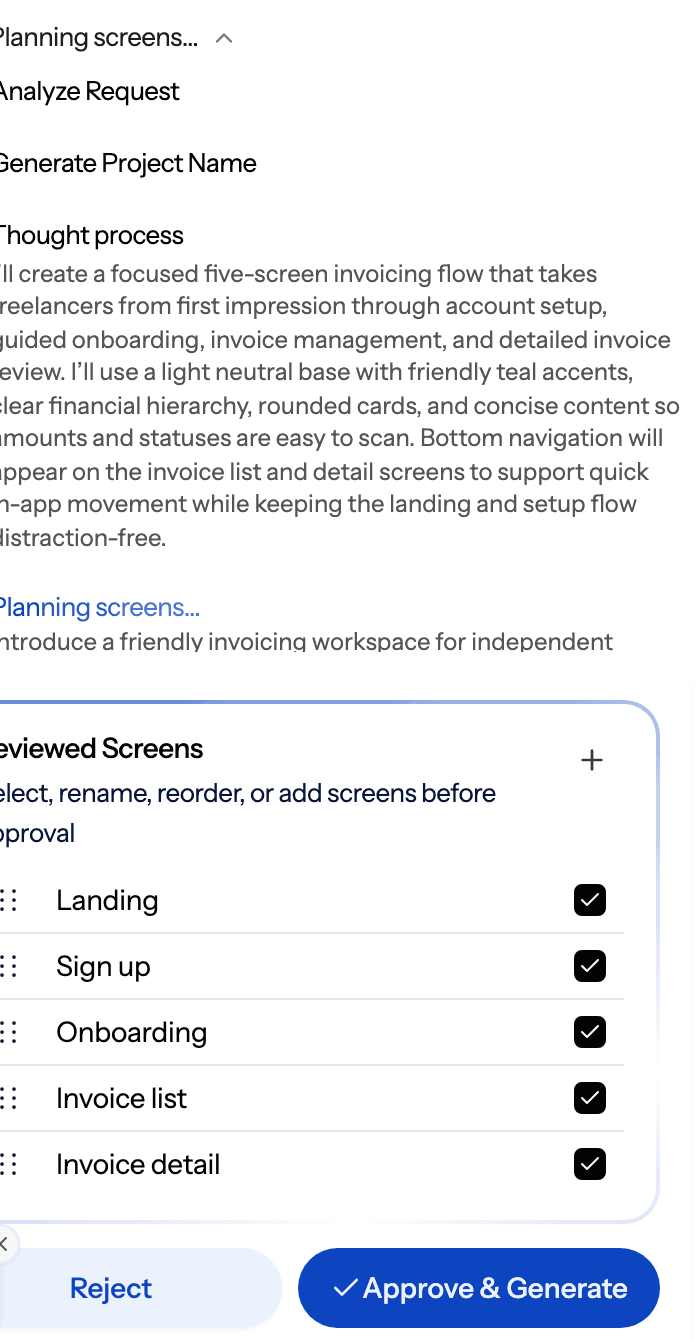
That plan is a scope checkpoint in disguise. A five-screen list is easy to read, easy to challenge and easy to compare against your PRD. If the plan proposes a settings page, a referral screen and an admin panel for a product whose MVP is "send an invoice reminder", you catch it before any screen exists. Planning also costs less than designing: proposing a plan is 1 credit, while designing a new screen is 3, according to how credits work.
A practical anti-creep workflow looks like this:
- Start from your PRD. Upload it and design from a document, so the screens follow the agreed scope rather than a fresh prompt that invites extras.
- Challenge the screen plan. Remove anything not in the MVP scope before you approve. Every screen you cut here is one you do not design, test or build.
- Settle structure in low fidelity. Use wireframe mode or the AI wireframe generator to agree layout before visual polish invites more debate.
- Generate the flow and make it clickable. Flow mode designs the journey with one shared theme, and the AI prototype generator turns it into something testable.
- Test with users, then share with stakeholders. Share a preview link and collect notes with comments and feedback, so requests arrive attached to a screen instead of a hallway conversation.
- Add later, deliberately. New screens can be added to an existing flow in the same theme when evidence supports them, so saying "not now" does not mean "never".
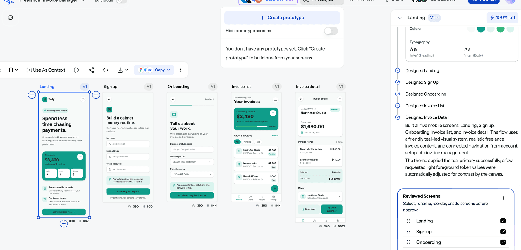
UXMagic is a design and prototyping tool, not a full app builder: it produces screens, flows, prototypes and exportable code, not your backend or business logic. That is exactly why it sits well before a builder in the workflow. Once the scope is tested, you can hand clean screens to your developers or an AI coding tool. For the full PM version of this workflow, read our spec-driven design workflow for product managers, and for the wider toolkit, our roundup of AI tools for product managers. If you are a founder without a designer, the AI MVP builder page shows how the same steps work for a first version.
A quick anti-creep checklist
Before you add any feature, ask:
- Which user problem in our problem statement does this solve?
- What evidence do we have: requests from many users, usage data, a test?
- What is its RICE score compared with what is already planned?
- What comes out, or what date moves, if this goes in?
- Have we seen it in a prototype, and did users understand it?
- Who will maintain it a year from now?
If you cannot answer the first two, it goes on the "not now" list. That single rule prevents most creep.
Final thoughts
Feature creep is not a failure of ambition. It is what happens when nobody is actively protecting a product's focus. The defence is a set of small, boring habits: a clear problem, a written scope with an "out" list, consistent scoring, and a prototype users have touched before anyone writes code. AI has made building cheaper, which makes those habits more valuable, not less. Plan the screens, test them, then build only what earned its place. See our pricing to get started on the free plan.
Related guides
- How to Validate a Product Idea: 7 Tests, With Templates
- Design Thinking Process: A Practical Guide for Product Teams
- Vibe Designing: Why Vibe-Coded Apps Look the Same, and the Fix
- The UX Case Study Template Hiring Managers Actually Read
- Replit Pricing 2026: Plans, Credits, and What an App Really Costs
- Fast AI Design is Easy, Shipping Reliable Products isn’t
- Design Ops 101: How to Scale UI/UX Production Without Slowing Down
- 10 Best a0.dev Alternatives for Building Mobile Apps with AI (2026)
- ChatGPT for UI/UX Design: What It Does Well, and 10 Prompts
- Figma Make Tutorial 2026: Prompt, Edit, Publish and Export Code
Plan the screens, cut the extras, then build
UXMagic proposes a screen plan you approve before anything is designed, so scope gets decided up front, not discovered later.