The dominant design platform just billed your team $90 for 3,000 generative credits and still handed you disconnected components and unusable div soup.
Now your engineers are rebuilding layouts manually because the export ignored semantic structure, hallucinated spacing tokens, and broke accessibility rules before sprint review even started. You didn’t save time. You created verification debt.
If you’re searching for Figma Make alternatives, you’re not shopping for prettier mockups. You’re trying to restore a workflow that produces consistent multi-screen architecture, respects design tokens, and exports code engineers will actually accept.
Why the 2026 Figma Make Pricing Shift is Breaking Design Workflows
The March 2026 credit enforcement update didn’t just change pricing. It changed how teams design.
Buying 3,000 additional generation credits now costs 5.6× more than adding a full platform seat. That flips the economics of experimentation. Instead of exploring ideas freely, teams ration prompts like API calls.
Design velocity collapses when ideation becomes metered.
Practitioners responded exactly how you’d expect:
- spinning up ghost accounts
- rationing generations mid-sprint
- reverting to manual layout work
- abandoning multi-screen generation entirely
This isn’t a tooling inconvenience. It’s workflow regression.
The hidden cost: verification tax
Most teams don’t calculate the real cost of AI generation. They only calculate credit usage.
The actual expense shows up later:
- token drift between screens
- spacing inconsistencies
- typography resets
- broken navigation hierarchies
- accessibility regressions
Fixing those errors takes longer than drawing the interface manually.
That’s the verification tax.
And once your engineers reject exported code for nested division bloat, you pay it twice.
The End of “Vibe Coding”: Why Generated UI Fails in Production
Most guides evaluating Figma Make alternatives compare visual quality.
That’s the wrong metric.
The real question is whether the system generates structural layout logic instead of aesthetic guesses.
Static mockups are not interfaces
“Vibe coding” tools optimize for screenshots.
Production teams optimize for:
- semantic color roles
- component inheritance
- token consistency
- DOM hierarchy
- framework compatibility
If spacing appears without a token source, it becomes technical debt immediately.
If typography shifts across screens, trust drops instantly.
If exports rely on absolute positioning, engineering throws them away.
Visual similarity is meaningless without structural continuity.
For teams already fighting blank-canvas inertia, this distinction matters even more. The difference between aesthetic prompting and system-level orchestration is exactly what separates experimentation from architecture, which is why the shift away from execution-only prompting mirrors what’s described in https://uxmagic.ai/blog/blank-canvas-syndrome-ai-ux-workflow.
Why token drift destroys multi-screen generation
Single-screen prompts feel fast. Until screen three.
Then the generator forgets:
- your border radius
- your primary hex code
- your spacing scale
- your typography hierarchy
Now you’re aligning frames manually again.
Sequential architecture not isolated generation, is the only reliable fix.
Evaluating the Best Figma Make Alternatives for Production Teams
Most alternative comparisons group tools by brand recognition.
That’s useless.
Instead, evaluate platforms by workflow stage.
The Ideation Layers: Flowstep and Google Stitch
Both tools solve the same problem: zero-to-one generation speed.
They are not replacements for production pipelines.
Google Stitch (Galileo AI)
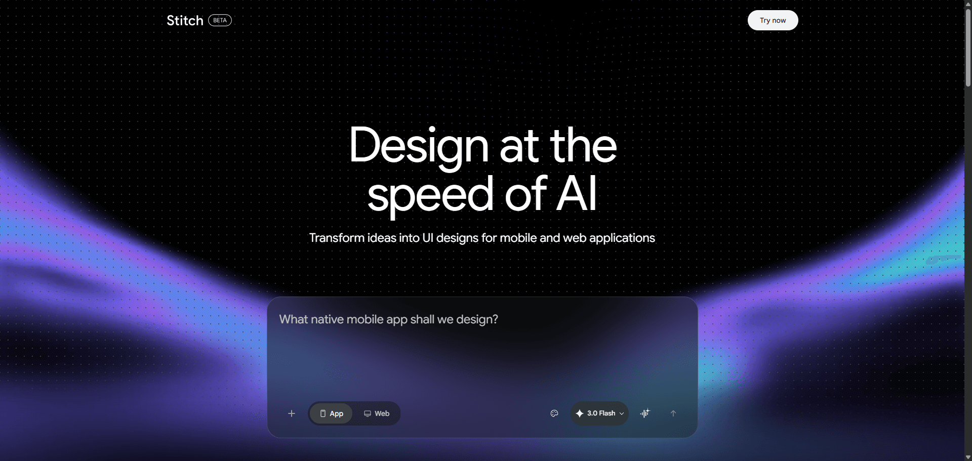
Strengths:
- rapid concept generation
- voice or text prompt support
- strong visual exploration
Weaknesses:
- Tailwind-only export pipeline
- limited enterprise infrastructure
- no accessibility labels or tooltips
- weak React alignment
Result: excellent ideation layer, incomplete architecture layer.
Flowstep
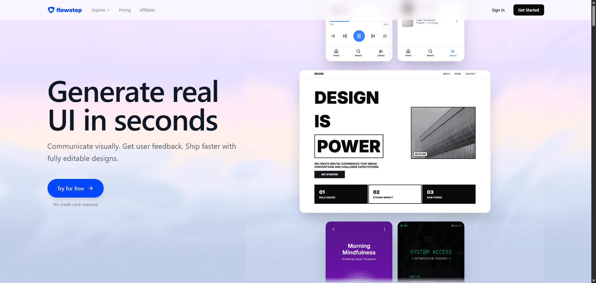
Strengths:
- removes blank canvas paralysis
- fast structural suggestions
- clipboard-friendly outputs
Weaknesses:
- depends on legacy canvas tools for handoff
- no native code export pipeline
- limited token system enforcement
Result: stepping stone, not destination.
The Prototyping Engines: Uizard and Framer AI
These tools target different users entirely.
Uizard
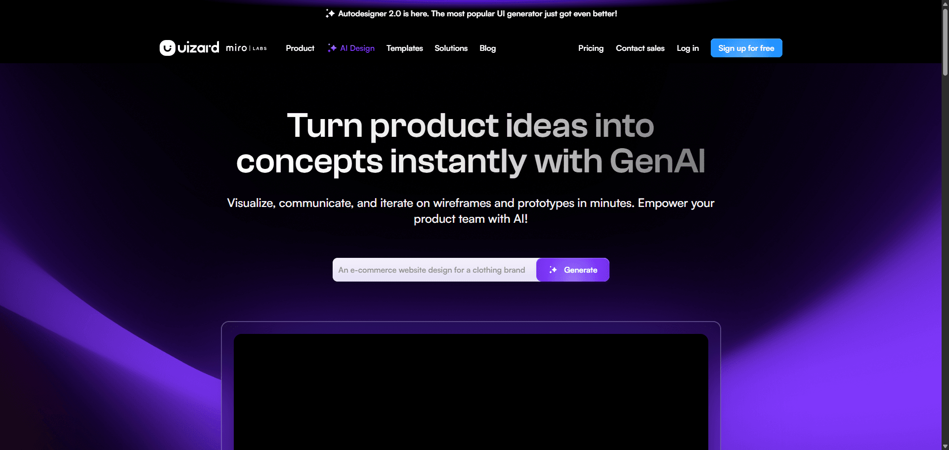
Strengths:
- beginner accessibility
- sketch-to-UI workflows
- fast low-fidelity outputs
Weaknesses:
- weak design-system alignment
- inconsistent token mapping
- no production-grade exports
Result: strong entry tool, weak scaling tool.
Framer AI
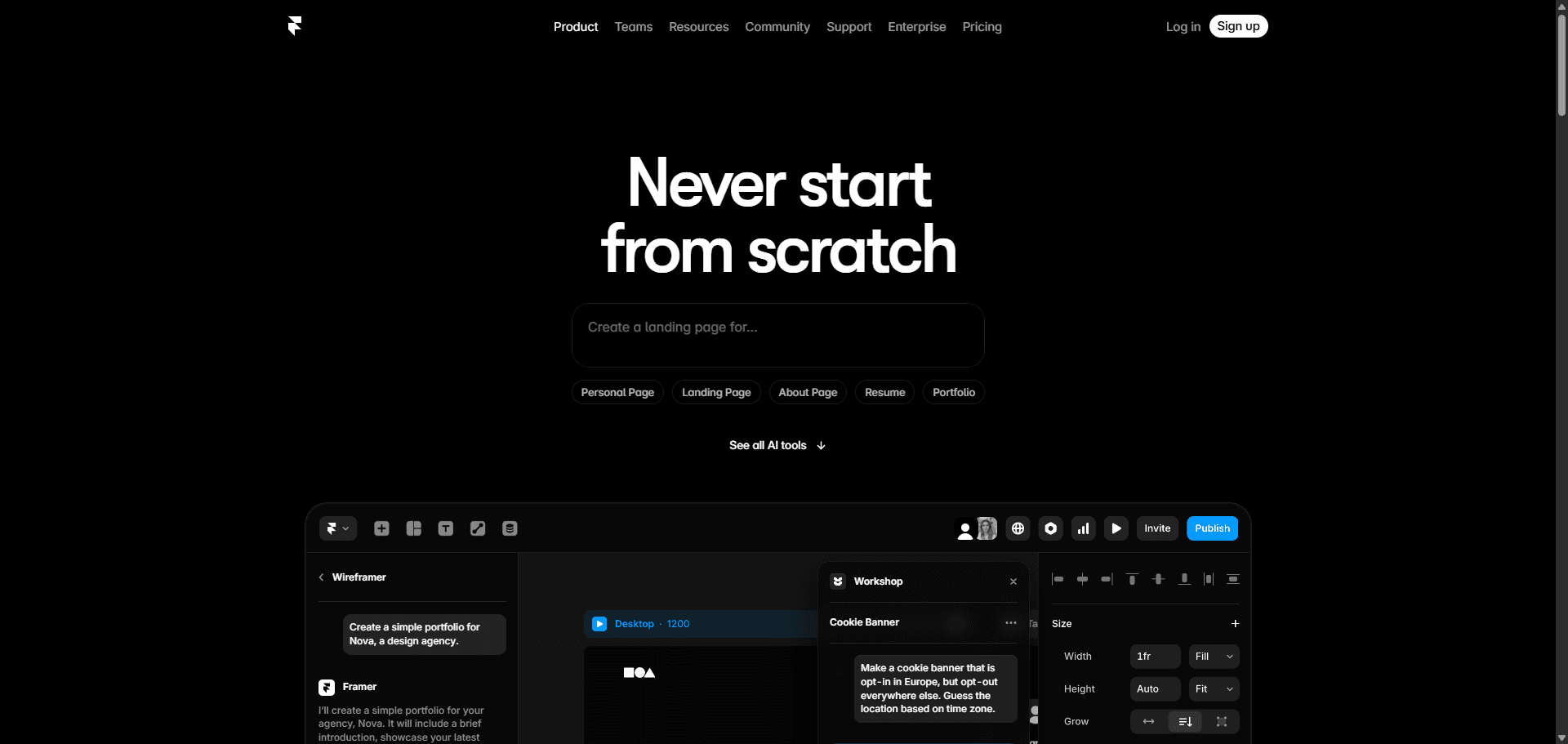
Strengths:
- marketing site generation
- animation workflows
- publish-ready landing pages
Weaknesses:
- restrictive for SaaS dashboards
- limited authenticated flow handling
- expensive editor scaling
Result: website generator, not application architecture system.
The Open-Source Alternative: Penpot
Penpot solves a different problem entirely: ownership.
Strengths:
- CSS Grid native
- SVG-based architecture
- self-hosted deployment
- privacy-first workflows
Weaknesses:
- no instantaneous structural generation
- manual setup overhead
- slower iteration loops
Result: ideal for teams prioritizing control over automation.
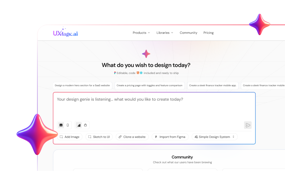
The Architectural Standard: UXMagic Flow Mode
The gap between alternatives isn’t visual quality.
It’s multi-screen consistency plus code reality.
This is where sequential generation changes the workflow.
Instead of prompting screens individually, Flow Mode maps:
- dashboard
- modal
- interaction states
- confirmation steps
in one continuous structural sequence.
Spacing tokens remain locked. Typography hierarchy remains stable. Component relationships persist across frames.
That removes the stitching work designers used to do manually.
It also eliminates the need to over-engineer prompts just to maintain context—a shift already reflected in how professional teams structure prompts today, as shown in https://uxmagic.ai/blog/production-ready-ai-design-prompts-saas.
The Modern AI-Assisted Design-to-Development Handoff
The traditional handoff model assumes designers produce visuals and engineers produce structure.
That assumption is obsolete.
If your export pipeline still produces inline-styled nested divisions, the system is broken upstream.
Why “div soup” still happens
Most generators translate layers into markup literally.
That produces:
- deeply nested hierarchies
- absolute positioning
- inline spacing values
- broken semantic structure
Engineering teams reject this immediately.
Because reverse-engineering layout intent takes longer than rebuilding it.
Framework-aware exports change everything
When architecture is component-aware from generation onward, exports become predictable.
Instead of rewriting interfaces manually, engineering teams receive:
- semantic HTML
- React component structure
- Tailwind utility alignment
- accessible DOM hierarchy
That eliminates the verification loop entirely.
This shift from static mockups to synchronized structural outputs mirrors the broader transition described in https://uxmagic.ai/blog/ai-in-ux-design-workflow, where generation supports architecture rather than decoration.
How the Workflow Actually Changes After Migration
Switching tools doesn’t accelerate teams.
Switching methodology does.
Here’s what that shift looks like in practice.
Phase 1: Context orchestration replaces sketching
Instead of drawing placeholder rectangles, designers define:
- data hierarchy
- semantic color roles
- typography scale
- spacing logic
The generator works from constraints, not vibes.
Uploading a PRD produces better outputs than writing aesthetic prompts.
Always.
Phase 2: Sequential generation replaces frame-by-frame prompting
Legacy workflow:
Prompt screen → fix tokens → prompt next screen → fix tokens again.
Sequential workflow:
Generate journey once → maintain tokens automatically.
Consistency becomes default behavior instead of manual cleanup.
Phase 3: Agentic editing replaces destructive regeneration
Most tools still reroll entire layouts for small changes.
That’s catastrophic for iteration speed.
Agentic editing allows:
- swapping list views for tables
- adjusting component density
- modifying navigation hierarchy
without touching surrounding structure.
This is where UXMagic’s sectional editing becomes practical infrastructure rather than convenience.
Phase 4: Code export replaces documentation handoff
Traditional workflow:
design → annotate → spec → rebuild → QA
Modern workflow:
generate → refine → export → integrate
Documentation becomes optional because structure already exists.
Real Production Scenarios Where Alternatives Win Immediately
Theory is easy.
Production constraints are not.
These scenarios expose the difference instantly.
Scenario: Dense SaaS analytics dashboard
Generic generator output
Results:
- inconsistent KPI spacing
- broken accessibility contrast
- fake data tables as graphics
- unusable responsive structure
Engineering response:
rebuild everything.
Sequential architecture output
Results:
- semantic metric cards
- structured tables
- token-locked spacing
- editable text nodes
Engineering response:
integrate components directly.
Scenario: Multi-step onboarding flow
Generic generator output
By screen three:
- button radius changed
- typography shifted
- warning colors mutated
Designer response:
manual cleanup for three hours.
Flow Mode generation
Across all screens:
- spacing locked
- typography consistent
- color roles preserved
Designer response:
move directly to usability testing.
Scenario: React handoff pipeline
Legacy export
Output:
- nested divisions
- inline styles
- broken mobile layouts
Engineering response:
discard export entirely.
Framework-aware export
Output:
- readable React components
- Tailwind utilities
- semantic structure
Engineering response:
minimal refactoring required.
This is the difference between preview generation and production generation, the exact distinction explored in https://uxmagic.ai/blog/human-in-the-loop-ai-design-workflow, where the machine handles structure while designers retain intent control.
Stop paying verification tax for generated layouts
If your team is still fixing spacing tokens after generation, you’re not accelerating anything.
You’re just moving cleanup earlier in the pipeline.
Stop prompting isolated screens. Generate entire flows instead. Try UXMagic free and build a production-ready multi-screen interface in minutes instead of stitching frames together manually.
Prediction: Within 12 months, teams that still rely on canvas-first generation instead of structural flow generation will look the same way Sketch-only workflows did after auto-layout, slow, fragile, and impossible to scale.
Generate Consistent UI Flows Without Token Drift
Stop fixing spacing, typography, and component resets between screens. Try UXMagic free and generate a multi-screen product flow with locked design tokens in minutes.