Spending three hours prompting an AI code generator to fix a broken grid layout often ends with an exhausted credit balance and an interface that looks like every other generic SaaS template on X. V0 by Vercel accelerates initial code scaffolding - but using it as an end-to-end interface design tool exposes some real structural limits worth knowing about upfront.
You already know React, Next.js, Tailwind, and shadcn/ui. This isn't an explainer on what a component is. It's a straightforward look at whether V0 belongs in a real production stack, how its token pricing actually behaves during real iteration, and how much manual engineering sits behind that first impressive fifteen-minute demo.
V0 is best understood as a rapid frontend code generator for developers who've already solved their product's layout architecture - not as a UI/UX design tool in its own right. Treating a component-level code generator as a product discovery environment tends to produce fragmented user flows and design debt that costs more to untangle later.
What Is V0 by Vercel? Architecture and Core Capabilities
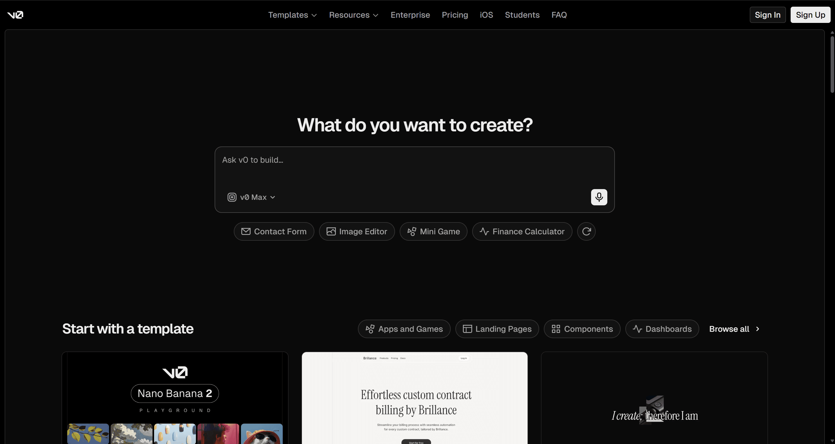
V0 rebranded from v0.dev to v0.app as its scope expanded from a simple prompt-to-component tool into more agentic UI generation.
Its current feature set includes:
- A Design Mode for direct visual editing of generated components
- Figma import for pulling existing designs in as a starting point
- One-click deploy straight to Vercel's infrastructure
The underlying job hasn't changed much despite the expanded surface area: generate React and Tailwind components styled with shadcn/ui primitives, fast. That speed is genuinely real for scaffolding a single component or screen. What it isn't built for is holding a multi-screen product journey together - which is where nearly every substantive complaint about this category of tool originates.
V0 Pricing 2026: Understanding the Token Economy
| Tier | Monthly Cost | Monthly Credits | Core Capabilities |
|---|---|---|---|
| Free | $0 | $5 | 7 messages/day, basic model only |
| Plus | $30/user | $30/user | All models, shared credit pool |
| Business | $100/user | $30/user | Data opt-out, team analytics |
| Enterprise | Custom | Custom | SAML SSO, dedicated support |
The sticker price is the least useful number on this page. V0 uses a metered token system that draws down from a monthly dollar-denominated allowance, and cost depends entirely on which model you're using and how many tokens get processed - not on how many messages you send. Unused credits expire after 65 days, so they don't bank indefinitely either.
Why iteration gets expensive fast
Token-metered pricing can work against the exact behavior good product design requires. Vendor messaging frames consumption-based pricing as fair and transparent. In practice, every prompt iteration increases the context window, which pushes usage into higher-tier costs - meaning the platform can end up financially penalizing the iterative visual exploration that's supposed to be the whole point of using an AI design tool.
Context window expansion is the hidden cost most reviews skip entirely. As a chat thread lengthens past roughly ten prompts, the underlying model starts forgetting previous layout constraints, introducing random inline overrides, and occasionally breaking components that were already working. One documented case: an entire $30 monthly allowance burned through in three hours just trying to get a responsive navbar to stop breaking on mobile - not because the fix itself was hard, but because the context needed to keep processing grew more expensive with every attempt.
Real-World Limitations of V0's AI UI Generation
Component Isolation vs. Connected User Flows
Generating isolated components without a persistent, visual flow map tends to produce fragmented experiences over time. Software interfaces generally need holistic architecture - multi-state spatial logic, navigation hierarchy, edge-case handling - established before code generation, rather than stitched together after the fact.
V0 is genuinely good at producing a single hero section or pricing table on its own. It has no real concept of how screen A logically connects to screen B in a multi-step journey, though. Assembling several independently generated screens into one coherent flow often surfaces mismatched button padding and diverging header hierarchies, and fixing that drift can cost real credits without fully achieving parity anyway.
Avoiding "Shadcn Slop" and Default Template Fatigue
V0's deep shadcn/ui and tailwind integration is often cited as a competitive advantage, and it genuinely does speed up scaffolding. The tradeoff worth knowing: many layouts tend to converge on a similar aesthetic - the same dark-mode shadcn look, the same Emerald-500 accent, the same rounded-lg borders - because the underlying model trained heavily on identical public repositories. Unless a team enforces custom design tokens explicitly from the start, output tends to default toward that shared look rather than a distinct brand identity.
The 80-Hour Engineering Integration Wall
V0 hands back clean React code. It doesn't hand back a database schema, state management persistence, or end-to-end routing. Bridging that gap - Supabase setup, environment variables, API routes, authentication - typically takes 65 to 85 hours of specialized engineering work before the product is actually usable by anyone.
Assuming production-ready code on day one is the fastest path to market validation is a common but risky assumption. It can tie product managers and non-technical founders to implementation details before the core user experience has even been validated. A few specific ways this plays out in practice:
- Multi-state components get messy fast. A UI designer needing resting, hover, active-filter, empty, and error states finds that requesting these variations in V0's chat often produces multiple isolated code blocks or conflicting inline Tailwind classes stacked onto each other - redundant wrapper divs included.
- Responsive fixes can break the other viewport. A non-technical founder prototyping a dashboard finds V0 defaults to wrapping desktop tables in basic horizontal-overflow containers for mobile. Prompting a fix into touch-friendly cards can break the desktop CSS grid in the process, since the model isn't holding a persistent spatial model across both.
- Handoff friction compounds everything above. Designers spend time tweaking code in a browser interface; developers sometimes end up discarding a portion of the generated React because it conflicts with existing design system primitives.
V0 vs. Alternatives: Bolt.new, Lovable, and UXMagic Compared
| Platform | Primary Output | UX Flow Continuity | Design System Control | Pricing Predictability |
|---|---|---|---|---|
| V0 by Vercel | React/Tailwind components | Low - isolated components | Fixed shadcn/Tailwind defaults | Variable token meter + credit burn |
| Bolt.new | Full-stack WebContainers | Medium - app-level state | Framework dependent | Token/message-based |
| Lovable | Conversational full-stack code | Medium - full-stack features | Custom prompts/Tailwind | Message/credit-based |
| Taskade Genesis | Complete business systems | High - workspace systems | Template structures | Subscription tiers |
| UXMagic | Production-ready UI flows & systems | High - native multi-screen mapping | Native persistent style engine | Predictable tiering |
The gap across most of this category is similar: many AI code platforms optimize for developer stack compatibility while treating UI design as a secondary byproduct of code generation, rather than its own architectural phase.
UXMagic approaches this a bit differently. It maps end-to-end multi-screen user journeys in a unified visual canvas before code generation, which helps avoid the isolated-component fragmentation that shows up in chat-based tools by default. A persistent style engine keeps token consistency across every generated flow - a direct answer to both the drift problem and the "shadcn slop" aesthetic fatigue covered above.
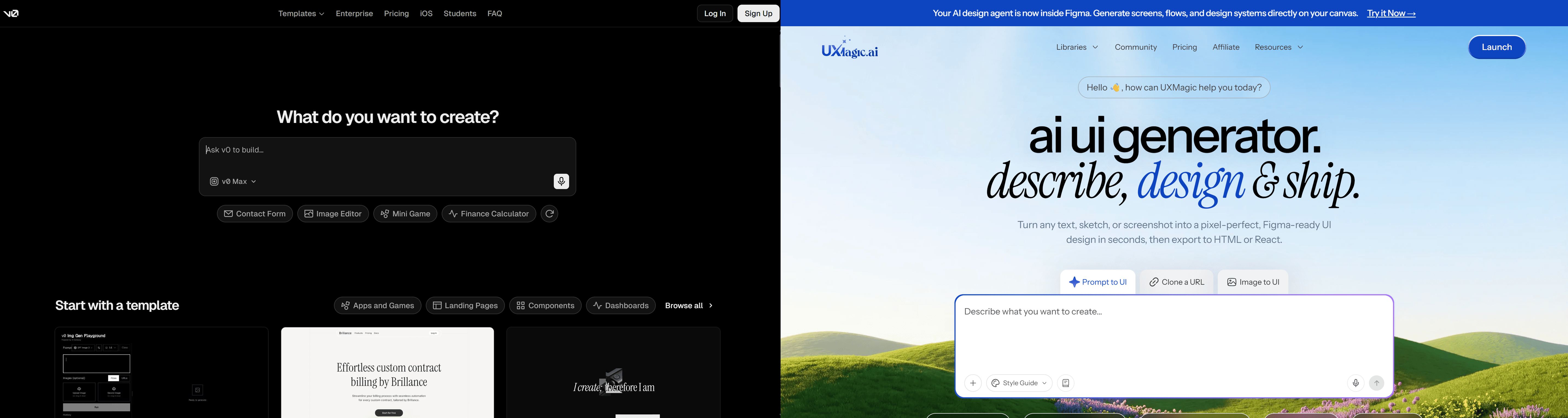
Here's what that difference looks like on a real B2B onboarding flow:
- Using V0: A PM builds a four-step journey - account creation, workspace setup, team invites, plan selection - across four separate prompt sessions. Individually the screens look clean, but Step 1 uses different button padding and header hierarchy than Step 3. Aligning them via chat prompts alters the container layout, consuming over $10 in credits without achieving full visual parity.
- Using UXMagic's Flow Mode: The same four steps are generated simultaneously in one canvas. Global style tokens keep typography, spacing, and button primitives identical across every step from the first pass, since nothing regenerates the earlier screens while working on later ones.
Best Practices for AI-Driven UX Workflows
The workflow that tends to avoid both the credit burn and the drift runs in three phases:
1. Architecture and bounds, before any prompt gets sent.
- Establish explicit negative constraints upfront (no inline card borders, no default drop shadows, no standard primary palette).
- Define baseline spatial grid rules.
- Broad prompts like "create a SaaS analytics dashboard" tend to fall back on generic training defaults - being specific about what's not wanted matters as much as what is.
2. Generation and refinement, kept short deliberately.
- As chat history lengthens, context window expansion causes the model to consume more tokens per iteration while sometimes introducing regressions into components that were already stable.
- Isolate specific UI sub-components in shorter threads rather than requesting continuous full-page overhauls in one long conversation - a discipline covered in more depth in production-ready AI design prompts.
3. Handoff and integration, budgeted honestly.
- Once layouts are finalized, code exports to GitHub or a preview deployment.
- This is a common point of friction for non-technical creators specifically, since V0 hands over frontend code with no database schema, state persistence, or routing.
- Budget the full 65-85 hours of engineering time this phase typically requires, rather than assuming the exported code is most of the way to done.
Key Takeaways
- V0 is a code generator, not a UX tool - genuinely fast for single components, not built to hold multi-screen journeys together.
- The $30 sticker price isn't the real cost - token-metered billing scales with context window size, and long chat threads get expensive fast.
- Default output tends toward "shadcn slop" - custom design tokens need to be enforced explicitly, or everything converges on a similar look.
- Budget 65-85 hours for real integration - frontend code alone doesn't include a database, auth, or routing.
- Multi-screen consistency needs a dedicated flow tool - platforms like UXMagic that map the full journey before code generation avoid the drift chat-based tools introduced by default.
Stop Paying for Drift
Ready to map a flow instead of patching drift after the fact? Try UXMagic free and generate a complete, consistent multi-screen flow before a single component gets built in isolation.