

Spending $20 per seat a month on an AI UI generator only to spend three hours refactoring broken Tailwind classes and aligning isolated screens is not an automated design process, it's an expensive cleanup job. Most AI design tools generate a clean single component just fine. They struggle the moment you ask them to maintain consistency across a multi-step user journey.
You already know what a component prop is and how atomic design principles work. This isn't a primer on what a design system does. It's a production-tested teardown of Magic Patterns the credit consumption rates, where it genuinely performs well, and exactly where it stalls during a real product sprint.
The short version: Magic Patterns is a solid component-first generator for developers who need clean React output fast. It's a weaker fit the moment a project needs more than one screen to relate to the others.
Can Magic Patterns Generate Production-Ready React Components?
Yes, Magic Patterns can generate production-ready React components, but the result is a starting point rather than finished application code. It can produce clean React and Tailwind UI for isolated screens, while developers still need to check application state, design tokens, responsiveness, and integration with the existing codebase.
Quick Comparison
| Capability | Magic Patterns | UXMagic |
|---|---|---|
| Component generation | Strong | Strong |
| Multi-screen flows | Limited | Strong |
| Design consistency | Manual | Built-in |
| Input types | Prompt + website capture | Prompt + URL + Sketch + Figma |
| Best for | Developers, single-component work | Product teams, full flows |
What Is Magic Patterns? Platform Overview and Core Capabilities
The Component-First Generation Model
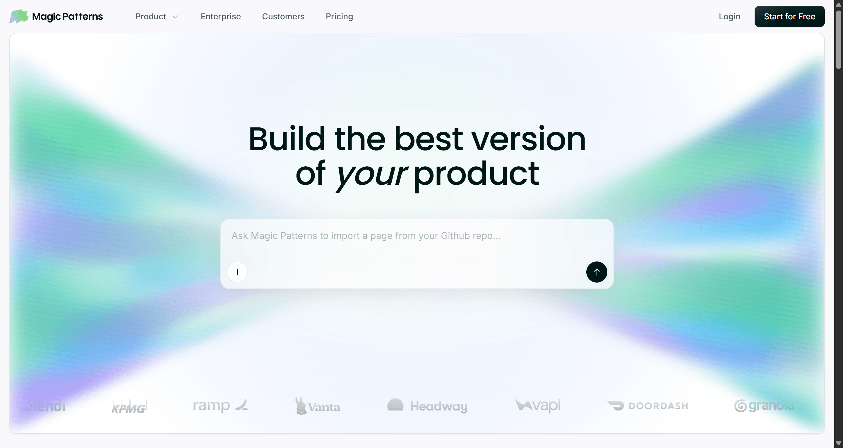
Magic Patterns converts text prompts, existing design rules, and website captures into editable UI layouts, centered on generating React, Tailwind, and Vue components. It's built primarily for front-end engineers who need to draft UI layouts fast and export clean code directly into a codebase.
Target Audience: Who Benefits Most?
Developer-leaning product teams get the most out of this tool, people comfortable reading React output, who want a component drafted quickly rather than a full product flow designed from scratch. Teams whose work centers on a single screen or isolated component at a time are a strong match for how the platform is built.
Magic Patterns Pricing Breakdown and Credit Mechanics (2026)
Starter vs. Business vs. Enterprise Workspace Tiers
Magic Patterns offers a Free tier with 100 monthly credits. Paid plans include Starter at $20/seat/month ($17 billed annually) with 1,000 credits, and Business at $100/seat/month ($85 billed annually) with 5,000 credits. Additional credits cost $0.02 each on pay-as-you-go billing.
Per-seat workspace billing creates real friction for growing teams. Needing two freelance developers to simply view generated components can mean upgrading an entire workspace to the $100 Business plan, a cost structure that penalizes collaboration rather than supporting it.
Analyzing Credit Burn Rates During Design Iterations
Standard generations consume approximately 25 credits per prompt run. On the Starter tier's 1,000 monthly credits, that works out to roughly 40 fresh generations a month before counting a single revision. Tweaking button padding and header alignment ten separate times can burn 250 credits on micro-iterations alone, a quarter of the monthly allowance spent on polish, not new screens.
Cost per screen, worked out: a single component generation runs about 25 credits (~$0.50 at the $20/1,000-credit Starter rate). A 5-screen onboarding flow built screen-by-screen, assuming 2-3 iterations per screen to fix drift between them, lands closer to 300-375 credits $6-7.50 in raw credit cost, before counting the manual hours spent aligning navigation and spacing across those screens by hand. That manual cleanup time is the real cost the credit math doesn't show: two hours of a designer's time standardizing five screens is worth considerably more than the credits spent generating them.
Per-generation credit models also discourage the exact creative iteration a design process needs. When a designer knows that testing a secondary layout variation burns 25 credits, careful, conservative prompting replaces genuine exploration. That's a structural cost, not a minor inconvenience.
Where Magic Patterns Is Actually the Better Choice
To be fair to what it does well: Magic Patterns is a genuinely strong pick in a few specific situations.
- Quick React component drafts. A developer who knows exactly what component they need a pricing card, a settings panel gets clean, usable code fast, without touching a design tool first.
- Developer-led experiments. Testing a UI idea directly in code, with GitHub syncing already part of the workflow, is a smoother path than round-tripping through a separate design tool.
- Existing codebase integration. Teams already deep in a React/Tailwind stack get output that mostly fits their conventions without a translation layer.
- Small, isolated UI changes. A single component update not a full flow is exactly the scope this tool is built to handle well.
Where it stops being the right tool is the moment "one component" becomes "a flow of five screens that need to feel like one product."
Production Constraints: Where Magic Patterns Falls Short
Single-Screen Generation and Lack of Native Flow Logic
Generating interfaces one screen at a time creates a specific, recurring problem for scalable product work. Software interfaces function as interconnected systems. When a generator processes prompts with no multi-screen flow context, it introduces conflicting navigation patterns, mismatched spacing tokens, and inconsistent interaction states across screens that were meant to feel like one product.
Export Stack Lock-In and Figma Handoff Friction
Output centers on React, Vue, and Tailwind, a real constraint for marketing teams or agencies shipping on Webflow, Shopify, or WordPress, who end up rebuilding the layout from scratch anyway despite the "export" step. Static Figma exports add cleanup overhead rather than removing it: when generated elements arrive as flat vector groups instead of native Auto Layout structures, cleaning the file up manually can take longer than building the layout in Figma from an empty canvas.
Real-World Workflow Comparisons
SaaS Onboarding Flow. A growth team needs a 3-step sequence role selection, workspace setup, team invitations. Magic Patterns workflow: prompt each step independently, then manually standardize button placement and input padding across all three roughly two hours of cleanup. UXMagic workflow: one product spec prompt outputs all three screens simultaneously, sharing component tokens and step-indicator states from the first generation.
Checkout Journey. An e-commerce team needs cart review, shipping, and payment screens to feel like one continuous flow. Magic Patterns workflow: each screen generated separately risks different button hierarchy and spacing conventions bleeding through from screen to screen. UXMagic workflow: the full checkout sequence generates with consistent field styling and button hierarchy from the same prompt, since nothing regenerates the earlier screens while building the later ones.
Mobile App Onboarding. A founder needs 4 mobile screens welcome, permissions, goal selection, and first action. Magic Patterns workflow: React output assumes a web layout by default, requiring manual adaptation to mobile conventions (bottom nav, thumb-zone actions) per screen. UXMagic workflow: generation can start from a mobile-native template, keeping bottom navigation and touch-target sizing consistent without a separate adaptation pass.
Dashboard Redesign. A product team needs a data-dense analytics dashboard with dark mode. Magic Patterns workflow: the React export handles light mode cleanly, but toggling dark mode often surfaces low-contrast text and unstyled chart elements the generation didn't account for. UXMagic workflow: system-wide token management defines compliant color tokens for both themes across charts, tables, and cards from the same generation pass.
Competitor Analysis: How Magic Patterns Compares
| Tool | Core Focus | Where It Differs from Magic Patterns |
|---|---|---|
| v0 (Vercel) | Next.js and shadcn/ui React generation | Narrower, more opinionated stack than Magic Patterns' broader framework coverage |
| Subframe | Code-first, React + Tailwind only | Similarly narrow scope; no visual canvas editing |
| Lovable | Full-stack app generation (frontend + backend) | Skips design entirely, generates functional app code; different category, not a direct design-tool comparison |
| Bolt.new | In-browser full-stack prototyping | Same full-stack-first approach as Lovable; UI is a byproduct of app building, not the primary focus |
| Uizard | Low-to-mid fidelity wireframing | Faster for rough concepts, weaker on production-ready code export |
| Galileo AI (Google Stitch) | Single-screen visual generation | Similar single-screen limitation to Magic Patterns, with less developer-oriented code output |
| UXMagic | Multi-screen flow generation + multi-platform export | Native flow logic and broader export range (React, HTML, Webflow, Shopify, Figma) that none of the above combine together |
Magic Patterns positions itself around assembling UI from component libraries and syncing with GitHub, which is a real, useful niche. The gap is native flow logic: it lacks the ability to map a multi-step user journey to a full onboarding or checkout sequence from a single prompt, and its input methods stop at Chrome extension captures, without native hand-drawn sketch parsing or broader multi-input support.
If flow consistency across multiple screens is the actual requirement, not just a single component, this is the exact gap UXMagic's Flow Mode was built to close - see the workflow breakdown below.
A Complete Design Workflow: When to Choose UXMagic
Multi-Screen User Journey Generation via Flow Mode
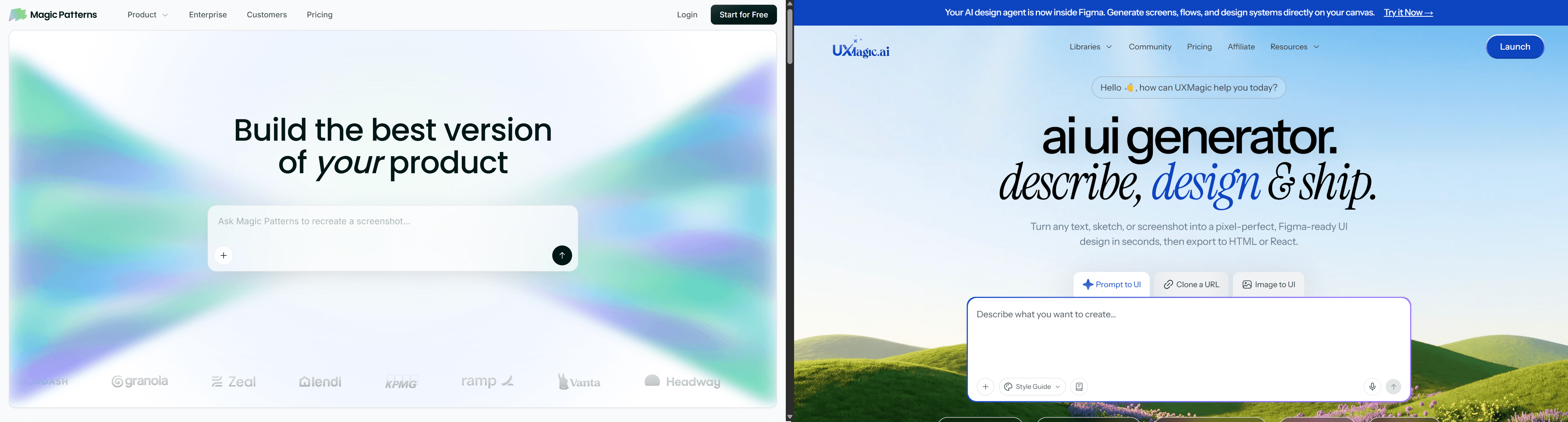
Flow Mode generates connected, multi-screen user journeys from a single prompt eliminating the two-hour standardization pass the onboarding scenario above required, and the same reconciliation work every single-screen tool in this category leaves for a designer to do manually.
Multi-Platform Exports: From React to Webflow and Shopify
Where Magic Patterns' export stack stays centered on React, Vue, and Tailwind, UXMagic generates production-ready React code while also offering direct exports to HTML, Webflow, Shopify, WordPress, and Auto Layout-ready Figma files covering the non-React stacks that leave Magic Patterns users rebuilding from scratch.
Multi-modal input matters here too. Designers can turn hand-drawn wireframes, raw screenshots, live URLs, or PRD text prompts into editable UI layouts directly reducing the prompt-iteration cycles that burn credits when a text-only prompt is the sole input available. This is where cloning a website directly skips the manual screenshot-and-rebuild step entirely, and where importing from Figma keeps an existing design system intact rather than starting generation from zero context.
Final Verdict: Is Magic Patterns the Right Choice for Your Team?
Magic Patterns earns its place for a specific job: a developer who wants a single, clean React or Vue component fast, with a GitHub-native workflow already in place. It's a poor fit for anyone designing a multi-step user journey, since the platform has no native concept of a flow that work gets done manually, screen by screen, credit by credit.
Quick takeaways before you commit budget:
- Calculate credit consumption before upgrading standard generations run about 25 credits each, and heavy iteration sessions exhaust basic tiers fast.
- Use flow-based tools for multi-step journeys to avoid isolated single-screen generators for onboarding sequences or checkout funnels specifically.
- Match code exports to your target stack verify HTML, Webflow, or Shopify support if your team isn't shipping on React.
- Verify Figma Auto Layout compatibility before exporting, to avoid a manual cleanup pass eating the time the export was supposed to save.
- Feed multi-modal inputs PRD specs, sketches, reference URLs into generation directly to cut down on costly re-prompting cycles.
Related guides
- Top 7 AI Tools for Design Consistency in 2026 (UI, UX, and Design Systems)
- 11 Best v0 Alternatives in 2026, Grouped by the Job You Need Done
- 9 Best UX Pilot Alternatives in 2026, Grouped by Use Case
- 9 Best Uizard Alternatives in 2026, Grouped by Use Case
- 11 Best Lovable Alternatives in 2026, Grouped by What You're Building
- 12 Google Stitch Alternatives in 2026, Grouped by the Job You Need Done
- Subframe Review 2026: Features, Pricing, and Top Alternatives
- 10 Best Figma Make Alternatives in 2026, Grouped by Use Case
- AI Wireframe Generator for Mobile Apps: Best Tools & Workflows (2026)
- Visily AI Review 2026: Is It Worth It for Non-Designers?
Build Connected Product Flows
Stop manually stitching isolated screens together. Try UXMagic free and generate complete multi-screen journeys with consistent components in one pass.