Your team just spent three weeks synthesizing user interviews into a stunning customer journey map in Miro, only for it to sit in a dusty Confluence folder while engineering builds whatever they want. The deliverablization of UX is killing product velocity.
Most “customer journey map complete guide” content teaches you how to decorate timelines with emotions. It does not teach you how to turn friction into interface logic. That gap is why maps get praised in meetings and ignored in sprints.
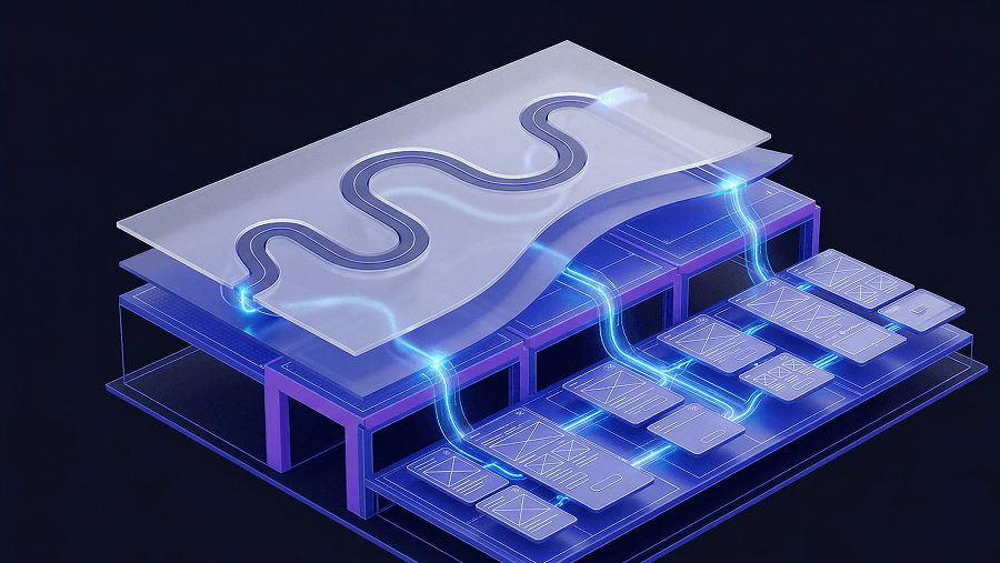
A journey map is only useful if it produces a testable wireflow within days. If it doesn’t change screens, states, or system logic, it’s a poster.
Stop Making Glossy Posters: The Real Purpose of a Customer Journey Map
The Deliverablization of UX Design
Most journey maps fail for one reason: they become artifacts instead of infrastructure.
Teams spend 40+ hours aligning boxes and labeling emotional states. Stakeholders applaud. Then engineering ships features based on assumptions anyway. The map never influences system logic.
That’s not research failure. That’s workflow failure.
A rough spreadsheet that leads directly to a tested wireflow beats a pixel-perfect PDF that nobody opens again.
If your map doesn’t produce a prototype within 24 hours, it’s slowing you down. This is why teams increasingly connect journey mapping directly to flow generation instead of documentation-heavy processes. In practice, designers now move from insights straight into state-aware sequences using approaches similar to those described in How Designers Actually Use AI in Real Projects.
Macro Journeys vs. Micro Flows (Why You Need Both)
A journey map tracks experiences across channels over days or weeks.
A user flow documents screen logic across minutes.
Confusing them creates broken interfaces.
Example:
Journey insight: “Users feel anxious during onboarding.”
Useful? Yes. Actionable? Not yet.
Flow logic translation:
- Upload ID
- Processing skeleton state
- Retry error path
- Success confirmation modal
Maps define the problem. Fl ows define the solution.
Trying to design UI directly from emotional timelines is how teams end up debating tooltip placement instead of solving drop-off.
How to Translate Customer Journey Maps into Shipped UI
This is where most guides stop. This one starts here.
Step 1: Identify the Highest-Leverage Friction Point
Do not map everything.
Map the bottleneck affecting revenue or retention first:
- onboarding confusion
- checkout abandonment
- integration setup failure
- authentication drop-offs
Example:
Analytics shows a 40% drop-off during KYC verification. Support tickets mention confusion. Session replays show repeated retries.
That’s your target.
Not the entire lifecycle. One friction point.
Speed beats completeness.
Step 2: Extract the Strict User Flow Logic
Now switch mental modes.
Journey mapping is emotional. Flow mapping is structural.
Write the sequence:
Step 1: Upload ID Step 2: Processing skeleton Step 3: Success OR retry Step 4: Confirmation state
Include:
- branching logic
- system states
- error handling
- required inputs
Remove:
- demographic personas
- storytelling language
- speculative motivations
If the flow cannot be written as a sequence, the map is not ready.
This transition is exactly where many teams hit blank canvas syndrome, because the emotional narrative never became interaction logic. A structured translation workflow solves that gap faster than traditional canvas-first prototyping approaches described in Blank Canvas Syndrome.
Step 3: Generate the Wireflow (Avoiding AI Context Amnesia)
Here’s where most AI UI tools fail.
They generate screenshots.
Users interact with flows.
Screen-by-screen prompting creates:
- token drift
- layout resets
- disappearing navigation
- inconsistent typography
- broken state continuity
This is context amnesia.
Flow-aware generation fixes it by building the sequence simultaneously instead of sequentially.
Instead of prompting:
“secure checkout screen”
you define:
Cart Review → Guest Checkout → Payment Input → Processing State → Confirmation
Tools built around flow generation — including UXMagic’s Flow Mode — maintain:
- navigation hierarchy
- component consistency
- typography tokens
- spacing rules
- system state continuity
That removes the translation tax between research and prototype.
It also makes journey maps testable immediately instead of decorative.
The 5 Biggest Mistakes When Journey Mapping (And How to Fix Them)
The Fictional Persona Trap
Demographic personas rarely improve UI decisions.
Knowing a user “loves yoga” does nothing for checkout completion.
Behavioral triggers matter:
- rage clicks
- retry loops
- abandonment points
- integration failures
Interfaces respond to intent and system state, not personality archetypes.
Delete personas that don’t affect flow logic.
Waiting for Perfect Analytics
Most teams delay mapping until research feels complete.
That’s wrong.
Map assumptions early. Prototype immediately. Validate with interaction data.
Speed to validation beats theoretical certainty.
Generate the flow. Test it. Replace the map later if needed.
Mapping Too Many Touchpoints
Mapping every edge case creates unreadable artifacts.
Instead:
Find the single highest-leverage friction point.
Fix it.
Repeat.
Journey maps are disposable scaffolding, not archives.
Confusing Maps With Flows
Journey maps answer:
Where does friction happen?
User flows answer:
What screens fix it?
Mixing them creates vague UI logic and missed error states.
Treating the Artifact as the Outcome
Stakeholders often want polished deliverables.
Users need working flows.
Ship prototypes, not posters.
Moving from Map to Code: The AI Design Workflow
A customer journey map complete guide is useless unless it explains how mapping connects to execution.
Here’s the actual pipeline modern teams use.
Stage 1: Data Aggregation and Insight Mining
Start with behavioral evidence:
- session replays from FullStory
- support tickets from Zendesk or Intercom
- interview transcripts
- analytics funnels
Break silos early.
If customer success data stays separate from product analytics, your map will be wrong.
Output:
A shortlist of validated friction points.
Stage 2: Macro Journey Mapping (The Skeleton)
Now map lifecycle phases:
- Awareness
- Consideration
- Purchase
- Onboarding
- Retention
Attach:
- user touchpoints
- emotions
- channels
- friction markers
Stop before micro-interactions.
Over-detailing destroys clarity.
Output:
One prioritized friction point.
Stage 3: Micro User Flow Extraction (The Bridge)
Translate friction into system logic.
Example:
Invite Team Set Permissions Connect Integration First Dashboard State
Now the map becomes executable.
This step is where flow-aware prompting frameworks like those shown in Real Prompts We Use reduce ambiguity between research insight and interface structure.
Stage 4: AI-Powered Wireflow Generation (The Execution)
Legacy workflow:
Draw rectangles in Figma for hours.
Modern workflow:
Describe the sequence.
Generate the flow.
Flow-based generation eliminates context amnesia by locking tokens across steps. UXMagic does this by generating connected journeys instead of isolated canvases, preserving layout memory across the entire sequence.
That makes the wireflow immediately reviewable by engineering.
And testable by users the same day.
Stage 5: Sectional Iteration and Engineering Handoff
Now refine only what matters.
Use sectional editing instead of full resets.
Annotate:
- branching paths
- validation states
- empty states
- integration logic
Then test the flow immediately.
Do not polish typography before validating navigation logic.
Journey maps exist to accelerate validation not delay it.
Real-World Journey Map Translation Scenarios
Scenario 1: Fixing B2B SaaS Onboarding Friction
Journey finding
Enterprise users experience cognitive overload after signup.
Legacy workflow failure
Manual process: Sketch 15 screens Debate tooltip placement Delay testing for weeks
Generic AI workflow:
Generate “onboarding dashboard” Miss configuration states Ignore permission logic
Result:
One screen. No flow.
Flow-based solution
Extract sequence:
Invite Team Set Roles Connect Integration First Dashboard State
Generate a structured onboarding wireflow.
Test immediately.
Weeks become hours.
Scenario 2: Plugging E-Commerce Checkout Drop-Off
Journey finding
Users experience trust anxiety at payment input.
Generic AI failure
Prompt:
secure checkout screen
Next prompt:
confirmation screen
Result:
different colors different fonts missing header
Trust collapses visually.
Flow-based solution
Define sequence:
Cart Review Guest Checkout Payment Input Processing Skeleton Confirmation
Generate simultaneously.
Token locking preserves visual consistency across the flow.
That consistency reinforces perceived security.
Scenario 3: Healthcare Portal Cross-Channel Transitions
Journey finding
Patients click SMS links and must re-authenticate inside non-optimized web views.
Generic AI failure
Separate mobile and web prompts produce different component systems.
Transition feels broken.
Flow-based solution
Prompt:
magic-link authentication → responsive test result summary
Flow-aware generation maintains structural continuity across channels.
Experience feels unified instead of fragmented.
Customer journey maps only matter if they change what gets built. The moment a friction point is identified, it should become a testable wireflow—not a polished artifact sitting in a folder. Treat mapping as a fast translation layer between research and system logic, and your product velocity immediately improves.
Generate your first wireflow from a journey map in minutes
Stop polishing journey maps nobody ships from.