TL;DR: Uizard is fast and cheap for early concepting, but it has no native Figma export, no auto-layout, and a credit system that charges you for every minor tweak - meaning the real cost shows up later, not upfront. Treat it strictly as a whiteboard for stakeholder alignment, never as a production pipeline. Tools built on flow-first generation (rather than isolated screens) avoid the screen-sprawl and handoff problems that make Uizard expensive in practice, even when it's cheap on paper.
Countless engineering hours get lost when a product team generates a conceptual UI in thirty seconds. Then spends three days untangling messy, unlinked SVG exports just to get the design into Figma. Speed at the ideation phase means nothing if it just relocates the work downstream as technical debt. That's the honest starting point for any Uizard review in 2026.
You already know Figma dominates professional design with roughly 89% market share. You don't need a wireframe defined for you. What you need is a straight answer: does Uizard eliminate the blank-canvas bottleneck, or does it just move that friction to developer handoff, where it costs more to fix?
Here's the unvarnished version - what Uizard does well, exactly where it breaks, and what the real alternatives look like once you've priced in the cleanup work.
What Uizard Actually Does (And What It Fails At)
Autodesigner 2.0: The Reality of Text-to-UI
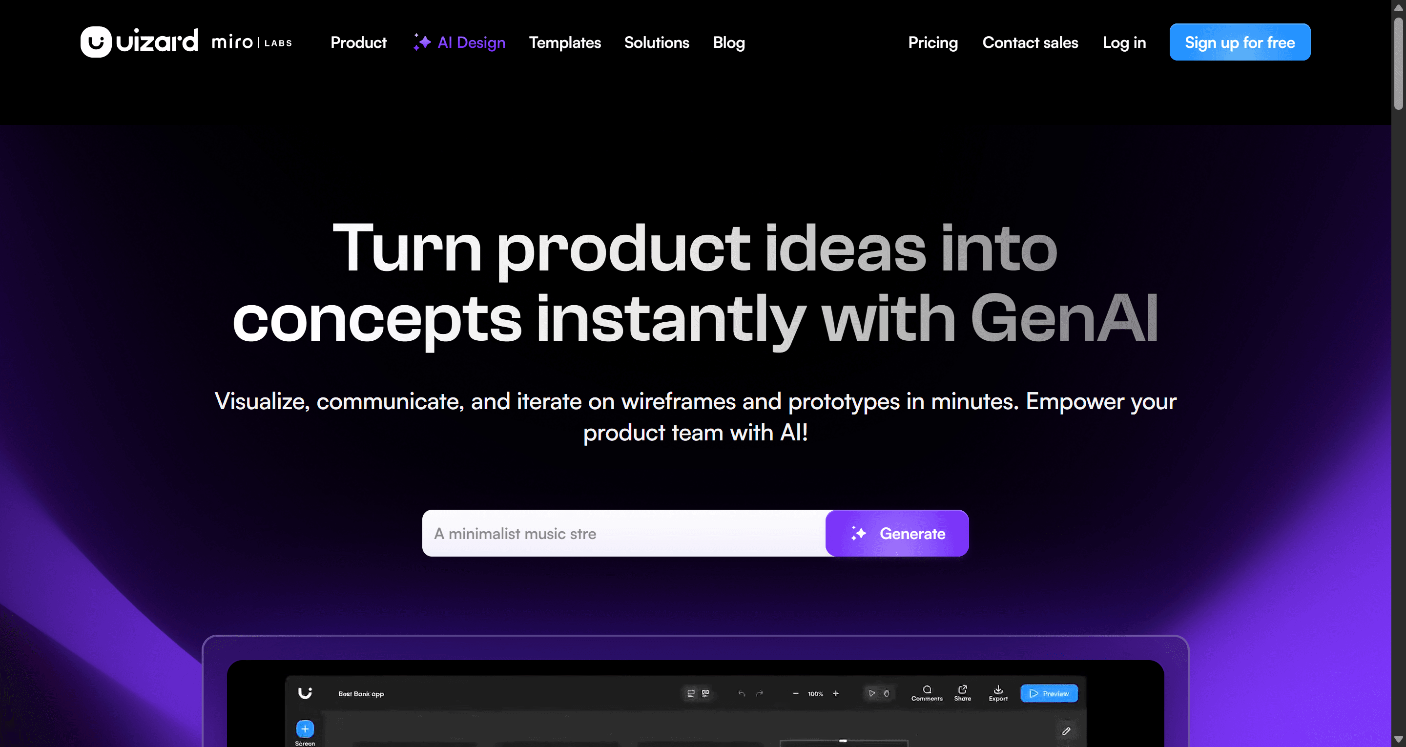
Autodesigner 2.0 is genuinely fast at what it's built for. Feed it a text prompt, and it produces a multi-screen layout in minutes. That's exactly why it's found an audience among non-designers and founders who need something to look at before engineering gets involved.
The problem shows up the moment it needs to hold up under scrutiny. The visuals stay blocky, hierarchy is weak, and screens feel evenly weighted rather than deliberately structured. Experienced stakeholders spot it as AI-generated immediately.
The deeper issue is architectural: Autodesigner generates isolated screens, not a connected flow. The industry commonly advises rapid-generating disparate screens to brainstorm layout variations. That's backwards. Without flow logic locked in from the first prompt, maintaining consistency across a real project becomes mathematically impossible past a handful of screens. Users routinely report that consistency collapses the moment a project scales past five screens.
Screenshot and Wireframe Scanners Evaluated
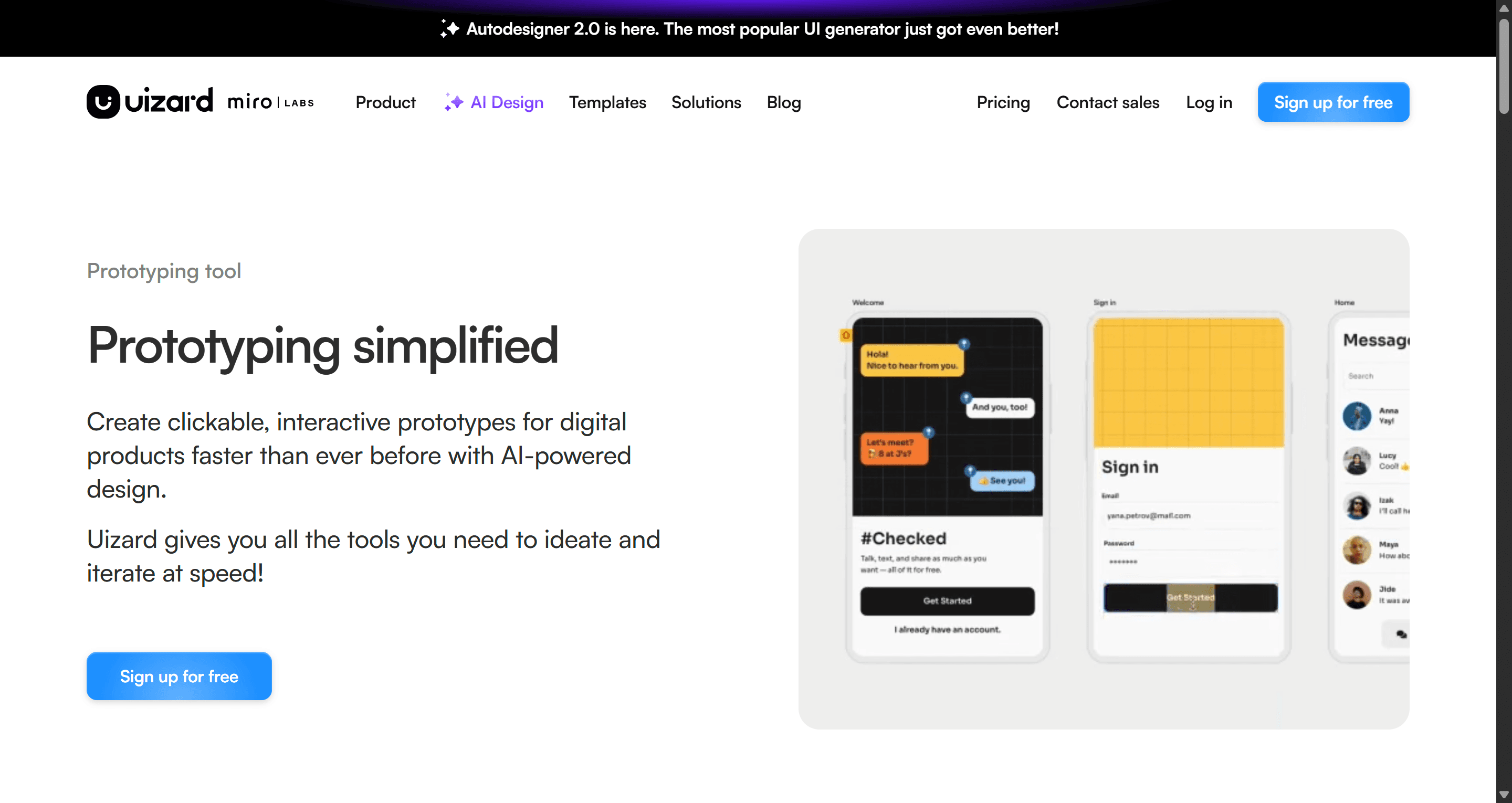
The Wireframe Scanner - digitizing a hand-drawn sketch into a baseline layout is one of Uizard's stronger, more legitimately useful features for the discovery-sprint phase.
The screenshot-to-UI feature is a different story. "Screenshot-to-UI" is largely a gimmick that fails the moment a layout gets genuinely complex. Horizontal scrolling carousels, z-index overlays, anything with real interactive behavior - these convert into static, broken grids. Fixing them by hand takes longer than building from scratch would have.
What's Else is Included in Uizard's Feature Set
Beyond Autodesigner and the scanners, Uizard bundles a handful of supporting tools: a drag-and-drop editor for manual adjustments, a built-in theme generator for applying brand colors and typography globally, and basic click-through prototyping for stakeholder walkthroughs.
The theme generator is worth flagging specifically. It applies global styles in one pass, which sounds like a shortcut to polish - but it can't fix the underlying structural issues covered above. A theme change makes blocky screens look like branded blocky screens. It doesn't add visual hierarchy or fix the flat, evenly-weighted layout problem underneath.
The prototyping layer is genuinely thin compared to a real interactive tool. Click-through links between screens work for a basic stakeholder demo, but there's no state management, no conditional logic, and no way to simulate anything beyond simple linear navigation - fine for a pitch, not for testing an actual user flow with edge cases.
Uizard Pricing in 2026: The Freemium Trap Explained
Uizard's pricing scales from a heavily restricted free plan to $12/month for Pro (billed annually, 500 AI generations) up to $39/month for Business (unlimited generations, priority support). On paper, 500 generations sounds like plenty for a full sprint.
It isn't, because of how credits get consumed. The iteration penalty is the real cost, not the sticker price. Every AI adjustment - a button color change, a header tweak, a spacing refinement - burns a credit, same as a full generation. A PM refining a design for one normal afternoon can burn through 300 credits before the sprint's actual ideation work is even finished.
This changes the whole procurement calculus. Discount the free tier entirely when evaluating this software. The three-generation cap on an outdated engine tells you nothing real about the tool. The only honest evaluation happens against the $39/month Business tier - that's the version built for continuous, iterative work, not a single demo generation.
The Fatal Flaw: Developer Handoff and Figma Export
This is where Uizard's velocity gains get erased entirely.
Uizard has no native Figma export. Getting a design out means raw SVG files, and importing those into Figma produces messy, unorganized layers with zero auto-layout and no meaningful component linkage. A designer picking up that file has to rebuild the entire component hierarchy, standardize layer naming, and re-link the prototype by hand - functionally rebuilding the file, not touching it up.
The lack of auto-layout compounds this before export even happens. There's no flexbox-equivalent responsive logic, so adding a button or extending a text field doesn't cause surrounding elements to adapt. Every screen needs manual realignment.
The code export tells the same story from the engineering side. React and CSS snippets don't use flexbox, lack semantic structure, and ignore existing design tokens. This isn't a rough draft engineering can clean up - it's markup that gets rejected outright in code review.
Abandon any workflow built around exporting Uizard SVGs into Figma. The structural chaos and the total absence of auto-layout routinely cost more cleanup time than building the interface from a blank canvas would have.
Uizard vs UXMagic: Screen Sprawl vs. Flow-First Production
Here's the architectural difference most Uizard comparisons skip.
Uizard generates screens independently. Each prompt produces an isolated artifact with no memory of what came before it. Typography drifts, spacing shifts, and component styling mutates as a project scales - the exact screen-sprawl problem covered above.
UXMagic's AI UI generator rejects that model at the architecture level. It starts with flow logic first - a connected UI that behaves like a real product from the first prompt. Consistency gets enforced automatically across multi-screen journeys instead of falling apart past five screens. Component states, spacing, and typography persist because the system remembers them, rather than treating every new screen as a blank slate.
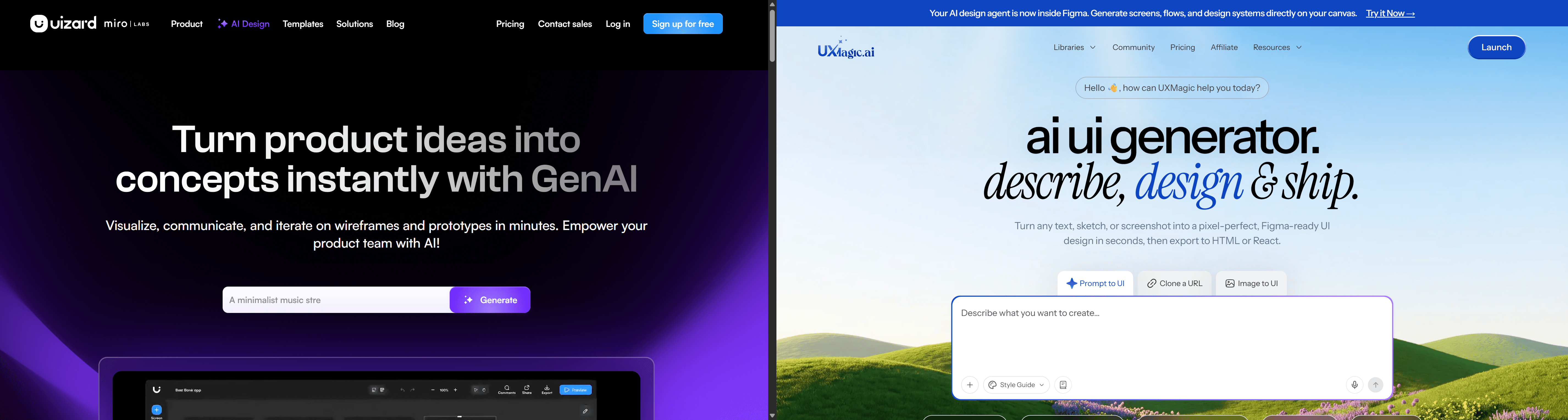
That difference compounds at export, where Uizard's core failure actually lives. Its SVG-only export lands in Figma as unlinked layers with zero auto-layout, requiring a near-total rebuild. UXMagic maps output directly into Figma's native auto-layout ecosystem, and exports to fully responsive React or HTML built for real engineering deployment - not a reference a developer has to rewrite from scratch.
The pricing model reflects the same gap. Uizard's credits charge for every micro-edit the same way they charge for a full generation, which penalizes normal iteration. A flow-first, stateful system doesn't need to meter every tweak the same punitive way, because refining an already-connected flow isn't regenerating it from zero. This is the same principle covered in how designers are actually using AI in real production workflows - the difference between a tool producing isolated artifacts and one producing a system you keep building on.
Tool Showdown: Other Uizard Alternatives
Beyond UXMagic, the field splits into a few more categories, each with a specific, real weakness.
| Tool | Core Strength | Critical Weakness |
|---|---|---|
| Figma Make | Deep integration for teams scaling an established product | Needs a pre-existing design system and heavy contextual setup — an enterprise scaler, not a zero-to-one generator |
| Visily | Clean screenshot-to-design fidelity, strong free tier | AI credits heavily capped even on paid plans, no native auto-layout for complex responsive builds |
| Google Stitch (formerly Galileo AI) | Gemini-powered, strong single-screen export accuracy | Struggles once a project becomes a long, multi-screen journey |
| UX Pilot | Generates UI directly inside Figma, strong predictive heatmaps | Frequently ignores complex negative prompts, defaults to generic layouts |
| Moonchild AI | Exceptional high-fidelity visual engine | Focused on visual "vibe" rather than structural engineering |
The pattern across all of them, Uizard included: most treat AI generation as an image-rendering exercise - static screens with no real component linkage underneath.
Honest Verdict: Should Product Teams Adopt Uizard?
Three scenarios show where this plays out in practice.
A founder validating an MVP benefits from Uizard's speed - an 8-screen dashboard prototype in three minutes is real progress toward a funding conversation. It falls apart the moment a hired designer needs to prep that concept for engineering. No Figma export means a full rebuild from an empty canvas, billing the founder an extra week of runway.
An enterprise PM mocking up a feature flow hits the credit-exhaustion problem directly. Burning through 300 of 500 monthly credits in one afternoon of routine refinement, then losing image placeholders to a glitch mid-generation, ends with finishing the wireframes manually in Balsamiq anyway.
An agency designer under a four-hour deadline learns the screenshot scanner's limits the hard way. A competitor's interactive carousel converts into a static, broken grid. Three of four allocated hours go to manually fixing the AI's structural mistakes.
The verdict: use Uizard strictly as a high-fidelity whiteboard for early stakeholder alignment. Nothing meant for engineering should get built there. Mandate that any AI tool in your actual pipeline outputs structured, semantic code and native Figma layers - not visual references pretending to be production assets.
Stop Untangling Div Soup
Stop untangling 400 absolute-positioned divs by hand. Try UXMagic's website cloner free and get a properly structured, auto-layout-native Figma file from any URL.