
Most healthtech interfaces resemble complex machinery controls designed by compliance officers who have never stepped into a high-stress clinical environment. When every visual alert is flagged as urgent and every clinical data point is displayed simultaneously, healthcare providers face real cognitive fatigue while patient safety risks rise. Product teams building in this space need to bridge the gap between regulatory checklists and functional usability - those two things aren't automatically the same thing.
A note before diving in: this guide covers UX design practice and how it intersects with usability engineering standards like IEC 62366-1. It isn't regulatory, legal, or clinical advice, and it doesn't replace a qualified regulatory affairs consultant or clinical safety officer on an actual medical device or SaMD project. Treat the frameworks here as design practice to bring into that conversation, not a substitute for it.
On scope, since "healthtech" covers genuinely different regulatory territory depending on the product:
- Medical devices / SaMD (Software as a Medical Device) - subject to IEC 62366-1, ISO 14971, and FDA or equivalent regulatory review. The heaviest regulatory burden of the four.
- Clinical software (EHR systems, clinical decision support tools) - often subject to similar usability and safety expectations even when not formally regulated as a device, depending on jurisdiction and function.
- Patient portals - typically governed by privacy regulation (HIPAA in the US) rather than device-level usability standards, though patient safety considerations still apply where the portal influences care decisions.
- Wellness/consumer health apps - generally outside SaMD regulation entirely, closer to standard consumer UX practice, though this varies by specific feature and jurisdiction.
This guide focuses primarily on the first two categories, where the usability-engineering framework below is most directly relevant. Confirm your own product's actual regulatory classification with qualified counsel - it's not always obvious from the outside.
You already understand product design fundamentals and standard SaaS UX patterns. This isn't a primer on what usability means. It's the specific ways clinical software breaks consumer UX conventions - click minimization, universal responsive layouts, aggressive minimalism - and the operational workflow that treats usability engineering as a design input, not a final compliance checkbox.
Understanding Healthtech UX: Beyond Consumer Design Frameworks
Regulatory Standards That Shape Medical Interfaces (IEC 62366-1, ISO 14971)
IEC 62366-1, the internationally recognized standard for applying usability engineering to medical devices, mandates a structured process to identify, evaluate, and mitigate use-related hazards. Product teams working on Software as a Medical Device (SaMD) or comparable clinical tools generally need to document clinical workflows, define intended user profiles, conduct formative and summative usability evaluations, and demonstrate that interface layouts actively work to prevent patient harm - not just that the interface looks clean or tested well with a general audience.
One nuance worth flagging directly: IEC 62366-1 explicitly states it does not apply to clinical decision-making itself - it governs the usability of the interface, not the medical judgment a clinician makes using it. It's also worth knowing that the standard's recognition status differs by market: it's a recognized consensus standard for US FDA submissions, while its status on the current EU harmonised standards list differs - a detail that matters for any team building for multiple regulatory markets, and another reason this guide isn't a substitute for real regulatory counsel.
ISO 14971 sits alongside this as the risk management standard - teams collaborate with regulatory engineers to perform hazard identification and Use-FMEA (Failure Mode and Effects Analysis), establishing explicit interface safety rules before screens ever get laid out. Since a 2020 amendment, the link between the two standards runs both ways: hazard-related use scenarios feed the ISO 14971 risk file, and new hazards identified through risk analysis get checked back against the usability hazard list. Treating usability validation as a final regulatory check right before release tends to lead to costly architectural rework. Human factors engineering works better driving the initial data architecture, component hierarchies, and user flows from the start.
Protecting Patient Safety Through Human Factors Engineering
Consumer UX design principles advocate for removing screen elements to reduce friction. In clinical UX design specifically, over-simplification can obscure contextual patient indicators that a clinician genuinely needs to see - though this is genuinely context-dependent, not a universal rule against minimalism everywhere in healthtech. A patient-facing wellness screen and a clinician's ICU monitoring dashboard have very different tolerances for visual simplicity. Progressive disclosure in high-stakes clinical contexts should focus on maintaining situational awareness rather than achieving visual purity - suppressing baseline physiological vitals or historical diagnostic notes purely to create a cleaner interface increases cognitive strain by forcing clinicians to recall hidden data points from memory instead of glancing at the screen.
Core Principles of Clinical Interface Design
Designing Role-Specific Experiences: Clinician, Patient, and Admin Views
Attempting to build a single responsive view that scales seamlessly from a desktop browser to a mobile device often satisfies neither clinicians nor patients - worth stating as a strong general tendency in high-stakes clinical software specifically, rather than a rule for every healthtech product regardless of context.
| Context | Clinician | Patient | Admin |
|---|---|---|---|
| Primary device/context | Desktop, workstation, often multi-monitor | Mobile phone, often at home or in transit | Desktop, back-office environment |
| Information density | High - trend data, multiple concurrent patients | Low - single relevant condition, simplified | Moderate - operational and scheduling data |
| Interaction requirements | Keyboard-driven, rapid navigation, minimal clicks per task | Touch-friendly, step-by-step guidance, high forgiveness for error | Standard business-software patterns, batch operations |
Physicians operating high-density dashboards on desktop monitors need high data throughput, complex trend visualization, and keyboard-driven navigation. Patients managing conditions on mobile devices need calm visual elements, high-contrast typography, and step-by-step guidance. Healthtech interfaces working in high-stakes clinical contexts generally benefit from prioritizing role-tailored views over universal responsive scaling - one screen trying to serve both audiences well tends to serve neither.
Managing Cognitive Load and Preventing Alarm Fatigue
Group non-critical vitals into trend summaries rather than surfacing every individual data point at equal visual weight, and reserve high-visibility visual alerts specifically for urgent conditions. When every alert looks equally urgent, clinicians start tuning out alerts altogether - which is the exact failure mode "alarm fatigue" describes, and it's a documented, serious patient safety concern in clinical software design broadly.
Progressive Disclosure vs. Data Density in Medical Dashboards
Popular design blogs frequently push the guideline that any task should be completed in three steps or fewer. Applying that rule rigidly to multi-party care plans, dosage inputs, or specialist referrals can lead to crowded modal overlays and accidental clicks under time pressure - a real usability concern in high-stakes data entry contexts, worth testing rather than assuming universally applies to every clinical interaction. Clinical interface safety tends to benefit from deliberate visual pacing, structured confirmation steps for critical actions, and real visual data density over an arbitrary click limit borrowed from e-commerce checkout design.
Operationalizing the Healthtech Design Workflow
Step 1: Clinical Task Analysis and Hazard Identification
Teams execute clinical task analysis by observing healthcare providers within their actual operating environments - mapping physical touchpoints, ambient lighting constraints, and realistic distraction patterns, not a quiet conference room. Designers define the formal scope required under IEC 62366-1, mapping intended user groups, operational environments, and clinical goals, then work with regulatory engineers to perform hazard identification and Use-FMEA under ISO 14971 before a single screen gets designed.
Step 2: Rapid Wireframing and Prototyping for Formative Testing
Once safety parameters are defined, the team translates clinical specifications into visual structures. Rather than treating the product as one application, designers establish separate information architecture models for primary clinicians, secondary administrative users, and end patients. Component layouts get structured around dense data grids for clinical decision support, clear trend visualizations, and accessible patient controls. Interactive safeguards - smart default values, non-overwhelming confirmation dialogs, real-time input validation - get embedded into wireframes specifically to prevent common user errors, not added as an afterthought once the layout is already locked.
This is where a real friction point shows up repeatedly: wireframe fatigue. Spending excessive sprint hours manually building UI variations for every edge case, error state, and role permission is a genuinely common bottleneck. Generating role-specific UI flows directly from a text prompt addresses that bottleneck at the source - instead of spending weeks manually wireframing separate web and mobile dashboards in Figma, designers can generate production-ready UI flows for multiple user roles from a single session, establishing aligned baseline layouts to iterate from rather than build from scratch each time. Generated UI is a strong starting structure, worth restating clearly - it is not validated medical software, and it doesn't substitute for the formative and summative evaluation this standard requires.
Step 3: Design History File (DHF) Documentation and Handoff
Product teams conduct formative usability evaluations, placing low- and high-fidelity prototypes in front of representative clinical users to identify interface friction and safety risks early, while changes are still cheap to make. All design iterations, test results, and risk mitigations get logged within the Usability Engineering File (UEF) and Design History File (DHF). Upon completing summative validation, implementation-ready design tokens and component specs get handed off to engineering to ensure faithful technical implementation - implementation-ready in the sense that the structure is sound, not "compliant" or "validated" on its own; final production sign-off still belongs to engineering and the relevant regulatory review process.
Practical Case Studies: RPM Vitals and Clinical Referrals
Remote Patient Monitoring (RPM) vitals tracking.
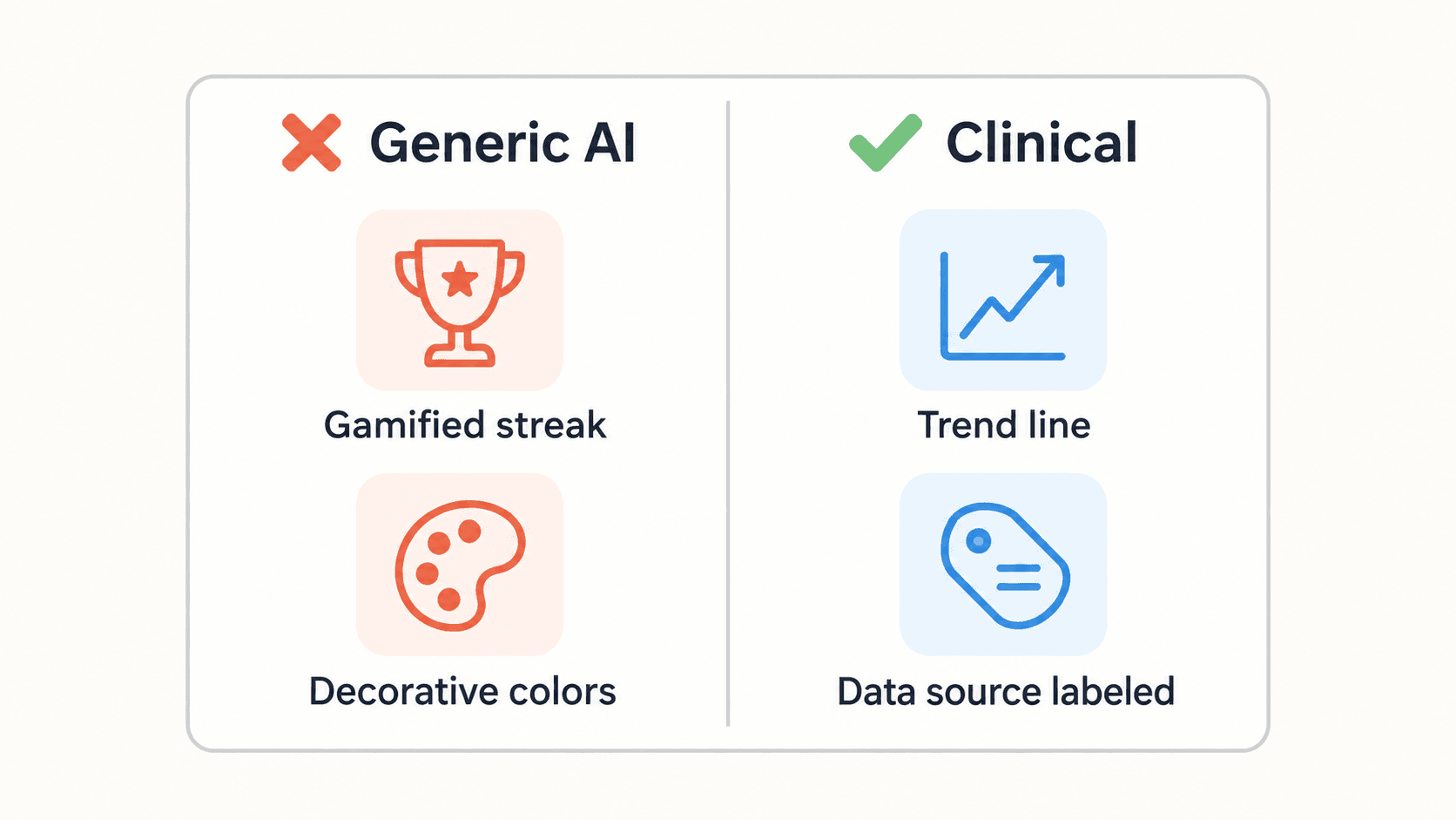
- Problem: Generic AI image generators asked to design a patient vitals dashboard typically render consumer fitness dashboards instead - gamified badges, decorative progress rings, playful color schemes - rather than clinical metrics, data provenance indicators, and medical trend charts.
- UX decision: Replace decorative gamification elements with clear trend visualization, explicit data source labeling, and a visual hierarchy that surfaces out-of-range values distinctly from stable ones.
- Expected outcome: A clinician or patient managing a real condition can see trend direction and data source clearly at a glance, rather than being distracted by a "7-day streak" badge that adds no clinical value.
Dental and specialist referral workflows.
- Problem: Basic AI tools asked to build a referral flow tend to generate standard web contact forms with generic text inputs, missing domain-specific interaction patterns entirely - visual anatomical mapping, structured clinical routing logic, compliance indicators.
- UX decision: Replace the generic form pattern with structured clinical routing - anatomical selection where relevant, explicit specialist-matching logic, and visible compliance/consent indicators built into the flow itself.
- Expected outcome: A referral flow that actually reflects clinical routing logic, rather than reading like a generic "contact us" form bolted onto a healthcare product.
Both failure modes trace back to the same root cause: a generic AI tool has no model of what a clinical interface actually needs to communicate, because it's pattern-matching against consumer software by default.
Accelerating Healthcare UI Generation with UXMagic
Designing for safety guidelines under IEC 62366-1 requires extensive mapping of error states, critical threshold alerts, and confirmation dialogs. Designers frequently skip mapping these secondary states under tight release deadlines - not because the states don't matter, but because manually building normal, loading, warning, critical alert, and empty-data variants for every screen eats real sprint capacity. Using UXMagic's Flow Mode, teams can generate complete visual variants - including those exact states - ensuring interface completeness before usability testing rather than discovering the gaps during it.
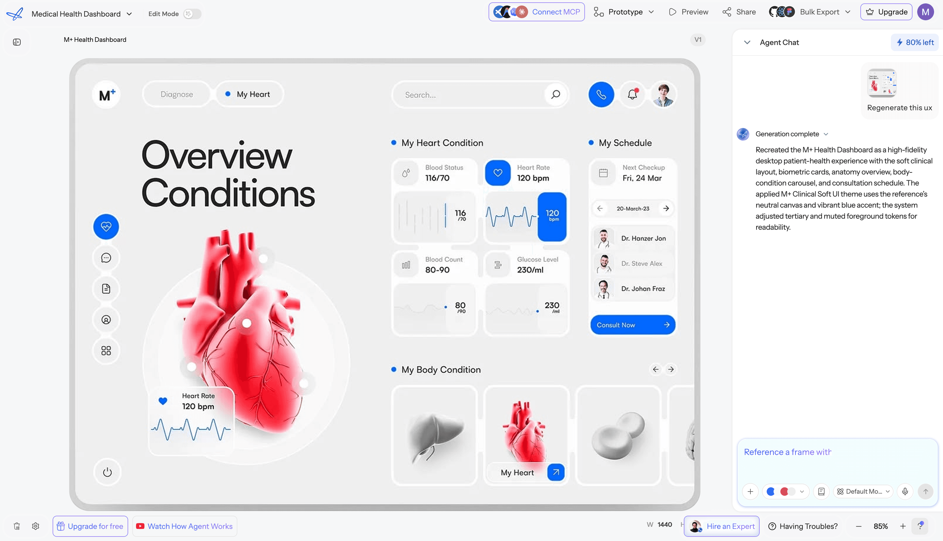
Preserving design system consistency across a genuinely complex product - dense clinical data tables, visual charts, and simplified patient-facing screens, all within the same product - is a real fragmentation risk during rapid iteration. UXMagic's Style Guide Generator locks colors, typography, and spacing as a real token system, keeping that consistency intact across data-heavy tables, modal dialogs, and accessible layouts without manual component reconstruction each time a new role-specific screen gets added - closing the exact gap between "the clinician dashboard looks like one product" and "the patient portal looks like a completely different one." For teams already governed by an existing brand system, importing those Figma styles directly keeps every generated role-specific screen anchored to real, existing tokens instead of a generic default.
Accessibility in Healthtech Interfaces
Accessibility deserves more than a passing mention in this context specifically, since the user base skews toward people managing real health conditions, often with real physical or cognitive limitations:
- Keyboard navigation - every clinical workflow, especially rapid data entry, needs to be fully operable without a mouse.
- Screen readers - properly labeled fields and ARIA-compliant structure aren't optional in a context where a visually impaired clinician or patient may depend entirely on assistive tech.
- Contrast - clinical dashboards in particular need contrast levels that hold up under variable ambient lighting (a dim hospital room, bright daylight through a window), not just a lab-tested default.
- Text scaling - patients managing chronic conditions skew older on average; interfaces need to hold up at larger text sizes without breaking layout.
- Alert presentation - critical alerts can't rely on color alone; pair every alert with text and, where appropriate, an icon or pattern distinct from routine notifications.
- Touch targets - patient-facing mobile interfaces need touch targets sized for users who may have reduced fine motor control, not a minimum-viable tap area.
When AI Should Not Be Used
A few specific situations where generative tools have no business making the final call, regardless of how good the generated UI looks:
- High-risk clinical decisions - any interface element that influences a clinical judgment (dosage calculation, diagnostic suggestion) needs clinical and regulatory review, not AI-generated defaults.
- Unvalidated clinical logic - business logic tied to actual patient safety (alert thresholds, escalation rules) needs explicit human specification and sign-off, never an assumption baked into a generated flow.
- Regulatory interpretation - whether a specific interface pattern satisfies IEC 62366-1 or a given jurisdiction's requirements is a determination for qualified regulatory affairs professionals, not a design tool.
- Final safety-critical interaction decisions - confirmation dialogs, override mechanisms, and alert escalation paths for genuinely high-stakes actions need deliberate human design and formal usability testing before they ship, not just a generated first draft.