Let’s be honest.
You’ve typed “SaaS dashboard for fintech startup” into an AI tool. It generated something beautiful in 12 seconds.
Modern. Clean. Dribbble-ready.
And then reality hit.
The loading state didn’t exist. The mobile layout was a guess. The login screen didn’t match the dashboard. Your developer asked, “Is 15px intentional?”
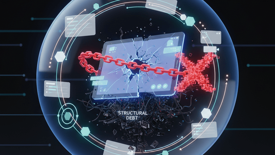
That’s not acceleration. That’s UX debt in disguise.
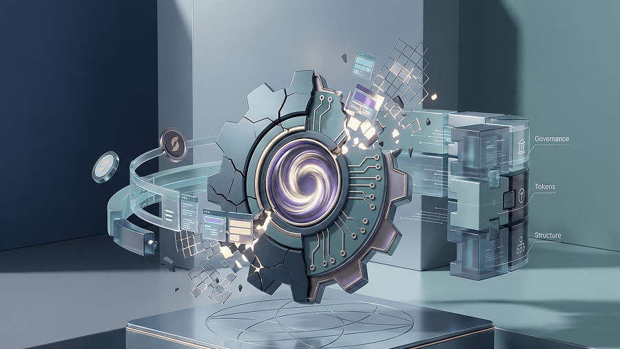
Single-screen AI design feels fast because it gives you pixels. But products aren’t pictures. They’re systems. And generating isolated screens is a structural dead end for anyone trying to ship real software.
The Illusion of Completeness in AI UI
Single-screen generators create what I call “the illusion of completeness.”
You see:
- A primary blue button
- A filled data table
- A polished dashboard layout
Your brain assumes:
- Hover state exists
- Focus state exists
- Loading spinner exists
- Empty state exists
- Error validation exists
It doesn’t.
Most AI models are trained on screenshots of software, not the logic of software.
They replicate:
- The aesthetic
- The spacing
- The “vibe”
They do not understand:
- State transitions
- Persistent session logic
- Cross-screen consistency
- Design systems
That’s how you end up with:
- 8px rounded corners on one screen
- 4px corners on another
- Serif on dashboard
- Sans-serif on settings
To AI, both are “modern UI.”
To users, it feels amateur.
To engineers, it’s CSS chaos.
Why Single Screens Break in the Real World
Let’s break down the structural failures.
- Missing Invisible States
Professional UI is 90% invisible.
Single-screen tools only generate the happy path.
They ignore:
- Loading states
- Error states
- Validation messages
- Permission failures
- Empty dashboards
- Loading State Vacuum
Real SaaS apps fetch data.
AI renders the screen as if the data is already there.
Developers then:
- Add spinners randomly
- Create layout shifts
- Patch visual gaps manually
You just lost the time you “saved.”
- Error State Abyss
AI-generated login screen:
- Perfect inputs
- Perfect success scenario
No:
- Invalid password state
- Email already taken state
- API timeout behavior
Production software fails. Your design has to anticipate that. AI doesn’t.
- The Empty State Problem
This is the most dangerous one.
When a new user signs up, their dashboard is empty.
That empty state:
- Drives onboarding
- Guides first action
- Creates the “Aha” moment
AI almost never generates it, because it’s trained on populated interfaces.
So you ship a dashboard full of fake charts. Then users sign up and see… nothing meaningful.
The Accessibility Gap (WCAG Failure)
Accessibility isn’t optional.
AI tools frequently generate:
- Low-contrast text
- No visible focus states
- Non-semantic structures
- Div-based buttons
They statistically reproduce the internet’s bad practices.
Fixing accessibility later is expensive:
- Auditing colors
- Refactoring structure
- Rebuilding interactive elements
If your AI-generated UI isn’t WCAG compliant from day one, you didn’t move faster. You just delayed the cost.
Responsive Reality vs Desktop Fantasy
Most AI UI tools default to desktop layouts.
Looks impressive in a pitch deck.
But:
- What happens to that data table on mobile?
- Do columns collapse?
- Does it scroll?
- Does it become cards?
Navigation:
- Desktop top-bar → Mobile hamburger
- Modal transitions
- Interaction shifts
AI doesn’t define that logic.
So your dev team guesses.
Desktop-first development in 2026 is not innovation. It’s regression.
The Hidden Cost: UX Debt Compounds Fast
Technical debt gets attention.
UX debt kills silently.
When you generate features screen-by-screen:
- Chat module this week
- Billing portal next week
- Settings page later
- Each built in isolation.
You get:
- Visual inconsistency
- Interaction inconsistency
- Pattern fragmentation
Users feel it as friction.
Metrics show it as:
- Higher churn
- Slower onboarding
- Increased support tickets
Engineers feel it as:
- CSS bloat
- Component duplication
- Hardcoded hex codes everywhere
That “one more screen” snowballs.
Now rebranding takes three weeks because you hardcoded #2F80ED in 37 places.
That’s the compound interest of inconsistency.
Page Thinking vs Systems Thinking
Here’s the core shift.
Page Thinking: “I need a dashboard screen.”
Systems Thinking: “I need users to understand project status across states.”
Page thinking optimizes for frames. Systems thinking optimizes for flows.
Historically, tools evolved toward systems:
- Pixel era: manual layers
- Component era: reusable symbols
- Early generative AI: back to flat outputs
That’s regression.
If AI is going to be useful in product design, it must operate at the system level — not the screenshot level.
Tokens > Raw Values
Bad output:
margin-left: 17px;
color: #2F80ED;
Good system thinking:
spacing-md
color-action-primary
Tokens let you:
- Re-theme
- Scale
- Maintain
Raw values lock you into chaos.
The Developer Handoff Crisis
AI screen → Developer.
Now what?
Developers reverse engineer intent:
- Is 15px deliberate?
- Is 13px grid gap a mistake?
- Should this be a
When design ambiguity increases, developers improvise.
That leads to:
- Spaghetti code
- Inline styles everywhere
- Hardcoded strings
- No localization structure
AI-generated UI code is often technical debt the moment it’s created.
The most expensive place to fix design mistakes is inside production code.
What Flow-Based AI Does Differently
If single-screen generation is the problem, the answer is flow-based generation.
Instead of:
Prompt → Screen
The model should operate as:
Intent → Connected system
Flow Mode: Designing the Movie, Not the Frame
In UXMagic, Flow Mode generates:
Landing → Signup → Email Verification → Onboarding → Empty Dashboard
Not isolated screenshots. Connected journeys.
Context persists:
- Brand name remains consistent
- Typography stays enforced
- Color logic carries across screens
No Frankenstein UI.
If you're exploring scalable workflows, this pairs well with our breakdown of design system consistency in AI tools, because without governance, flows still break.
AI Style Guide: Governance Before Generation
Instead of generating random hex codes, the system defines:
- Primary / Secondary / Error colors
- Typography scale
- Core component patterns
New screens assemble from defined atoms.
If you change the primary color, the entire flow updates.
That’s systems thinking.
That’s debt prevention.
Sectional Editing Instead of Regenerating Everything
Most tools force you to regenerate an entire screen.
You lose the 90% that worked.
With sectional refinement, you can:
- Update just the pricing grid
- Change a layout block
- Modify a specific component
Without breaking the rest. That’s how real teams iterate.
The Future: Designers as Architects
AI doesn’t replace designers.
It replaces pixel pushing.
The designer’s role becomes:
- Defining constraints
- Architecting flows
- Reviewing system logic
- Curating output
AI becomes the fast junior. You remain the principal architect.
If you’re still judging AI tools by how pretty one screen looks, you’re optimizing for the wrong metric.
Build Your Next Flow, Not Just Another Screen
Design complete user flows with loading, error, and empty states baked in. UXMagic helps you generate scalable systems, not fragile screenshots.

Conclusion
If you want AI to actually accelerate your product, not sabotage it. Try building your next user journey in Flow Mode and see how different it feels.
Because products aren’t pictures. They’re living systems.