You spent three hours building a gorgeous UI color palette in an aesthetic generator then watched it collapse the moment it touched a real SaaS data table. Suddenly your Figma file has 47 undocumented blues, your warning yellow turned into brown just to pass contrast checks, and engineering keeps asking which hex code is the disabled hover state.
This isn’t a taste problem. It’s an architecture problem.
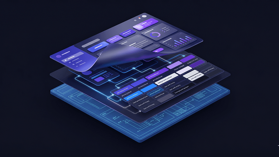
A production-ready UI color palette isn’t five swatches. It’s a semantic system of 50–100 tokens that survive dark mode, accessibility math, developer handoff, and multi-screen AI workflows without collapsing into chaos.
Quick takeaways (for when you’re already late for standup)
- Kill the 60-30-10 rule. Use tinted neutrals for ~90% of the canvas.
- Generate ramps in OKLCH, not HSL.
- Stop trusting WCAG 2.0 contrast in dark mode, use APCA logic.
- Name tokens functionally, not poetically.
- Stop vibe-coding palettes with aesthetic generators, use token-aware workflows like the ones described in How Designers Actually Use AI in Real Projects.
The Fundamental Failure of Modern UI Color Theory
Why the 60-30-10 Rule Destroys SaaS Interfaces
The 60-30-10 rule works for living rooms. It fails spectacularly in product interfaces.
Applying a saturated brand color across 60% of a dashboard creates cognitive noise, visual fatigue, and unreadable data density. Yet designers still follow this advice because it’s repeated everywhere.
Here’s what actually happens in real products:
- purple sidebars dominate analytics dashboards
- table headers compete with chart colors
- CTA hierarchy collapses
- users report eye strain within minutes
Professional interfaces invert the ratio.
Instead of 60% brand color, you typically get:
- ~90% tinted neutrals
- ~8% structural emphasis tones
- ~2% interaction accents
Brand color becomes signal, not wallpaper.
This is exactly why systems-first workflows outperform aesthetic-first ones. If you’re still starting palettes visually instead of structurally, you’re recreating the problem described in Blank Canvas Syndrome.
The “Dark Yellow Problem” and Semantic Clashes
Every designer hits this eventually.
You darken warning yellow to pass contrast.
It turns brown.
Now users stop recognizing it as a warning state.
This isn’t a skill issue. It’s a luminance problem.
Semantic colors operate under two constraints:
- accessibility math
- cognitive expectation
Yellow fails because increasing contrast destroys recognition.
The correct fix isn’t darkening the hue.
Instead:
- use dark text on light yellow surfaces
- or shift toward high-visibility orange
- preserve semantic mapping across screens
Consistency beats purity.
If warning states behave differently between modal alerts and table rows, your interface becomes unpredictable and users stop trusting it.
How to Build a Scalable UI Color Palette (The 2026 Standard)
Extracting the Core Brand Seed (Digital Blue)
Your palette starts with a constraint.
Usually marketing hands you a hex code.
Example: #BA7542
The mistake most teams make is assuming brand color equals interaction color.
It doesn’t.
Print-optimized colors often vibrate on screens or fail accessibility thresholds.
So you pivot.
This is called the Digital Blue strategy.
You:
- slightly adjust chroma
- stabilize luminance
- preserve identity
- enable interaction use
That adjusted version becomes your action token.
Your original brand color stays intact for marketing.
Your digital variant powers links, buttons, and focus states.
This prevents the classic “brand consistency vs usability” argument with stakeholders before it starts.
Using OKLCH to Generate Accessible Tints and Shades
Most palettes still rely on RGB or HSL ramps.
That’s why midtones look muddy.
Those color spaces don’t match human perception.
OKLCH does.
Instead of manipulating arbitrary sliders, you control:
- lightness
- chroma
- hue
Independently.
That lets you build predictable ramps like:
brand-50 → brand-900
Each step maintains perceived contrast spacing.
This matters because UI states depend on it:
- hover
- pressed
- disabled
- background surfaces
- outlines
- overlays
Without structured ramps, designers improvise shades.
Improvisation becomes inconsistency.
Inconsistency becomes developer Slack messages.
Once your ramps exist, execution becomes mechanical. That’s where token-aware automation tools step in, especially when applying palettes across flows the way described in Real Prompts We Use.
Why You Must Tint Your Neutral Grays
Pure gray is a beginner move.
#333333, #666666, #999999
These produce the “wireframe mud” effect.
Interfaces feel unfinished because they are visually disconnected from brand identity.
Instead:
inject 2–3% chroma from your primary hue into neutral ramps.
Result:
- warmer typography
- cohesive surfaces
- reduced visual fatigue
- stronger hierarchy clarity
Even subtle tinting changes perceived quality dramatically.
Users won’t notice it consciously.
They’ll feel it immediately.
Applying Tokens Across Multi-Screen Flows Without Manual Drift
Building ramps is the easy part.
Applying them across 50 screens isn’t.
Manual propagation introduces:
- token drift
- duplicate shades
- inconsistent hover states
- broken semantic mapping
This is exactly where Flow Mode-style workflows help.
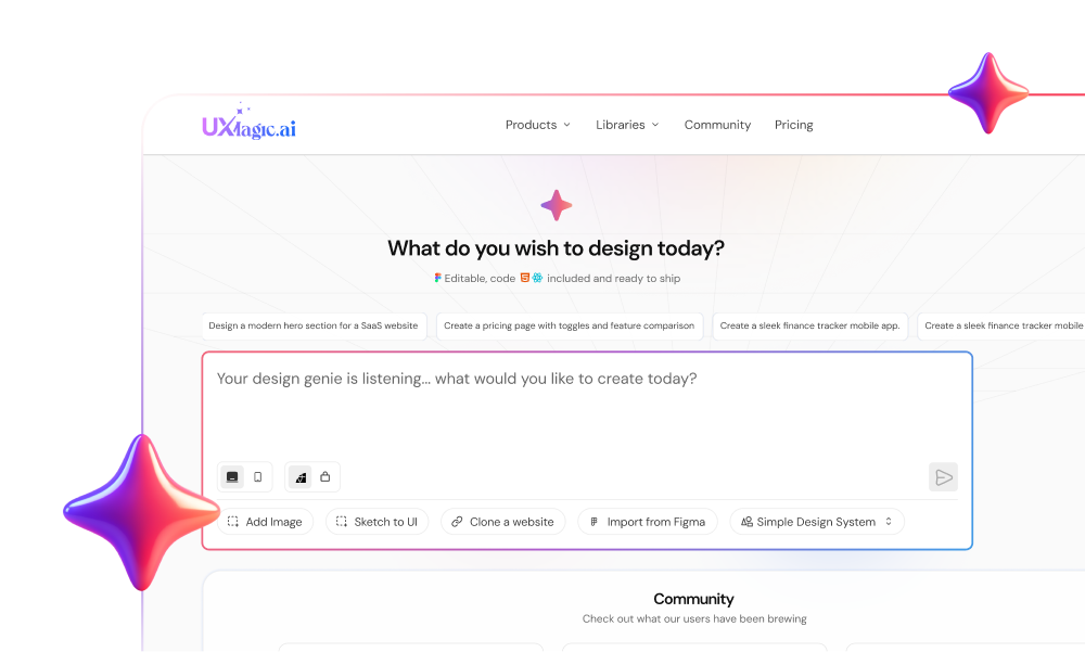
Instead of regenerating components screen by screen, token-locked systems enforce palette consistency across entire journeys automatically similar to how UXMagic applies semantic tokens across flows without introducing new colors mid-generation. That eliminates the “47 shades of blue” problem entirely.
Accessibility Beyond Legacy Algorithms
The Mathematics of APCA in Dark Mode Design
Passing WCAG 2.0 does not guarantee readability.
Especially in dark mode.
WCAG contrast math treats perception linearly.
Human vision isn’t linear.
So you get:
- false passes
- false failures
- vibrating text
- halation artifacts
Example:
brand blue on #121212
passes contrast
still hurts to read
That’s because spatial frequency and font weight matter.
APCA accounts for both.
Instead of asking:
“Does this technically pass?”
APCA asks:
“Can a human read this comfortably?”
That shift changes everything.
Dark mode palettes must be generated separately, not inverted.
Teams that skip this step inevitably rebuild their token system later.
Accessibility belongs inside palette architecture from day one, not as a final checklist. That’s the same mindset behind designing accessibility directly into prompts as shown in Prompting for Accessibility.
Naming Conventions and Design System Handoff
Moving from Abstract to Functional Token Naming
“Ocean Blue”
“Sky Blue”
“Midnight”
These names break the moment engineering touches them.
Sequential naming fails too:
gray-1
gray-2
gray-3
Insert a new shade between them and everything collapses.
Instead use:
color-brand-500
mapped to:
button-primary-default
Now intent is visible instantly.
Benefits:
- predictable implementation
- scalable insertion
- no renaming cascades
- cleaner React exports
Functional naming converts palettes into infrastructure.
That’s the difference between decoration and architecture.
It’s also a prerequisite for enforcing style consistency across design systems in multi-screen AI workflows.
The Limitations of AI Color Palette Generators
Aesthetic Swatches vs Production-Ready UI Systems
Most palette generators output vibes.
Not systems.
Tools like Coolors or Canva generate:
- 5 swatches
- no ramps
- no semantic mapping
- no accessibility guarantees
They’re fine for inspiration.
They’re useless for applications.
A real UI color palette includes:
- interaction states
- neutral scales
- semantic feedback tokens
- dark mode variants
- typography hierarchy support
If your generator can’t produce those, it’s not solving your problem.
It’s delaying it.
Enforcing Style Consistency Across Multi-Screen Flows with UXMagic
Most AI UI tools hallucinate colors.
You prompt:
“Use brand blue”
They generate purple.
Now you’re debugging instead of designing.
That’s the verification tax.
Spec-driven workflows remove it.
Instead of generating visuals first, they lock tokens first similar to the logic explained in the breakdown of Human-in-the-Loop AI Design.
Once tokens are locked:
- semantic colors propagate correctly
- ramps remain stable
- dark mode variants stay aligned
- exported components remain predictable
This is how AI becomes infrastructure instead of decoration.
A production-ready UI color palette isn’t about picking attractive swatches, it’s about building a semantic system that survives accessibility checks, dark mode, developer handoff, and multi-screen scaling. When tokens are structured correctly and enforced consistently, color stops being decoration and becomes infrastructure.
Designers don’t struggle with choosing colors. They struggle with making colors behave like systems.
Generate a Token-Safe UI Color System Automatically
Stop fixing palette drift across screens. Define your tokens once and let UXMagic apply them consistently across full user flows in minutes.