It starts small: someone on the design team asks for the FAQ accordion's icon moved to the left, the background changed on expansion, and the drop shadow removed. Four hours later, the engineer is still targeting .MuiAccordion-root directly, fighting slotProps, and wondering why changing three visual properties on a UI component library's component turned into an afternoon of override archaeology. If your team is fighting the framework harder than building actual features, the library stopped being a shortcut a while ago.
You already know what a component is. You've shipped with MUI, fought Ant Design's theme provider, and you know what sx prop hell looks like at 11pm before a release. This isn't an explainer on why reusable components matter. It's the honest build-vs-buy math nobody wants to run before the library is already load-bearing in production.
What Is a UI Component Library
A UI component library is a pre-built collection of interface elements - buttons, modals, data grids, accordions - packaged as an installable dependency, complete with their own styling engine and behavioral logic. Install MUI or Ant Design and you get hundreds of components ready to drop into a codebase, styled according to that library's own design opinions.
That's the entire value proposition: skip writing boilerplate HTML, CSS, and accessibility logic from scratch, and get visual consistency across the app for free. The tradeoff is baked in from the first npm install - you're not just importing components, you're importing someone else's opinions about how those components should look, behave, and be styled, and every customization from that point forward is a negotiation with those opinions.
That distinction - opinions bundled with logic - is what separates a standard library from a headless one, and it's the fault line this entire piece runs along.
The True Cost of UI Component Libraries in 2026
Common advice says you can simply "theme" a library like MUI or Ant Design to match your brand. That's technically true and practically a trap. These libraries rely on nested DOM structures and injected style engines like Emotion - the moment your design system diverges from the library's default patterns, you're writing brittle CSS overrides with !important flags and deeply nested selectors, and the maintenance cost routinely exceeds what building custom would have cost.
To be fair, this isn't universal - mature ecosystems like MUI earned adoption for real reasons, particularly baked-in accessibility patterns and genuinely hard components like enterprise data grids that would take a small team months to reproduce. The cost only outweighs the benefit once customization needs exceed what the library was designed to flex around.
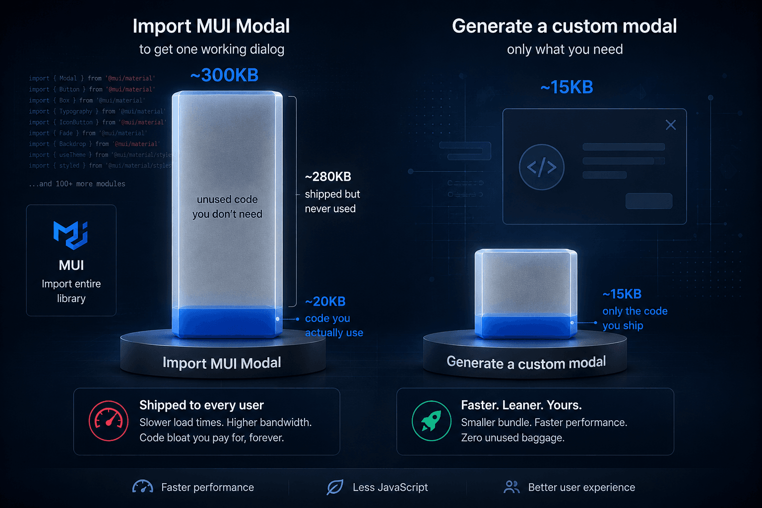
Importing MUI's Modal to get one working dialog pulls in roughly 300KB - shipped to every user even though the app calls a fraction of what's inside. Then there's dependency lock-in: when a library's maintainers haven't updated peer dependencies, the whole roadmap can get blocked by a dependency the team doesn't control. Most teams treat this as a rare edge case. It's not - it's the default trajectory of any library adopted without an upgrade-path audit up front.
Accessibility compounds this for customized cases specifically. Marketing copy claims WCAG compliance, but a real screen reader audit reveals nested DOM nodes inside complex dropdowns breaking keyboard navigation entirely. And in production, MUI's Emotion styles inject late in the head, silently overriding Tailwind classes - rendering fine locally, breaking once deployed.
Buy, Own, or Generate: A Decision Framework
This isn't a single decision made once per company - it's made per component, per product surface.
| Pre-Styled Library | Headless + Utility | Own-Your-Code | |
|---|---|---|---|
| Initial velocity | Very high | Medium | High |
| Design flexibility | Low, opinionated | Very high | Very high |
| Bundle impact | Heavy | Light, tree-shakable | Zero overhead |
| Maintenance burden | High, version lock-in | Medium | Low |
| Best fit | Internal tools, admin panels | Custom SaaS, strict brand | Modern, scalable design systems |
A founder building an internal admin tool is the clearest "buy" case - brand fidelity is irrelevant, and Ant Design ships in four days what custom-building would take three weeks. A Series A consumer app with a specific brand aesthetic is the opposite: a pre-styled library looks fast for a month, then turns into a mess of !important hacks fighting the library's own opinions, while Radix plus Tailwind or shadcn/ui routinely drops bundle size 40% because nothing's fighting a third party anymore.
On migration: if MUI or Ant Design is already working - internal tools, low customization pressure - ripping it out is its own costly distraction. Migration earns its cost when the override percentage is climbing on customer-facing surfaces, not as a default move.
The Customization Trap: The MUI Accordion Paradox
Modern HTML5 gives you details and summary - built-in disclosure, zero JavaScript, easily styled with CSS. Developers default to importing a bloated Accordion component anyway, which is the clearest example of where this entire category of decision breaks down.
Take the FAQ example from the opening: icon on the left, custom background on expansion, drop shadow removed. Using MUI's Accordion, that means targeting .MuiAccordion-root directly, overriding box-shadow to strip default elevation, passing complex slotProps to the IconButton, and manually managing expanded state.
"What should have been 10 lines of native details HTML and CSS becomes 60 lines of tightly coupled React code - and the library still forces a button inside a heading tag, a W3C ARIA violation you didn't ask for."
That last part matters beyond code cleanliness - a button nested in a heading creates a real role="heading" vs role="button" conflict that breaks assistive technology, and in Next.js these deeply nested elements are also a common source of React Server Component hydration errors. Most teams assume the fix is more overrides. It's the opposite - past a certain point, the fix is dropping the library for that component entirely.
The Rise of Headless UI and the "Own Your Code" Movement
Common advice says to wrap a library's component in a custom facade to avoid vendor lock-in. In practice, product requirements always leak through the abstraction - developers end up passing massive props objects down just to expose the underlying library's features, doubling the maintenance workload instead of insulating against it.
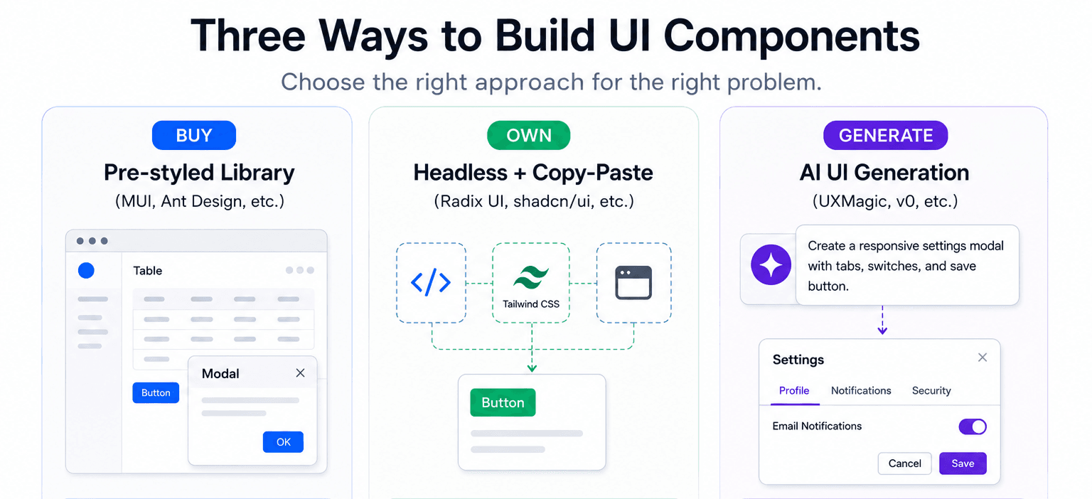
This is exactly what shadcn/ui's copy-paste model solves: copy the component's code into your own repository and own it outright, no external version to lock to. Headless libraries like Radix solve an adjacent problem - they hand you complex functional logic (focus management, ARIA state, keyboard navigation) and leave styling entirely to you.
Radix, shadcn/ui, and AI generation aren't really competing choices so much as points on one evolution: Radix gives you behavior and asks you to style it, shadcn/ui gives you that logic pre-styled as code you own, and AI generation collapses both steps - producing the styled, functional component directly from a prompt.
How AI UI Generation Is Making Component Libraries Obsolete
A UI library's original value was avoiding boilerplate. That proposition weakens once AI generates production-ready, styled, accessible UI directly from a prompt - importing a 300kb dependency for one modal stops making sense when the same modal generates custom, styled exactly to spec, with none of the bundle weight.
It's worth being precise about what this replaces, though: AI generation removes manual boilerplate, not the architectural thinking behind design tokens and constraints. A prompt still needs to carry those constraints explicitly - this is the same discipline behind writing production-ready prompts instead of vague ones. Generation quality is bounded by the constraints fed in, not the tool itself.
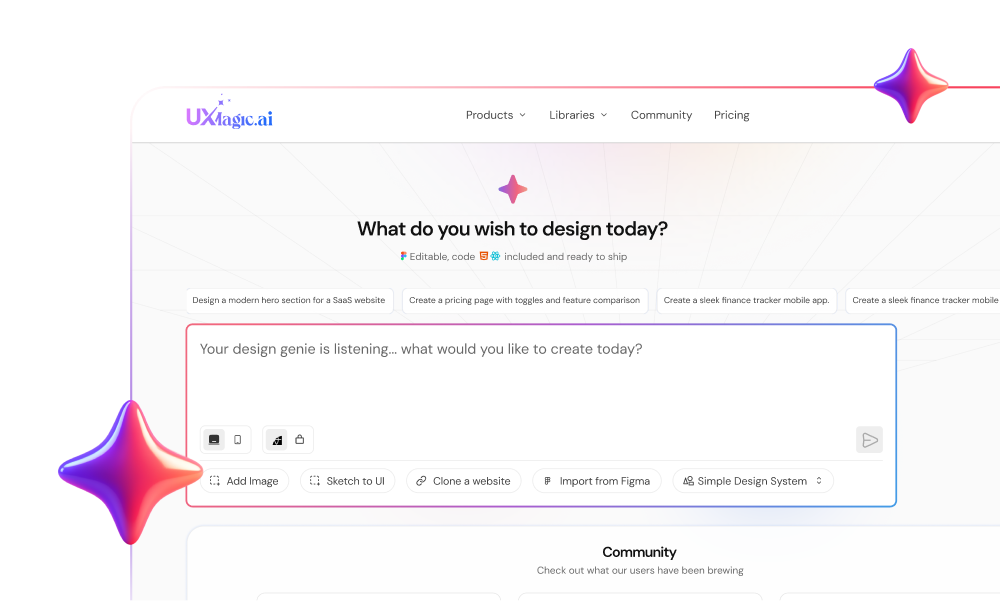
This is also where implementation drift shows up - design hands over a Figma file with tokens that don't exist in whatever library engineering agreed to use, a translation-loss problem covered in more depth in wireframe vs. mockup vs. prototype. Instead of installing a bloated library and fighting its defaults, UXMagic's AI UI generator generates the exact interface from a prompt - the velocity of a library with none of the architectural compromise, and the direct fix for drift itself: a prompted user journey becomes immediately usable code, removing the manual translation step where drift gets introduced, per how designers are actually using AI in real workflows - best paired with keeping a human reviewing the output rather than shipping the first generation untouched.
The bundle math flips entirely: a monolithic library ships every feature whether used or not; generated components ship exactly what was prompted for. Same "own your code" principle as shadcn/ui, just generated instead of copy-pasted.
Component libraries solved yesterday's bottleneck: building common UI from scratch. Today's bottleneck is forcing unique products to fit someone else's abstractions. The teams moving fastest aren't choosing between libraries and custom code-they're generating exactly the components they need, owning the output, and eliminating the maintenance tax before it starts.
Stop Fighting Your Component Library
Generate production-ready UI components from your requirements instead of overriding library defaults. Own the code, keep your bundle lean, and ship exactly what your product needs.