
Most UX case studies fail not because the underlying design work is poor, but because the layout forces a hiring manager to read a thousand words of methodology before seeing a single finished screen. Standard portfolio templates encourage documenting every intermediate artifact, creating bloated pages that design leads skim for a matter of seconds and close. Restructuring your case study around explicit trade-off decisions and immediate high-fidelity UI flows is a direct path to more interview callbacks.
A quick note on this article's own length versus what it recommends: this guide runs long because it's teaching the framework - explaining reasoning, giving examples, covering edge cases. The case study itself, the one you actually publish, should be far shorter: 600–1,200 words. Don't confuse the length of the instructions with the length of the deliverable.
You already understand information architecture, wireframing, usability testing, and persona creation. This isn't a "what is a UX case study" primer. It's an actionable, cold-read-optimized blueprint that skips the academic framework recap and gets straight to what actually gets a hiring manager to keep reading past the first screen.
Process-Heavy vs. Outcome-Focused Case Study
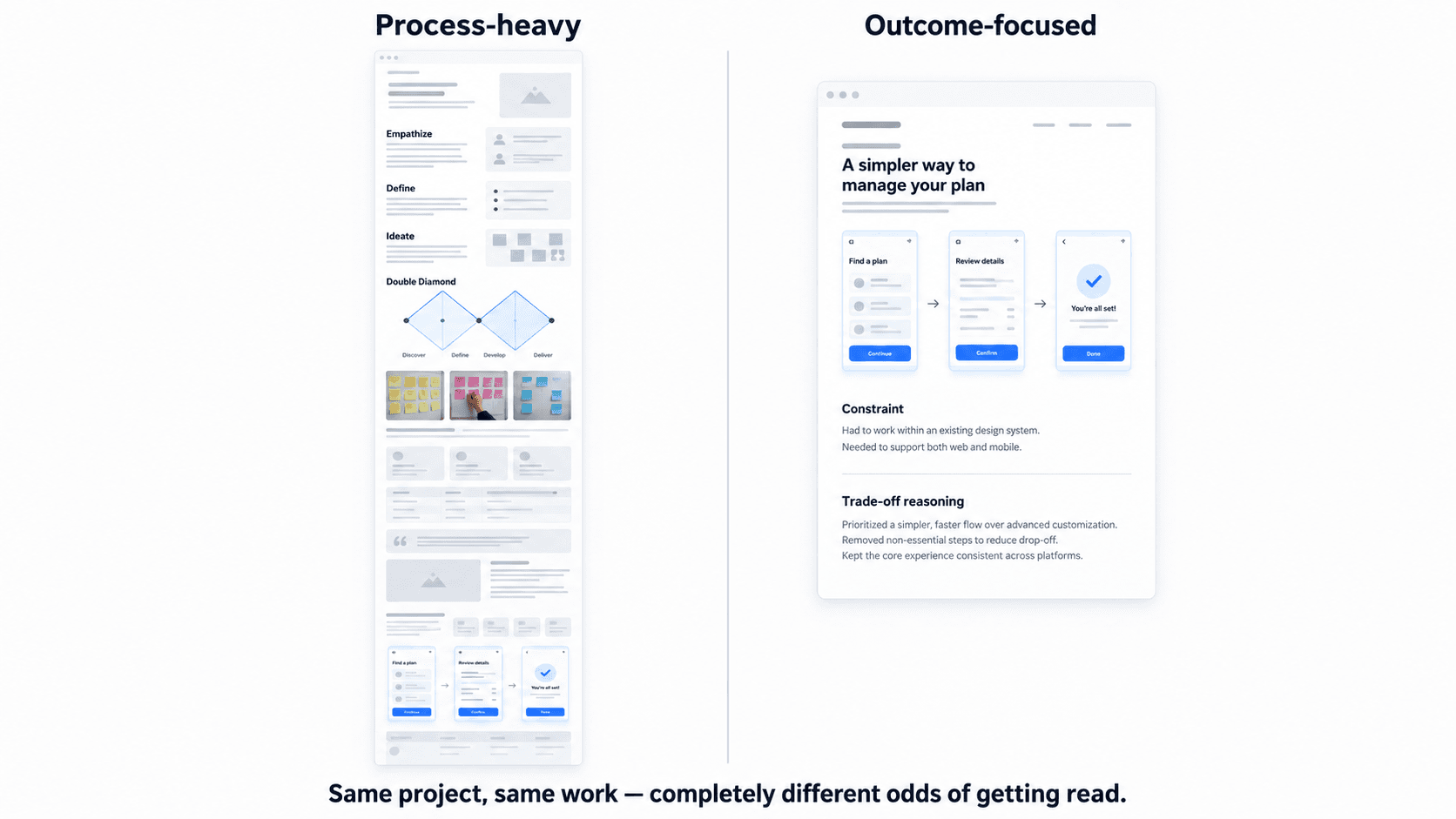
Why Traditional UX Case Study Templates Fail Hiring Manager Screens
The Cold-Read Reality
Screening design directors tend to assess visual polish, interface hierarchy, and layout structure within the first moments of landing on a case study page. Treat the "30 seconds" framing you'll see throughout this guide as a practical cold-read benchmark, not a literal, universal stopwatch rule every hiring manager follows to the second - the exact number varies by reader and context, but the underlying principle holds consistently: you have far less time than you think before a reader decides whether to keep scrolling. Spending four weeks polishing wireframes, drafting two thousand words of background documentation, and setting up Figma auto-layout components only matters if a director actually stays on the page long enough to see any of it. Conventional portfolio guides prioritize academic documentation over visual craft and decision-making logic exactly backwards from how the page actually gets read.
Replacing Generic Double Diamond Frameworks with Insight Headlines
Including Double Diamond graphics, IDEO design thinking steps, or photos of unsorted post-it notes adds essentially zero signal for design leaders. Experienced hiring managers already know these frameworks - showing them signals template dependency, not strategic execution. Section headers work harder when they replace generic labels like "Discovery" or "Ideation" with project-specific insight headlines: "Identifying Navigation Bottlenecks in Multi-Tenant Checkouts" tells a reader something real; "Ideation" tells them nothing.
The 4-Part High-Velocity UX Case Study Template
- Project Context and Constraint Statement
Before writing case study text or organizing visual assets, define the core project constraint explicitly. Avoid vague statements like "improving user experience," which describe a goal, not a boundary. State the actual boundary conditions - adhering to a legacy component library, shipping within a strict two-week deadline, engineering within complex API constraints. A constraint is what makes the design decisions that follow make sense; without it, every choice looks arbitrary.
- Primary Solution Showcase (High-Fidelity Flows First)
Conventional portfolio guides advise telling a linear chronological story that buries final designs at the bottom. Case studies work better leading with core interactive UI flows instead, following up with supporting research and trade-off rationale afterward - the reverse of the default chronological instinct.
- The Reasoning Layer: Trade-Offs and Rejected Alternatives
Documenting every step of a six-month project results in an unreadable case study. Methodology explanations should serve purely as brief setups for this reasoning layer. Hiring managers evaluate senior-level thinking through explicit trade-off documentation - specifically detailing what design options were rejected and why constraints made those alternatives impossible.
Strong vs. weak trade-off statements:
- Weak: "We considered a few different navigation options and landed on tabs."
- Strong: "Considered a hamburger menu for the mobile settings flow, but rejected it because usability testing showed a 40% miss rate on the icon among first-time users - tabs kept the same options visible without requiring discovery."
- Weak: "Simplified the checkout to reduce friction."
- Strong: "Reduced checkout from four steps to two by merging shipping and payment onto one screen, rejected as too dense until testing showed users preferred fewer screens over shorter forms."
- Weak: "Redesigned the dashboard for clarity."
- Strong: "Considered showing all twelve KPIs by default, rejected because stakeholder interviews revealed only three mattered for daily decisions - the rest moved behind a 'view all' toggle."
The pattern in every strong version: name the alternative, name the reason it was rejected, and tie the reason back to real evidence or a real constraint not just taste.
- Measurable Outcomes and Post-Launch Learnings
Close with real outcomes where you have them. A few categories worth considering beyond a single conversion number:
- Conversion increase - signup, checkout, or activation rate change
- Task completion - whether users could complete the core flow faster or more successfully in testing
- Reduced support tickets - a real, trackable proxy for reduced confusion
- Faster task completion - time-on-task improvements from usability testing
- Adoption or retention - whether a feature actually got used after shipping, not just whether it shipped
When You Don't Have Quantitative Data
Many projects never launch, or the client never shares analytics that's genuinely common, and it doesn't mean you have nothing to show. Present qualitative outcomes instead: specific usability testing findings ("4 of 5 test participants completed the task without assistance, versus 2 of 5 on the original flow"), validated learnings ("testing confirmed our assumption that users wanted saved templates, which shaped the second iteration"), or stakeholder feedback that led to a real decision. The goal is evidence that your reasoning was tested against something real, even if that something wasn't a live conversion number.
A Copy-Paste Case Study Structure
Use this as a literal starting outline - replace the bracketed prompts with your own project specifics:
CONSTRAINT STATEMENT (2–3 sentences)
[What was the real boundary? Legacy system, timeline, technical limit, business requirement?]
PRIMARY SOLUTION SHOWCASE
[High-fidelity UI flow — lead with this, before any process]
REASONING LAYER (one entry per major screen/decision)
- Screen/Decision: [what you built]
- Alternative considered: [what else you tried]
- Why rejected: [the evidence or constraint that ruled it out]
OUTCOMES
[Quantitative if available: conversion, task completion, adoption]
[Qualitative if not: usability findings, validated assumptions, stakeholder decisions]
WHAT I'D DO DIFFERENTLY
[One honest, specific reflection - this signals seniority more than a clean win story does]
Keep the whole thing under 1,200 words. If a section is running long, that's usually a sign it belongs in a follow-up conversation during the interview, not the written case study.
Accelerating Portfolio Workflows Using AI-Driven UI Generation
Generating Multi-Screen UI Flows from Text Prompts
Case study guides often instruct designers to show alternative user flows explored during a project. Historic project files frequently lack clean intermediate wireframes for which dedicating days to redrawing early-stage variations or missing edge-case flows for a portfolio case study is a genuinely inefficient use of time. UXMagic's Flow Mode solves this directly: enter text prompts describing complex user journeys - a multi-step checkout, a B2B SaaS onboarding sequence - and generate cohesive, multi-screen UI flows ready for portfolio inclusion, without touching a blank Figma canvas.
Maintaining Visual Consistency Across Portfolio Mockups
Disjointed visual mockups undermine an otherwise strong case study. UXMagic keeps generated interface screens aligned to consistent visual hierarchy, spacing tokens, and typography systems, letting designers present complete, system-aligned UI flows without spending hours building component libraries from scratch. For the broader case on why this consistency matters across a whole product, not just a portfolio, how AI is actually changing UX design workflows covers the same principle applied to real product work rather than portfolio artifacts.
Real-World Portfolio Case Study Examples: Before vs. After
Mid-level designer updating a portfolio after a layoff. The designer has final production screenshots but lacks clean low-fidelity wireframe flows showing the alternative onboarding architectures explored during early iterations.
Before (traditional workflow): A 2,400-word case study opens with a Double Diamond graphic, spends 600 words on "Discovery," another 500 on "Ideation" with a photo of a whiteboard, and doesn't show a real screen until the reader has scrolled past the fold twice. Building the missing intermediate wireframes takes over twenty hours of manually drawing frames, aligning auto-layout groups, and mapping connection wires in Figma.
After (modern workflow): The case study opens immediately with the final high-fidelity onboarding flow. A two-sentence constraint statement follows ("Legacy auth system required a three-step verification; original single-step flow wasn't technically possible"). The missing alternative flows get generated by inputting prompt descriptions into UXMagic, producing cohesive multi-screen UI flows inserted into the case study within an hour - total document length under 900 words.
Non-technical founder pitching product architecture. An early-stage founder needs to present a design case study to prospective investors and engineering hires to demonstrate product feasibility.
Before: Text-heavy slides and rough sketches, leaving investors uncertain about user experience quality - the pitch relies on the founder verbally describing what the product will feel like.
After: Functional user journeys get input into UXMagic, generating production-ready UI flows that visually validate the product architecture directly, rather than describing it in prose.
Pitfalls of Generic AI Text Generators in Case Studies
Using conversational AI models to auto-generate case study text produces recognizable filler - "in today's fast-paced digital world," "ensuring a seamless user-centric experience." Hiring managers dismiss these generic summaries on sight. AI tools do genuinely valuable work handling visual UI flow generation and asset structuring; narrative strategy - the actual reasoning behind your decisions needs to stay with the designer, since that's exactly the judgment the case study is meant to demonstrate in the first place.
Build Better UX Case Studies
Generate missing UI flows for your portfolio and showcase your design decisions without spending hours redrawing old wireframes.