Most ecommerce UX design advice optimizes screenshots, not revenue.
If your product pages look premium but paid traffic still bounces, the issue isn’t typography scale or whitespace. It’s cognitive load, misplaced trust signals, broken navigation models, and checkout friction hiding inside otherwise “modern” interfaces.
This is where ecommerce UX design stops being visual styling and becomes conversion architecture.
Why Visual Aesthetics Don’t Guarantee E-commerce Conversions
A polished interface can still destroy Return on Ad Spend.
Teams often over-optimize aesthetics and accidentally increase decision fatigue. Hidden navigation, ultra-thin iconography, and stripped-down layouts force users to solve puzzles instead of completing purchases.
That friction shows up immediately in:
- higher bounce rates
- weaker Add-to-Cart interaction
- checkout abandonment
- lower ROAS
Design establishes baseline trust. Messaging clarity and layout predictability close the sale.
The Psychological Power of “Ugly” High-Converting Websites
“Ugly” ecommerce pages outperform minimalist ones more often than designers admit. Why?
Because they optimize cognitive fluency.
Dense layouts with visible guarantees, plain-text reviews, and explicit CTAs reduce uncertainty instantly. Users don’t hunt for answers, they see them immediately inside their F-pattern scan path.
Hyper-polished pages often signal corporate distance. Slightly rough pages signal authenticity and intent.
Conversion favors clarity over elegance.
The 5 Most Costly UX Design Myths in E-commerce
Most ecommerce UX design mistakes come from copying portfolio trends instead of behavioral patterns.
Here are the expensive ones.
Myth 1: Minimalism Always Improves Conversion
Minimalism frequently increases cognitive load.
Removing labels, hiding navigation behind hamburger menus, or replacing text with icons forces interpretation work onto users. Every extra decision slows progression toward checkout.
Clarity beats visual purity every time.
Myth 2: Designers Should Write Conversion Copy
Designers architect containers. Copywriters close transactions.
In high-performing DTC environments, messaging comes from merchandising teams and performance marketers who mirror customer anxieties and intent directly.
If the copy speaks in “We,” conversion drops. If it speaks in “You,” conversion rises.
Your layout exists to guide the eye toward that message.
Myth 3: Endless Scroll Improves Product Discovery
Infinite scrolling destroys orientation.
It also:
- hides footer trust links
- breaks browser back-button logic
- increases decision fatigue
- weakens navigation memory
Replace it with a Load More button plus lazy loading. Users keep control while discovery remains continuous.
Myth 4: Pagination Is the Safer Alternative
Pagination interrupts browsing flow.
Each click reloads context. Each reload increases exit probability.
Controlled progressive loading beats both extremes.
Myth 5: AI Layout Generators Maintain Design Systems
They don’t.
Stateless pixel generators create what engineers call “Frankenstein UI.” Typography shifts between screens. spacing grids drift. colors mutate.
If you’ve experienced this while prototyping flows, you’ve already seen what happens without persistent tokens. The problem is explained deeply in this breakdown of Blank Canvas Syndrome in AI UX workflows.
Step-by-Step: Architecting a High-Converting Product Detail Page (PDP)
The Product Detail Page is the highest-leverage screen in ecommerce UX design.
It determines whether evaluation becomes commitment.
Here’s the structural baseline that consistently improves conversion behavior.
Use Z-Pattern Layout for Above-the-Fold Decisions
Users scan diagonally before they scroll.
That means your PDP should position:
- logo (top-left anchor)
- navigation (top-right orientation)
- value proposition headline
- Add-to-Cart CTA
inside a single predictable eye path.
If price appears below two scroll depths, you’ve already lost intent momentum.
Place Social Proof Directly Beneath the H1
Trust signals belong immediately under the headline.
Not buried below image galleries.
Example:
Before
Hero video → lifestyle imagery → brand statement → scroll → rating
After
Headline → rating (4.9/5) → price → CTA → guarantees
Trust arrives before hesitation.
Include 3–5 Product Images Minimum
Users cannot touch ecommerce products.
Images replace tactile evaluation.
Each PDP needs:
- angle variation
- scale reference
- texture detail
- usage scenario context
Fewer than three images increases return rates and purchase hesitation.
Remove Horizontal Tabs on Mobile
Horizontal tabs hide information.
Users miss sizing guides, materials, and specifications because swipe affordances are invisible.
Replace tabs with vertically stacked accordions instead.
Discoverability increases immediately.
The AI Prototyping Trap: Prevent Context Amnesia in Multi-Step Flows
Most teams trying AI-assisted ecommerce UX design hit the same failure point by screen three.
The model forgets everything.
Spacing changes. fonts drift. button styles mutate. validation states disappear.
This “context amnesia” turns multi-step funnels into unusable prototypes.
If you want a deeper breakdown of how designers actually integrate AI into production workflows, read how AI fits inside real UX delivery pipelines.
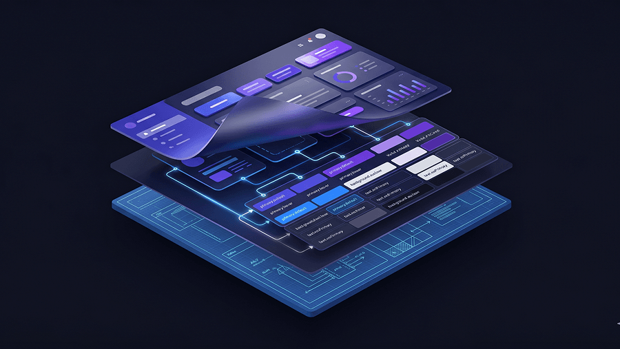
Enforcing Style Consistency Using Semantic Design Tokens
Token hierarchies prevent drift.
Structure them like this:
- Primitive tokens → raw values (blue-500)
- Semantic tokens → intent (primary-action-bg)
- Component tokens → implementation (button-primary-bg)
When tokens drive layout generation, flows remain stable even across brand refreshes.
Without tokens, every generated screen resets to the training-data average.
Why Stateless Canvas AI Produces “Div Soup”
Pixel-first generation ignores DOM structure.
That leads to:
- nested div overload
- inline styling hacks
- inaccessible markup
- broken responsive behavior
System-centric assembly solves this.
UXMagic’s Flow Mode handles multi-screen journeys as connected systems rather than isolated prompts. It locks tokens globally so your checkout confirmation button inherits the same semantic styling as your Add-to-Cart trigger without manual correction.
That removes the verification tax most teams silently absorb during AI prototyping.
Developer Handoff: From Static Screens to Executable Wireflows
Traditional handoff assumes engineers translate vectors into logic.
That model is obsolete.
Modern ecommerce UX design outputs executable structure instead of visual suggestions.
Export Semantic HTML, Not Decorative Frames
Static canvases introduce translation errors immediately.
Executable exports ensure:
- accessibility compliance
- consistent spacing logic
- responsive behavior continuity
- validation-state predictability
If your layout breaks at 200% text zoom, your conversion funnel already excludes users.
Accessibility isn’t compliance theater. It’s usability infrastructure. This guide on prompting AI for WCAG-ready interfaces explains how to enforce it early instead of fixing it late.
Map Edge States Before React Exists
High-performing teams design:
- empty states
- loading skeletons
- validation errors
- fallback scenarios
before development begins.
That prevents last-minute component rewrites and layout collapse during integration.
UXMagic’s component assembly model helps here by generating flows from structured React-ready components instead of pixel approximations, which keeps spacing, typography, and tokens consistent across the funnel automatically.
If you’re experimenting with structured prompting already, these production-ready design prompts used by SaaS teams show how constraint-based generation prevents drift before it starts.
High-converting ecommerce UX design isn’t about polish it’s about predictability, trust signals, and cognitive fluency. When layouts surface guarantees early, remove navigation friction, and enforce token consistency across flows, conversion improves because users stop guessing and start acting.
Generate a Conversion-Ready Ecommerce Flow
Stop fixing spacing drift and broken checkout states manually. Try UXMagic free and generate a consistent product-to-payment journey in minutes.