Industry retention data puts mobile app uninstall rates within 72 hours at around 77% a widely-cited figure across app analytics reports, not a single definitive study, but directionally consistent with what most product teams already sense about early churn. Most teams respond to that number by polishing visuals harder , better icons, smoother animations, and a nicer palette. That's usually the wrong fix, because the problem is rarely visual. It's an unoptimized, disconnected flow creating friction the moment someone tries to actually do something.
You already know what auto-layout does, what a component state is, and why visual hierarchy matters. This isn't a "what is mobile app design" primer. It's the 2026 framework thumb-zone ergonomics, platform-specific patterns, token systems, and the handoff mechanics that determine whether a design survives contact with engineering.
A team can spend three weeks crafting pixel-perfect Figma screens, only to find during handoff that the layout breaks on standard viewports, violates thumb-zone accessibility, and needs a structural redesign. That's what happens when screens get designed one at a time instead of as a system.
Core Mobile UX Principles for High User Retention
Ergonomic Mapping of the Physical Thumb Zone
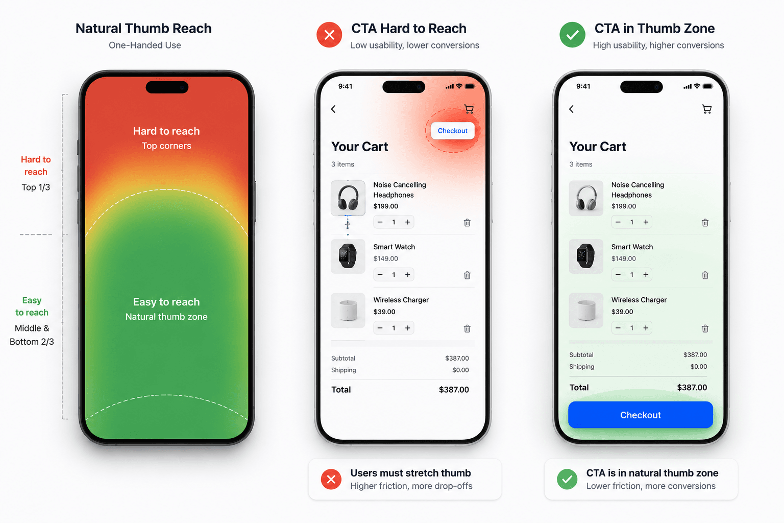
Primary action buttons belong in the lower thumb-reach zone, not the top of the screen; that's not a stylistic preference, it's how people actually hold a phone. A checkout flow that puts its confirmation button up top is fighting the device's own ergonomics before the user even reads the copy.
Progressive Onboarding and Low-Friction Interaction
Most guides suggest front-loading account creation for data collection. That tends to backfire apps that demand excessive inputs before demonstrating any value are the ones losing users in the first three days. The retention collapse isn't about polish, it's about asking for too much before earning it.
Accessibility Standards and Contrast Ratios by Default
Contrast ratios and accessible color choices need to be a default setting, not a late-stage QA pass. Retrofitting accessibility after a design is "done" is exactly the kind of rework that eats a sprint for no visual gain anyone will notice except the users who couldn't use the app before.
The 2026 AI-Assisted Mobile Design Workflow
Screens Generated in Isolation Don't Add Up to a Product
Generating ten screens from ten separate AI prompts routinely produces ten screens with none of the same button styles, navigation patterns, or data structures an unorganized visual mess dressed up as finished work. The fix is mapping the complete multi-screen flow architecture before generating individual interfaces, so navigation logic and component relationships exist from the first screen instead of getting reconciled after the fact. Starting from a pre-built mobile app template rather than a blank prompt gives that structure a mobile-native head start standard nav patterns, thumb-zone layout instead of adapting a generic generation after the fact.
Automated Design System Token Enforcement
Auto-layout refactoring is one of the most common time sinks in mobile design hours tweaking padding rules and frame constraints for a concept that took thirty seconds to visualize in the first place. That gap between "visualized fast" and "usable fast" is a tokens problem, not a creativity problem.
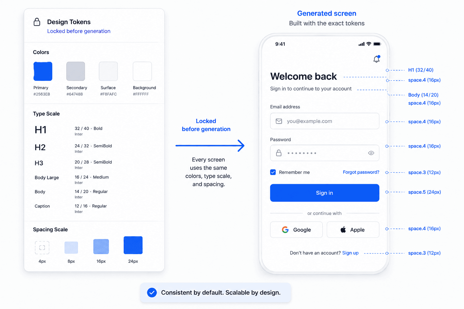
Standardizing design system tokens type scale, spacing, color before generation is what prevents that refactoring cycle. Designers routinely spend real time manually organizing Figma layers and auto-layout settings before handoff; enforcing token rules during generation itself, rather than cleaning up after, is what actually removes that step.
Streamlining Handoff with Production-Ready Code Export
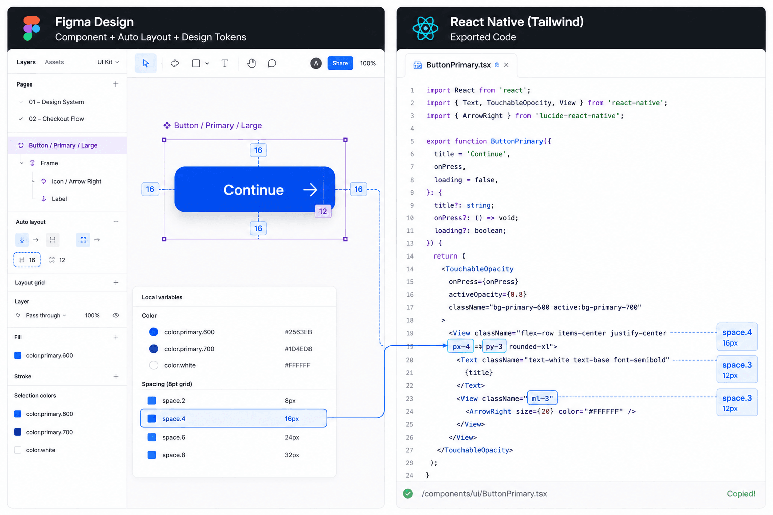
Design-to-engineering handoff is where a lot of otherwise good work quietly falls apart. One common failure: a team's Figma auto-layouts get days of developer refactoring because the responsive constraints broke completely on compact mobile viewports, a problem that should have been caught in design, not discovered in a sprint.
Here's what that looks like on a real project. A fintech team building KYC onboarding document capture, identity checks, biometric authentication traditionally spends fifteen-plus hours manually configuring six to ten screens in Figma: auto-layouts, input validation states, microcopy alignment, one screen at a time. Standard AI text-to-image tools make this worse, not better: the output looks appealing but lacks functional form fields, back-navigation, or state persistence across screens.
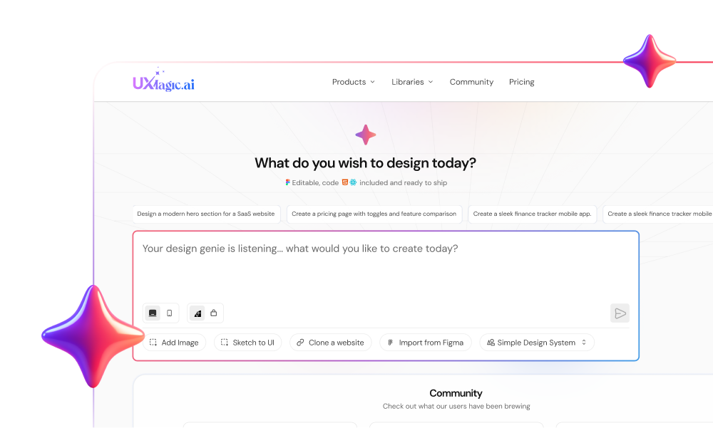
A flow-first approach instead takes one prompt detailing the compliance requirements and generates a connected six-screen flow with progress indicators, contextual help states, inline error handling, and primary buttons already positioned in the lower thumb zone structurally correct from the first generation, not fixed afterward. This is the specific gap UXMagic's AI App Builder is built around, and it's worth comparing directly against the alternatives in the table further down.
Platform-Specific Design Patterns
iOS: Apple Human Interface Guidelines
iOS interfaces follow Apple's Human Interface Guidelines, which set expectations around navigation patterns (tab bars at the bottom, large titles that collapse on scroll), system typography (SF Pro), and platform-native gestures like swipe-to-go-back. Designing outside these conventions doesn't just look off, it creates real friction for users who've built muscle memory around how iOS apps behave.
Android: Material You
Android's Material You design language emphasizes dynamic color theming (drawing accent colors from the user's wallpaper), a distinct elevation and shadow system, and navigation patterns like the bottom navigation bar or navigation drawer. A design ported directly from iOS without adapting to these conventions tends to read as noticeably foreign to Android users, even if the underlying flow logic is identical.
React Native: Designing for One Codebase, Two Platforms
Cross-platform frameworks like React Native let a single UI codebase serve both iOS and Android, but that convenience comes with a real design tradeoff: platform-specific nuances (iOS's swipe gestures, Android's back button behavior) need to be accounted for explicitly, or the app ships feeling correct on neither platform rather than adequate on both.
Cross-Platform Execution: React Native, Expo, and Tailwind
Responsive Breakpoints for Compact Mobile Viewports
Desktop-first viewport bias is a specific, recurring failure: a dense, multi-column dashboard gets approved on a widescreen monitor, then becomes completely unreadable the moment it's constrained to a portrait mobile screen. Designing against the actual target viewport from the start avoids a redesign nobody budgeted time for.
Designing for Low Connectivity and Offline State Recovery
An app that looks pristine in a happy-path prototype and degrades into broken UI during real network timeouts and local caching drops hasn't actually been designed for mobile, it's been designed for a demo. Loading states, offline caching behavior, and error recovery need to be explicit design decisions, not something engineering improvises when the network drops mid-build.
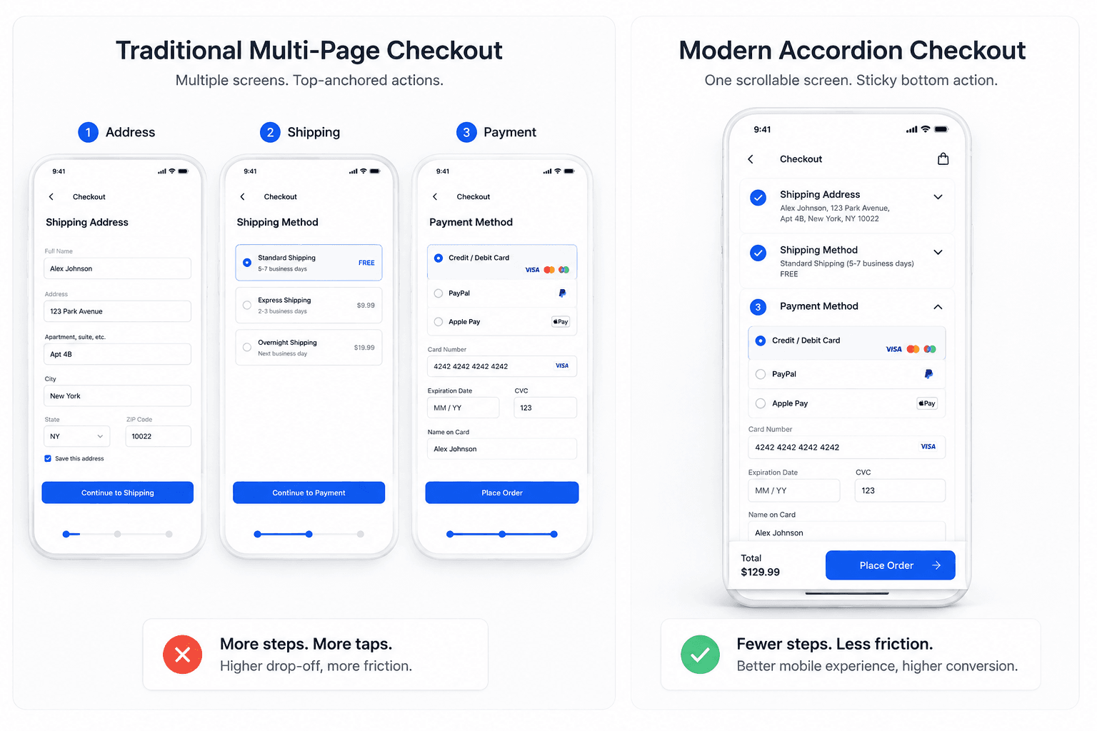
The same before/after logic applies directly to checkout flows. A legacy mobile checkout forces separate screens for address, shipping, and payment, with confirmation buttons near the top and long forms that reset on error exactly the friction pattern driving cart abandonment on mobile. Re-architected as a single-page accordion flow, primary actions move into a sticky bottom bar within thumb reach, autofill gets enabled, and express payment gets prioritized reducing completion time and eliminating the keyboard-overlap bugs that plague the traditional layout.
Comparing AI Mobile Design Tools
Most content in this space explains the category without actually comparing tools side by side. Here's a direct comparison against the criteria that matter for mobile-specific work:
Tool
Multi-screen flow generation
Design token enforcement
Native code export
Best fit
Figma AI
Isolated drafts, not connected flows
Uses existing Figma libraries if present
No — stays inside Figma
Teams already deep in an established Figma design system
Uizard
Limited — leans toward low/mid-fidelity single screens
Minimal, template-driven
No
Early-stage wireframing, non-designers sketching ideas fast
Google Stitch (formerly Galileo AI)
No — single-screen generation only, with visual drift across separate prompts
Not enforced
Copy-paste into design tools, not production code
Fast single-screen concept exploration
Lovable
Generates full app scaffolds, but as functional code rather than a design-first flow
No — no design token layer
Yes — React/Supabase, but with known reliability issues on complex logic
Founders wanting a working prototype fast, not a governed design system
UXMagic
Yes — Flow Mode generates connected multi-screen sequences in one pass
Yes — enforced at generation
Yes — React Native, Tailwind
Teams needing consistent, production-ready mobile flows
No single tool here is wrong for every job. Figma AI genuinely earns its place for teams with a mature existing library, and Uizard is a reasonable low-stakes way to sketch an idea before committing real design time. The gap worth being clear-eyed about is specifically multi-screen consistency plus code export; together that combination is where most of this list falls short, and where a mobile-specific evaluation should focus.
Mobile Design Checklist
Run any mobile flow against this before calling it handoff-ready:
☐ Thumb zones - Are primary actions positioned in the lower reachable zone, not the top of the screen?
☐ Navigation - Does the nav pattern match platform convention (tab bar for iOS, bottom nav or drawer for Android)?
☐ Empty states - Does every list, dashboard, or feed have a designed empty state, not just the populated version?
☐ Error states - Are network failures, validation errors, and timeout states explicitly designed, not left to engineering to improvise?
☐ Accessibility - Do all text/background combinations meet contrast requirements by default, not as a retrofit?
☐ Offline behavior - Is there a defined state for lost connectivity, and does data persist locally where it should?
☐ Token consistency - Do spacing, type scale, and color stay identical across every screen in the flow?
☐ Responsive breakpoints - Has the design actually been checked at real mobile viewport widths, not just approved on a desktop monitor?
Copy or screenshot this list before your next handoff review - it catches most of the structural issues that turn into engineering rework later.
Fix Mobile Rework Before It Starts
Audit your mobile flow before handoff and catch token inconsistencies, missing states, and edge cases early. Try UXMagic free to generate connected flows built for review and development from the start.
Mobile app design typically moves through strategy (defining outcomes and core flows), architecture (mapping the multi-screen structure and design tokens), visual design (applying styling to the structure), and handoff (exporting to code or specs for engineering). Skipping the architecture stage is the most common cause of rework later.
Cost varies widely based on scope, team structure, and whether the work is freelance, agency, or in-house. A small number of screens designed by a freelancer costs meaningfully less than a full-flow enterprise app built by an agency team; the real cost driver is usually rework from skipped architecture planning, not the initial design phase itself.
Mobile app design prioritizes flow-first architecture and thumb-zone ergonomics. Interfaces must position core interaction controls within easy reach of the user's thumb while maintaining auto-layout responsiveness, accessible color contrast ratios, and design system token consistency across diverse mobile viewports.
AI tools accelerate development by converting natural language product briefs directly into structured user journeys, auto-layout frames, and production-ready code. Modern platforms automatically enforce global design tokens, eliminating manual layer organization and simplifying developer handoff.
Native design targets platform-specific guidelines like Apple Human Interface Guidelines or Google Material You, maximizing hardware capabilities. Cross-platform design uses frameworks like React Native or Flutter to deliver a single, adaptable UI codebase across iOS and Android without maintaining separate design systems.
Early retention collapse is primarily caused by aggressive upfront registration forms, unoptimized user flows, unclear navigation structures, and friction during core tasks. Apps that require excessive inputs before demonstrating value experience immediate user drop-off.
Not the judgment part of the job AI is shifting what designers spend time on, not eliminating the role. Value is moving away from manually drawing individual screens toward orchestrating system-level prompts, managing edge-case logic, and validating product-market fit, all of which still require human decision-making.