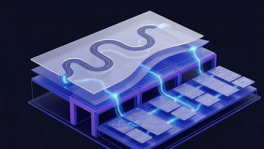
Most “website design inspiration” guides are built for portfolios, not products.
If you’re designing SaaS workflows, dashboards, onboarding sequences, or enterprise UI, scrolling Dribbble isn’t inspiration, it’s noise. You don’t need prettier screens. You need layouts that survive engineering constraints, scale across flows, and reduce churn.
In 2026, website design inspiration isn’t about aesthetics anymore. It’s about extracting structural patterns you can ship.
The Evolution of Website Design Inspiration in 2026
Why Visual-Only Galleries like Dribbble Actively Fail SaaS Teams
Most guides still tell designers to browse Dribbble daily. That advice is outdated and expensive.
Dribbble optimizes for screenshots that look impressive in isolation. Real SaaS products live across 200+ connected screens with shared tokens, layout anchors, and navigation logic. A single “beautiful” frame tells you nothing about whether the workflow survives production.
This is the core problem behind what many teams quietly call Dribbblisation:
- hidden navigation behind hover states
- inaccessible typography
- fragile layout hierarchies
- zero awareness of backend constraints
If your inspiration source ignores interaction logic, it increases user friction ,even if the UI looks modern.
And friction is where churn starts.
The Critical Shift from Component Inspiration to Workflow Inspiration
Static moodboards used to be enough. They aren’t anymore.
Modern SaaS interfaces must support:
- progressive disclosure across onboarding
- role-based access control dashboards
- multi-tenant navigation layers
- dense analytics grids
You can’t design those from isolated components.
Senior teams now source inspiration at the flow level, not the screen level. That shift alone eliminates a large chunk of what many designers experience as blank canvas paralysis ,something explored in detail in this breakdown of why blank canvas syndrome happens in AI UX workflows.
The goal isn’t visual direction. It’s structural clarity.
Top Curated Web Design Galleries for SaaS and B2B Workflows
Mobbin and Saaspo: Analyzing Functional Patterns Over Aesthetics
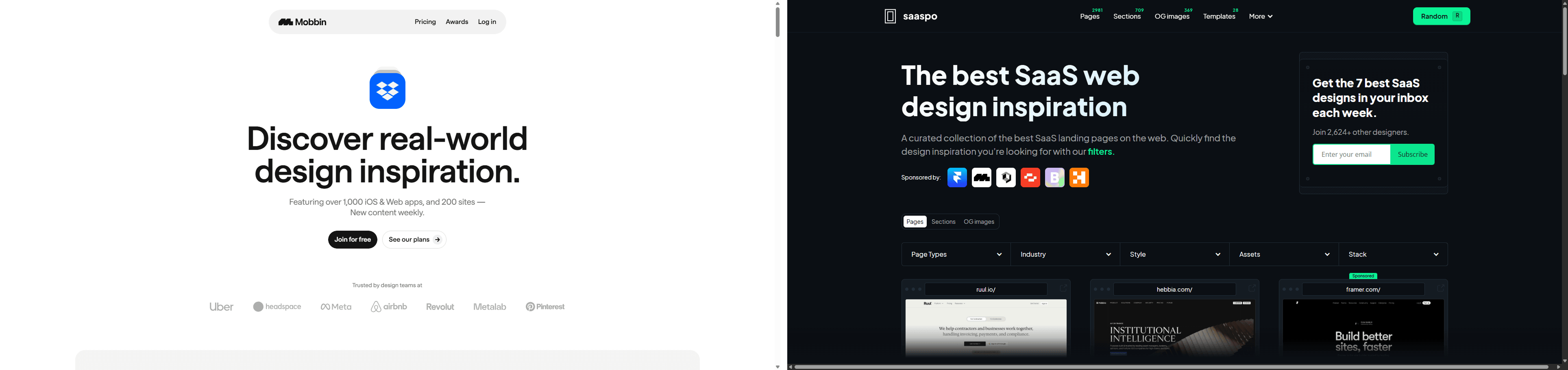
If you’re designing serious product UI, these two libraries should replace Dribbble immediately.
Mobbin excels at:
- onboarding sequences
- authentication flows
- mobile-to-web transitions
- progressive disclosure patterns
Saaspo focuses on:
- enterprise dashboards
- RBAC structures
- data-heavy layouts
- integration marketplaces
These platforms document how software actually behaves in production ,not how it photographs.
That difference matters.
A “clean dashboard” screenshot from Dribbble might hide filters behind hover interactions. A Saaspo example shows how filtering scales across nested datasets without breaking navigation logic.
Only one survives engineering review.
Bento Grids and Godly: Extracting Structural Layout Inspiration
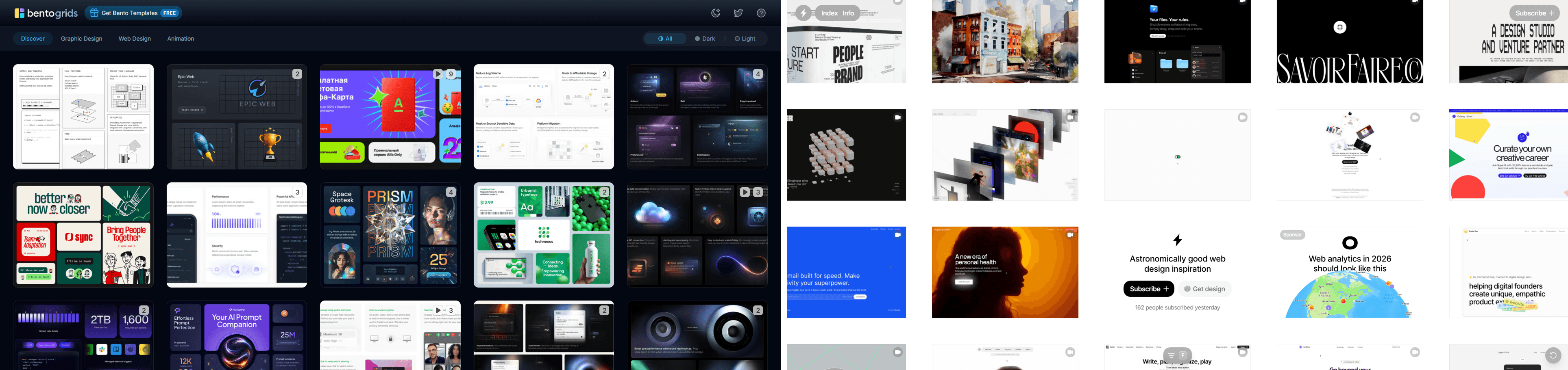
Landing pages still matter ,especially above-the-fold clarity and value communication.
Bento Grids helps you analyze compartmentalized layout logic that supports scanning behavior.
Godly surfaces conversion-oriented structural hierarchies instead of decorative hero experiments.
These galleries are useful when you’re solving:
- feature positioning
- onboarding entry points
- pricing comparisons
- trust-building layout sequencing
Treat them as layout references ,not style moodboards.
How AI Is Fundamentally Redefining the UX Design Workflow
The Systemic Problem with Prompt Engineering and Token Drift
Most designers assume inconsistent AI layouts mean their prompts are weak.
That’s wrong.
Prompt engineering is negotiation with a system that has no structural memory. The result is predictable:
- typography scale shifts between screens
- button radii drift mid-flow
- spacing tokens mutate silently
- rogue hex colors appear
This is token drift. It creates what teams call the verification tax ,hours spent auditing AI output before handoff.
If you want to understand how teams actually integrate AI into production design instead of fighting it, this analysis of how designers use AI in real UX workflows explains the shift clearly.
Consistency doesn’t come from longer prompts. It comes from constraints.
Constraint Engineering: The New Standard for Production UI Generators
Constraint engineering replaces guesswork with rules.
Instead of asking the model to “match the design system,” you enforce:
- locked typography scales
- semantic color tokens
- fixed component enums
- spacing protocols
Platforms built around this idea, including UXMagic’s constraint-driven generator described on its AI UI design generator page ,trhttps://uxmagic.ai/ai-ui-design-generatoreat design systems as infrastructure, not suggestions.
That’s why they produce layouts engineers accept immediately.
Maintaining Absolute Design Consistency Across Multi-Screen Flows
Overcoming Context Amnesia in Generative AI Layouts
Generic AI tools forget what they generated two screens ago.
Example:
Screen 1 → sidebar: 240px → button radius: 4px → semantic color scale locked
Screen 2 → sidebar: 256px → button radius: 8px → new hex codes invented
Multiply that across 150 screens and your release slips weeks.
Persistent structural memory fixes this by locking layout anchors across the entire journey instead of regenerating each screen independently.
This is why modern teams generate flows ,not frames.
Utilizing Flow Mode for Persistent Structural Memory
Flow-aware generation changes how inspiration becomes production UI.
Instead of prompting: “Design dashboard screen”
You generate: authentication → dashboard → analytics grid → confirmation modal
as one connected system.
UXMagic’s Flow Mode exists specifically for this. It maintains token integrity across the sequence so navigation hierarchy, spacing logic, and typography never drift mid-journey.
You’re designing the movie ,not screenshots.
And that’s what eliminates the verification tax.
From Inspiration to Production: The Zero-Tax Developer Handoff
Integrating Figma Components and React Libraries as Hard Constraints
The fastest way to break sprint planning is handing engineers something unbuildable.
This happens when inspiration ignores:
- API latency realities
- component library limits
- translation scaling
- cloud architecture constraints
Production-grade inspiration workflows import existing Figma and React systems first, then generate inside those boundaries.
That prevents hallucinated components before they exist.
It also aligns with the principle behind human-in-the-loop AI design workflows: designers act as system governors, not pixel decorators.
Machine Experience (MX): Designing for AI Agents and Human Users
Modern SaaS interfaces serve two audiences:
humans and machines
Agentic systems increasingly interact with products through UI structure, semantic metadata, and labeled inputs. If your interface doesn’t communicate intent clearly at the structural level, it becomes invisible to automation layers.
This is where inspiration workflows must evolve.
Instead of copying layouts manually, advanced teams now analyze competitor architectures directly using tools like UXMagic’s ability to clone any website into editable UI structure. That converts static references into token-mapped systems you can actually test.
The result is faster strategy iteration and fewer blind guesses.
Website design inspiration isn’t about collecting nicer screenshots anymore. It’s about extracting patterns that survive engineering constraints, scale across flows, and reduce friction where churn actually happens. If your inspiration source can’t translate into production-ready structure, it isn’t inspiration ,it’s decoration.
Generate Your First Flow ,Not Just Another Screen
Skip token drift and disconnected layouts. Use UXMagic to generate complete, constraint-locked product flows that move from inspiration to developer-ready structure in minutes.