You didn’t search for what is UX design because you want a history lesson on human-computer interaction.
You searched because your team shipped something functional and users still left. Activation is low. Support tickets are rising. Engineers are waiting on “design decisions.” Nobody agrees what UX actually means.
UX design isn’t decoration. It’s the system that decides whether users reach value in 90 seconds or abandon your product in frustration.
More Than Just Interface: What Is UX Design, Actually?
UX design is the structure that determines how users move through your product to reach value.
Not the colors. Not the typography. Not the spacing system.
UX decides:
- what appears first
- what stays hidden
- what requires confirmation
- what gets automated
- what gets ignored
In SaaS, UX design is conversion rate optimization disguised as interface logic.
If users need six clicks to export a report, that’s a UX problem. If onboarding takes ten minutes before value appears, that’s a UX problem. If trial users churn before connecting integrations, that’s a UX problem.
Most teams think UX is polish. It’s actually architecture.
UI vs. UX: The Difference That Costs Startups Money
UI is how the product looks.
UX is how the product works.
When teams confuse the two, they optimize aesthetics instead of outcomes. That’s how you get dashboards that impress investors but confuse users.
If you want a deeper breakdown of how teams apply AI inside real product workflows—not design theory—read how designers actually use AI in real projects: https://uxmagic.ai/blog/ai-in-ux-design-workflow
Why Traditional UX Processes Are Failing Agile Teams
Most UX advice online assumes unlimited runway.
Startups don’t have that luxury.
The classic “discover → define → develop → deliver” pipeline works inside enterprise environments. Inside early-stage teams, it creates bottlenecks that delay validation.
Good UX in startups isn’t about perfection. It’s about speed to clarity.
The “Founder Mode” Trap and Feature Bloat
Founder intuition is powerful but dangerous in interface design.
Because founders understand backend logic perfectly, they build interfaces that mirror system architecture instead of user goals. The result is the “Dashboard of Death.”
Symptoms include:
- 12 widgets visible on first login
- nested hamburger navigation
- analytics before actions
- dual sidebars competing for attention
Users freeze. Time-to-first-value jumps past seven minutes. They leave.
Progressive disclosure fixes this immediately. Show one primary action first. Hide everything else until it matters.
Activation improves because users stop guessing what to do.
The Wireframing Bottleneck
Traditional wireframing slows teams more than they admit.
Designers spend days drawing rectangles. PMs wait. Engineers idle. Stakeholders debate button placement instead of logic.
Skipping wireframing entirely is worse. That produces fragmented flows assembled from UI libraries with no structure.
Modern teams solve this differently.
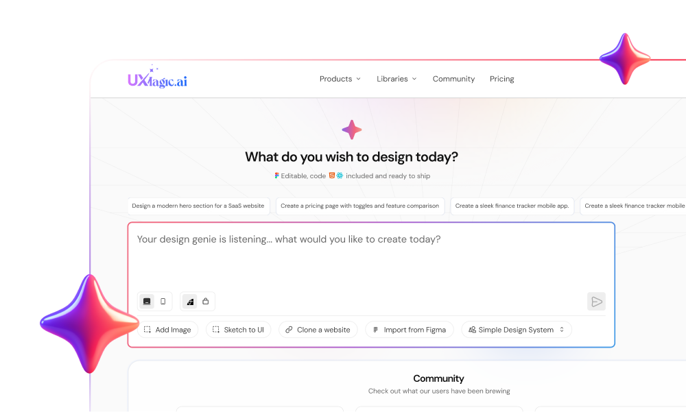
Instead of drawing screens manually, they generate structured flows directly from requirements. Tools like UXMagic convert product constraints into production-ready UI logic in seconds, eliminating the blank-canvas delay that blocks momentum.
If that “where do we even start?” feeling sounds familiar, here’s a deeper breakdown of Blank Canvas Syndrome and why it stalls teams: https://uxmagic.ai/blog/blank-canvas-syndrome-ai-ux-workflow
How to Measure the ROI of Good UX Design
If UX can’t be measured, it won’t survive roadmap prioritization.
Good UX directly changes business metrics.
Not hypothetically. Operationally.
Time-to-First-Value (TTFV) and Activation Rates
TTFV is the fastest way to diagnose UX quality.
When users reach value quickly:
- activation increases
- retention improves
- onboarding friction disappears
Example:
A dashboard showing 12 analytics widgets overwhelms users. Replacing it with a single CTA like “Create your first campaign” reduces hesitation and drops TTFV under 90 seconds.
Activation jumped by 24%.
That’s not design taste. That’s revenue recovery.
Reducing Customer Acquisition Cost (CAC) and Support Tickets
Poor UX inflates CAC silently.
Every confused user:
- opens a support ticket
- requests onboarding help
- abandons trial early
- never converts
Clear flows reduce training time and support load simultaneously.
That reclaimed bandwidth compounds across growth stages.
Good UX doesn’t just help users. It protects runway.
The Core Elements of SaaS UX Design
Most definitions stop at empathy and usability.
Real SaaS UX depends on structural decisions that affect activation, retention, and engineering cost.
Information Architecture and Progressive Disclosure
Information architecture determines what users see first.
Bad IA creates cognitive overload instantly.
Example:
A reporting dashboard with zero data often appears blank. Users interpret that as broken software not an empty state.
Designing empty states first fixes onboarding perception immediately.
Instead of silence, the interface guides users toward the next action:
- connect integration
- upload dataset
- create campaign
- invite teammate
Progressive disclosure ensures complexity appears only when needed.
This reduces hesitation and speeds value delivery.
Designing for the Empty State First
Most teams design ideal scenarios.
Users experience empty ones.
If the first screen shows nothing useful, activation collapses.
Designing empty states early ensures:
- trust during onboarding
- clarity during setup
- guidance before analytics exist
Ignoring empty states guarantees churn.
Killing Linear Product Tours
Mandatory product tours feel efficient internally.
Users hate them.
A forced 10-step onboarding sequence creates drop-offs around step three. Users click “Next” blindly just to escape it.
Contextual tooltips outperform scripted tours every time.
They appear when needed not when scheduled.
That preserves autonomy while still teaching features.
How AI Is Rewriting the Rules of UX Design in 2026
Manual wireframing used to be necessary.
Now it’s optional.
Generative UI tools shift UX from pixel creation to flow strategy.
Moving from Manual Wireframing to AI Generation
Traditional process:
- interpret requirements
- sketch flows
- build wireframes
- iterate layouts
- validate logic
AI-augmented process:
- define constraints
- generate structured flows
- validate decisions immediately
This removes the slowest stage in product delivery.
Instead of debating rectangles, teams debate behavior.
UXMagic fits here as a structural UI generator not an image tool. It outputs component-based flows aligned with real design systems, which makes developer handoff viable instead of speculative.
For examples of prompts that generate production-ready layouts instead of concept art, see these real prompts we use: https://uxmagic.ai/blog/production-ready-ai-design-prompts-saas
And if you’re worried AI removes designers from the process,it doesn’t. It changes their role. This breakdown of the human-in-the-loop AI design workflow explains why: https://uxmagic.ai/blog/human-in-the-loop-ai-design-workflow
Where Generic AI Still Fails Product Teams
Image generators create attractive interfaces.
They don’t create usable ones.
Common failures include:
- ignoring platform UI conventions
- flattening interaction structure
- missing responsive states
- producing non-extractable assets
Developers can’t build from pixels.
They build from systems.
Real generative UI respects:
- design tokens
- spacing rules
- typography scales
- component hierarchies
That’s the difference between concept art and production logic.
UX design isn’t about polishing screens, it’s about removing friction between users and value. Teams that treat UX as a measurable business lever ship faster, reduce churn earlier, and stop wasting runway on features nobody understands. The advantage now belongs to teams that design flows, not pixels.