Output Comparison: Side-by-Side Design Quality
Design a modern fintech mobile app called “FlowPay” for peer-to-peer payments and expense tracking, creating a 5-screen connected flow with consistent UI and components: Home (balance, recent transactions, Send Money CTA), Send Money (select contact, enter amount, add note), Confirmation (payment summary + confirm), Success (payment success with updated balance), and Transaction Details (receipt with status, timestamp, breakdown); use a clean, production-ready iOS-inspired layout with proper spacing, typography, and hierarchy, a minimal fintech aesthetic like Revolut, Stripe, or Paytm, and focus on seamless flow, strong visual consistency, and a realistic, ship-ready UI.
UXMagic.ai
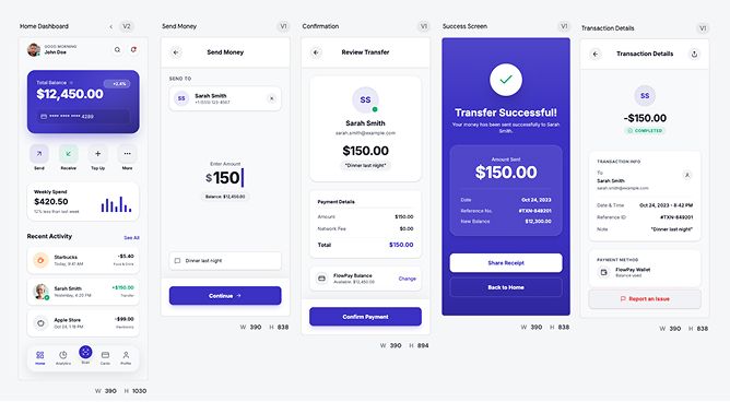
Clean visual hierarchy makes the flow instantly understandable without thinking.
Strong consistency across screens, feels like a real product not a concept.
UI feels a bit generic, nothing memorable or brand-defining.
Success and confirmation screens lack emotional punch or delight factor
Claude Design
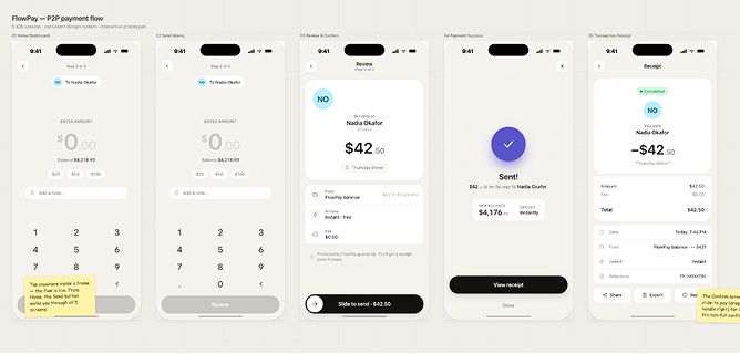
Much stronger personality and visual style, actually feels like a brand.
Micro-interactions like “slide to send” add real UX depth and engagement.
Readability and contrast feel weaker, especially in key transaction info.
Flow clarity takes a hit, user has to think more compared to the first design.
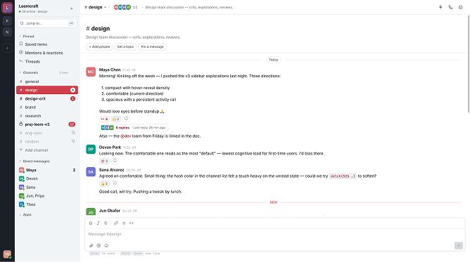
Design a Slack-style desktop communication interface focused on real-world usability, layout systems, and interaction logic, with workspace and channel-based navigation, channel list showing unread/active/muted states, a main conversation area with message flow and timestamps, and threaded conversations with contextual actions; follow a dense yet readable, fast, and functional design with clear separation between navigation and chat, strong hover/active/unread states, smooth channel switching, and an overall stable, dependable feel suitable for all-day use.
UXMagic.ai
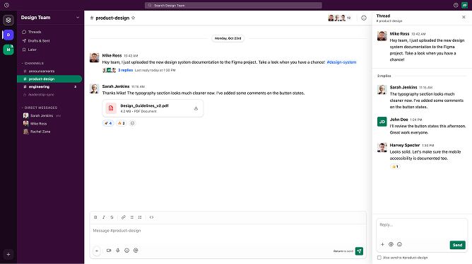
Faithful replication of Slack’s layout and structure, instantly familiar and usable.
Clear hierarchy across sidebar, chat, and thread panel aligns well with real Slack behavior.
Visual styling feels slightly flat compared to Slack’s richer depth and contrast.
Some elements (like sidebar density and spacing) feel a bit off, reducing overall balance.
Claude Design
Clean and distraction-free layout, easy to scan conversations quickly.
Logical grouping of channels and messages keeps structure understandable.
Way too bland, almost zero visual hierarchy so everything blends together.
Weak sidebar presence, doesn’t guide attention or create clear navigation focus.

About UXMagic
UXMagic is a specialized AI design tool built for real product teams. It transforms prompts, sketches, and URLs into structured UI designs with Figma-ready files and production-grade React or HTML code.
Unlike general tools, UXMagic focuses on shipping, not just generating.

About Claude Design
Claude Design is a multimodal AI tool powered by advanced Claude models. It enables users to generate interactive prototypes, pitch decks, and visual assets through conversation.
It’s designed to remove the need for traditional design tools, making visual creation accessible to anyone across an organization.
Feature Comparison
| Feature | UXMagic | Claude Design |
|---|---|---|
| Prompt to UI | Converts prompts into structured UI screens with layout logic | Generates visual outputs conversationally with less structural control |
| Export Options | Exports to Figma, React, HTML, CSS |
Pricing Comparision
Free – $0/month
5 projects, 60 free credits (one-time), upto 10 screens, 1 Figma export
Premium – $17..5/month
20 projects, 480 credits (monthly), upto 80 screens, 80 Figma exports, React/HTML exports
Ultimate – $35/month
Unlimited projects, 1500 credits (monthly), upto 250 screens, 250 Figma exports, unlimited React/HTML exports
Final Verdict
The UXMagic vs Claude Design comparison isn’t about which tool is better. It’s about what stage you’re in.
Claude Design is for idea generation, speed, and exploration. UXMagic is for execution, structure, and production.
got questions?we have answers.
UXMagic is better for structured UI design and production workflows, while Claude Design is better for rapid prototyping and exploration.
No, Claude Design does not support direct Figma export, which is a major limitation for professional UI teams.
Yes. UXMagic generates production-ready React and HTML that aligns with real development workflows.
Claude Design appears cheaper due to bundling, but UXMagic provides better ROI for teams shipping actual products.
Not reliably. Claude is great for ideas, but lacks consistency and system-level control required for production.