Spending three days writing convoluted CSS overrides inside a bloated third-party npm package, only to have a minor patch release break your production forms, is a structural failure worth understanding before it happens to you. Traditional component libraries promise development speed and often end up locking product teams inside a black box they don't fully control. The explosive adoption of shadcn/ui shows developers increasingly preferring to own their component source code directly instead.
Quick context if you're new to this: shadcn/ui is a collection of accessible, customizable UI components buttons, dialogs, forms that you copy directly into your own codebase via a CLI, rather than installing as a traditional package. Developers moved toward this model because packaged libraries make deep customization genuinely painful, and because AI coding tools work dramatically better against code they can actually read. If you're a designer, PM, or founder who needs to understand why your engineering team is talking about this, or a developer deciding whether to adopt it, this covers both.
You already know how Material UI, Chakra, and Ant Design work as packaged dependencies. You don't need utility-first CSS explained, and you already understand the handoff boundary between a Figma file and a React repo. This isn't a setup tutorial. It's what shadcn/ui actually is architecturally, why it made AI coding assistants viable rather than the other way around, and where the real operational friction still lives.
What Is shadcn/ui?
shadcn/ui is a collection of accessible, customizable UI components buttons, dialogs, forms, dropdowns, and more distributed through a CLI that copies the actual component source code directly into your own project, rather than installing it as a traditional package. It's built on three underlying technologies: Radix UI for accessible behavior, Tailwind CSS for styling, and Class Variance Authority (CVA) for managing variants like size and color.
The practical difference from something like Material UI or Chakra UI: those arrive as compiled dependencies you install and update via npm. shadcn/ui components land in your /components/ui folder as plain, editable files you own outright no package to install, no version to track, nothing hidden behind an abstraction layer.
Quick Comparison
Approach
Ownership
Customization
Updates
npm packages
External dependency
Limited - CSS overrides, wrapper components
Automatic via npm
Tailwind UI
Copy/paste code
Medium - manual edit after paste
Manual, no update path
shadcn/ui
Lives in your codebase
Full control - direct file edits
Manual diff-and-merge via CLI
Why shadcn/ui Is Not a Component Library
This is the point most explainers get wrong, and it's worth a dedicated section because everything else follows from it. shadcn/ui behaves differently from a traditional component library, and treating it like one creates confusion down the line.
No dependency. Traditional component packages live in node_modules as compiled, version-locked dependencies. shadcn/ui works completely differently: a CLI tool copies the actual component source code directly into your /components/ui folder.
No package versioning. It's not in your package.json. There's no version to bump, because there's no package installed, just files that are now yours.
Components become part of your app. Once copied in, a shadcn/ui component is functionally indistinguishable from code you wrote yourself. You can restyle it, extend its logic, or delete parts of it entirely; nothing is protected behind a package boundary.
Traditional component libraries create real limitations for teams that need deeper ownership and customization hidden logic behind a package boundary means losing control over accessibility attributes, bundle optimization, and visual customization depth. Owning the source directly is a stronger paradigm for anything meant to evolve past a v1.
The Technology Stack: Radix Primitives, Tailwind CSS, and CVA
Three pieces do the actual work under the hood: Radix UI handles stateful, accessible behavior (focus traps, keyboard navigation); Tailwind CSS handles utility-first styling; and Class Variance Authority (CVA) manages variant logic - size, color, state without CSS specificity fights.
Architectural Deep Dive: How Open-Code Systems Work Under the Hood
Unstyled Accessibility: The Role of Radix UI Primitives
Radix supplies the headless behavior layer, a dialog's focus trap, a dropdown's keyboard navigation completely separate from visual styling. That separation is what lets a team restyle a component aggressively without accidentally breaking its accessibility guarantees.
Preventing Class Collisions with tailwind-merge and the cn() Utility
Bypassing the cn() class merger is one of the most common implementation failures. Developers frequently try customizing a component instance with raw string concatenation instead of routing classes through cn(), which combines clsx and tailwind-merge to resolve specificity collisions. Skip it, and conditional utility classes stop reliably overriding base styles, a subtle bug that's genuinely annoying to trace back to its source.
The AI Transparency Advantage: Why LLMs Prefer Open Code
AI coding assistants didn't create shadcn/ui's popularity, shadcn/ui made AI assistants meaningfully more reliable at this task. The common narrative gets the causality backwards. LLMs routinely hallucinate APIs when working against abstract, packaged component interfaces they can't actually see inside. shadcn/ui's transparent, strongly-typed local files give a model exact JSX structure, props, and Tailwind classes to work against no guessing, no hallucinated methods.
Operational Friction: Managing Design Drift and Component Updates
Aligning Figma Variables with Local CSS Tokens
Uncustomized shadcn/ui implementations create what's sometimes called the "generic Vercel aesthetic" problem. Because the defaults are genuinely polished, production apps that never touch the underlying CVA variants can end up visually indistinguishable from every other early-stage SaaS product built on the same defaults grey tokens, standard Lucide icons, minimal brand investment. Relying entirely on defaults isn't really a shortcut; the framework was built as an unopinionated baseline to customize, not a finished visual identity.
Design drift compounds this. Designers maintain a Figma kit while developers pull unstyled primitives via CLI without deliberate token synchronization, spacing values and color palettes diverge fast, creating expensive visual QA cycles nobody budgeted time for.
Upstream Maintenance Without Package Versioning
Because components live in your repository rather than as an external package, there's no automatic npm update path. When an accessibility patch ships upstream, developers have to manually diff against the registry and merge fixes into local files using standard git workflows. Re-running the CLI with --overwrite on a heavily customized local file wipes out every internal change, a destructive mistake that's easy to make once and costly to recover from.
Where shadcn/ui Actually Makes a Difference
SaaS dashboards. Dense, data-heavy interfaces need consistent table, filter, and dropdown behavior across dozens of screens. Owning the component source directly means a single design-system change (a new spacing scale, a new accent color) propagates everywhere at once, instead of fighting override specificity in a packaged library screen by screen.
Banking and fintech apps. Accessibility isn't optional in regulated financial products, and Radix's built-in focus management and keyboard navigation give a real head start on WCAG compliance while full styling control means the interface doesn't have to look like a generic template in a space where trust and visual credibility matter directly.
E-commerce checkout flows. Checkout is exactly where a broken third-party package update is most costly; a form library patch that silently changes input behavior can tank conversion overnight. Owning the component locally removes that specific risk entirely, since there's no upstream version to update unexpectedly.
Internal admin tools. Lower visual-polish pressure, but real need for fast iteration data tables, permission toggles, bulk actions. shadcn/ui's speed-to-scaffold via CLI fits this well, since internal tools rarely justify the overhead of a fully custom design system from scratch.
Here's what the tradeoff looks like on a real migration. A Series B SaaS company running a heavily customized Material UI installation had three years of CSS overrides bloating its bundle by 480KB, with dark mode functionally difficult under conflicting theme providers. Migrating to shadcn/ui moved dialog code directly into components/ui/dialog.tsx, offloaded accessibility to Radix, and converted styling to Tailwind classes mapped to CSS variables bundle size dropped as unused code got tree-shaken naturally, and dark mode became a single root class toggle instead of a rewrite.
A second failure mode worth naming directly: an unstructured AI assistant prompted to "build a responsive data table with filtering, pagination, and action dropdowns" with no component registry to constrain it can output a 900-line monolithic file with inline flexbox styling, inaccessible custom dropdowns, and no screen reader support. Constraining the same prompt to compose from existing /components/ui/table.tsx and /components/ui/dropdown-menu.tsx files instead produces modular, accessible output that's immediately shippable.
UXMagic: Closing the Gap Between Design and shadcn/ui Code
Developers already have reusable, accessible components sitting in /components/ui, ready to scaffold in seconds via CLI. The remaining challenge is deciding which screens, states, and flows those components should actually assemble into before engineering starts building, not after.
Static Figma UI kits are increasingly the real bottleneck here, not engineering. While a CLI scaffolds accessible, stateful primitives in seconds, designers can spend dozens of hours manually assembling static variant states by hand in a design tool work that's already solved on the code side and shouldn't need re-solving visually from scratch.
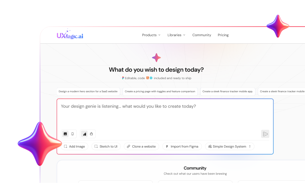
This is exactly where UXMagic fits into the pipeline before a CLI command ever runs. Instead of manually assembling wireframes in Figma and waiting on a developer to translate them into stateful React, UXMagic converts a natural-language product description into a complete, multi-screen UI flow structured around standardized design tokens, providing a direct bridge from concept to CLI scaffolding rather than a separate, disconnected step.
The consistency problem gets solved the same way. Different team members or different AI prompts on different days introduce visual inconsistencies across screens when nothing is enforcing shared tokens. UXMagic maintains global design system tokens across every screen in a generation, keeping typography, spacing, and component variants aligned with project standards before any code reaches a repository, rather than catching drift in review after the fact.
Non-technical founders hit a related wall constantly: presenting a design idea to engineering and getting immediate pushback about technical feasibility or component constraints. Generating complete, context-aware flows from a text prompt that exports directly into modern React and Tailwind respecting the same modular standards a /components/ui folder already expects means eliminating Figma-to-code design drift before the conversation with engineering even starts, not during it.
Build Token-Aligned UI Flows
Stop rebuilding static Figma variants. Try UXMagic free and generate consistent, token-aligned flows that connect directly with your component system.
Shadcn/ui is an open-source component distribution system that copies accessible React components directly into your project repository via a CLI. Built on Radix UI primitives and Tailwind CSS, it gives developers full code ownership over UI logic and styling, completely eliminating third-party npm package dependencies and version lock-in.
Tailwind UI provides static, pre-styled HTML and React code snippets that developers copy manually. Shadcn/ui provides an automated CLI distribution workflow that installs fully accessible, stateful components powered by headless Radix UI primitives, utilizing Class Variance Authority (CVA) to manage complex component state variants systematically.
Generative AI tools perform better with shadcn/ui because its components exist as transparent, strongly-typed TypeScript files in the local repository. LLMs can read the exact JSX structures and Tailwind utility classes directly, avoiding the API hallucinations and syntax errors common when attempting to code for abstracted npm packages.
No, shadcn/ui is not an npm package and does not appear in your project's package.json file. It functions as a distribution registry. A CLI tool downloads component source code directly into your /components/ui folder, ensuring complete immunity from breaking upstream package updates.
Because components live inside your local repository, updates are managed manually. Developers can re-run the CLI command to view diffs against the upstream registry, merging bug fixes into local files using standard git workflows without overwriting custom brand styles or internal business logic.
It depends on the priority. Material UI offers faster initial setup with a consistent, opinionated design language out of the box. shadcn/ui trades that convenience for full ownership and customization better suited to teams that need deep brand control or plan to heavily modify component behavior over time.
Generally yes, for teams with at least one engineer comfortable owning component code directly. The tradeoff is manual maintenance versus automatic npm updates, a reasonable trade for a startup that needs visual differentiation and doesn't want to fight package customization limits while iterating fast.
Yes, it's built on Radix UI primitives (a mature, accessibility-focused library) and is widely used in production SaaS applications. Production-readiness ultimately depends on the implementation quality, not the framework itself, since components become local code your team is responsible for maintaining.
Yes, notably well. Because components exist as transparent local TypeScript files rather than abstracted package APIs, AI coding assistants can read the exact structure and generate accurate code against them, a meaningful advantage over prompting against a packaged component library the AI can't see inside.