Most glassmorphic UI components look stunning in static design mockups but fail completely in production as unreadable, WCAG-noncompliant accessibility bugs. The moment real user data shifts or dark mode activates, arbitrary transparency values turn clean dashboards into visual noise. Shipping frosted glass that survives real production environments requires precise CSS property ratios, not visual guesswork.
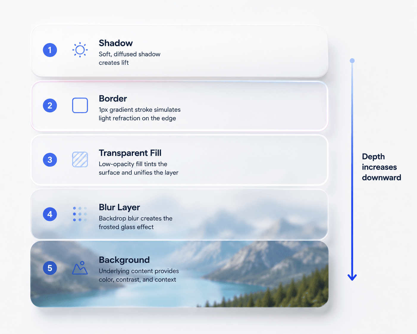
Glassmorphism explained simply: it's a UI style that makes elements look like frosted glass floating above the content behind them - a semi-transparent background, a soft blur, a light border, and a subtle shadow working together to create depth. That's the whole concept. Everything below is about getting the numbers right so it actually works in a real product.
You already understand spatial hierarchy, opacity parameters, and layout software mechanics. This isn't a beginner definition post. It's the exact blur radii, fill opacities, and CSS fallback rules that separate a glassmorphic component that ships from one that gets pulled after the first accessibility audit.
Quick Reference
Property
Recommended Value
Blur radius
12px–20px
Fill opacity
12%–25%
Border
1px gradient stroke (white 60%→20% alpha)
Shadow
Soft, elevated, low opacity
Components per page
3–5 max
What Is Glassmorphism in Modern UI Design?
Glassmorphism is not a decorative visual style, it's a spatial architectural material engineered to define structural depth across layout layers. It mimics translucent frosted glass hovering above background layers, using backdrop blurs, light refraction border strokes, and low fill opacities to establish that a component is elevated above the content behind it.
Product teams that treat translucent blur as an aesthetic filter run into mobile GPU rendering lag and broken layout hierarchy. Restricted strictly to contextual overlays, frosted glass clarifies interface structure far better than a solid flat container does but that only holds if the underlying ratios are right.
Glassmorphism vs. Neumorphism vs. Flat Design vs. Material Design
Glassmorphism vs. Neumorphism:
Glassmorphism succeeded where neumorphism failed largely because of contrast. Neumorphism relies on soft, embossed shadows on matching-color surfaces, which makes it genuinely hard to tell what's interactive. Glassmorphism's transparency plus blur creates a clearer visual separation between layers, even before accounting for its grounding in real operating-system material design (Apple SwiftUI, Microsoft Fluent Acrylic).
Glassmorphism vs. Flat Design:
Flat design deliberately removes depth cues - no shadows, no gradients, no layering. Glassmorphism reintroduces depth specifically through translucency rather than the skeuomorphic shadows; flat design was originally a reaction against. The two aren't really competitors; a product can use flat design as its base language and glassmorphism selectively for elevated overlays.
Glassmorphism vs. Material Design:
Material Design (Google's system) uses solid surfaces with elevation communicated through shadow and z-axis positioning. Glassmorphism communicates elevation through transparency and blur instead. Both are solving the same underlying problem - showing what's "above" what - with different physical metaphors.
Is glassmorphism still relevant in 2026?
Yes, specifically because it's grounded in native OS material systems rather than a passing web trend - see the permanence argument below.
Glassmorphism is permanent material architecture, not a passing fad and it's worth understanding why it outlasted neumorphism specifically. Enterprise design systems - Apple SwiftUI, macOS Tahoe, Microsoft Fluent Acrylic - grounded the style in physical material behavior that solves a genuine layer-hierarchy problem, not just a visual one. When operating systems build translucency into their native rendering, the aesthetic has infrastructure behind it that a passing trend never gets.
The Four CSS Pillars of Production Glassmorphism
Fill Opacity and Backdrop Filter Blur Ratios
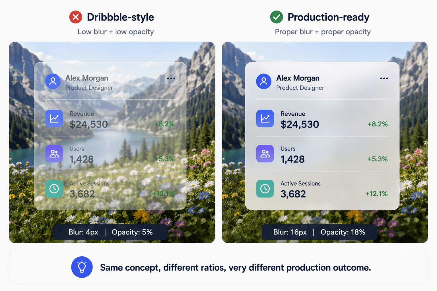
Many Dribbble-style glassmorphism examples fail in production because they prioritize appearance over accessibility and performance. Popular design showcases advocate low blur radii (2px–5px) combined with low fill opacities (5%), which creates unreadable interfaces the moment real, dynamic content renders underneath.
Production glassmorphism demands higher values to preserve legibility:
Blur radius: 12px - 20px
Background fill opacity: 12% - 25%
That range is the actual difference between a component that reads clearly over shifting dashboard data and one that looks fine in a static Figma mockup and falls apart the second real data loads.
Border Gradient Strokes and Soft Shadow Elevation
A 1px inside border stroke using a linear gradient (white 60% alpha fading to white 20% alpha) simulates glass light refraction along the component edge - this is what sells the "glass" illusion, not the blur alone. Pair it with a soft, diffused drop shadow at low opacity and elevated blur radius to lift the container visually off the canvas.
When NOT to Use Glassmorphism
Glassmorphism is a targeted tool, not a default. It's a poor fit for:
Data-heavy tables - dense rows of numbers need maximum legibility, not a translucent layer competing with the content behind it.
Long-form content areas - body text over a blurred background fatigues the eye over any real reading length.
Primary text containers - anything that's the main content, not an overlay, should sit on a solid surface.
Low-end mobile experiences - if your user base skews toward older or budget Android hardware, the GPU cost of backdrop blur may not be worth the visual payoff.
The rule from earlier is the practical filter here: frosted glass belongs on elevated, transient layers - navigation, modals, command palettes never on the content someone actually needs to read carefully.
Usability, Accessibility, and Performance Guidelines
Ensuring WCAG AA Text Contrast Across Dynamic Themes
Frosted glass belongs exclusively on elevated structural layers - floating action bars, sticky top navigation, search command palettes, modal backdrop panels. Applying translucency to primary body text, form fields, or data grids ruins usability, and it's exactly what junior designers tend to get wrong first.
The layout looks pristine over a static purple gradient in Figma, but the moment dynamic data renders underneath it, the text becomes unreadable. Automated accessibility suites will flag every translucent container that fails the WCAG AA text contrast threshold of 4.5:1 against a dynamic background - test against real, shifting content, not the mockup's fixed gradient.
Eliminating Mobile GPU Scroll Lag and Frame Drops
Stacking more than two blurred panels on mobile web viewports can tank scrolling performance down to 15 FPS on mid-range Android hardware. Excessive backdrop blurs create rendering overhead on mobile GPUs specifically, which is easy to miss when testing only on a high-end desktop browser.
To maintain 60 FPS scroll performance:
Limit active glass components to 3–5 per page
Keep blur values between 10px and 15px
Apply transform: translateZ(0) to trigger GPU hardware acceleration
Technical Implementation in CSS and Figma
Figma Component Stack Assembly
Build the layer stack in this order:
Create a container shape with fill set to 10% - 20% white opacity (light mode) or 10% - 20% black opacity (dark mode)
Add a Background Blur effect layer set between 12px and 20px
Apply a 1px inside border stroke using the white 60%–20% alpha linear gradient
Add a soft drop shadow - low opacity, elevated blur radius (e.g., 0 8px 32px rgba(0, 0, 0, 0.1))
Cross-Browser Fallbacks Using @supports Feature Queries
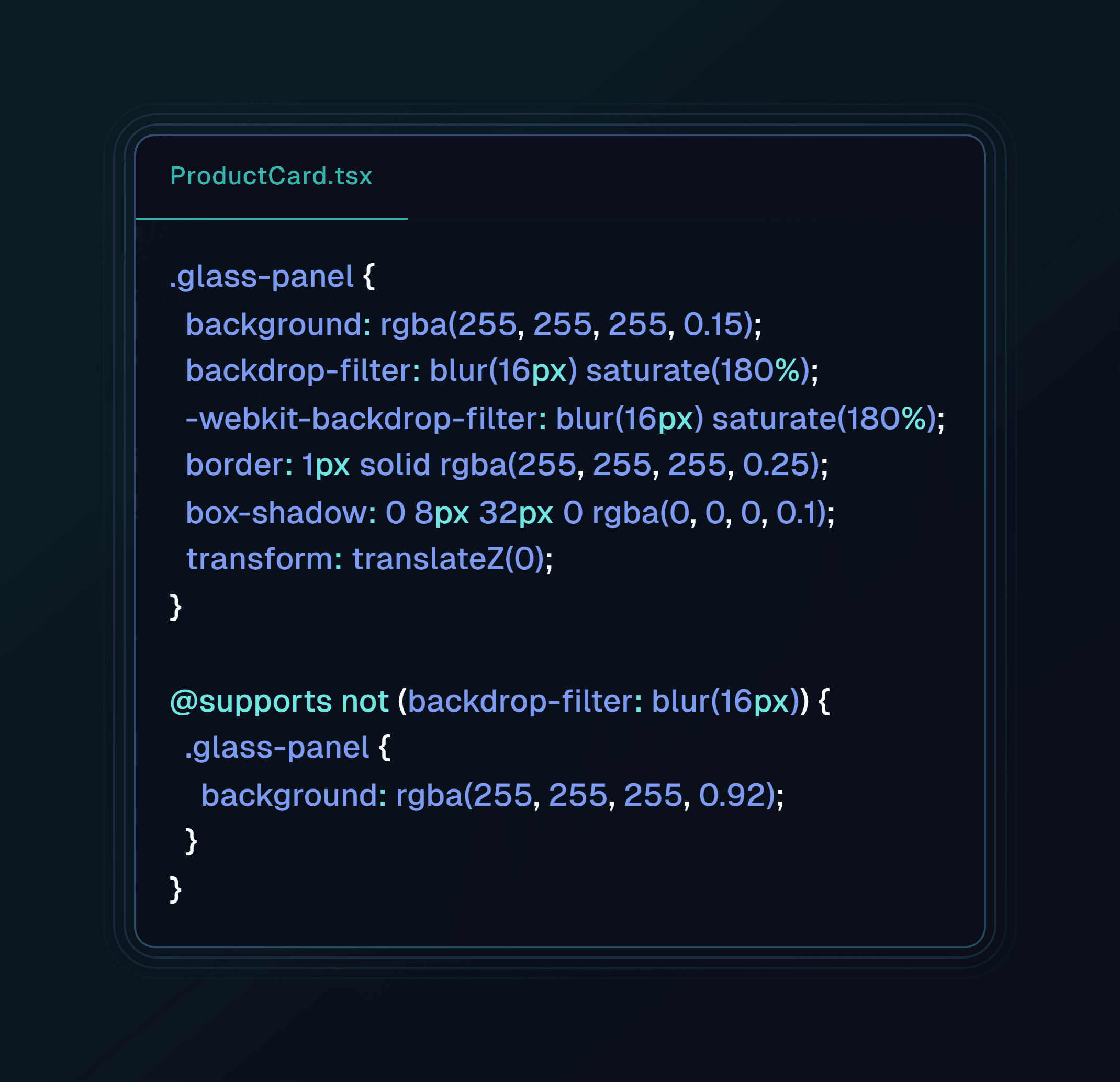
Safari, Chrome, and Firefox render backdrop-filter differently, and older browser versions drop the blur entirely, leaving a plain white box behind. Ship WebKit vendor prefixes and an explicit fallback rule so unsupported browsers get a solid, high-contrast background instead of a broken translucent one:
Resolving Parent Stacking Context Bugs with overflow: clip
Developers routinely lose their backdrop blur entirely because of a parent overflow: hidden declaration that interferes with the browser's sampling context. Replace parent overflow containment with overflow: clip - it retains the same layout boundary without breaking backdrop sampling on child elements. This is a common enough failure mode that it's worth checking first whenever a blur mysteriously stops rendering.
Getting these tokens defined consistently matters more than any single component - the discipline behind SaaS design system architecture is what keeps fill opacity and blur radius from drifting screen to screen as a product scales.
Browser Compatibility
Browser
backdrop-filter Support
Fallback Needed
Chrome
Yes
No
Safari
Yes
Vendor prefix (-webkit-backdrop-filter) required
Firefox
Partial, varies by version
Yes - @supports fallback recommended
Older browsers (any engine)
No
Yes - solid background fallback required
This is exactly why the @supports not (backdrop-filter: blur()) block above isn't optional without it, a meaningful share of real users get a plain, potentially low-contrast white box instead of the intended design.
Real-World Scenarios: Solid vs. Glassmorphic Execution
SaaS analytics dashboard header. A solid white sticky header cuts abruptly across dynamic dashboard data charts, creating a harsh visual division and reducing visible canvas area during scroll. A production glassmorphic header using background: rgba(255, 255, 255, 0.12) paired with backdrop-filter: blur(12px) instead lets underlying metric trends stay contextually visible during scroll while still maintaining clear visual distinction.
Mobile e-commerce modal overlay. An opaque modal backdrop conceals the underlying product summary entirely, disorienting the buyer about where they are in the purchase funnel. A floating modal card using backdrop-filter: blur(20px) and a 1px refraction border dims and blurs the underlying shopping cart instead, while keeping the buyer's spatial context intact.
Where generic AI tools fail. Standard AI design tools frequently generate low-contrast translucent cards with unconstrained blur values, arbitrary text opacities, and missing vendor prefixes. They tend to produce flat, single-screen concepts that collapse the moment they need to scale across a multi-screen user journey or a dark-mode design system state.
When a product manager generates multi-screen flows from a text prompt through UXMagic's Flow Mode, the generation engine applies WCAG AA-compliant glassmorphism parameters automatically - sticky navigation bars and modal overlays come pre-configured with compliant contrast tokens instead of requiring manual fill-opacity and blur calculations for every screen. Maintaining identical translucent CSS tokens across a 10-screen onboarding journey is genuinely hard to do by hand during rapid iteration; Flow Mode enforces that border stroke alpha, backdrop blur radii, and elevation shadows stay identical across the entire product surface. On export, UXMagic eliminates the handoff friction covered above directly - production-ready CSS and Tailwind classes ship with hardware acceleration hooks, cross-browser @supports fallbacks, and the overflow: clip parent-container fix already applied, not left for a developer to discover after the blur silently breaks.
Build Production-Ready Glassmorphic UI
Generate consistent glassmorphic UI systems across every screen with built-in blur, opacity, and design tokens that meet accessibility standards.
Glassmorphism is a UI design style that simulates frosted or translucent glass using background blur effects. It typically combines a semi-transparent background with an underlying blur, a light border stroke, and a soft drop shadow to create a sense of depth and layered hierarchy between foreground elements and the background.
Glassmorphism uses transparency, backdrop blur, and light refraction to simulate frosted glass, working well over dynamic or colorful backgrounds. Neumorphism mimics a soft, extruded plastic look using subtle shadows on a monochromatic surface, and generally struggles with the same visual contrast problems glassmorphism solves.
Excessive backdrop blurs create rendering overhead on mobile GPUs. To maintain 60 FPS scroll performance, limit active glass components to 3–5 per page, keep blur values between 10px and 15px, and apply transform: translateZ(0) to trigger GPU hardware acceleration.
Only when implemented with sufficient fill opacity and tested against real, dynamic backgrounds not by default. Foreground text needs to meet the WCAG AA contrast threshold of 4.5:1 against whatever content actually renders behind the translucent panel, which static mockups over a fixed gradient don't reliably test for.
Yes. Unlike short-lived web design trends, glassmorphism is grounded in native operating system material systems - Apple SwiftUI, macOS Tahoe, Microsoft Fluent Acrylic - which gives it infrastructure and staying power a purely decorative trend never gets.
Entre na nossa comunidade
Compartilhe trabalhos, peça ajuda, fique por dentro das novidades e faça networking com outras pessoas do UXmagic.ai