Your plugin just generated 300 div tags to render a navigation bar with four links. Every one of them is absolute-positioned, none of them are semantic, and the layout collapses the moment someone resizes the browser below 1440px. That's before we even get to the part where Figma wants $35 a month per seat just to let engineering inspect a padding value.
You already know what Auto Layout does and you've already been burned by Anima, Locofy, or Builder.io promising "production-ready" output. This is the manual extraction method that actually survives a browser resize, plus where the entire plugin category quietly fails.
If this article ends with "so install this plugin instead," that would defeat the entire point - so it doesn't.
The State of Figma to HTML: Why Plugins (and Paywalls) Are Failing Teams
Dev seats run $12/month per user on the Professional plan and up to $35–$55/month per user on Enterprise plans. For ten developers who each check a padding value once a week, that's $4,200–$6,600 a year for read-only spec extraction that used to be free.
The plugin ecosystem doesn't fix this - it introduces a different problem. Tools like Anima, Locofy, and Builder.io accelerate initial visual replication, but because Figma has no intrinsic concept of web layout logic, these tools resort to absolute positioning to force elements into place. The result is "div soup": fifty nested, meaningless div tags with hardcoded coordinates like top: 142px; left: 890px, built to replicate a static frame rather than express structure.
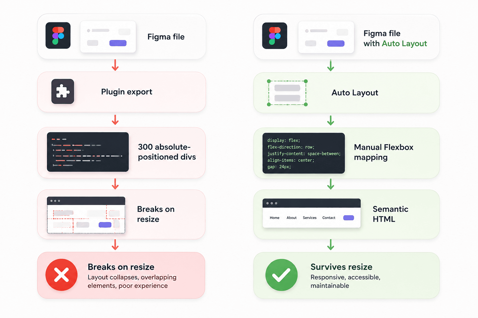
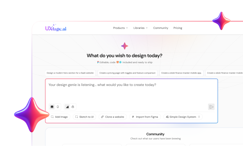
Most guides tell you the fix is a better plugin. That's wrong - generating 50 lines of unmaintainable CSS to avoid writing 10 lines by hand is a failure of engineering discipline. And it compounds: Locofy's output is only usable if the source file is perfectly architected - if the file is messy, the output is unusable regardless of which plugin ran it. This is exactly the gap that eventually pushed us to build UXMagic's AI UI generator - not another plugin translating vectors better, but a way to skip vector translation entirely. More on that once the manual method is covered.
If Auto Layout is broken or absent in the source file, the code is dead on arrival. A file built with loose groups (Cmd + G) and fixed dimensions cannot be translated into responsive Flexbox - manually or by any plugin.
Time cost, for reference:
| Method | Time Required | What You Still Have to Fix |
|---|---|---|
| Manual extraction | 2–3 hours per screen | Nothing — clean from the start |
| Plugin export + cleanup | ~20 min + 2–4 hrs cleanup | Div soup, broken responsiveness |
| AI generation (UXMagic) | 5–10 minutes | Minor review, not a rebuild |
Core Principles: Mapping Figma Auto Layout to CSS Flexbox
Auto Layout is Figma's proprietary stand-in for display: flex. Get this mapping wrong and every step after it inherits the mistake.
| Figma Property | CSS Flexbox Equivalent | Effect |
|---|---|---|
| Direction | flex-direction: column / row | Primary axis of the layout stack |
| Spacing (Gap) | gap: [value]px | Uniform spacing without margins |
| Padding | padding: [top][right][bottom][left]px | Inner container spacing |
| Hug Contents | width/height: max-content | Container shrinks to fit children |
| Fill Container | flex-grow: 1 | Child stretches to fill available space |
| Packed vs. Space Between | justify-content: flex-start / space-between | Alignment along the main axis |
"Hug" and "Fill" are intrinsic sizing behaviors, not just toggles - getting this translation wrong is one of the most common sources of layout breakage. Figma's "Wrap" property, meanwhile, is the visual equivalent of flex-wrap: wrap, and it's the exact mechanism you'll lean on later when writing media queries, since Figma can't simulate the fluid states between fixed frame widths.
Step-by-Step: The Manual Figma to HTML Workflow
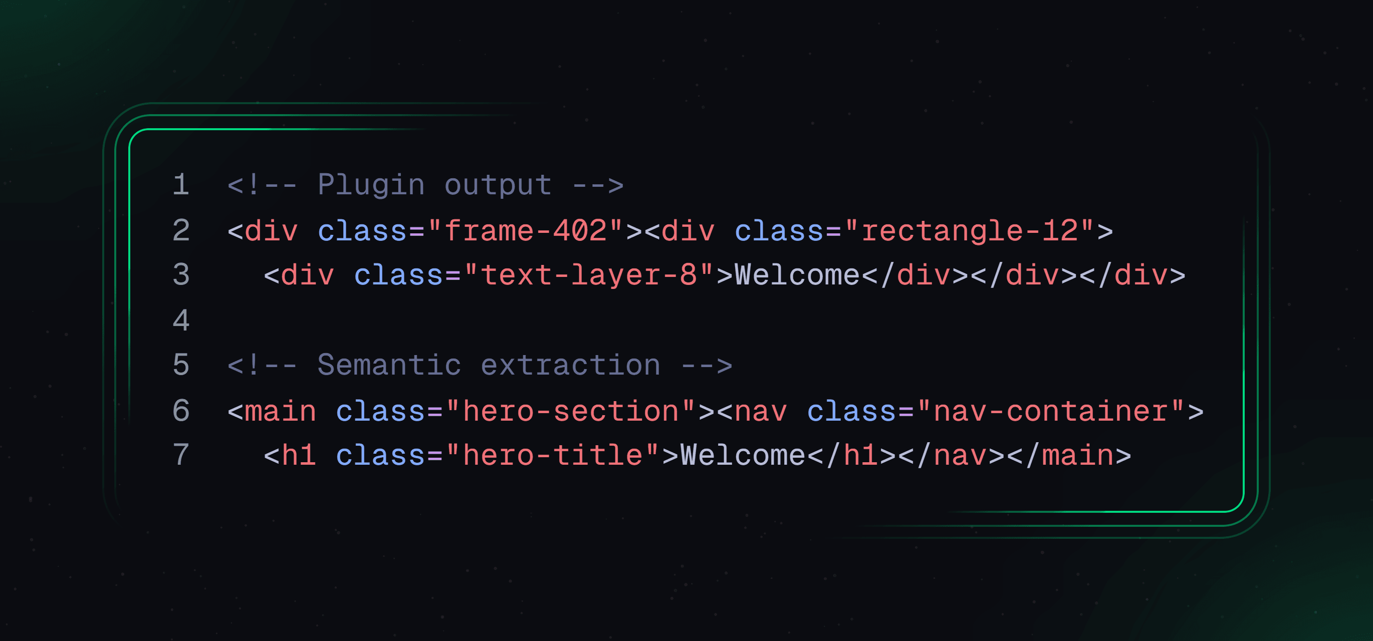
Step 1: Pre-export sanitization. Eradicate groups; every structural component needs Auto Layout (Shift + A) applied - it's the direct equivalent of a div with display: flex. Use semantic layer naming (hero-section, not Frame 402) so class names stay legible. Flatten complex vectors (Cmd + E) before export to avoid rendering anomalies from nested blend modes.
Step 2: Extracting CSS without Dev Mode. Select an element in Figma's standard properties panel - width, height, typography, hex codes are all visible without a Dev seat. Manually copy these into a styles.css file. It's the same data Dev Mode surfaces; the paywall adds friction, not exclusivity.
Step 3: Writing the semantic wrapper. This is the step every plugin skips. The top-level frame becomes main, the nav frame becomes nav, text layers get real heading hierarchy instead of generic span tags:
Responsive adjustments. Figma files are static snapshots at fixed widths. Every state between 1440px and 375px has to be written by hand: @media (max-width: 768px) rules translating "Wrap" into flex-wrap: wrap at the breakpoints that matter.
The absolute positioning trap. Designers drag elements - a badge, a decorative shape outside the Auto Layout flow using "Absolute Position." Hardcoding top: 142px; left: 890px means the element floats to a nonsensical spot the moment the screen resizes. Fix: position: relative on the parent, percentage-based positioning (top: 10%; right: 5%) on the child.
Validating in DevTools. Open Chrome DevTools' Elements panel - a blue "flex" badge confirms display: flex landed correctly. Toggle the device toolbar (Cmd/Ctrl + Shift + M) and drag through several widths manually rather than checking only two fixed breakpoints, since Figma can't show you what happens in between.
Case Study: One Frame, Start to Finish
A pricing card frame: Auto Layout, vertical direction, 24px gap, 32px padding, containing a heading, price, three feature rows, and a CTA.
Structure extraction translates directly:
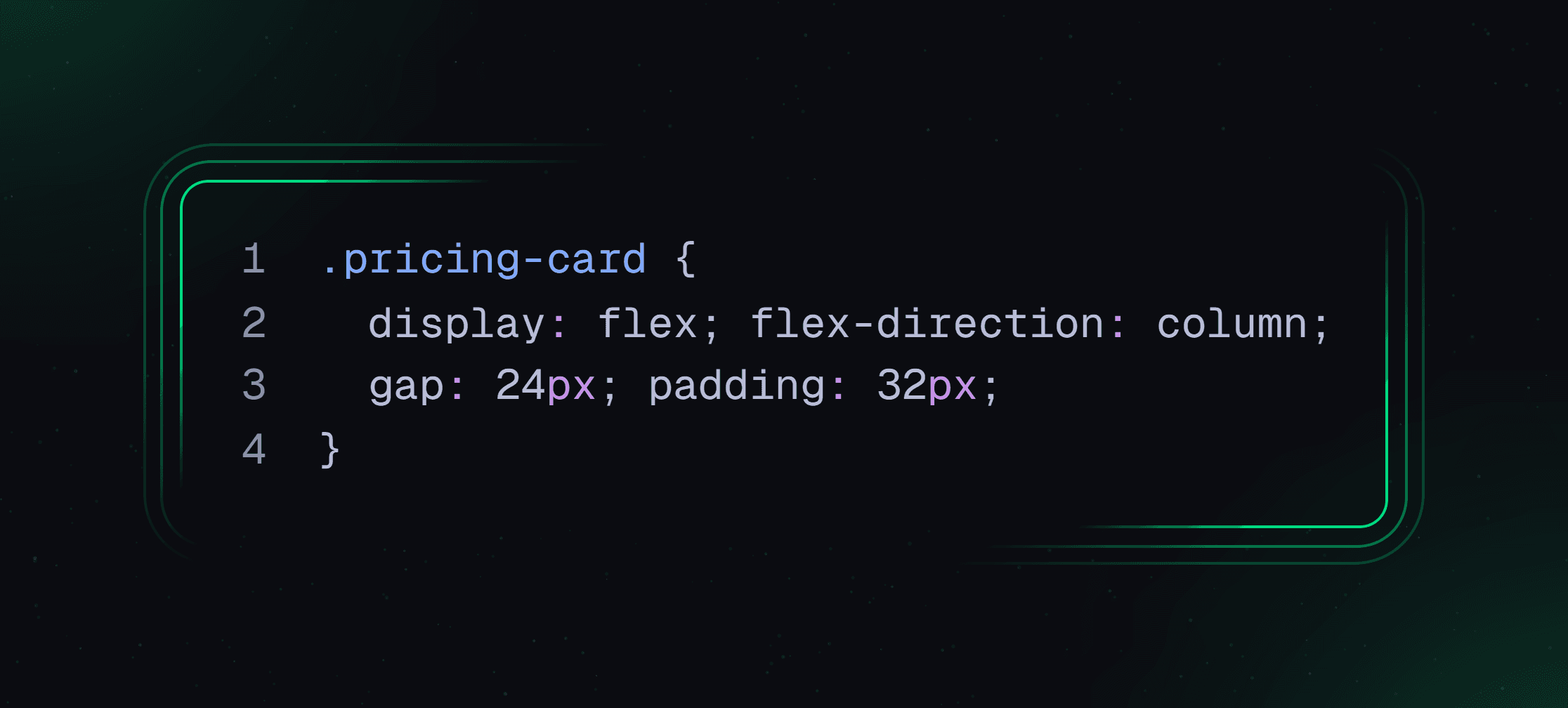
Semantic wrapper - the card becomes article, the heading h3, features a ul instead of three stacked divs:
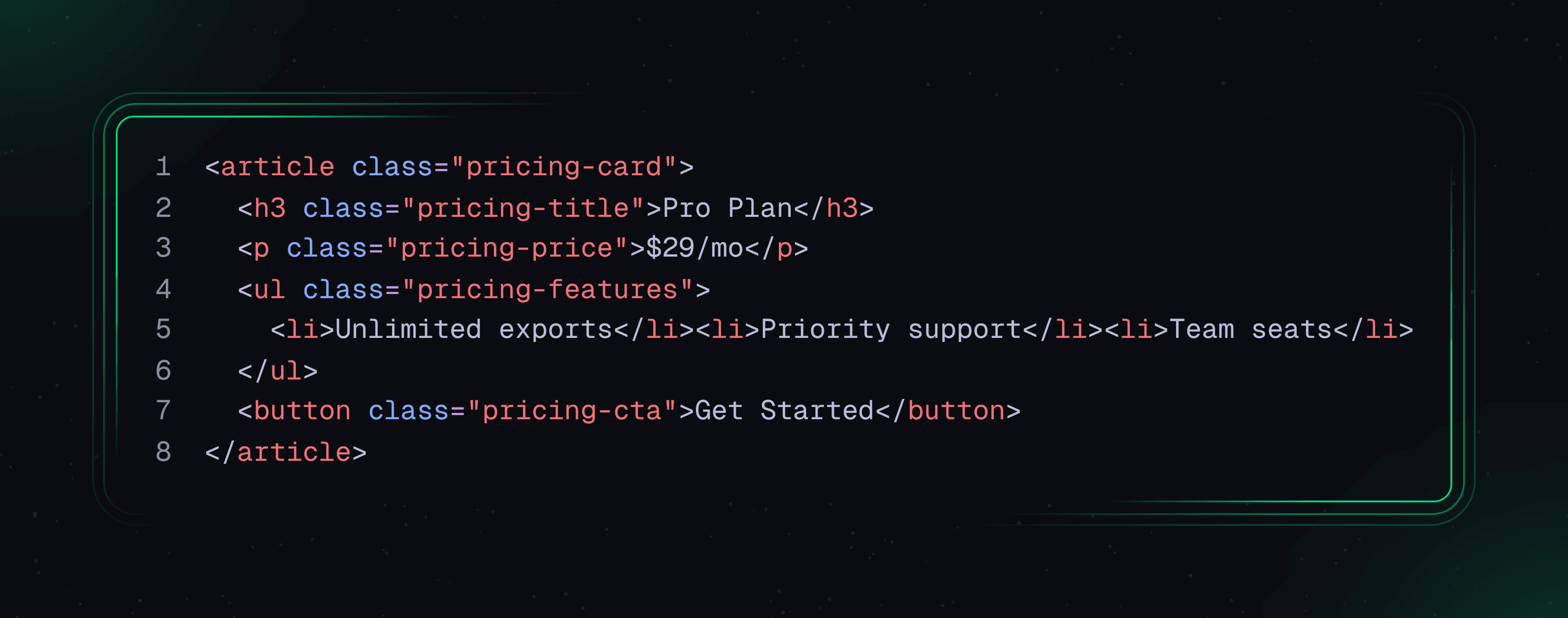
Responsive pass - three cards (via display: grid; grid-template-columns: repeat(3, 1fr);) stack at 768px with one media query. No absolute positioning, no nested wrappers, and it holds at every width in between because the underlying logic was Flexbox and Grid throughout - not a coordinate snapshot.
Troubleshooting the SVG Export Nightmare
A custom icon with a drop shadow gets sliced off on render, and React throws errors - Figma exports clip-path and stroke-width, not JSX-compliant clipPath and strokeWidth. Fix: expand the frame bounds before exporting so the glow isn't clipped, flatten boolean operations, then manually convert hyphenated attributes to camelCase and strip redundant defs blocks.
The hero image scaling disaster: a "Fill" background image gets hardcoded to exactly 1440px via an absolute-positioned img, producing a broken scrollbar on smaller viewports. Fix: min-height: 100vh on the parent, background-image with background-size: cover, standard Flexbox centering for the text on top.
The pricing-table div soup case: groups instead of Auto Layout force a plugin into forty nested divs using margin-top: -15px and float: left, failing WCAG checks. The real fix takes fifteen minutes: display: grid; grid-template-columns: repeat(3, 1fr); gap: 24px;.
Common Mistakes Checklist
- Using Groups instead of Auto Layout: nothing to translate to Flexbox.
- Fixed-coordinate absolute positioning: only correct at one exact viewport width.
- Unnamed layers: Frame 402 becomes unreadable CSS class names.
- Skipping the semantic wrapper step: everything defaults to div.
- Not flattening complex vectors: multi-layer illustrations render incorrectly.
- Testing only at two frame widths: the layout can still break in between.
The Modern Alternative: Generating Native UI Over Translating Vectors
The entire manual workflow above is still reverse-engineering a static drawing into a fluid medium. Even done perfectly, you're translating flat vector coordinates into DOM logic after the fact - backwards, since the web was never meant to work like a fixed 1440px artboard.
This is the gap UXMagic closes. Rather than paying $12–$55 per seat to inspect padding values, teams generate the UI flow directly from prompt-based logic - nothing to extract, because design and code are generated simultaneously as one asset. The output maps to real Figma to code handoff without the manual CSS-copying this article just walked through.
Div soup disappears for the same reason: generating UI from actual UX logic means the output is structured from the first pass, instead of nesting divs to replicate a screenshot's pixel positions - the same distinction covered in why semantic HTML matters for AI-era SEO. The iteration problem resolves too - Agent Mode means a style change updates the entire generated flow cohesively instead of a regenerate-and-pray cycle. For teams starting from a live site instead of a Figma file, the Website Cloner applies the same logic to a URL, and MCP wires generation directly into existing coding tools.
UXMagic's Figma Import and Export
None of this requires abandoning work already in Figma. UXMagic includes a Figma import and export feature: an existing file pulls in directly, so the structural work a designer already did doesn't get thrown away just because the extraction method is changing - useful specifically for teams with an established design system already built out.
Importing from Figma into UXMagic:
- In Figma, select the frame or component you want to bring over.
- Copy it directly (Cmd/Ctrl + C).
- Paste it directly into UXMagic (Cmd/Ctrl + V) - no export step, no file upload, no share link needed.
- The frame's existing structure, including Auto Layout, carries over intact.
- It's now a normal UXMagic project - editable and ready to prompt further.
Exporting from UXMagic back into Figma:
- In UXMagic, select the specific frame or screen you want to send back.
- Copy it directly (Cmd/Ctrl + C).
- Paste it directly into an open Figma file (Cmd/Ctrl + V) - no export dialog, no file conversion step.
- It lands in Figma with real Auto Layout and proper layer structure, not a flattened image.
- It's ready for design work or handoff, and can be copied back into UXMagic anytime - the flow works both ways.
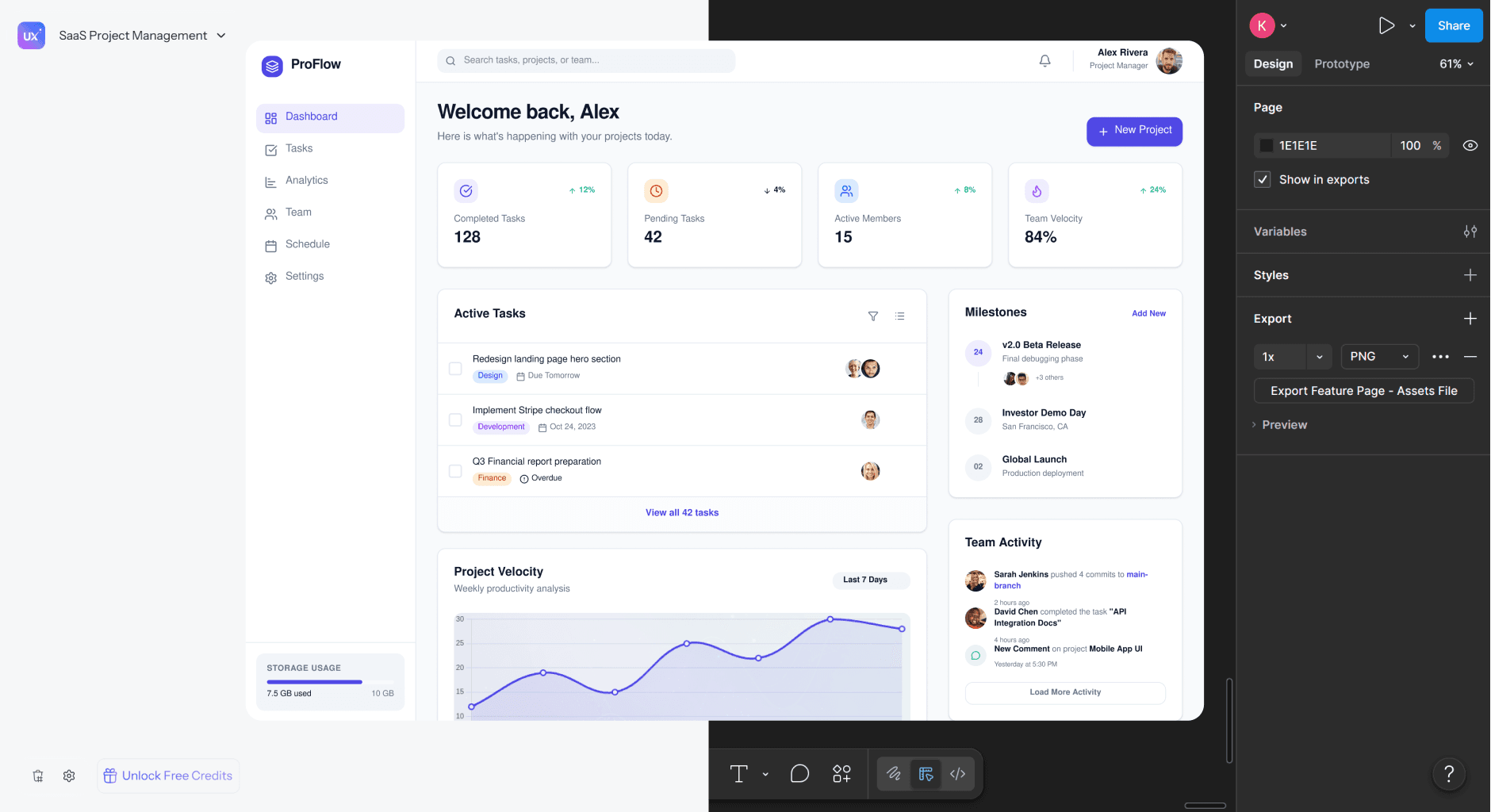
Once imported, UXMagic's Figma AI capability applies the same prompt-based generation logic on top of that existing structure, producing the semantic, Flexbox-native output described earlier - rather than starting every project from a blank prompt. This differs fundamentally from tools like Figma Make, which still operate inside Figma's visual-first constraints and hand back another static artifact. For more on what this transition looks like day to day, see how designers are actually using AI in production workflows.
Stop Reverse-Engineering Designs
Generate semantic, production-ready UI without manually extracting CSS values or rebuilding layouts from static designs. Keep your code clean and ship faster.