If your developers treat your Figma files like “rough suggestions,” your mockups aren’t doing their job.
Most teams searching what is a mockup aren’t confused about definitions. They’re trying to stop design drift, unblock engineering, or figure out whether a static UI is enough to raise money. The question isn’t academic. It’s operational.
A mockup isn’t decoration. It’s the moment your interface becomes executable intent instead of abstract structure.
What Is a Mockup? Defining the High-Fidelity Design Artifact
A mockup is a static, high-fidelity visual representation of the final interface used to lock visual decisions before engineering begins.
It applies typography, spacing tokens, semantic color scales, and real component structure to a wireframe. No interactivity. No simulated logic. Just precision.
The Critical Differences: Wireframe vs. Mockup vs. Prototype
Most guides blur these. That’s exactly how teams waste weeks building the wrong artifact.
- Wireframe: grayscale layout for hierarchy and flow logic
- Mockup: final visual layer with real tokens and components
- Prototype: clickable simulation for usability validation
If your deliverable is clickable, it’s already a prototype.
If it defines spacing systems, typography scales, and UI hierarchy for engineering, it’s a mockup.
Understanding this boundary matters because the entire AI in real product workflows stack depends on choosing the right fidelity at the right time.
Why the “Happy Path” Mockup Is a Danger to Product Teams
Most mockups fail because they only show success states.
That forces engineers to design:
- error handling
- loading states
- empty dashboards
- overflow conditions
- API failures
under sprint pressure.
The result isn’t just inconsistency. It’s permanent design debt.
A valid mockup includes the unhappy path before handoff starts.
The Strategic Role of Mockups in B2B SaaS and Product Design
Mockups exist to create alignment across stakeholders who don’t share the same mental model of the product.
They solve three expensive problems at once.
Securing Stakeholder Alignment and Preventing Design Debt
Leadership doesn’t approve wireframes. Engineers don’t implement moodboards.
Mockups bridge that gap by:
- locking token architecture
- validating visual hierarchy
- exposing layout breakpoints
- revealing edge-case failures early
This is where design stops being interpretive and becomes executable.
If your mockups still leave room for guessing, they’re incomplete.
Should Founders Use Mockups or Prototypes for Seed Pitch Decks?
Most founders assume investors want working software.
That’s wrong.
Early-stage investors evaluate:
- market size
- clarity of vision
- execution credibility
A polished static mockup communicates those faster than a buggy MVP.
Trying to ship half-functional code before fundraising usually signals weak prioritization, not technical strength.
A clean visual narrative beats broken interaction every time ,especially when the interface is already structured around flows that are optimized for acquisition instead of aesthetics, like teams do when designing SaaS interfaces strictly optimized for user acquisition.
The Modern Product Design Workflow: Creating Spec-Driven Mockups
Mockups aren’t artistic output. They’re structured translation layers between strategy and code.
Here’s what the workflow actually looks like in 2026.
Step 1: Transitioning From Structural Wireframes to Visual Systems
Before high fidelity begins:
- PRD alignment is finalized
- decision logic is mapped
- navigation hierarchy is fixed
- edge cases are documented
Color comes later.
Layout correctness comes first.
Starting visual work too early is how teams end up redesigning onboarding three times.
Step 2: Enforcing Token Consistency and Brand Identity
Consistency isn’t a discipline problem. It’s an infrastructure problem.
Across fifty screens, manual enforcement always fails.
System-first workflows solve this by:
- locking typography scales
- enforcing spacing grids
- constraining semantic colors
- reusing component libraries
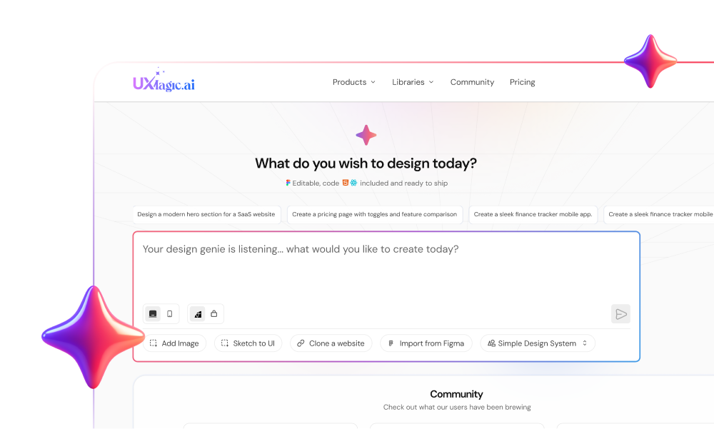
This is exactly where UXMagic becomes useful. Instead of treating style guides as suggestions, it applies them as constraints while generating layouts ,so spacing and component logic don’t drift halfway through a flow.
That’s the difference between inspiration tools and production tools.
Step 3: Mapping Edge Cases and Error States Before Handoff
Engineering friction almost always traces back to missing scenarios.
A complete mockup includes:
- empty dashboards
- invalid input states
- offline behavior
- timeout responses
- maximum-length content stress tests
Skipping this step turns developers into emergency designers.
And they shouldn’t have to be.
The High-Fidelity Trap: Why Pixel-Perfect Mockups Ruin Early User Research
High-fidelity mockups bias user feedback.
Participants stop evaluating workflows and start debating typography.
Designers stop iterating structure because they’re attached to polish.
Most teams run usability testing too late because they introduce fidelity too early.
Correct sequence:
- validate logic with wireframes
- validate hierarchy with flows
- validate aesthetics with mockups
Reversing that order produces confident decisions based on bad data.
How AI Is Changing the Mockup Phase (And Where It Fails)
AI accelerated mockup generation. It didn’t solve architectural consistency.
The biggest failure is context amnesia.
The Problem With Context Amnesia in Generative UI
Generate five onboarding screens with generic tools and you’ll get five different design systems.
Typical symptoms:
- shifting spacing rules
- inconsistent navigation
- typography drift
- component mutations mid-flow
That output looks impressive but can’t ship.
It’s why teams experimenting with AI still rely on structured prompting strategies like the ones shown in real prompts we use in production.
Maintaining Multi-Screen Consistency With Flow Mode
Consistency across flows requires persistent architectural memory.
UXMagic handles this through Flow Mode, which keeps tokens, navigation patterns, and layout rules stable across entire journeys instead of regenerating each screen in isolation.
That solves the exact fragmentation problem most teams encounter when moving beyond single-screen experiments.
It’s also why structured workflows outperform “blank canvas prompting,” especially when teams are already dealing with blank canvas syndrome in AI-assisted design.
Seamless Developer Handoff: From Static Mockup to React Components
The traditional “handoff” phase doesn’t work anymore.
Throwing files into Jira and hoping for alignment creates:
- spacing drift
- typography mismatches
- inconsistent breakpoints
- duplicated component logic
Modern mockups act as executable specifications.
That means:
- tokens are locked before implementation
- component structure mirrors frontend architecture
- edge cases are already mapped
- layout behavior is predictable
Instead of translation, developers get instruction.
This shift is exactly what teams mean when they talk about moving toward a human-in-the-loop AI design workflow ,where automation accelerates structure but humans control architecture.
And when mockups are generated inside system-aware environments like UXMagic, they can export structured React outputs aligned with the original design tokens instead of disconnected HTML fragments.
That removes the guesswork entirely.
A mockup isn’t a prettier wireframe, it’s the point where interface decisions become executable constraints for engineering. Teams that treat mockups as architectural blueprints ship faster, avoid design drift, and eliminate handoff guesswork before a single line of code is written.
Generate Mockups That Developers Don’t Ignore
Stop handing off static screens that drift in production. Try UXMagic free and generate system-consistent mockups aligned with real component logic in minutes.