
What design consistency means + why it’s hard?
Design consistency is not about making things look pretty. It is about making products feel reliable.
When consistency breaks, users notice immediately. Buttons change color. Fonts jump styles. Interactions behave differently from screen to screen. The product feels cheap, unfinished, or worse, untrustworthy.
There are two layers to consistency in product design:
Visual consistency means using the same colors, typography, spacing, and components everywhere. If your primary button is blue on the homepage, it should not randomly turn green on the pricing page.
Functional consistency means interactions behave the same way every time. Users build muscle memory. They stop thinking and just use the product. When that muscle memory breaks, friction appears instantly.
This creates the classic tension in design. Creativity versus usability. Originality versus familiarity. Designers want to explore, but products need rules. That tension is why design systems exist, and why maintaining them is exhausting.
In 2026, AI is finally good enough to help. But most AI design tools still struggle with one thing: consistency at scale.
Below are the 7 AI tools that actually handle design consistency well, each in a very different way.
AI Tools for Design Consistency Comparison Table
| Tool | Best For | Core Approach | Strength | Limitation | System-Level Consistency |
|---|---|---|---|---|---|
| UXMagic | Product teams and designers shipping real products | Hard-enforced style guides and contextual flow memory | Extremely strict consistency and accurate dev handoff | Less flexible for wild visual exploration | ✅ Yes |
| UX Pilot | Designers with existing Figma systems | Reads and follows Figma tokens | Respects existing rules, no random styles | Depends heavily on Figma setup quality | ✅ Yes |
| Magic Patterns | Developer-led teams | Uses real code components | Impossible to generate incorrect components | Limited visual experimentation | ✅ Yes |
| Magic Path | Fast UX flow visualization | Remembers previous screens for continuity | Smooth page-to-page transitions | Weak system enforcement | ⚠️ Partial |
| Stitch | Early ideation and inspiration | Copies styles from images | Fast visual inspiration | Inconsistent across large flows | ❌ No |
| Uizard | Non-designers and presentations | Theme-based styling | Very fast and easy to use | Lacks strict rules for developers | ❌ No |
| Banani | Founders, PMs, non-designers | Theme and contextual memory | High fidelity output from text prompts | Less precise than the system-first tools | ⚠️ Partial |
Quick rule of thumb: If you care about long-term product consistency, choose a system first tool. If you care about speed or inspiration, choose a theme-based tool.
Detailed breakdown of each tool
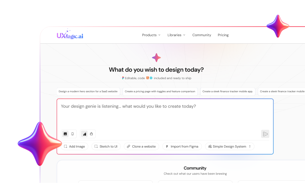
- UXMagic AI
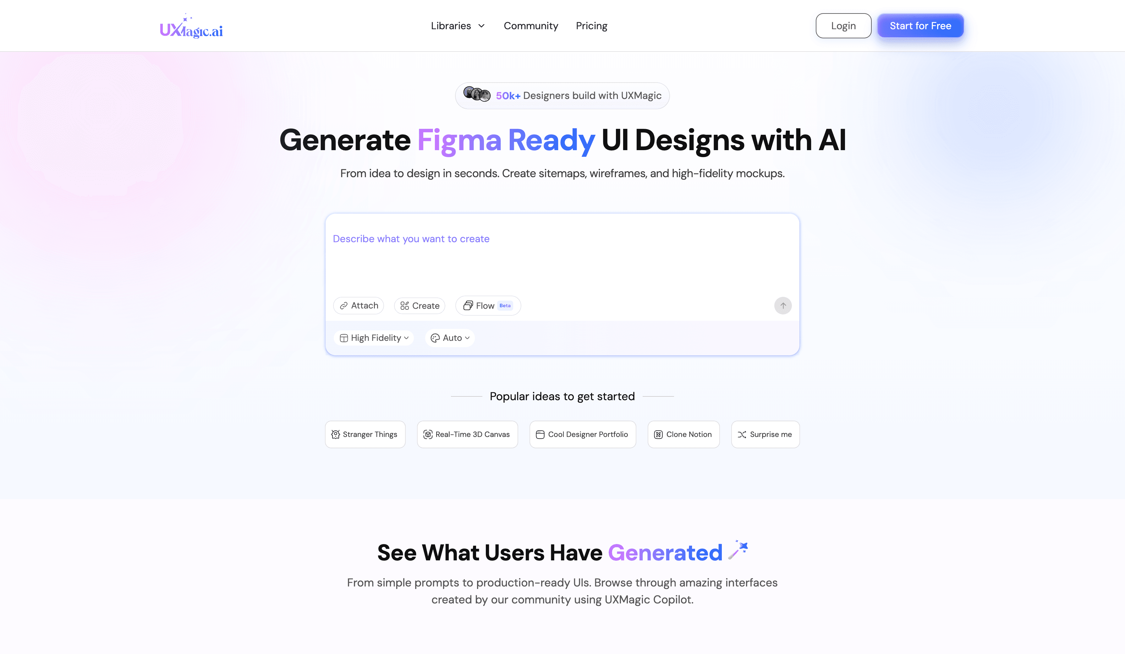
How it maintains design consistency: UXMagic treats consistency as a hard rule, not a suggestion. Style guides are enforced as constraints, not inspiration. When generating multiple screens, Flow Mode preserves context so layouts, spacing, and components follow the same logic across the entire flow.
Best use case: Teams that care about design system integrity and developer handoff accuracy.
Best Feature: It can generate a full style guide from a live URL, then apply bulk updates across screens instantly. You can import Figma components and reuse them directly, which keeps generations aligned with your real system.
Limitation: It is not the best tool for wild visual exploration. UXMagic prioritizes rules over experimentation, which means it shines in production work but feels restrictive for pure concept art.
Verdict: Best for teams who want AI-generated designs to stay consistent and match the final implementation closely.
Pricing: Free tier available. Paid plans start around $17.5 per month.
- UX Pilot
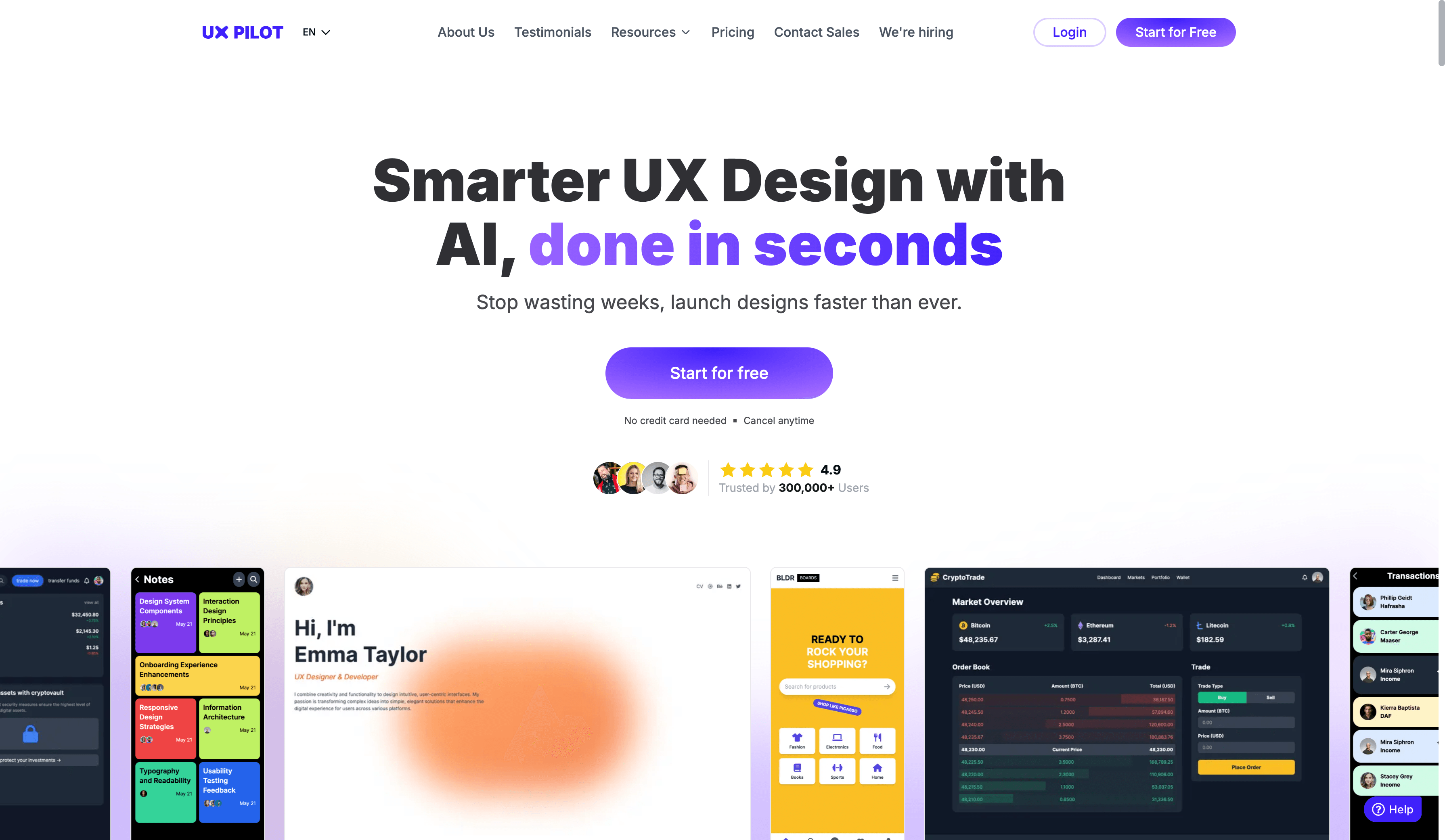
How it maintains design consistency: UX Pilot reads existing design tokens from Figma and follows them. It does not invent new colors or typography if rules already exist.
Best use case: Designers with an established Figma system who want AI to execute, not improvise.
Best feature: It respects existing rules instead of fighting them.
Verdict: Solid if your system already lives in Figma and you want AI assistance without disruption.
Pricing: Free tier available. Paid plans start around $19 per month.
Want a deeper breakdown? See a full UXMagic vs UX Pilot comparison
- Magic Pattern
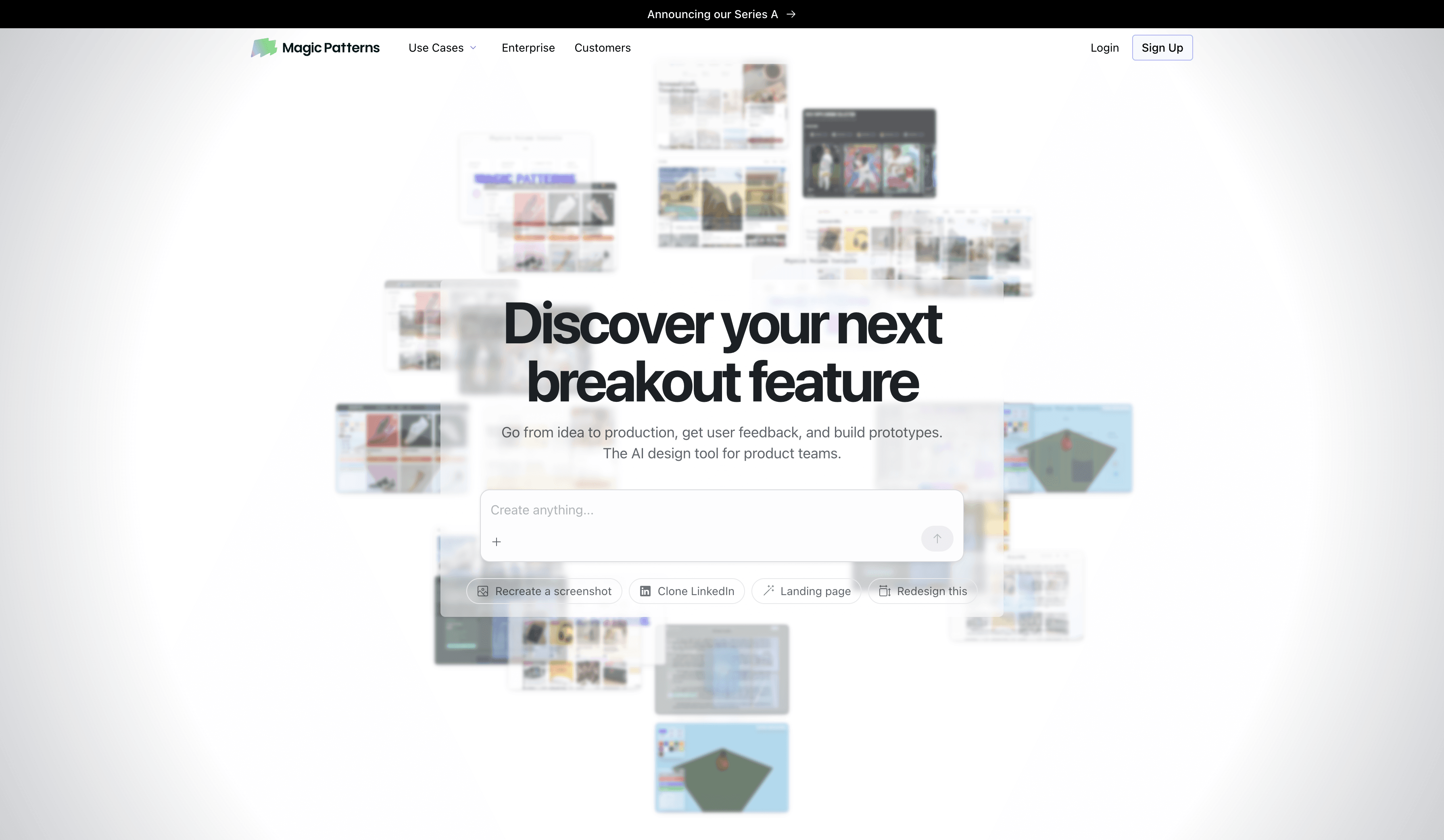
How it maintains design consistency: Magic Patterns builds screens using real code components instead of drawing fake UI. If your button exists in code, that exact button is used.
Best use case: Developer-led teams with established component libraries.
Best feature: It cannot generate incorrect components because it only uses what already exists.
Verdict: Excellent for engineering-heavy teams, less useful for early design exploration.
Pricing: Free and paid plans starting around $19 per month.
Want a deeper breakdown? See a full UXMagic vs Magic Patterns comparison
- Magic Path
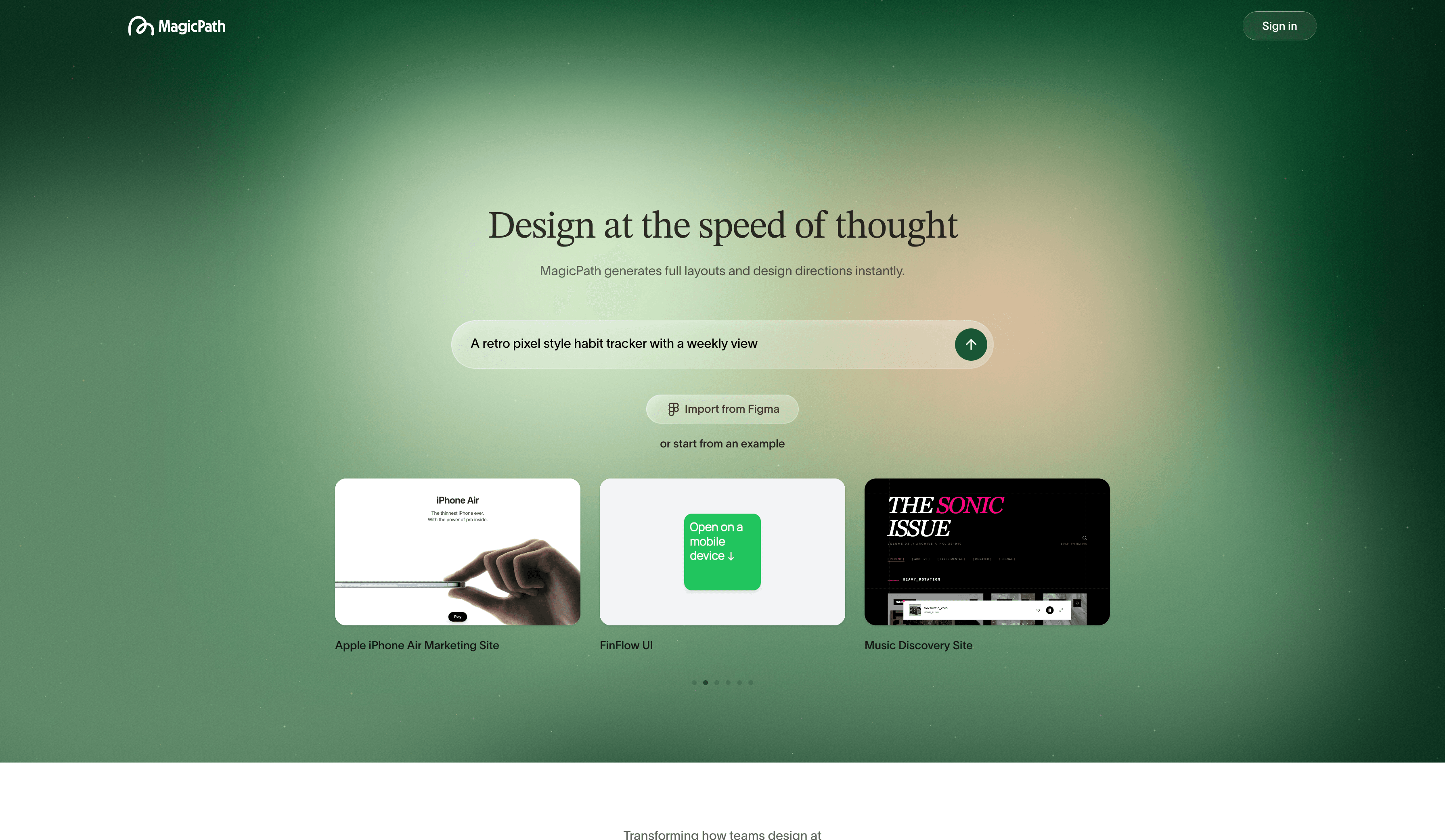
How it maintains design consistency: Magic Path remembers the previous screen when generating the next one, keeping layouts and visual style aligned across a flow.
Best use case: Visualize user flows quickly and smoothly.
Best feature: Smooth transitions between screens.
Verdict: Good for flows and storytelling, weaker on strict system enforcement.
Pricing: Free tier available. Pro plans start around $20 per month. Want a deeper breakdown? See a full UXMagic vs Magic Path comparison
- Stitch
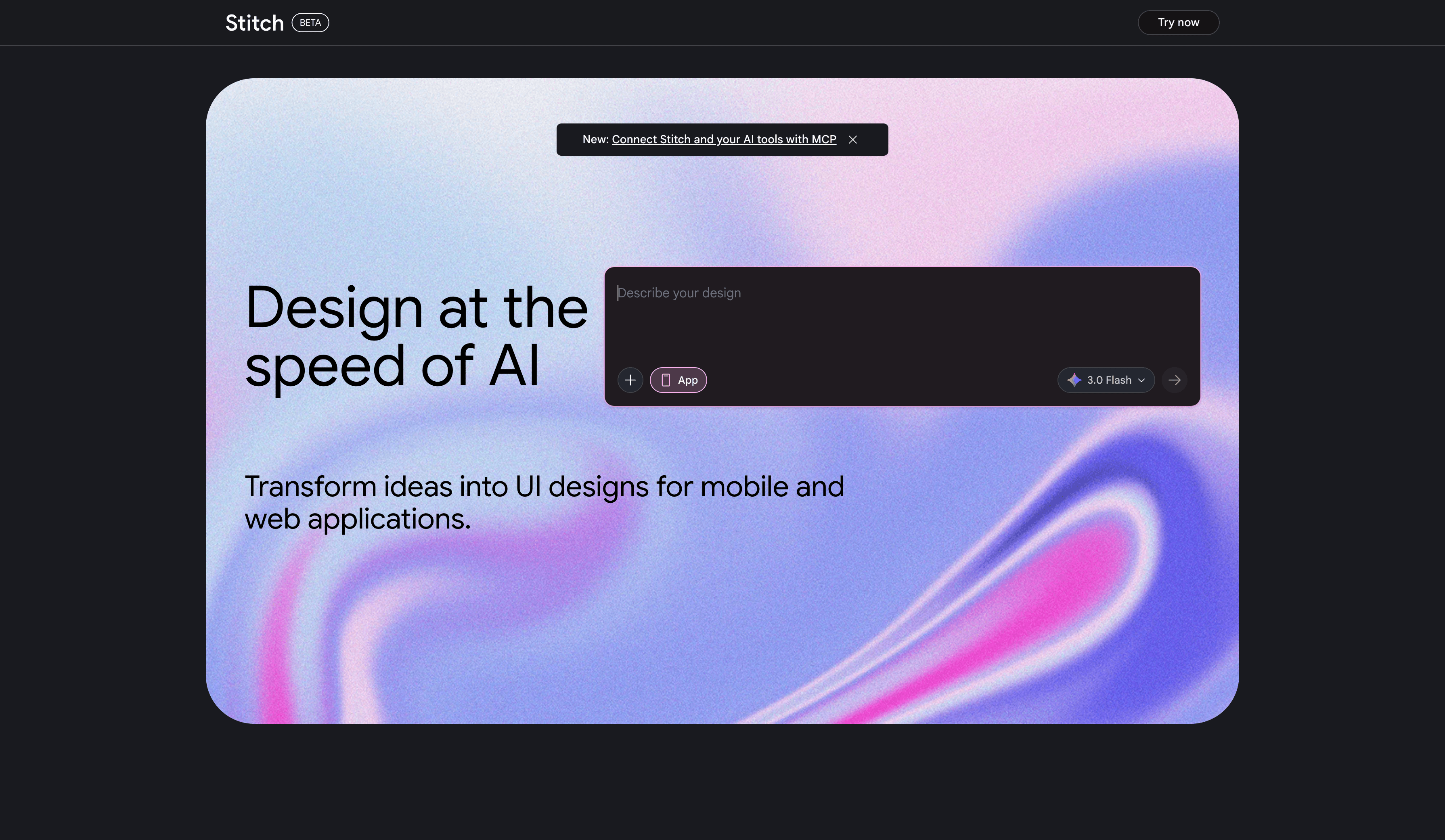
How it maintains design consistency: Stitch copies visual style from images or screenshots, but does not strictly enforce rules across many screens.
Best use case: Early ideation and visual inspiration.
Best feature: Fast style cloning from references.
Verdict: Great for brainstorming. Risky for production consistency.
Pricing: Currently free during beta. Want a deeper breakdown? See a full UXMagic vs Stitch comparison
- Uizard
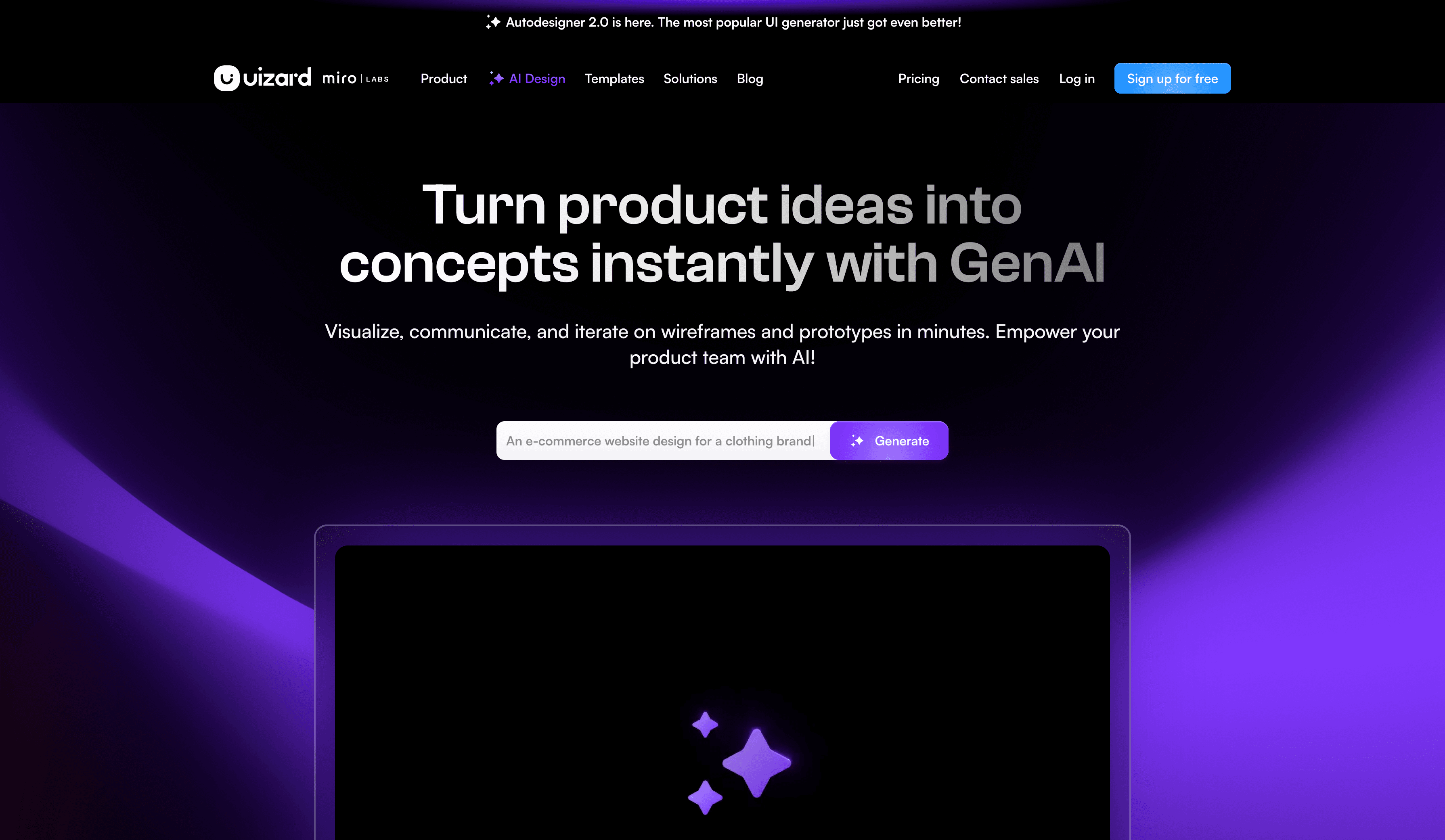
How it maintains design consistency: Uizard applies themes globally using a palette and layout presets.
Best use case: Non-designers creating quick mockups or presentations.
Best feature: One click visual restyling.
Verdict: Looks nice quickly, but lacks the rigor needed for real design systems.
Pricing: Free tier available. Paid plans start around $12 per month.
Want a deeper breakdown? See a full UXMagic vs Uizard comparison
- Banani
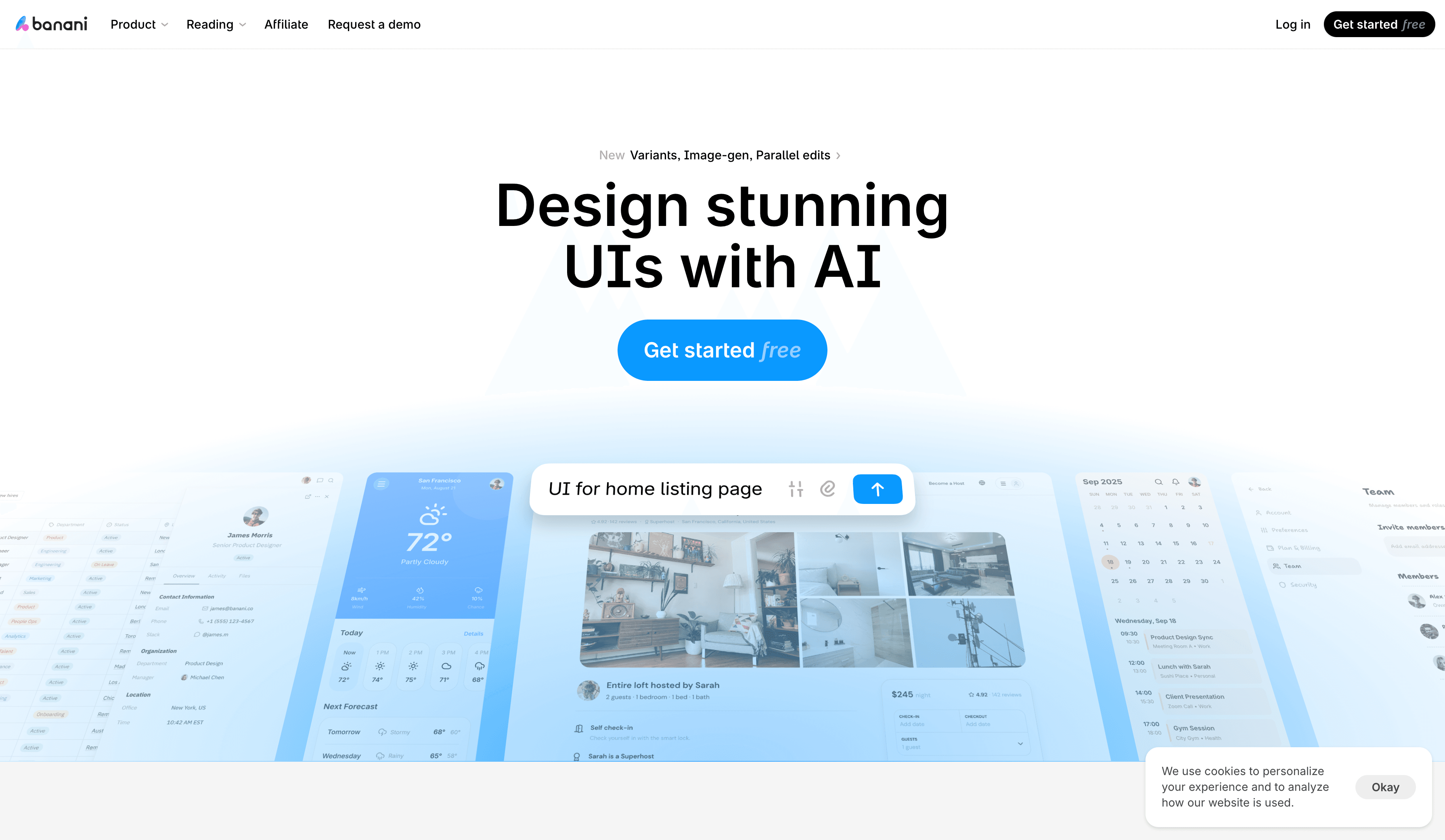
How it maintains design consistency: Banani uses themes and system rules while maintaining contextual memory across screens.
Best use case: Founders, PMs, and non-designers creating high-fidelity flows fast.
Best feature: Text to high-fidelity prototypes that feel presentation-ready.
Verdict: Powerful, fast, but less precise than system first tools.
Pricing: Free tier available. Pro plan is around $20 per month.
Want a deeper breakdown? See a full UXMagic vs Banani comparison
Build Consistent Product Designs, Not Just Screens
Stop fixing mismatched buttons and broken design systems. Generate UI that follows strict style guides, preserves flow context, and stays aligned with development from day one.
Conclusion
If you want inspiration, many AI tools can help. If you want consistent, system-driven product design, only a few truly deliver. The right tool depends on whether your priority is exploration, speed, or long-term maintainability.