Most AI-generated layouts look fine at desktop width. Then they collapse the moment you test them on mobile.
If you've ever typed “design a modern SaaS dashboard” and received something visually polished but structurally useless, you’ve already met the limits of generic prompting. The real problem isn’t the tool. It’s the lack of architectural constraints.
Prompting AI for responsive UI design isn’t about better adjectives. It’s about forcing adaptive logic across breakpoints before generation even starts.
The Architecture of Generative UI: Prompting AI for Responsive Design
Most guides tell you to “be specific” when prompting AI.
That’s wrong.
Specific wording doesn’t fix broken layout logic. What actually works is enforcing structural rules across breakpoints before the model generates anything.
Why Generic AI Generators Fail at Mobile-Responsive Layouts
Generic generators treat responsiveness as scaling, not restructuring. That leads to what experienced teams call the Mobile Lie:
- sidebars shrink until unreadable
- touch targets fall below 44×44px
- tables become horizontal scroll traps
- CTAs overlap decorative elements
This isn’t randomness. It’s missing instructions.
AI tools don’t infer adaptive behavior unless you explicitly define it.
If you’ve seen this pattern before, it’s the same failure mode described in our breakdown of how designers actually use AI in real projects. Production workflows always start with constraints, not vibes.
The Difference Between Responsive Scaling and Adaptive UI Logic
Responsive scaling stretches a layout.
Adaptive logic swaps components.
Example:
Scaling approach (bad):
Shrink a 10-column table until it fits mobile width.
Adaptive approach (correct):
Replace the table entirely with stacked cards under 768px.
If you don’t specify the swap, the model won’t do it.
Overcoming Context Window Amnesia in Multi-Screen Design
If your typography changes between onboarding steps, that’s not randomness. It’s Context Window Amnesia.
The model literally forgot your system.
Using Design Tokens to Prevent Style Drift
Design Token Drift happens when:
- hex values mutate
- spacing scales shift
- border radii change mid-flow
- clamp() typography disappears
Fixing this manually is expensive. That’s the hidden cost known as the Verification Tax.
Instead, inject tokens before generation:
- typography scale via clamp()
- spacing rhythm
- border-radius system
- color dictionary
- layout padding rules
Better yet, avoid regenerating screens independently. Generate the entire state machine at once.
This is exactly why workflows that treat AI as isolated screen generators break down and why structured pipelines like the human-in-the-loop AI design workflow consistently outperform them.
Advanced AI Prompting Frameworks for Product Designers
Prompt engineering isn’t the skill you think it is:
Context engineering is.
Senior teams don’t search for magic prompt templates. They define systems first.
Implementing the R.A.C.E. Framework for UI Generation
The R.A.C.E. structure prevents layout hallucination:
Role
Define expertise precisely:
You are a Principal UX Architect specializing in responsive B2B fintech SaaS interfaces.
Action
Describe the structural objective: Design a responsive analytics table transitioning to stacked cards under 768px.
Context
Inject system rules:
- Tailwind utility classes
- analyst audience
- no hidden desktop navigation
- fluid typography scale
Expectation
Specify output format: Return semantic React components with WCAG 2.2 AA attributes. Most teams skip Expectation. That’s where breakpoints fail.
The Sandwich Method: Bridging Human Strategy and AI Speed
Effective responsive UI generation follows a three-layer pipeline:
Human → AI → Human
Phase 1: define architecture Phase 2: generate structured layout Phase 3: audit semantics and accessibility
Skip Phase 1 and you pay the Verification Tax.
Skip Phase 3 and you ship div soup.
If you want examples of production-ready constraint prompts, the patterns in real prompts we use for SaaS UI generation follow this exact structure.
Prompting for Complex SaaS Layouts across Breakpoints
Responsive prompting fails most often in high-density enterprise interfaces.
Tables. dashboards. navigation shells.
Here’s what works instead.
Converting Desktop Data Tables to Mobile Card Interfaces
Bad prompt: Create a responsive user management table.
Result: Scrollable overflow container. High cognitive load. Broken hierarchy. Tiny actions.
Expert prompt:
On viewports >1024px render a 5-column grid table. On viewports <768px replace the table with stacked cards. Name appears as 18px header. Status badge top-right. Metadata stacked below. Minimum touch target height 48px.
Now the model swaps structures instead of shrinking pixels.
That’s adaptive logic.
It’s also how teams avoid the same “Frankenstein layout” failures discussed in our guide to escaping blank canvas syndrome with structured AI workflows.
CSS Grid and Flexbox Constraints for AI Prompts
Macro-layout generation should always start with grid structure first.
Example constraint sequence:
Desktop:
- persistent sidebar
- CSS Grid shell
- defined column relationships
Tablet:
- 64px icon-only sidebar
- labels hidden
- hover tooltips preserved
Mobile:
- sidebar removed
- bottom nav with four destinations
- secondary routes inside hamburger drawer
If the prompt doesn’t define breakpoint behavior explicitly, the model guesses.
And guesses are expensive.
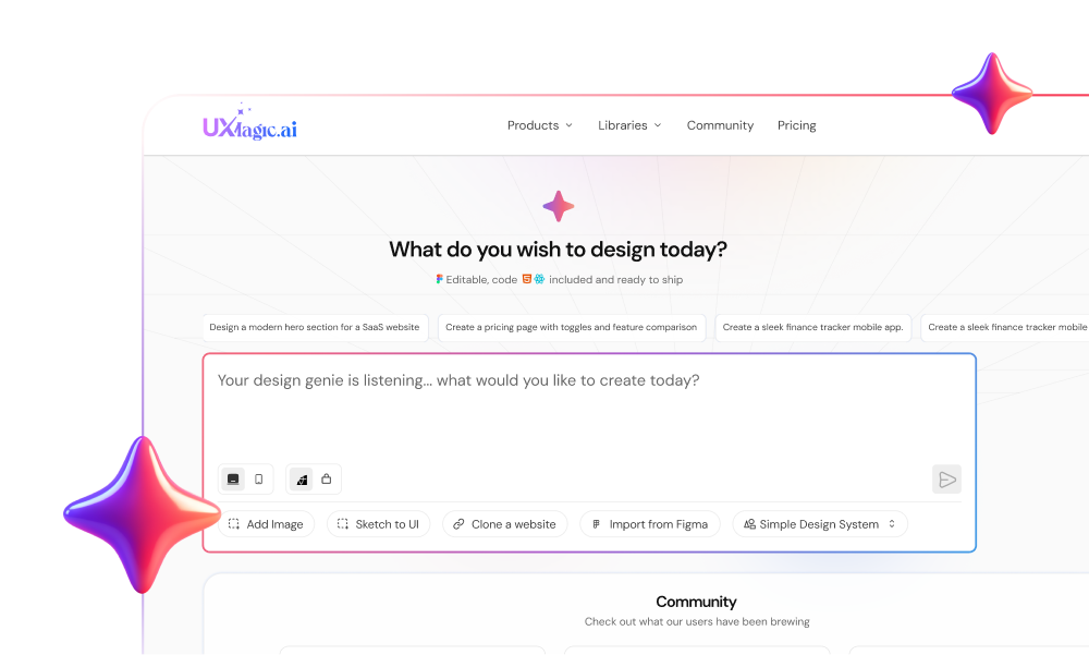
How UXMagic Flow Mode Eliminates the Verification Tax
Most generators treat every screen as a fresh canvas.
That guarantees token drift.
UXMagic Flow Mode locks typography, spacing, and color tokens across entire journeys so onboarding, dashboards, and billing flows share the same structural DNA.
Instead of rebuilding layouts after every tweak, teams generate component-based flows aligned with their actual system. That removes the hours normally spent correcting hallucinated spacing and navigation regressions.
It also supports importing existing Figma components directly into context. So the AI reuses your production system instead of inventing one.
The result isn’t prettier UI.
It’s UI that survives developer handoff without reconstruction.
Responsive UI generation with AI only works when you stop asking for layouts and start defining systems. The teams getting real output from generative tools aren’t writing better prompts, they’re enforcing breakpoints, locking tokens, and forcing adaptive component behavior before generation begins.
If your prompt doesn’t define what changes between desktop and mobile, the model will decide for you and it will decide wrong.
Generate Breakpoint-Aware Flows Without Token Drift
Stop fixing layouts after generation. Use UXMagic Flow Mode to create responsive UI flows that preserve spacing, typography, and navigation logic across every screen.