Most dashboard mockups look portfolio-ready in Figma, but completely disintegrate the moment real production data with missing fields and nine-digit numbers hits the screen. Designing an interface that survives dynamic enterprise data requires moving past aesthetic card grids into structured information hierarchy. What follows is the exact layout patterns, visual encoding rules, and architectural decisions required to ship a dashboard UI that doesn't fall apart on contact with real data.
You already understand card components, padding, and standard design system primitives. This isn't a definition post. It's the decision-mapping discipline, the chart-selection rules, and the edge-case handling that separate a dashboard that gets used from one that gets exported to CSV and ignored.
Adding more charts and color-coded status indicators to an analytics screen actively decreases the speed of user decision-making. High-performing SaaS interfaces don't maximize visible data - they ruthlessly filter secondary metrics to surface actionable insight within five seconds.
Quick Reference: Common Mistakes vs. Better Approaches
Common Mistake
Better Approach
Too many KPI cards on one screen
Focus on decision metrics only - cut anything that doesn't trigger action
Meaningful color coding, reserved strictly for alerts
Static, perfectly balanced mockup data
Real data testing - nine-digit numbers, negative percentages, empty states
What Makes a Dashboard Different From a Regular UI?
Most product UI is built to help users complete a task - check out, fill a form, send a message. A dashboard has a different job: it helps users understand a situation and decide what to do next. That distinction changes almost every design decision that follows.
A checkout flow succeeds when someone finishes a linear sequence. A dashboard succeeds when someone glances at it and immediately knows whether something needs their attention - which is exactly why the 5-second rule, chart accuracy, and restrained color aren't stylistic preferences here. They're the mechanism that makes "understand a situation fast" actually possible.
The Four Types of SaaS Dashboards
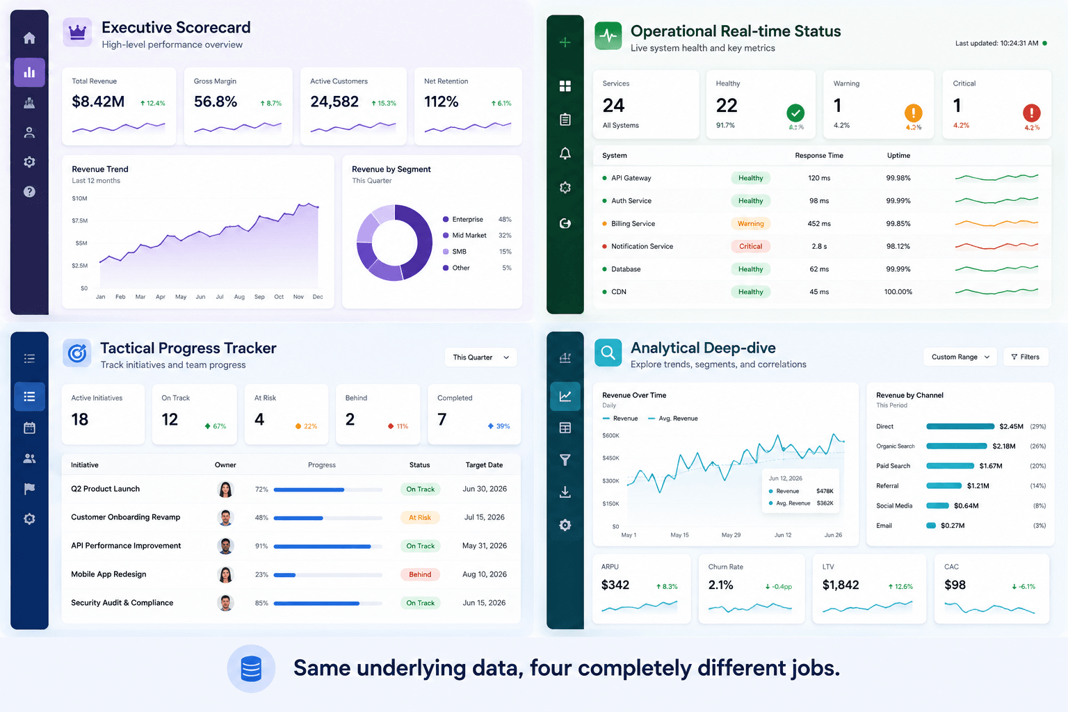
SaaS dashboards generally fall into four categories, and confusing them is a common source of the "monolithic screen" problem covered below:
Strategic (Executive) dashboards - tracking long-term KPIs like revenue trajectory and net retention, built for someone who needs the ten-second version, not the detail.
Operational dashboards - monitoring real-time system performance, built for someone who needs to catch a problem the moment it happens.
Tactical dashboards - tracking progress toward departmental goals, built for someone managing a team's week-to-week execution.
Analytical dashboards - investigating complex data trends and historical patterns, built for someone who has time to dig, not glance.
The Executive-style CRM dashboard pattern (think Salesforce-style pipeline overviews) leans heavily on scorecards and trend deltas. The Operational monitoring pattern (think Datadog-style status grids) leans on real-time density and alert color. The financial reporting pattern (think Stripe-style revenue dashboards) leans on a single dominant trend line with drill-down detail hidden behind it. The analytics-reporting pattern (think Google Analytics-style dashboards) leans on comparative time-series charts a user is expected to actively explore, not just glance at. Matching the pattern to the actual job not defaulting to "add more charts" is the real skill here.
The Science of Dashboard UI Design: Visual Hierarchy & Cognitive Load
Applying the 5-Second Rule and Top-Left Scanning Patterns
An effective dashboard presents critical data in a structured visual hierarchy so users extract insight and make an operational decision within five seconds. That's the actual bar not "does it look impressive," but "can someone act on it before they've finished their first glance." Human scanning follows a top-left to bottom-right F-pattern, which is why primary KPIs belong in the top-left viewport, not scattered wherever there's open space.
Reducing Non-Data Ink: Data-Ink Ratio in Modern SaaS
Strip away redundant gridlines, dark card borders, background gradients, and uninformative icons to protect the data-ink ratio. Every visual element that isn't communicating a data point is competing with the elements that are - a chart with heavy borders and decorative icons isn't more informative, it's just louder.
Single-Page Views vs. Tabbed Interfaces vs. Progressive Disclosure
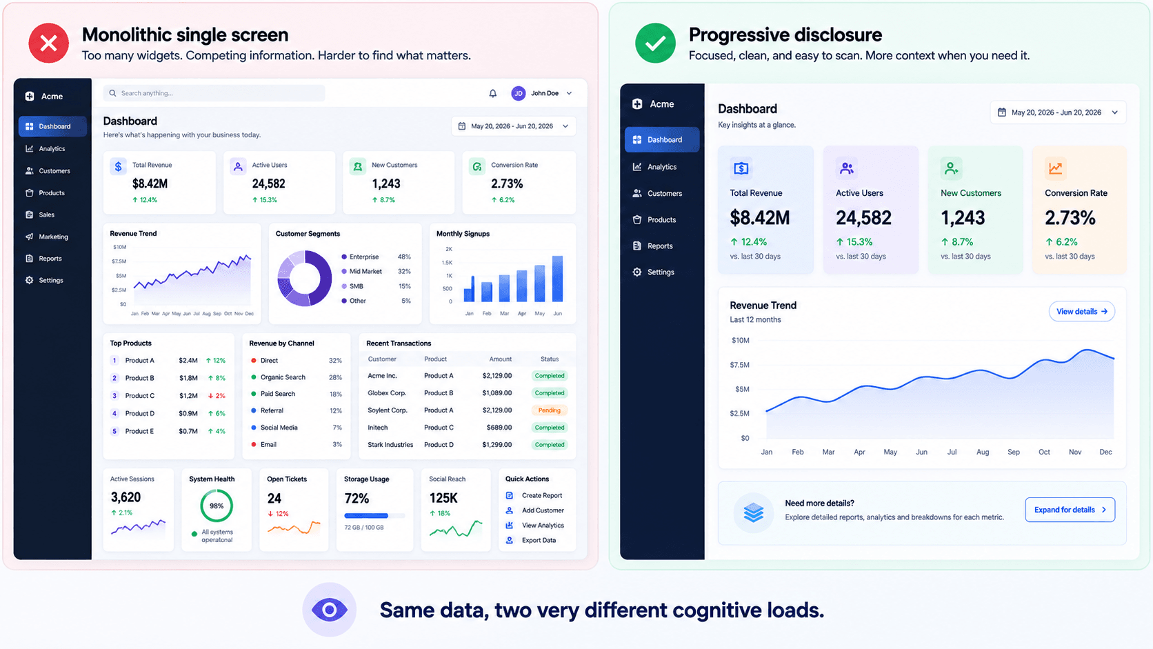
A monolithic single-screen dashboard often creates unnecessary cognitive load when teams try to answer too many questions on one page. Cramming every business question into one dense viewport tends to produce a "density disjoint" problem - competing data points dilute attention instead of sharpening it. High-performing enterprise applications generally rely on progressive disclosure, tabbed segmentation, and contextual drill-downs rather than forcing all metrics into a single screen.
The Scorecard Grid: Structuring KPIs with High Perceptual Accuracy
Vanity metrics can quietly sabotage dashboard adoption. Designers routinely place aggregate numbers - "Total Registered Users," "Cumulative Lifetime Sales" - in the primary top-left hero position. Those numbers rarely trigger a real decision; almost nobody changes behavior because cumulative lifetime sales ticked up. Decision metrics belong there instead churn risk velocity, open support ticket escalation rate, system latency spikes - the ones that demand immediate intervention.
Use a standard 12-column responsive grid, and apply the Rule of 6: limit any single visual group to a maximum of six widgets to maintain focus. Past six, the group stops being a scannable summary and becomes a wall.
Chart Selection Taxonomy: How to Encode Data Accurately
Comparison, Composition, and Time-Series Visualizations
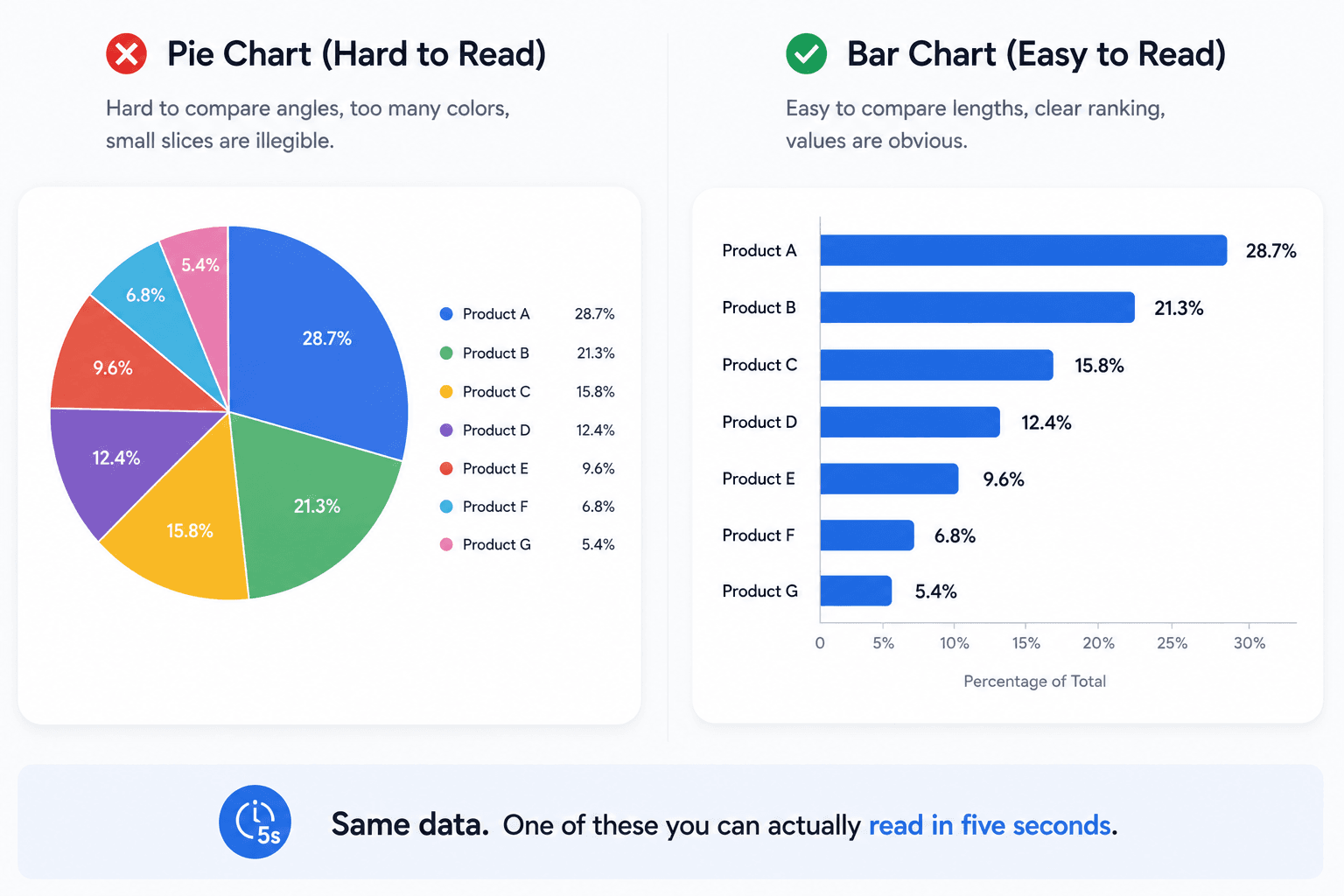
Build visual comparisons on spatial position and bar length rather than angles, areas, or 3D volumes. Human visual perception processes linear position and length far more accurately than it processes arcs or spatial area - this is a well-established perceptual finding, not a stylistic preference, and it's why bar charts and line series tend to outperform decorative alternatives for anything requiring real comparison.
Why Pie Charts Fail in Enterprise Analytics (And What to Use Instead)
Pie charts and gauge widgets are worth avoiding in the large majority of enterprise use cases. Common design guides showcase colorful pie and donut charts because they're visually engaging but engaging isn't the same as accurate. Bar charts and bullet graphs communicate comparative data with meaningfully higher precision while consuming less screen space. Reserve pie charts for binary, two-slice comparisons specifically; a seven-category time-series trend rendered as a pie chart leaves users unable to tell which segment is actually growing.
UX Rules for Color, Typography, and Spatial Density
Stoplight Palette Overuse and Accessibility Compliance
Dark mode analytics dashboards tend to be a weaker default for daytime operational SaaS, despite dominating portfolio sites. Light text on dark backgrounds can increase visual halation and eye fatigue when scanning dense tables and small typography under standard office lighting. Dark mode works well as an opt-in context, but is often a worse default architecture for a tool people use for hours during the workday.
Reserve saturated color strictly for alerts. Overusing stoplight red/green/yellow across every card creates visual noise, reduces the perceptual impact of genuine alerts, and degrades usability for colorblind users - a real accessibility compliance issue, not just a taste problem.
Step-by-Step Dashboard Design Workflow
Step 1: Pre-Design - Data Architecture & Decision Mapping
Before opening a design tool, map every metric directly to a user action:
Identify stakeholder decisions - every metric on the screen needs to answer a specific operational question, or it doesn't belong there.
Audit data cleanliness and feasibility - collaborate with database administrators on live data structures, refresh frequency, and metadata consistency before designing around assumptions.
Establish persona views - group data into 2–4 role-based tiers (Executive Overview, Operations Queue, Tactical Analyst) rather than one screen serving everyone.
Position 3 - 4 critical scorecards with primary numbers, trend indicators, and percentage deltas in the top-left viewport. Structure the grid on a standard 12-column system, apply the Rule of 6 within each visual group, and use preattentive attributes - spatial position, bar length, controlled saturation to highlight outliers instead of relying on decorative color.
Stress-test zero-data states, loading skeleton states, error boundaries, and extreme value states (nine-digit numbers, negative percentages) before anything reaches engineering. Define hover tooltips, modal drill-downs, and touch target sizes - minimum 44x44pt for tablet and mobile. Hand off vector component specs, semantic tokens, and responsive behavior rules, not just static screens.
Designing for Edge Cases: Empty States, Loading, and Mobile
The dashboard mockup looked incredible in Figma with clean three-digit numbers, but the moment live production data loaded with nine-digit currency strings and negative percentages, the layout broke. Designers routinely build grids around static, perfectly balanced placeholder text - dynamic enterprise data overflows containers, breaks alignment, and collapses hierarchy the moment a real string length shows up unannounced.
Mobile dashboard UI requires adapting desktop component patterns, not scaling down the same grid. Stack multi-column cards vertically, replace complex multi-line charts with concise summary cards, and use progressive disclosure drill-downs instead of forcing a dense analytics grid into horizontal scroll - the dense multi-column grid becomes an endless, broken scrolling nightmare on mobile otherwise. This same discipline applies to mobile app UI design patterns more broadly, where desktop-first thinking is the most common source of a broken mobile handoff.
A real example of what this looks like end to end: a DevOps team building a live server-status monitor traditionally forces engineers through four sub-menus to locate an active error during an outage. The optimized architecture instead uses a single-page, high-density grid with color-coded status badges - neutral blues and grays for nominal performance, bold red reserved strictly for active alerts - paired with an inline, actionable incident table. Generic AI generators tend to output static, low-density marketing-page layouts here instead of the high-density tables and real-time indicators DevOps tooling actually needs.
From Decision Map to Handoff: The Full Workflow
Here's how the whole process connects end to end, rather than as separate disconnected steps:
Decision Map - stakeholder interviews produce the list of metrics that actually drive action, sorted by role.
Prompt - the finalized decision map gets fed directly into UXMagic's Flow Mode as a structured brief, rather than manually built in Figma from scratch.
Dashboard Flow - a complete multi-screen flow generated with correct grid alignment, established hierarchy, and context-appropriate chart types, in the same session the decision map gets finalized.
Testing - the generated flow gets stress-tested against zero-data states, extreme values, and edge cases before anyone touches code.
Developer Handoff - vector component specs and semantic tokens export directly, closing the two-week manual assembly gap most teams treat as unavoidable.
Assembling responsive Figma card grids, auto-layout variants, and chart states manually takes teams two weeks before a prototype is even testable - that's the specific bottleneck this workflow compresses into a single session instead.
Scaling one dashboard architecture across Executive, Ops, and Analyst roles compounds the edge-case problem, since each variant needs the same token consistency without manual refactoring for every role. Design system consistency in SaaS is what UXMagic maintains automatically when generating role-specific variants from a master system - typography rules and spacing scales carry across every generated screen instead of drifting role to role.
Generating Dashboards Directly From a Decision Map
Dense data doesn't have to mean a messy layout. UXMagic's AI Dashboard Generator structures information so the most important numbers stay immediately visible, rather than competing for attention with everything else on the screen - the exact top-left hierarchy and Rule of 6 discipline covered above, applied automatically at generation time.
The workflow maps directly onto the three-step process from earlier in this guide: describe the dashboard, review the generated layout, then export and build. Feed in the finalized decision map - the KPIs, the audience, the data types and the output comes back populated with realistic sample data instead of empty placeholder boxes, so a stakeholder can actually judge whether the chart choices and hierarchy work before a single line of production data exists.
Two things matter most once the first draft is on screen. First, every element stays editable through plain-language chat - swap a bar chart for a line chart, rearrange KPI cards, adjust the structure until it actually matches how the target role reads data, without starting the layout over from scratch. Second, the output is a real, structured file ready for development, not a static image someone has to rebuild by hand - exporting directly into Figma as editable layers, or straight into implementation-ready code.
That combination - realistic data preview, natural-language editing, and structure that survives export is also what holds consistency across multi-screen dashboards specifically, the same token discipline that keeps an Executive view and an Operations view from drifting apart when they're built from the same underlying system.
Faq
có thắc mắc?chúng tôi có câu trả lời.
An effective dashboard design presents critical data in a structured visual hierarchy, allowing users to extract insights and make operational decisions within five seconds. It reduces cognitive load by prioritizing key performance indicators, applying clear visual encodings, and avoiding non-essential visual clutter.
Visual hierarchy guides user attention to high-priority metrics first, utilizing size, contrast, and top-left grid positioning. Without clear hierarchy, dashboards suffer from visual clutter, forcing users to waste effort searching for critical information rather than taking immediate operational action.
SaaS dashboards fall into four main categories: strategic dashboards for tracking long-term executive KPIs; operational dashboards for monitoring real-time system performance; tactical dashboards for tracking progress toward departmental goals; and analytical dashboards for investigating complex data trends and historical patterns.
Color should be used sparingly and deliberately to encode meaning, direct visual focus, and highlight anomalies. Designers should avoid overusing saturated stoplight red and green palettes across routine metrics, reserving vibrant accents strictly for actionable system alerts and critical status changes.
Yes, standard grid layouts, such as 12-column systems, provide visual consistency, align component cards cleanly, and simplify responsive breakpoint adaptation. Breaking the grid should occur only intentionally to call immediate visual focus to high-priority system alerts or primary scorecards.
Mobile dashboard UI requires adapting desktop component patterns rather than scaling down grids. Designers should stack multi-column cards vertically, replace complex multi-line charts with concise summary cards, and utilize progressive disclosure drill-downs to maintain touch-target usability.
The core principles are: map every metric to a decision before designing, build a clear top-left visual hierarchy, protect the data-ink ratio, encode comparisons with position and length rather than angles, reserve saturated color for alerts only, use a consistent grid system, and design explicit edge-case states before handoff.
There's no fixed number, but the Rule of 6 is a useful ceiling per visual group limiting any single cluster of widgets to a maximum of six keeps a section scannable. Beyond that, progressive disclosure (tabs, drill-downs) should absorb additional detail rather than adding more charts to the main view.
The best layout depends on dashboard type, but a standard 12-column grid with 3–4 top-left scorecards, a dominant primary chart, and secondary detail tucked into expandable sections works across most strategic and operational use cases. Analytical dashboards, built for deeper exploration, can support more density.
Dashboard UI design covers the layout and structure that helps a user understand a situation at a glance. Analytics UI design is a related but broader discipline that includes deeper exploratory interfaces - filtering, segmentation, custom querying - meant for active investigation rather than a quick five-second read.