Passing an automated browser scan doesn't guarantee your interface is accessible, and memorizing 86 WCAG success criteria is a poor use of a designer's time. Scanners are genuinely useful; they catch missing alt text, invalid HTML, and obvious contrast failures fast and cheap. What they can't do is tell you whether a multi-step flow makes logical sense, whether a keyboard user can actually exit a modal, or whether a touch target is ergonomically viable. That's where accessibility heuristics come in mental shortcuts that surface the interaction flaws scanners structurally can't see.
You already know what a screen reader is and why contrast matters. This isn't that post. It's a translation layer: how specific layout choices such as a borderless input field, a 16px icon, a hover-only action button turn into real compliance failures, plus a scoring system to prioritize fixing them instead of arguing about them in a design review.
Here's the scenario this checklist exists to prevent: a team ships a redesigned billing flow, and keyboard-only users get permanently trapped inside a promo code modal. Engineering blames design for missing focus specs. Design blames engineering for bad DOM structure. Both are right, and both problems trace back to the same root cause accessibility got treated as a final QA checklist instead of an active heuristic during flow generation.
Quick Reference: Key Terms
A few terms worth having pinned before the rest of this gets technical:
ARIA (Accessible Rich Internet Applications): a set of HTML attributes that describe a component's role and state to assistive technology for example, telling a screen reader that a custom dropdown is actually a dropdown, not just a styled div.
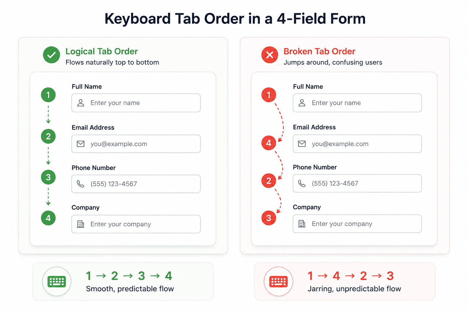
Focus management: control over which element is "active" as a user tabs through a page with a keyboard, and ensuring that focus moves logically (and never gets trapped somewhere with no way out).
Screen reader navigation: how a blind or low-vision user moves through a page using a tool like VoiceOver or NVDA typically by heading structure, landmarks, and tab order, not by visually scanning the layout.
What Are Accessibility Heuristics (And What Automated Scans Catch vs. Miss)?
Automated tools and manual heuristic review aren't competing approaches; they're catching different failure classes, and a serious accessibility process uses both.
What automated scanners genuinely catch well: missing alt attributes, invalid ARIA roles, insufficient color contrast on static text, missing form labels in the DOM, and broken HTML structure. Run one early and often it's fast, cheap, and catches real issues before a human ever needs to look.
What automated scanners structurally can't evaluate: whether a multi-step flow makes logical sense, whether keyboard focus follows a sane spatial path, whether a touch target is ergonomically viable in real use, or whether a dynamic screen reader announcement actually fires at the right moment. A tool can hand back a 96 while a keyboard user is fully unable to navigate past an onboarding modal not because the scanner is broken, but because that specific failure mode is outside what static analysis can see.
JavaScript accessibility overlays are a separate, weaker category worth flagging specifically. A post-hoc overlay widget doesn't fix underlying component architecture; it layers a fragmented secondary experience on top, one that frequently interferes with native assistive tech like NVDA or VoiceOver rather than supporting it. Real accessibility gets designed into components natively, at the wireframe stage, not patched on after launch with a script tag.
Official WCAG documentation also isn't the right day-to-day design spec. It's written for legal auditors and browser engineers, not visual layout designers forcing a product team to parse raw success criteria during ideation kills momentum for limited practical gain. Translated heuristic frameworks like Denis Boudreau's 10 Accessibility Heuristics convert that legal language into spatial, structural rules a designer can actually apply while sketching, with the specific WCAG criteria referenced alongside for when a precise citation is needed.
The 10 Core Accessibility Heuristics for Product Teams
Ten categories worth running every screen against not as a compliance audit, but as a design instinct, the same way you already check visual hierarchy or spacing.
#
Heuristic
The Question to Ask
WCAG Reference
1
Navigation & Wayfinding
Can users always tell where they are and how to get back?
2.4.3 Focus Order
2
Structure & Semantics
Does document structure match what's visually presented?
1.3.1 Info and Relationships
3
Contrast & Legibility
Do text and controls meet minimum contrast, even without color?
1.4.3 Contrast (Minimum)
4
Language & Readability
Is the copy clear, and is page language properly declared?
3.1.1 Language of Page
5
Error Prevention & States
Are errors shown through more than color, with recovery possible?
3.3.1 Error Identification
6
Predictability & Consistency
Do similar components behave the same way everywhere?
3.2.4 Consistent Identification
7
Visual & Auditory Alternatives
Does every non-text element have a text equivalent?
1.1.1 Non-text Content
8
Device Independence
Can every action be completed by mouse, keyboard, and touch?
2.1.1 Keyboard
9
Timing & Motion Control
Can users control time limits and auto-advancing content?
2.2.1 Timing Adjustable
10
Tolerance for Error
Are touch targets large and forgiving enough for imprecise input?
2.5.8 Target Size (Minimum)
A quick severity example for each, to make these concrete instead of abstract:
Navigation (1): A modal with no visible close button and no Escape key handler Critical severity, blocks task completion entirely for keyboard users.
Contrast (3): Light-grey placeholder text at 2.8:1 against white High severity, affects a large share of users in bright-light conditions, not just low-vision users.
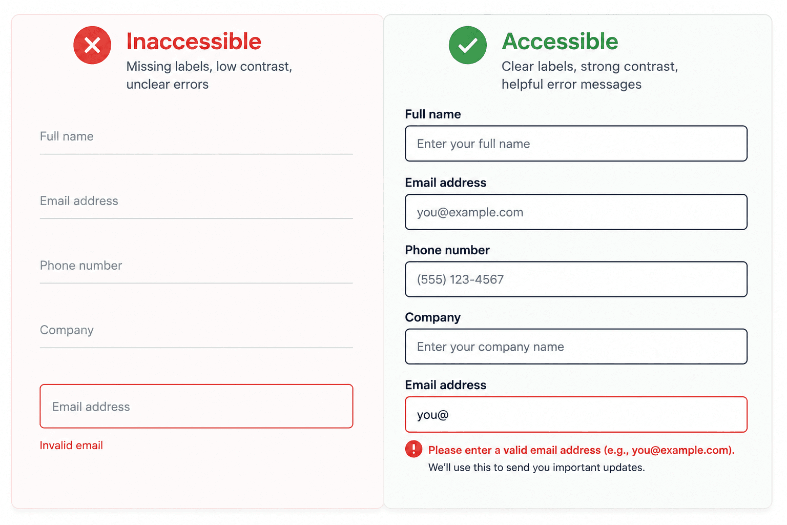
Error States (5): A red border with no text explanation High severity for colorblind users specifically, invisible to everyone else in review.
Tolerance for Error (10): A 16x16px delete icon with no padding next to other tappable elements Medium-to-High, causes accidental destructive actions on mobile.
How to Conduct an Accessibility Heuristic Evaluation
Assemble evaluators and define scope first. Decide whether the review targets a single component, a full flow, or a whole app view. Run it with 3 to 5 independent evaluators spanning design, product, and engineering, and agree on a rubric before anyone looks at a screen.
Use a consistent severity scale. Choose a 0-to-4 severity scale or a simpler 0-to-2 pass/partial/fail matrix before evaluation starts, so findings get logged consistently instead of debated case by case.
Score objectively, don't argue subjectively. Without a shared metric, accessibility reviews devolve into personal opinions about styling. The fix is a formula:
Frequency - how often users encounter this component during a standard task flow.
Impact - how severe the impediment is, from minor delay to complete task blocker.
Visibility - how obvious the issue is across keyboard, screen reader, and touch.
Issues scoring 80 or higher get classified Critical and require a fix before the developer handoff the math already made the call. Once findings are logged, annotate keyboard navigation flows, tab orders, focus ring styles, and ARIA state announcements directly in the spec.
Component-Level Checklist for SaaS Interfaces
Form architecture persistent labels, not placeholders. A common failure pattern: a work email field shows only placeholder text that vanishes on focus, an error is flagged by nothing but a red border, and the submit button sits at 2.8:1 contrast. The accessible version anchors a persistent "Work Email Address" label above the input, uses a 4.5:1 contrast border, pairs the error text with a warning icon (satisfying WCAG 3.3.1), and gives the button a 7:1 contrast ratio with a visible focus ring (satisfying 1.4.3 and 2.4.7).
Touch targets size and spacing. A second recurring pattern: dashboard cards exposing edit/delete actions only via hover or multi-finger swipe, with 16x16px icons and no padding. The fix, satisfying WCAG 2.5.8, is a permanently visible "Card Options" button sized to at least 44x44 CSS pixels for mobile (or 24x24 with adequate spacing for desktop AA), openable by click or keyboard spacebar.
Focus rings and state documentation. Every interactive control needs an explicit focus ring (WCAG 2.4.7 Focus Visible) and a non-color-dependent state signal. Undefined focus styling gets forgotten screen by screen instead of applied uniformly unless it's locked as a design token from the start.
Real Product Examples
Banking app KYC verification step. A common pattern in fintech onboarding: a multi-step identity verification flow uses a progress indicator that's purely visual (a colored bar with no text equivalent), so screen reader users get no sense of how many steps remain. The fix pairs the visual bar with an announced text label "Step 2 of 4: Identity Verification" satisfying both Heuristic 1 (Navigation) and 7 (Visual and Auditory Alternatives) at once.
SaaS analytics dashboard. Data-dense dashboards routinely rely on hover-only tooltips to explain what a chart metric actually means. On touch devices, that information becomes permanently inaccessible; there's no hover state on a phone. The accessible pattern uses a tap-to-reveal info icon instead, satisfying Heuristic 8 (Device Independence) without losing the clean, uncluttered look the hover version was going for.
E-commerce checkout flow. A frequent failure: a "Save 15% - apply code" banner auto-dismisses after five seconds, giving users no way to pause or reopen it if they didn't finish reading. This fails Heuristic 9 (Timing and Motion Control) outright. The fix is either removing the auto-dismiss timer entirely or adding a persistent, reopenable control, a small change that avoids losing a genuine conversion opportunity to an accessibility bug nobody meant to ship.
Manual Audit vs. Lighthouse vs. Axe vs. AI Accessibility Checks
Nothing structural, but slower and requires trained evaluators
Slow (hours per flow)
High (evaluator time)
Lighthouse
Missing alt text, basic contrast, invalid HTML, missing labels
Interaction logic, keyboard flow, dynamic states
Fast (seconds)
Free
Axe (browser extension)
Similar to Lighthouse, with somewhat deeper ARIA validation
Same structural blind spots as Lighthouse
Fast (seconds)
Free / low-cost
AI-native design generation
Bakes contrast, labels, and touch targets in at generation time, before a scan is even needed
Doesn't replace a manual review of finished flow logic
Instant (built into output)
Included in tool cost
The practical takeaway: run Lighthouse or Axe constantly, because they're free and catch real issues fast. Don't stop there schedule manual heuristic review at the wireframe stage, before either tool has anything to scan yet, since that's the stage where flow-level problems are cheapest to fix.
How UXMagic Eliminates Early Accessibility Debt
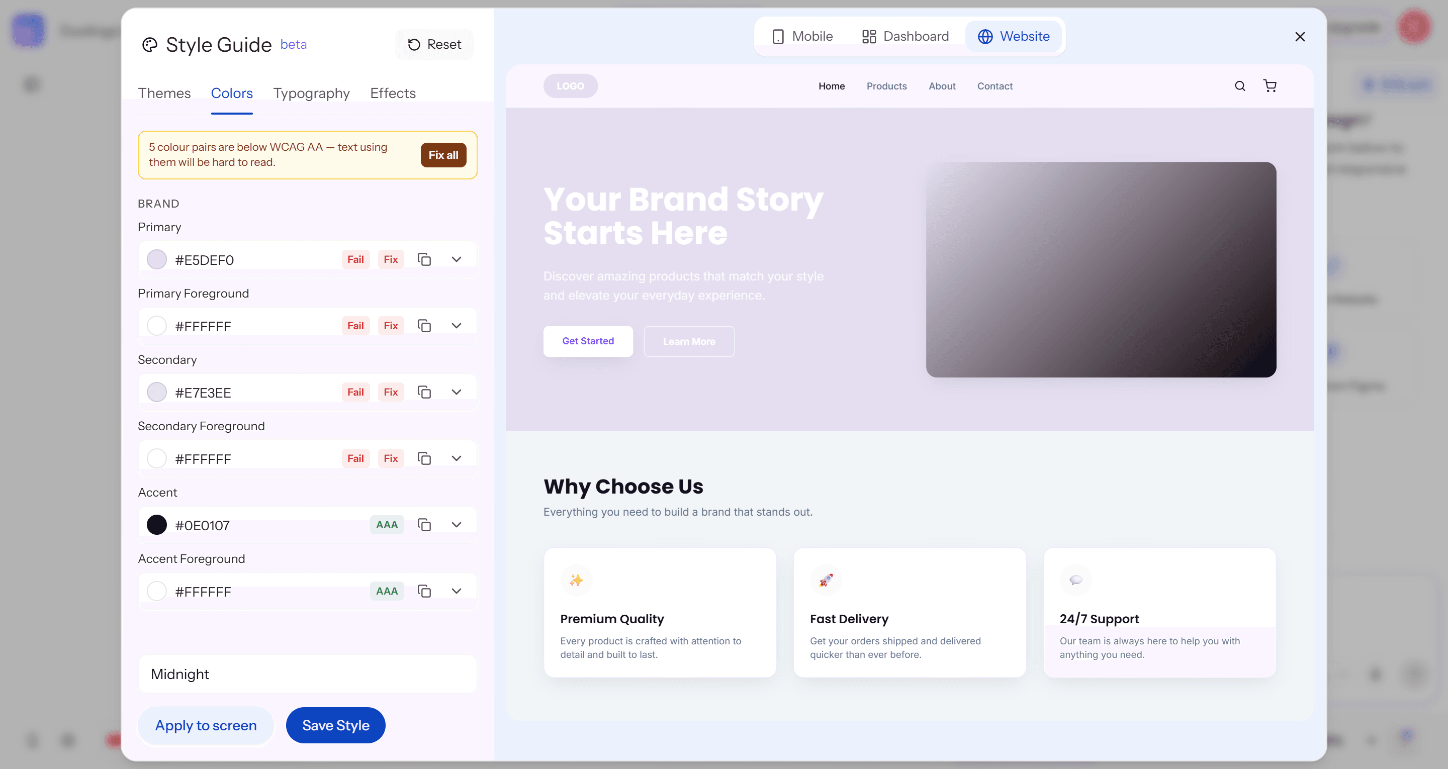
Standard AI design tools generate non-compliant mockups by default with low-contrast text, missing labels, tiny touch targets leaving a designer to spend hours fixing basic errors that shouldn't have existed. UXMagic's Style Guide closes this gap directly: every color pair in your palette gets checked against WCAG AA automatically, with a clear Pass/Fail/AAA label next to each token. When a pair fails say, a light lavender background paired with white foreground text the panel flags it immediately and offers a one-click "Fix" for that pair, or "Fix all" to resolve every failing combination across Primary, Secondary, and Accent tokens at once, rather than leaving a designer to manually recalculate contrast ratios one swatch at a time.
The second gap this closes is state completeness. Designers routinely forget to draft focus rings, hover variations, disabled states, and inline error messages, an incomplete set that causes real dev churn later. UXMagic's Flow Mode generates complete component state sets alongside primary screens automatically default, focused, hover, disabled, and error validation states for every control, produced in the same pass instead of drafted separately by hand.
Build Accessibility In Early
Stop catching accessibility issues before code freeze. Try UXMagic free and generate screens with contrast, touch targets, and focus states handled from the start.
Usability heuristics evaluate overall user experience and task efficiency for general user groups. Accessibility heuristics specifically evaluate whether an interface can be navigated and operated by individuals with visual, hearing, motor, or cognitive impairments, translating technical WCAG compliance criteria into intuitive design rules.
WCAG is organized around four principles, often abbreviated POUR: Perceivable (information must be presentable in ways users can perceive), Operable (interface components must be operable via keyboard and other inputs), Understandable (content and operation must be clear), and Robust (content must work reliably across assistive technologies).
An effective evaluation requires 3 to 5 independent evaluators. Utilizing multiple evaluators catches 75% to 80% of major accessibility barriers, as different evaluators identify different issues across visual hierarchy, keyboard focus paths, and screen reader compatibility.
No, but they complement each other well. Automated tools reliably catch code-level issues like missing labels and basic contrast failures, while manual review catches keyboard focus logic, dynamic screen reader announcements, and whether touch targets are ergonomically sound in real use of different failure classes entirely.
AI design and audit tools are generally strong at enforcing static rules contrast ratios, label presence, touch target size but can still miss context-dependent issues like whether a multi-step flow's logic makes sense, or whether a dynamic state change gets properly announced to a screen reader in real time.
WCAG 2.2 adds criteria directly affecting visual layout, including Guideline 2.5.8, which mandates a minimum target size of 24x24 CSS pixels for interactive pointer inputs, along with stricter requirements for visible focus indicators and non-modal help placements.
Automated scans (Lighthouse, Axe) should run continuously, ideally on every build. Manual heuristic evaluations are most valuable at the wireframe stage before development starts, and again before any major flow ships catching issues early is significantly cheaper than retrofitting after launch.